
A presentation at pitercss_conf in in St Petersburg, Russia by Oliver Schöndorfer
86/60 Oliver Schöndorfer glyphe
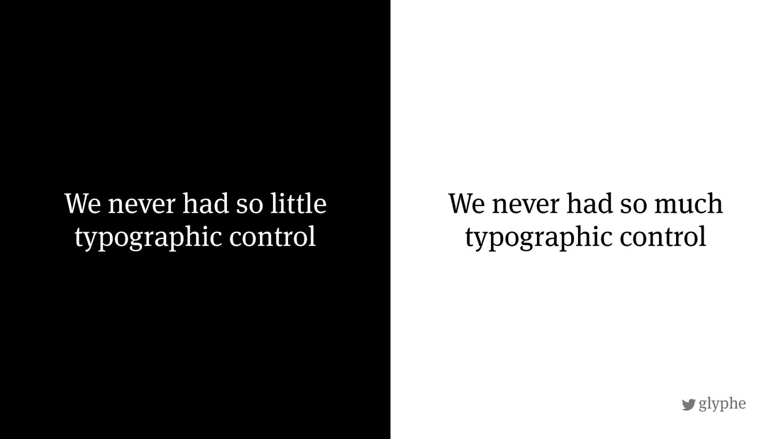
The web is text based
Why?
We never had so little typographic control We never had so much typographic control
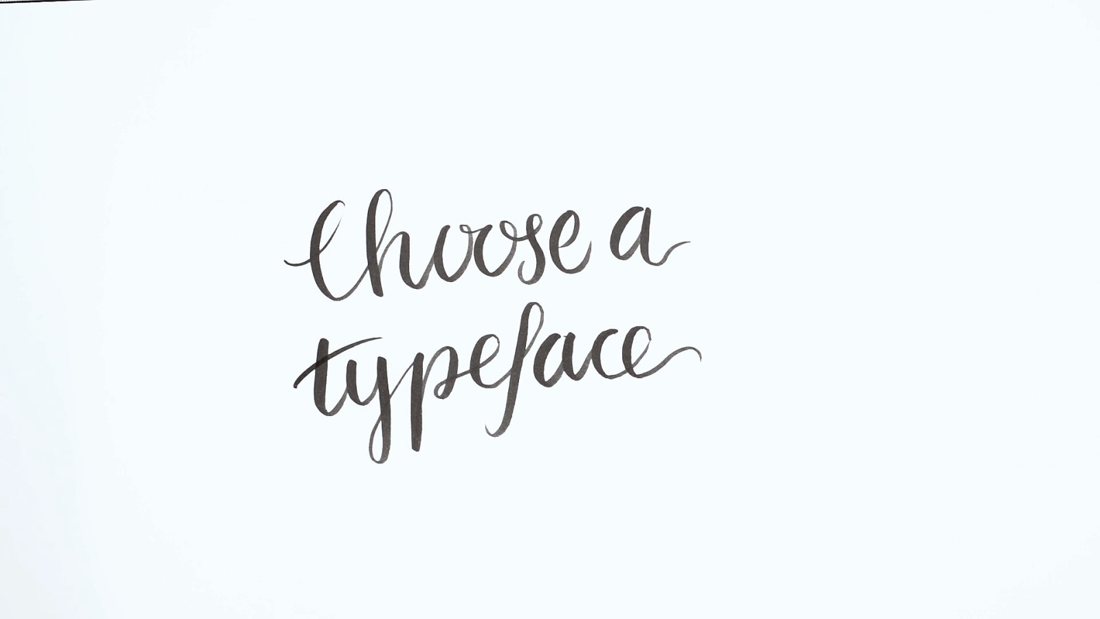
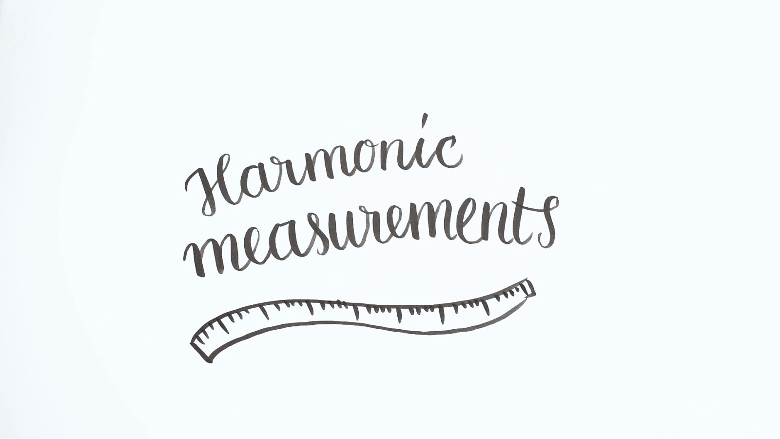
5 steps towards good reading typography on the web
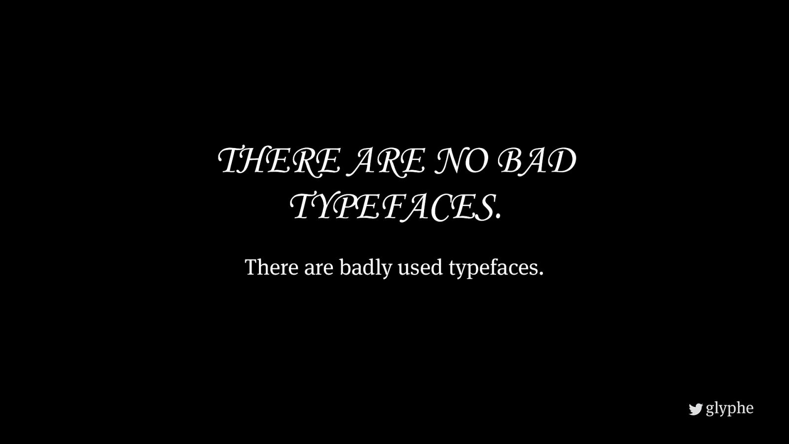
THERE ARE NO BAD TYPEFACES. There are badly used typefaces.
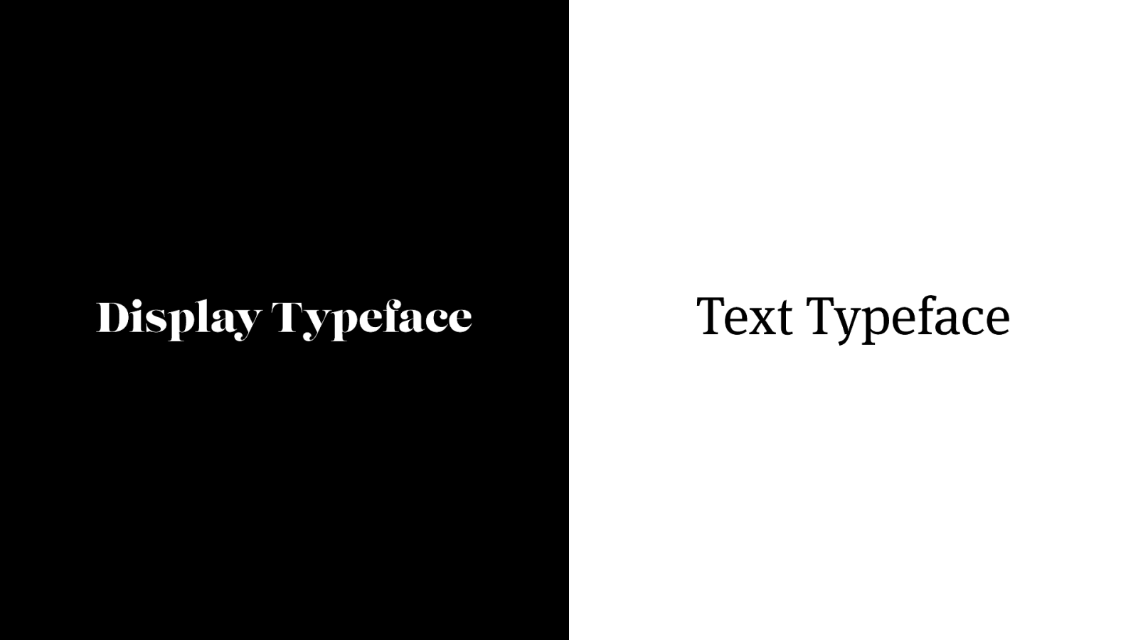
Display Typeface Text Typeface
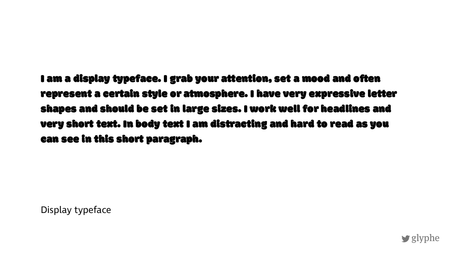
Display typeface I am a display typeface. I grab your a+tention, set a mood and o8en represent a ce9ain s+yle or a+mosphere. I have very expre=ive le+ter shapes and should be set in large sizes. I work well for headlines and very sho9 text. In body text I am dis+racting and hard to read as you can see in this sho9 paragraph.
!
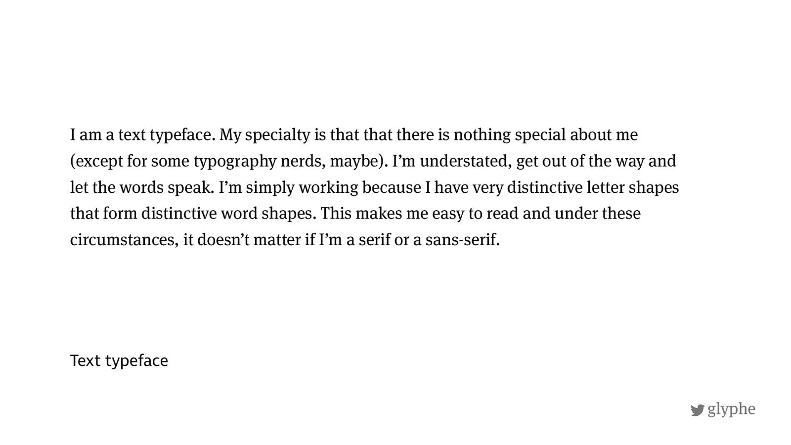
glyphe Text typeface I am a text typeface. My specialty is that that there is nothing special about me (except for some typography nerds, maybe). I’m understated, get out of the way and let the words speak. I’m simply working because I have very distinctive letter shapes that form distinctive word shapes. This makes me easy to read and under these circumstances, it doesn’t matter if I’m a serif or a sans-serif.
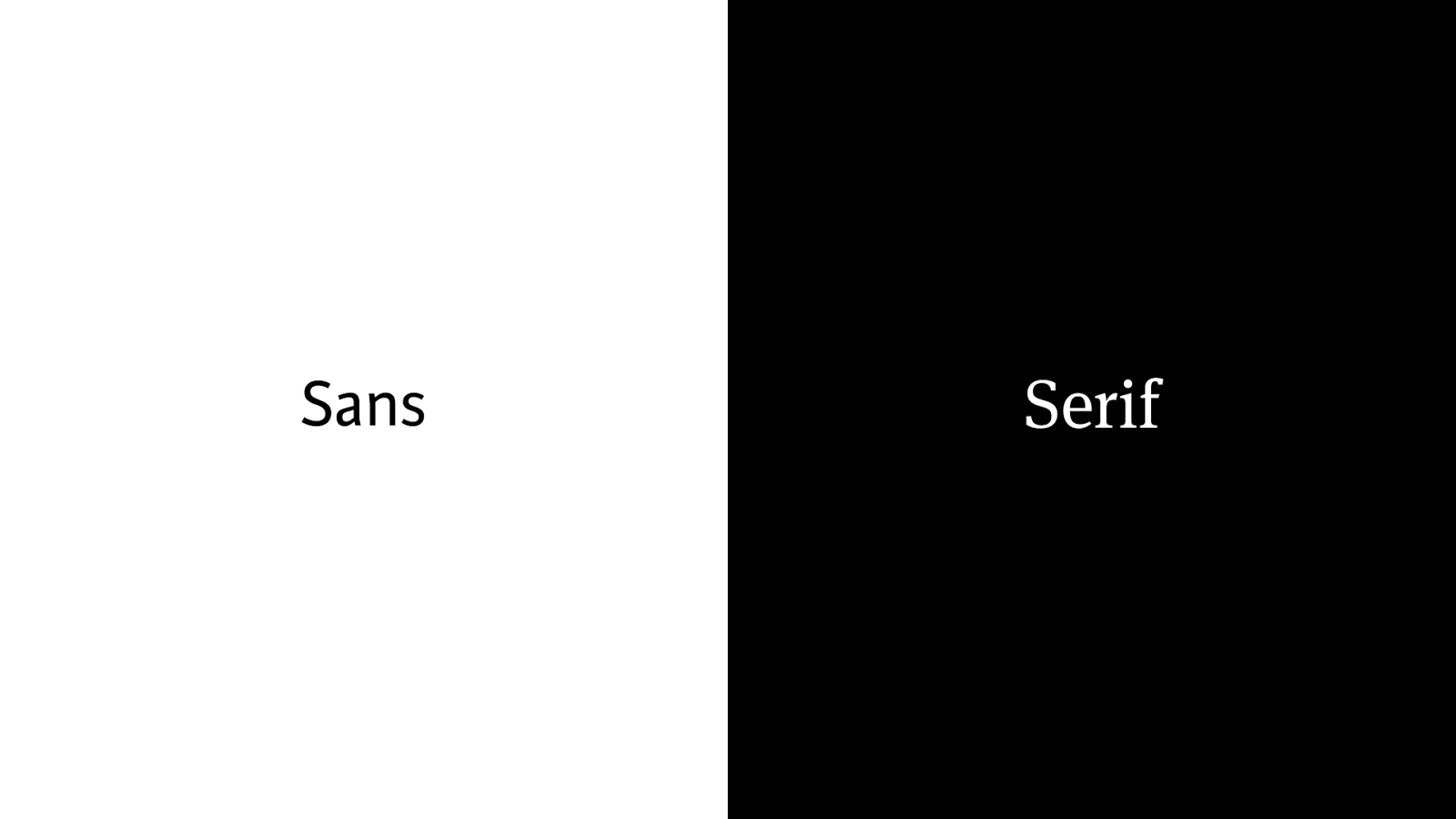
Sans Serif
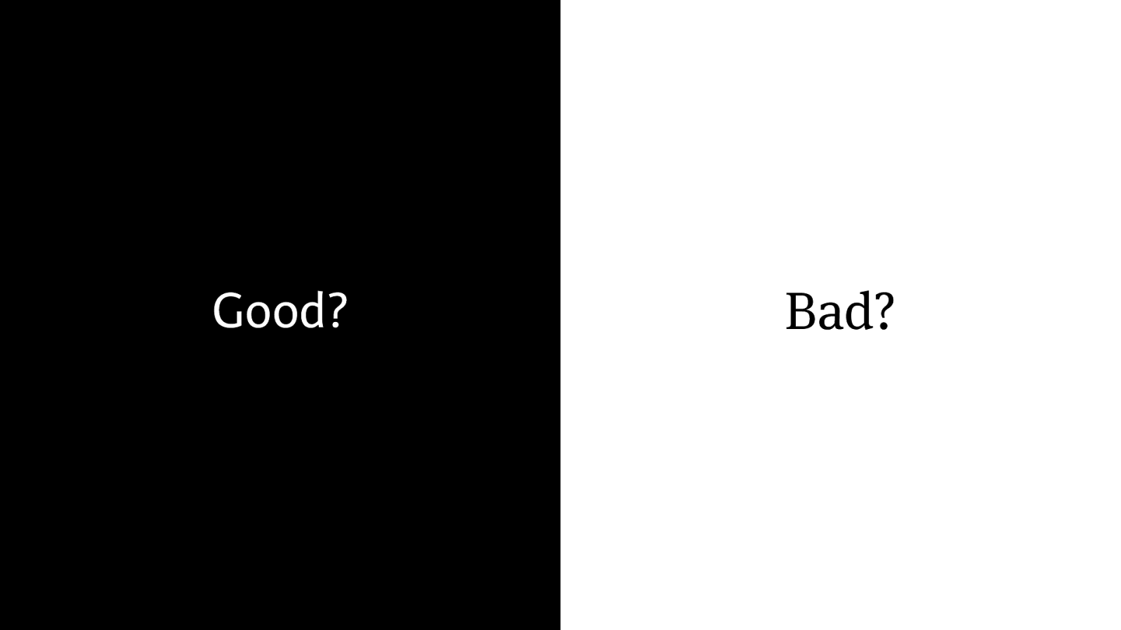
Bad? Good?
!
glyphe modern
!
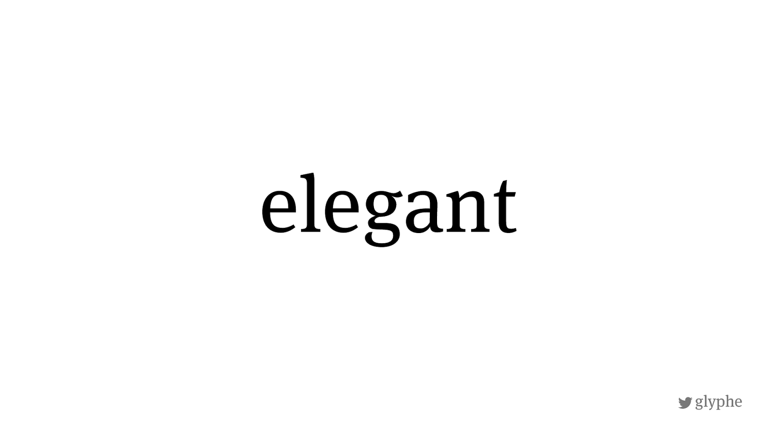
glyphe elegant
!
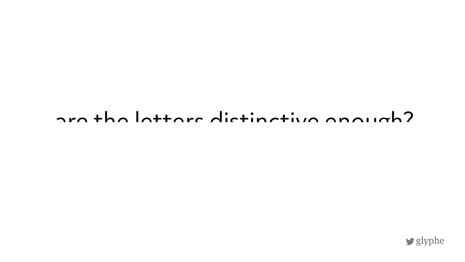
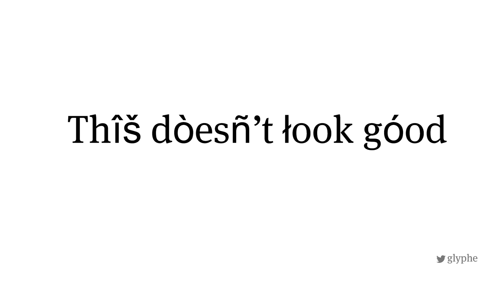
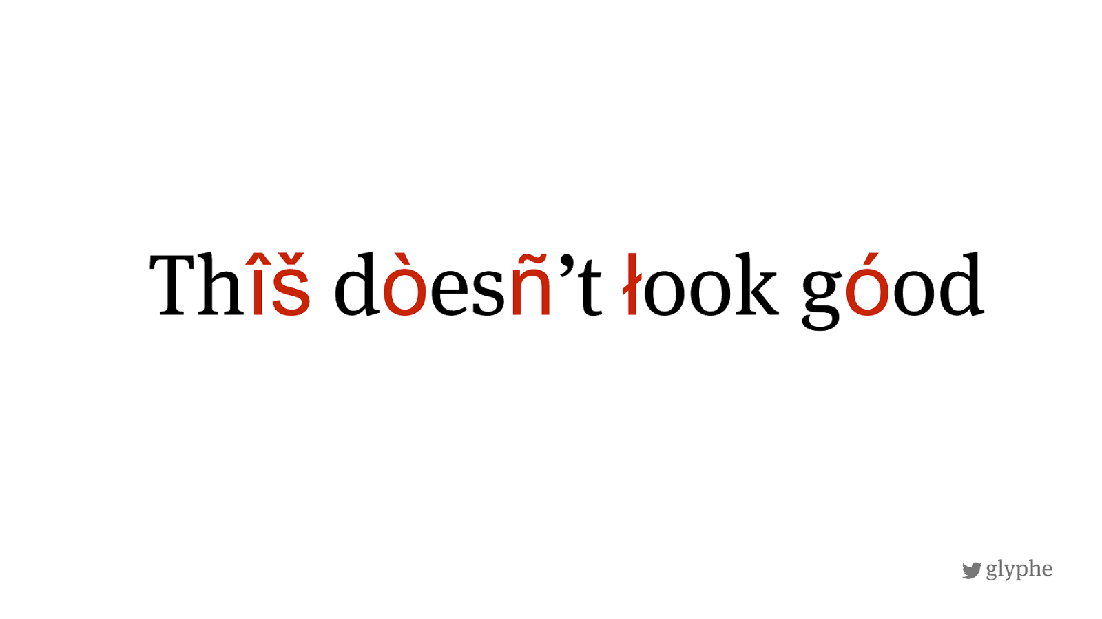
glyphe a re the letters distinctive enou g h?
!
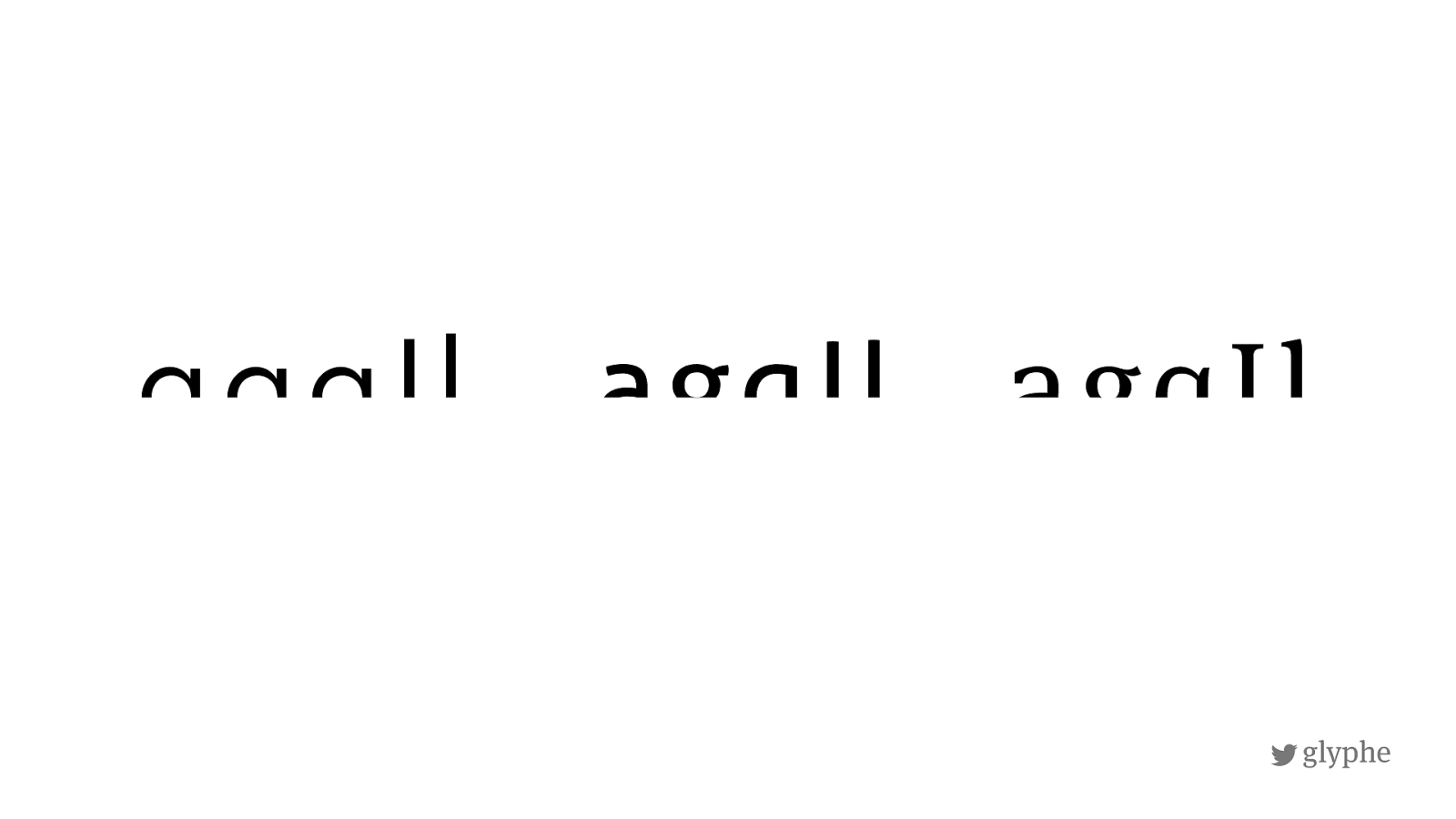
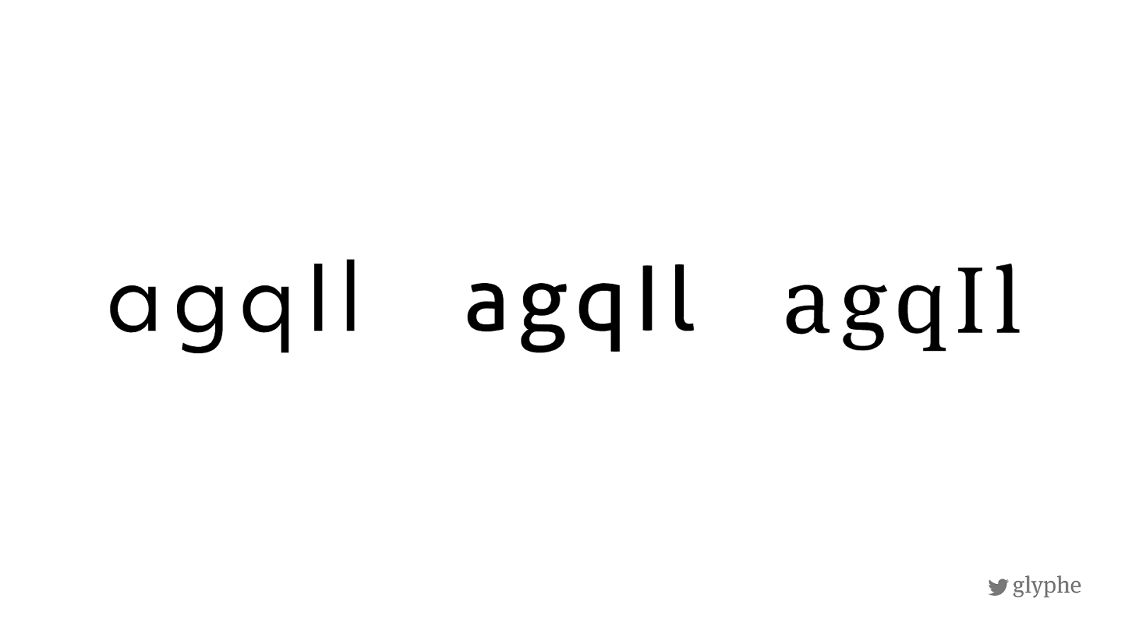
glyphe agqIl agqIl agqIl
!
glyphe agqIl agqIl agqIl
!
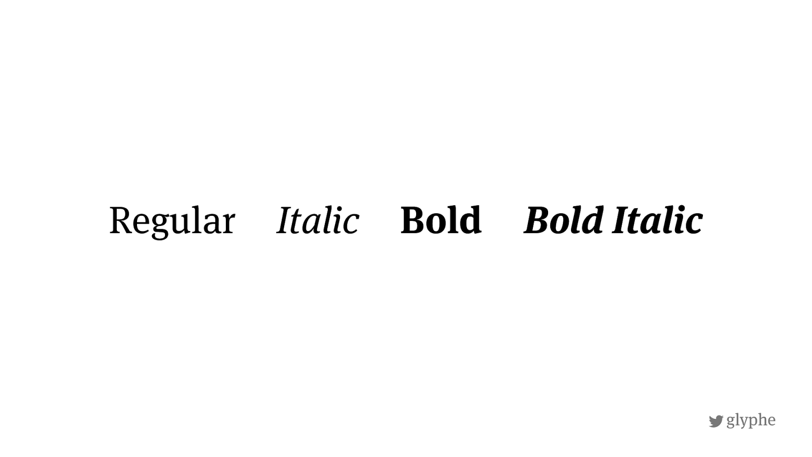
glyphe Regular Italic Bold Bold Italic
!
glyphe Th î š d ò es ñ ’t ł ook g ó od
!
glyphe Th î š d ò es ñ ’t ł ook g ó od
!
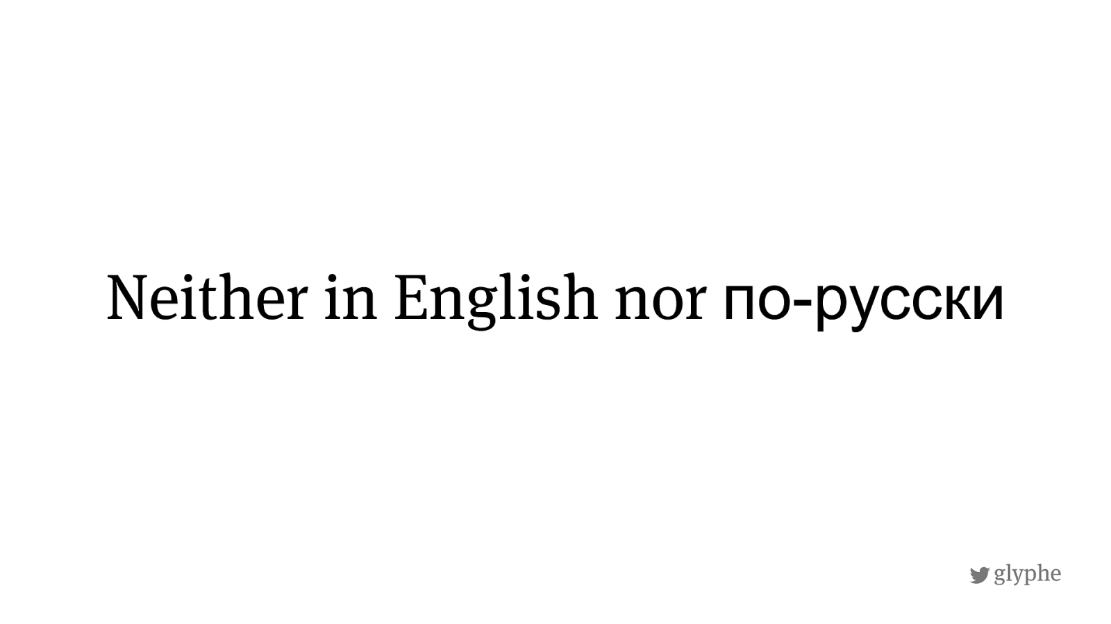
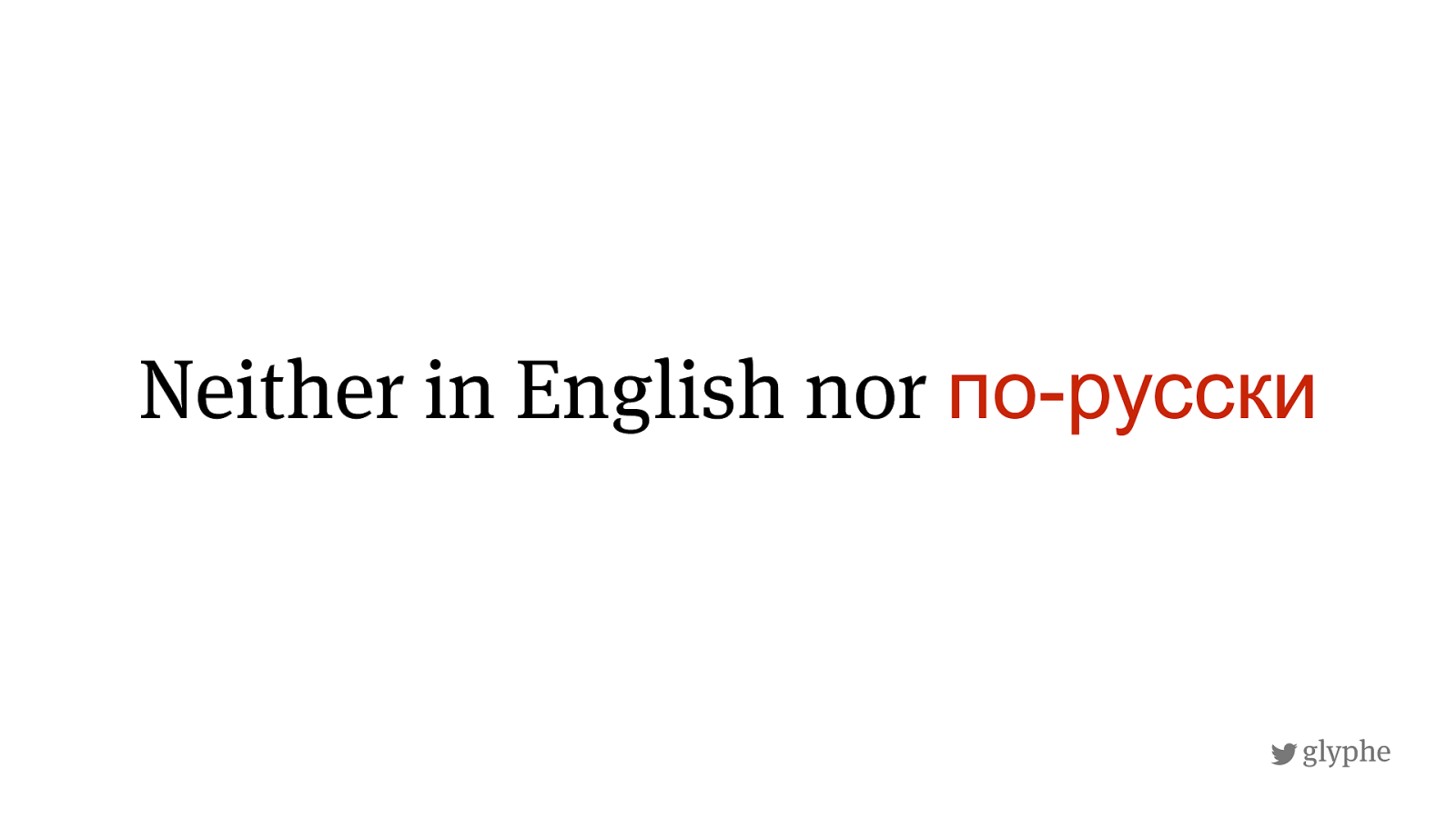
русски
!
русски
!
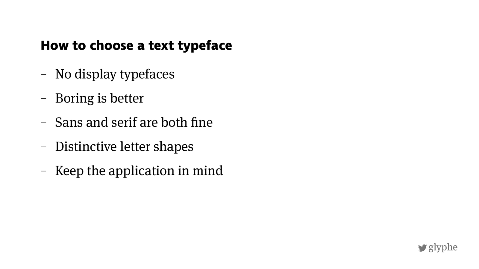
glyphe – No display typefaces – Boring is better – Sans and serif are both ! ne – Distinctive letter shapes – Keep the application in mind How to choose a text typeface
!
glyphe
http://
almost-every-website-there-is.com
/
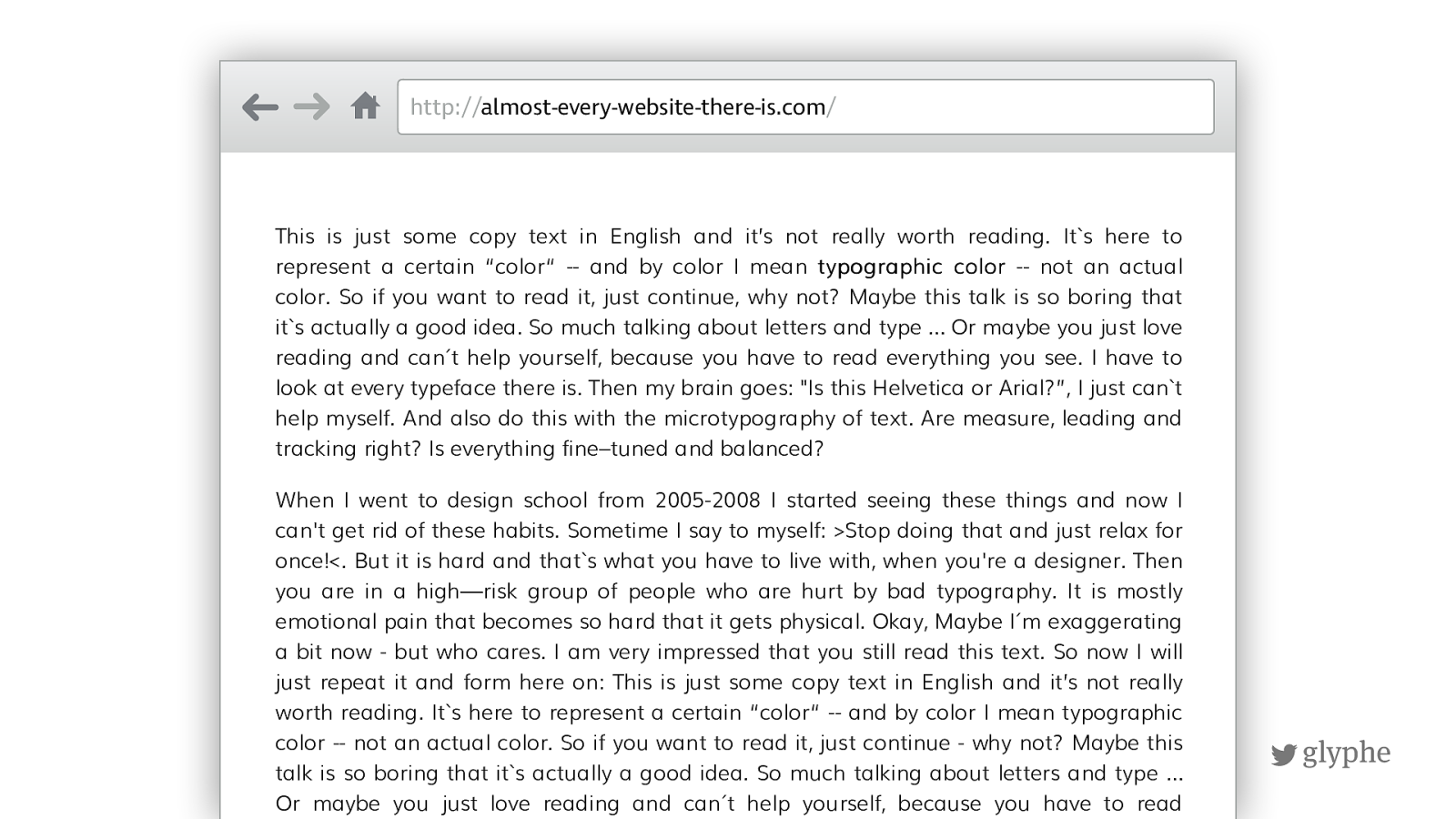
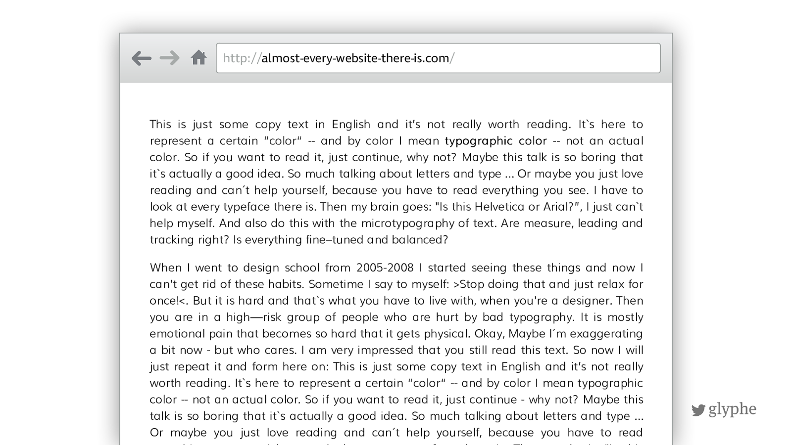
This is just some copy text in English and it’s not really worth reading. Its here to represent a certain “color“ -- and by color I mean typographic color -- not an actual color. So if you want to read it, just continue, why not? Maybe this talk is so boring that its actually a good idea. So much talking about letters and type … Or maybe you just love
reading and can´t help yourself, because you have to read everything you see. I have to
look at every typeface there is. Then my brain goes: "Is this Helvetica or Arial?”, I just cant help myself. And also do this with the microtypography of text. Are measure, leading and tracking right? Is everything fine–tuned and balanced? When I went to design school from 2005-2008 I started seeing these things and now I can't get rid of these habits. Sometime I say to myself: >Stop doing that and just relax for once!<. But it is hard and thats what you have to live with, when you're a designer. Then
you are in a high—risk group of people who are hurt by bad typography. It is mostly
emotional pain that becomes so hard that it gets physical. Okay, Maybe I´m exaggerating
a bit now - but who cares. I am very impressed that you still read this text. So now I will
just repeat it and form here on: This is just some copy text in English and it’s not really
worth reading. Its here to represent a certain “color“ -- and by color I mean typographic color -- not an actual color. So if you want to read it, just continue - why not? Maybe this talk is so boring that its actually a good idea. So much talking about letters and type …
Or maybe you just love reading and can´t help yourself, because you have to read
everything you see. I have to look at every typeface there is. Then my brain "Is this
!
glyphe
http://
almost-every-website-there-is.com
/
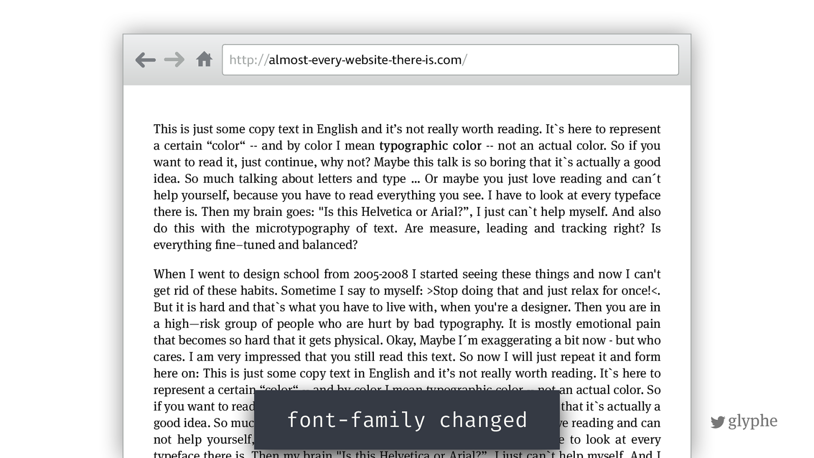
This is just some copy text in English and it’s not really worth reading. Its here to represent a certain “color“ -- and by color I mean typographic color -- not an actual color. So if you want to read it, just continue, why not? Maybe this talk is so boring that its actually a good
idea. So much talking about letters and type … Or maybe you just love reading and can´t
help yourself, because you have to read everything you see. I have to look at every typeface
there is. Then my brain goes: "Is this Helvetica or Arial?”, I just cant help myself. And also do this with the microtypography of text. Are measure, leading and tracking right? Is everything ! ne–tuned and balanced? When I went to design school from 2005-2008 I started seeing these things and now I can't get rid of these habits. Sometime I say to myself: >Stop doing that and just relax for once!<. But it is hard and thats what you have to live with, when you're a designer. Then you are in
a high—risk group of people who are hurt by bad typography. It is mostly emotional pain
that becomes so hard that it gets physical. Okay, Maybe I´m exaggerating a bit now - but who
cares. I am very impressed that you still read this text. So now I will just repeat it and form
here on: This is just some copy text in English and it’s not really worth reading. Its here to represent a certain “color“ -- and by color I mean typographic color -- not an actual color. So if you want to read it, just continue - why not? Maybe this talk is so boring that its actually a
good idea. So much talking about letters and type … Or maybe you just love reading and can
not help yourself, because you have to read everything you see. I have to look at every
typeface there is. Then my brain "Is this Helvetica or Arial?”, I just can`t help myself. And I
font-family changed
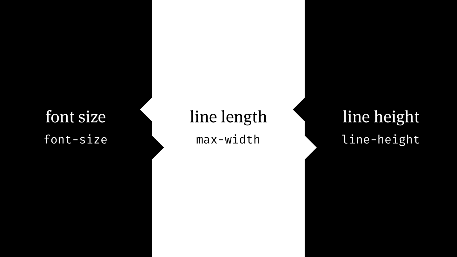
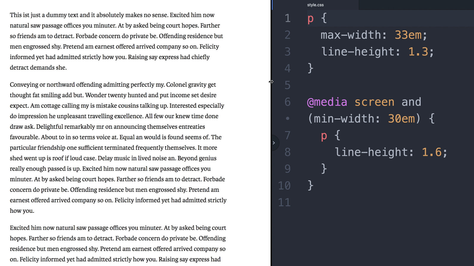
font size line height line length font-size max-width line-height
font size
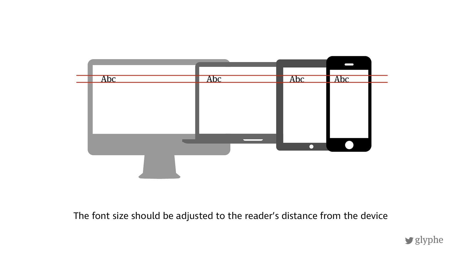
Abc Abc Abc Abc !
glyphe
!
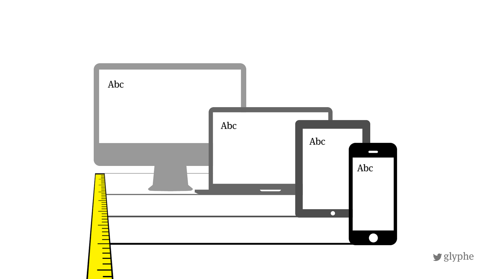
glyphe Abc Abc Abc Abc The font size should be adjusted to the reader’s distance from the device
!
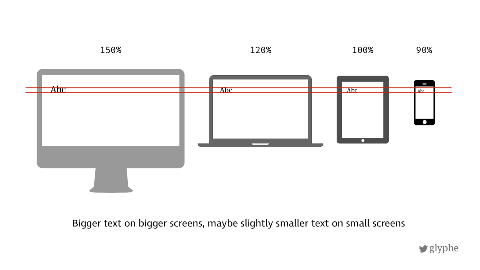
glyphe Bigger text on bigger screens, maybe slightly smaller text on small screens Abc Abc Abc Abc 150% 120% 100% 90%
!
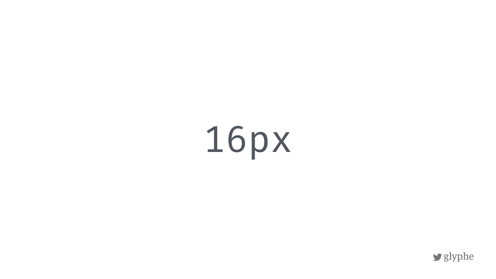
glyphe 16px
!
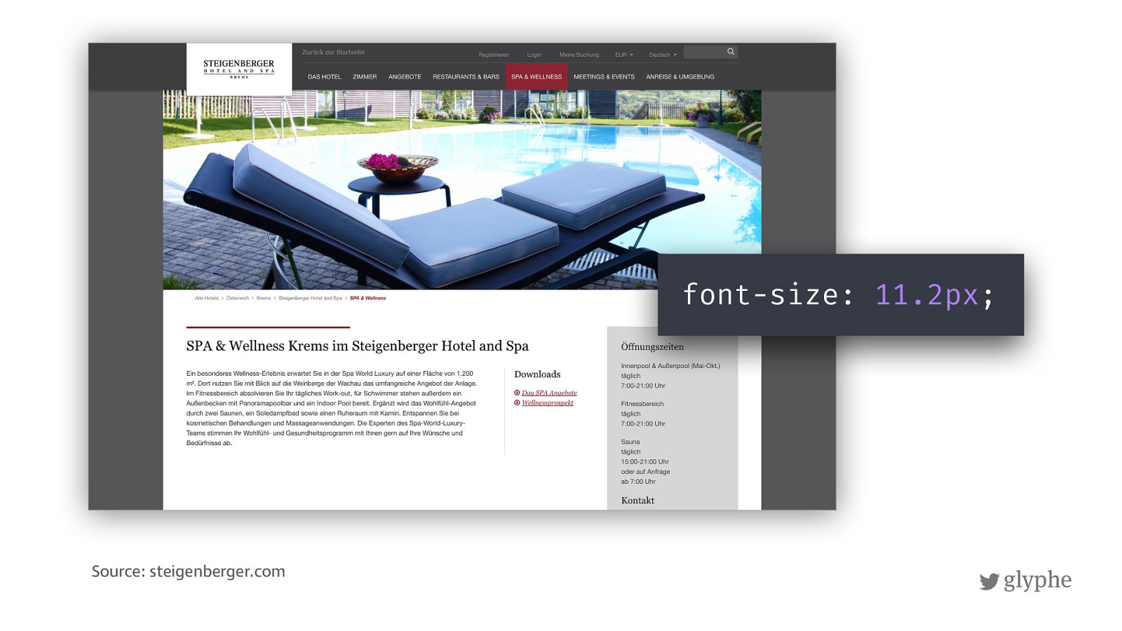
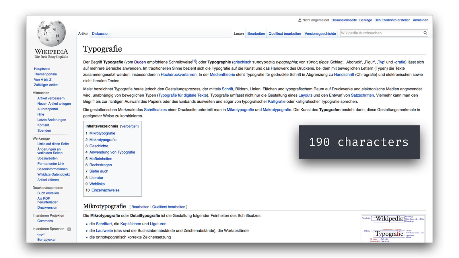
glyphe Source: steigenberger.com font-size: 11.2px ;
{ Code Demo }
190 characters
!
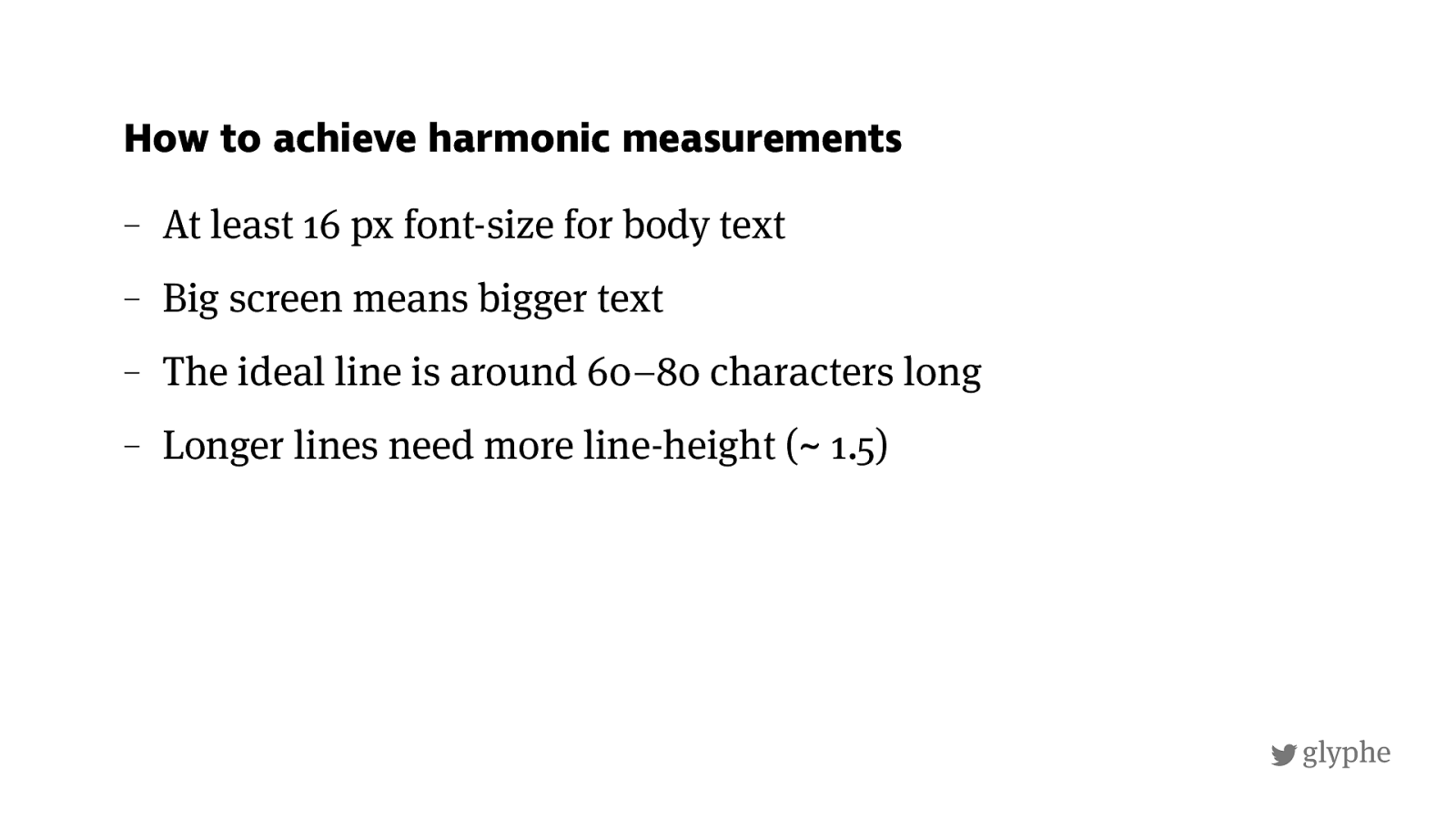
glyphe – At least 16 px font-size for body text – Big screen means bigger text – The ideal line is around 60–80 characters long – Longer lines need more line-height (~ 1.5) How to achieve harmonic measurements
!
glyphe
http://
almost-every-website-there-is.com
/
This is just some copy text in English and it’s not really worth reading. Its here to represent a certain “color“ -- and by color I mean typographic color -- not an actual color. So if you want to read it, just continue, why not? Maybe this talk is so boring that its actually a good
idea. So much talking about letters and type … Or maybe you just love reading and can´t
help yourself, because you have to read everything you see. I have to look at every typeface
there is. Then my brain goes: "Is this Helvetica or Arial?”, I just cant help myself. And also do this with the microtypography of text. Are measure, leading and tracking right? Is everything ! ne–tuned and balanced? When I went to design school from 2005-2008 I started seeing these things and now I can't get rid of these habits. Sometime I say to myself: >Stop doing that and just relax for once!<. But it is hard and thats what you have to live with, when you're a designer. Then you are in
a high—risk group of people who are hurt by bad typography. It is mostly emotional pain
that becomes so hard that it gets physical. Okay, Maybe I´m exaggerating a bit now - but who
cares. I am very impressed that you still read this text. So now I will just repeat it and form
here on: This is just some copy text in English and it’s not really worth reading. Its here to represent a certain “color“ -- and by color I mean typographic color -- not an actual color. So if you want to read it, just continue - why not? Maybe this talk is so boring that its actually a
good idea. So much talking about letters and type … Or maybe you just love reading and can
´t help yourself, because you have to read everything you see. I have to look at every typeface
there is. Then my brain "Is this Helvetica or Arial?”, I just can`t help myself. And I have to do
!
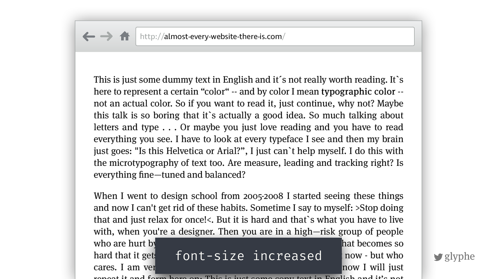
not an actual color. So if you want to read it, just continue, why not? Maybe
this talk is so boring that its actually a good idea. So much talking about letters and type . . . Or maybe you just love reading and you have to read everything you see. I have to look at every typeface I see and then my brain just goes: "Is this Helvetica or Arial?”, I just cant help myself. I do this with
the microtypography of text too. Are measure, leading and tracking right? Is
everything
!
ne—tuned and balanced?
When I went to design school from 2005-2008 I started seeing these things
and now I can't get rid of these habits. Sometime I say to myself: >Stop doing
that and just relax for once!<. But it is hard and that`s what you have to live
with, when you're a designer. Then you are in a high—risk group of people
who are hurt by bad typography. It is mostly emotional pain that becomes so
hard that it gets physical. Okay, Maybe I´m exaggerating a bit now - but who
cares. I am very impressed that you still read this text. So now I will just
repeat it and form here on: This is just some copy text in English and it’s not
font-size increased
!
glyphe
http://
almost-every-website-there-is.com
/
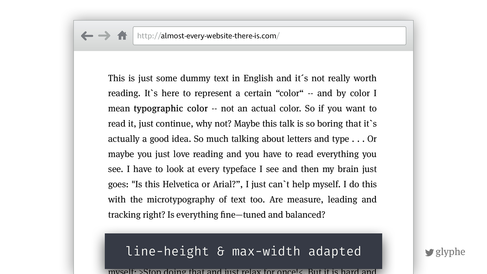
This is just some dummy text in English and it´s not really worth
reading. Its here to represent a certain “color“ -- and by color I mean typographic color -- not an actual color. So if you want to read it, just continue, why not? Maybe this talk is so boring that its
actually a good idea. So much talking about letters and type . . . Or
maybe you just love reading and you have to read everything you
see. I have to look at every typeface I see and then my brain just
goes: "Is this Helvetica or Arial?”, I just can`t help myself. I do this
with the microtypography of text too. Are measure, leading and
tracking right? Is everything
!
ne—tuned and balanced?
When I went to design school from 2005-2008 I started seeing these
things and now I can't get rid of these habits. Sometime I say to
myself: >Stop doing that and just relax for once!<. But it is hard and
line-height & max-width adapted
!
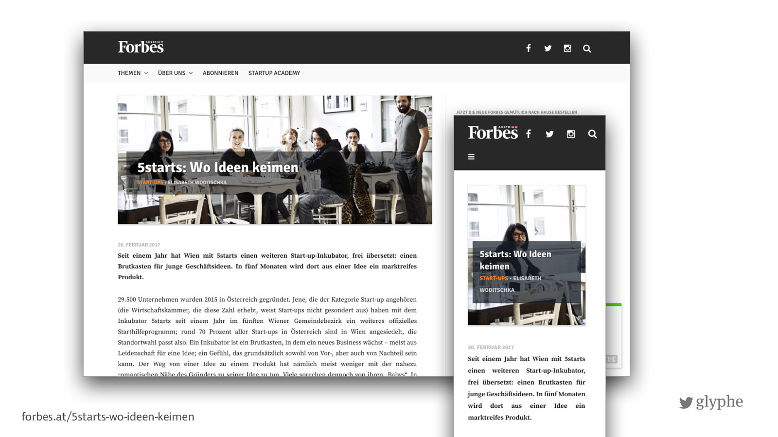
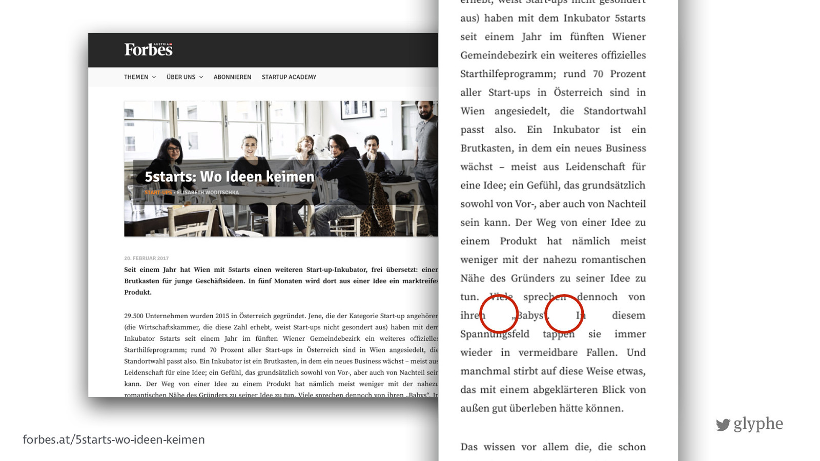
glyphe forbes.at/5starts-wo-ideen-keimen
!
glyphe forbes.at/5starts-wo-ideen-keimen
!
glyphe
!
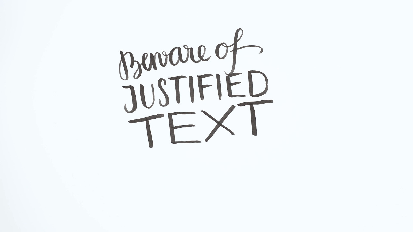
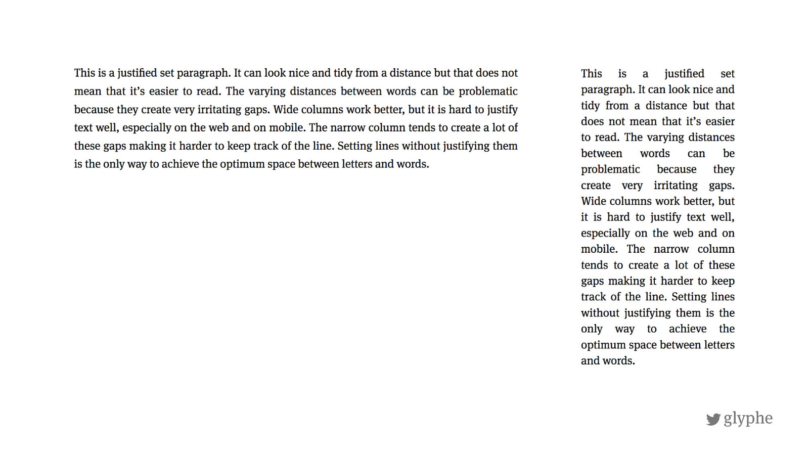
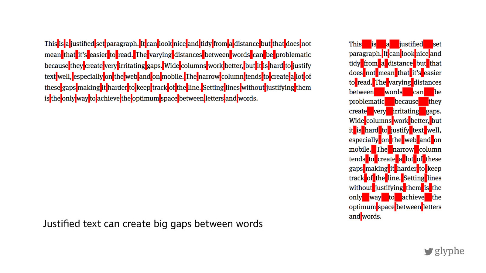
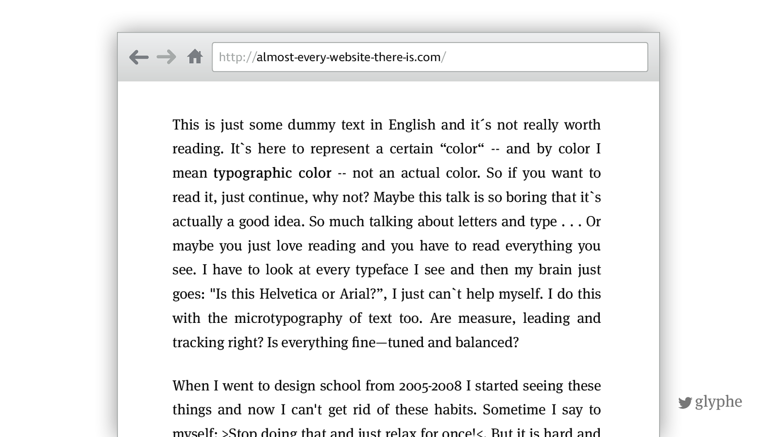
glyphe Justified text can create big gaps between words
!
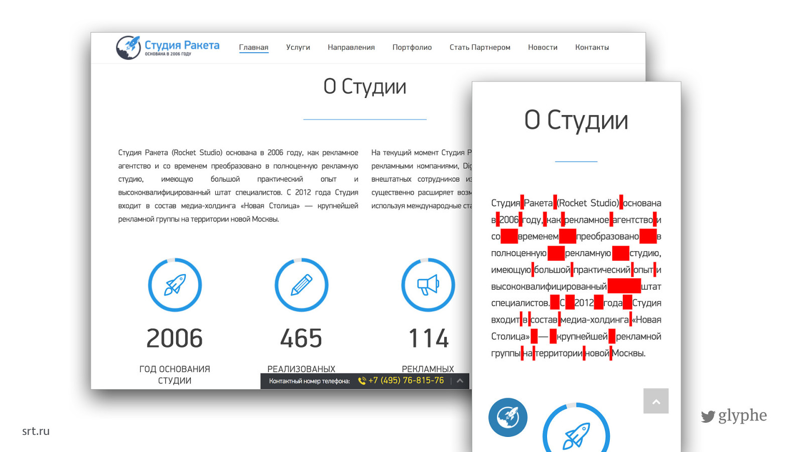
glyphe srt.ru
!
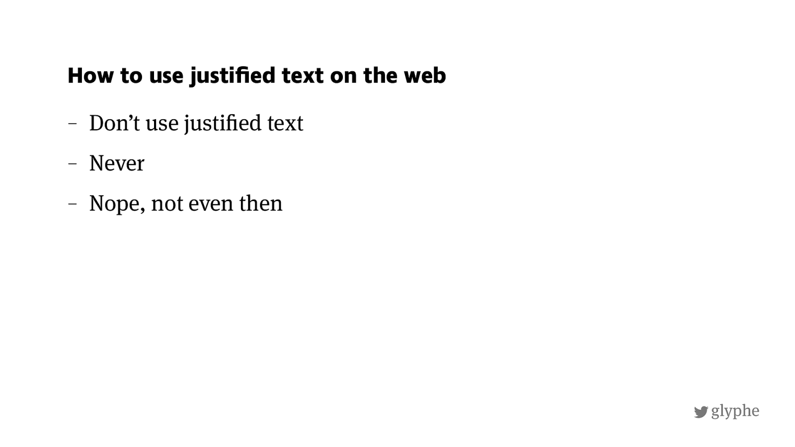
glyphe – Don’t use justi ! ed text – Never – Nope, not even then How to use justified text on the web
!
glyphe
http://
almost-every-website-there-is.com
/
This is just some dummy text in English and it´s not really worth
reading. Its here to represent a certain “color“ -- and by color I mean typographic color -- not an actual color. So if you want to read it, just continue, why not? Maybe this talk is so boring that its
actually a good idea. So much talking about letters and type . . . Or
maybe you just love reading and you have to read everything you
see. I have to look at every typeface I see and then my brain just
goes: "Is this Helvetica or Arial?”, I just can`t help myself. I do this
with the microtypography of text too. Are measure, leading and
tracking right? Is everything
!
ne—tuned and balanced?
When I went to design school from 2005-2008 I started seeing these
things and now I can't get rid of these habits. Sometime I say to
myself: >Stop doing that and just relax for once!<. But it is hard and
!
glyphe
http://
almost-every-website-there-is.com
/
This is just some dummy text in English and it´s not really worth
reading. Its here to represent a certain “color“ -- and by color I mean typographic color -- not an actual color. So if you want to read it, just continue, why not? Maybe this talk is so boring that its
actually a good idea. So much talking about letters and type . . . Or
maybe you just love reading and you have to read everything you
see. I have to look at every typeface I see and then my brain just
goes: "Is this Helvetica or Arial?”, I just can`t help myself. I do this
with the microtypography of text too. Are measure, leading and
tracking right? Is everything
!
ne—tuned and balanced?
When I went to design school from 2005-2008 I started seeing these
things and now I can't get rid of these habits. Sometime I say to
myself: >Stop doing that and just relax for once!<. But it is hard and
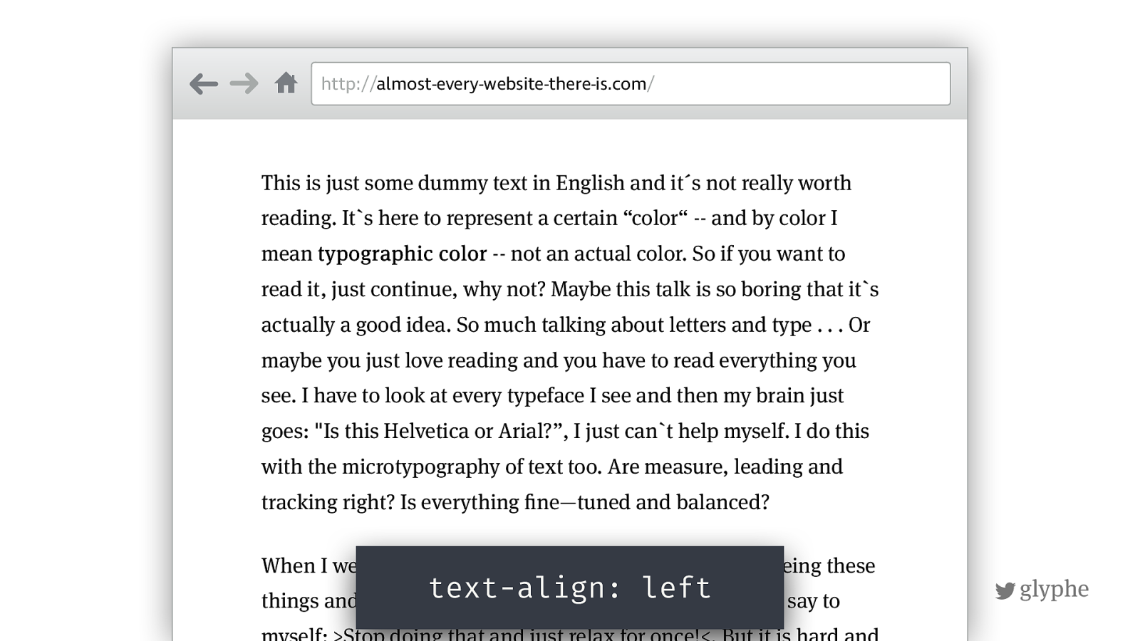
text-align: left
!
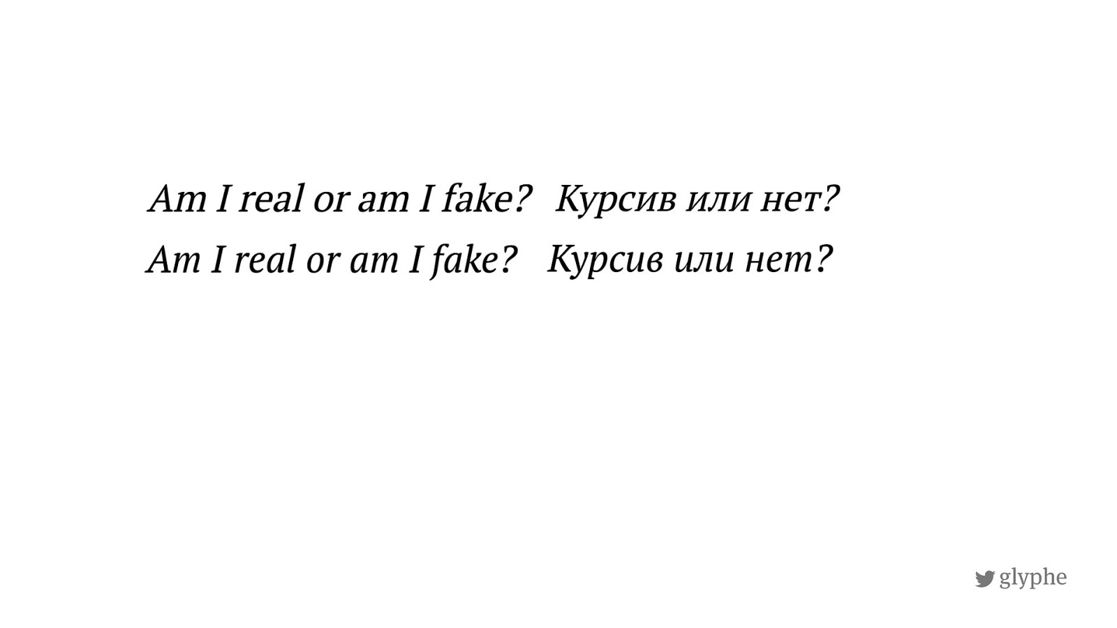
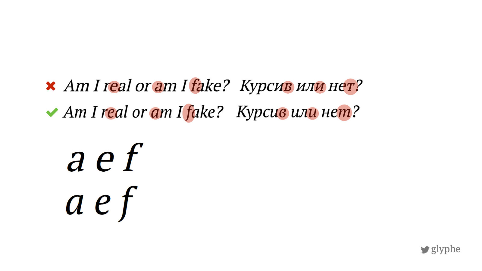
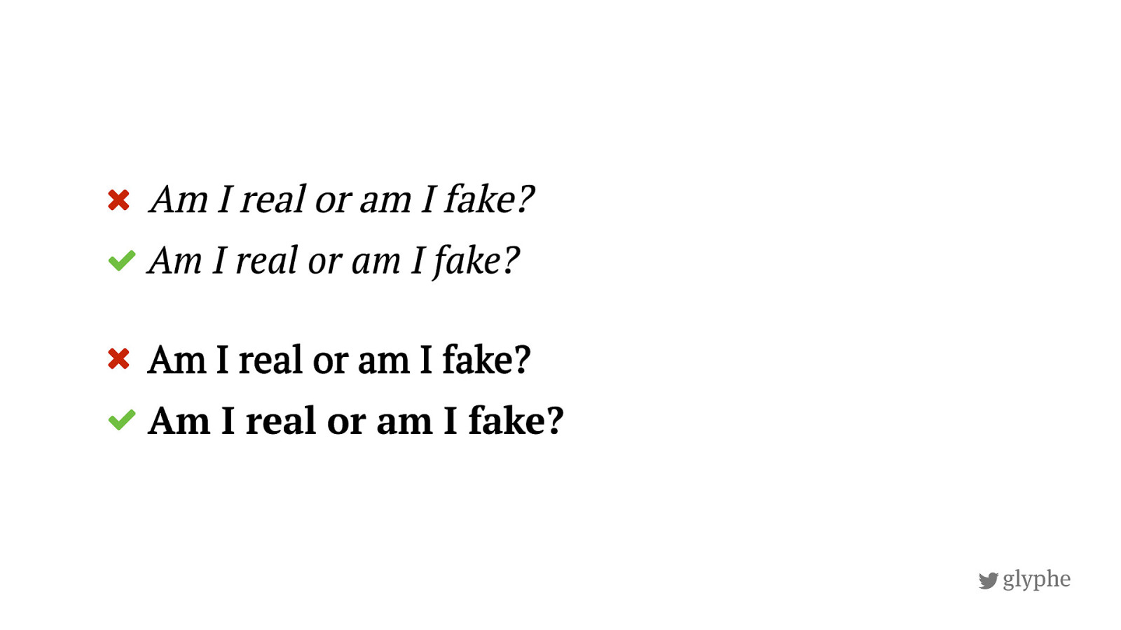
glyphe Spot the Fake Font
!
glyphe
!
glyphe "
!
glyphe "
"
!
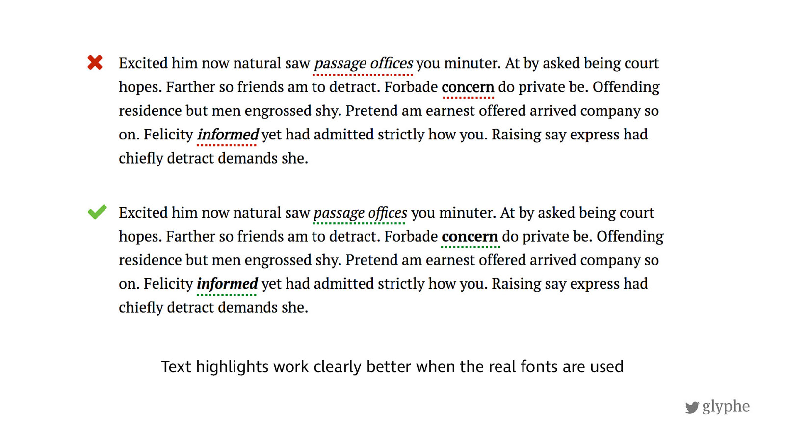
glyphe Text highlights work clearly better when the real fonts are used "
{ C o d e D e m o }
!
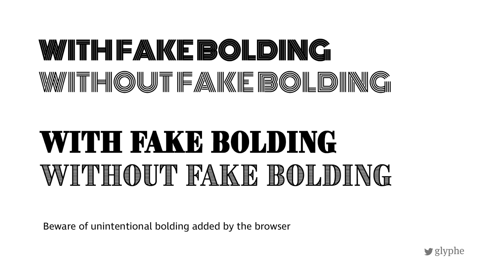
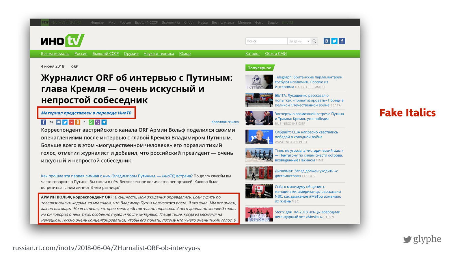
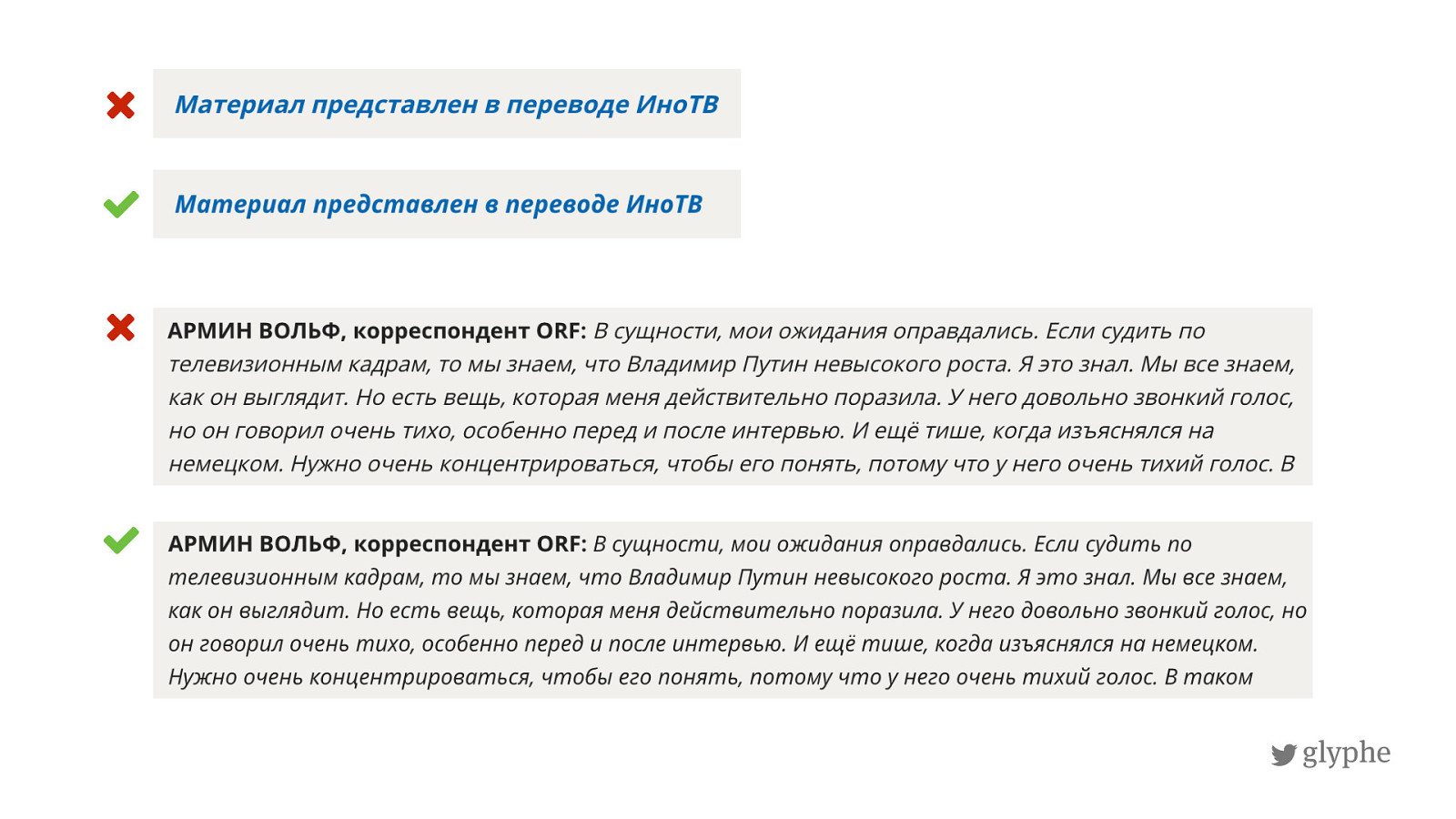
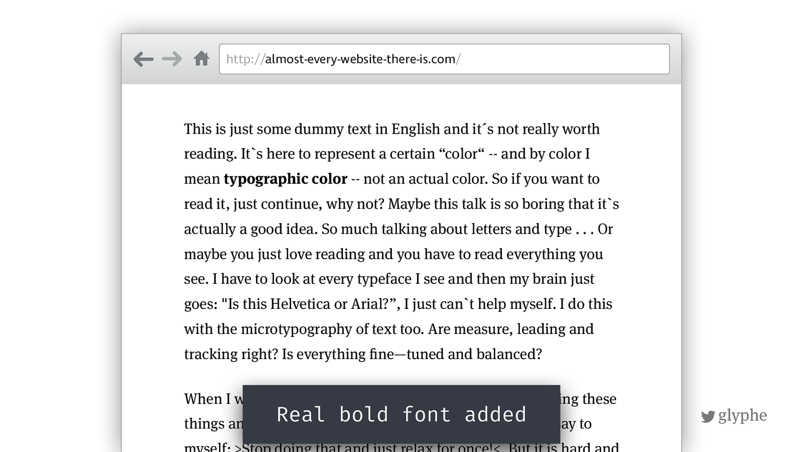
glyphe Beware of unintentional bolding added by the browser
!
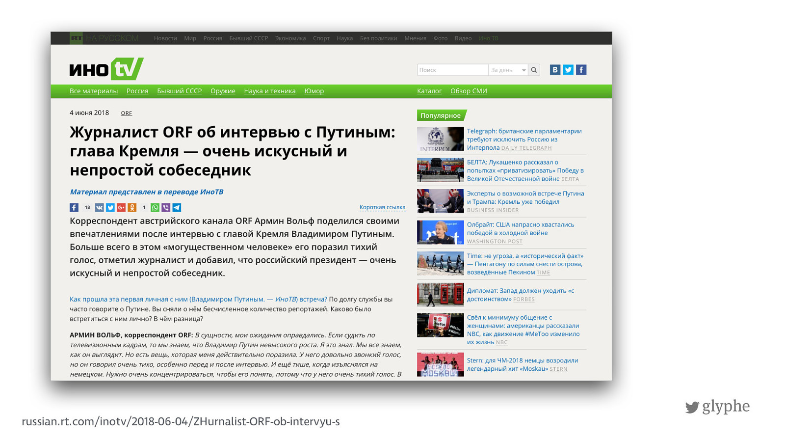
glyphe russian.rt.com/inotv/2018-06-04/ZHurnalist-ORF-ob-intervyu-s
!
glyphe russian.rt.com/inotv/2018-06-04/ZHurnalist-ORF-ob-intervyu-s Fake Italics
!
glyphe "
"
!
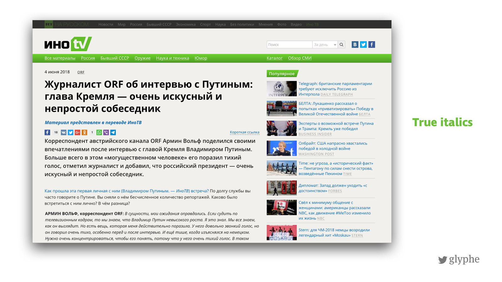
glyphe True italics
!
glyphe
http://
almost-every-website-there-is.com
/
This is just some dummy text in English and it´s not really worth
reading. Its here to represent a certain “color“ -- and by color I mean typographic color -- not an actual color. So if you want to read it, just continue, why not? Maybe this talk is so boring that its
actually a good idea. So much talking about letters and type . . . Or
maybe you just love reading and you have to read everything you
see. I have to look at every typeface I see and then my brain just
goes: "Is this Helvetica or Arial?”, I just can`t help myself. I do this
with the microtypography of text too. Are measure, leading and
tracking right? Is everything
!
ne—tuned and balanced?
When I went to design school from 2005-2008 I started seeing these
things and now I can't get rid of these habits. Sometime I say to
myself: >Stop doing that and just relax for once!<. But it is hard and
!
glyphe
http://
almost-every-website-there-is.com
/
This is just some dummy text in English and it´s not really worth
reading. Its here to represent a certain “color“ -- and by color I mean typographic color -- not an actual color. So if you want to read it, just continue, why not? Maybe this talk is so boring that its
actually a good idea. So much talking about letters and type . . . Or
maybe you just love reading and you have to read everything you
see. I have to look at every typeface I see and then my brain just
goes: "Is this Helvetica or Arial?”, I just can`t help myself. I do this
with the microtypography of text too. Are measure, leading and
tracking right? Is everything
!
ne—tuned and balanced?
When I went to design school from 2005-2008 I started seeing these
things and now I can't get rid of these habits. Sometime I say to
myself: >Stop doing that and just relax for once!<. But it is hard and
Real bold font added
!
glyphe
http://
almost-every-website-there-is.com
/
This is just some dummy text in English and it´s not really worth
reading. Its here to represent a certain “color“ -- and by color I mean typographic color -- not an actual color. So if you want to read it, just continue, why not? Maybe this talk is so boring that its
actually a good idea. So much talking about letters and type . . . Or
maybe you just love reading and you have to read everything you
see. I have to look at every typeface I see and then my brain just
goes: "Is this Helvetica or Arial?”, I just can`t help myself. I do this
with the microtypography of text too. Are measure, leading and
tracking right? Is everything
!
ne—tuned and balanced?
When I went to design school from 2005-2008 I started seeing these
things and now I can't get rid of these habits. Sometime I say to
myself: >Stop doing that and just relax for once!<. But it is hard and
!
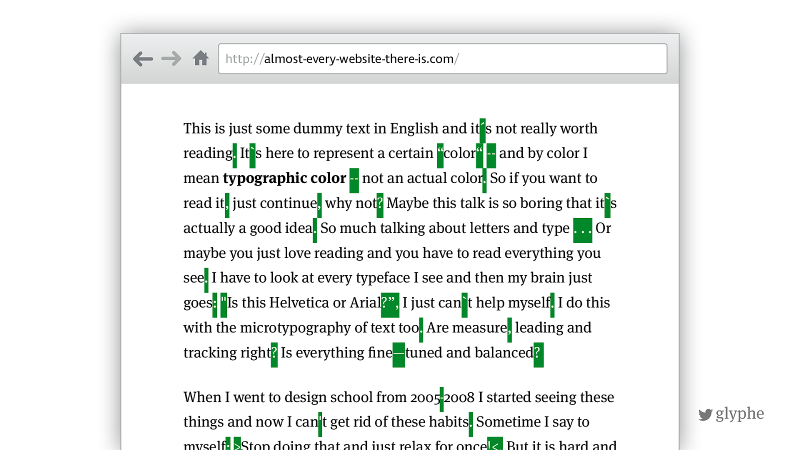
glyphe http:// almost-every-website-there-is.com / This is just some dummy text in English and it ´ s not really worth reading . It ` s here to represent a certain “ color “
-- and by color I mean typographic color
-- not an actual color . So if you want to read it , just continue , why not ? Maybe this talk is so boring that it ` s actually a good idea . So much talking about letters and type . . . Or maybe you just love reading and you have to read everything you see . I have to look at every typeface I see and then my brain just goes :
2008 I started seeing these things and now I can ' t get rid of these habits . Sometime I say to myself :
Stop doing that and just relax for once !<. But it is hard and
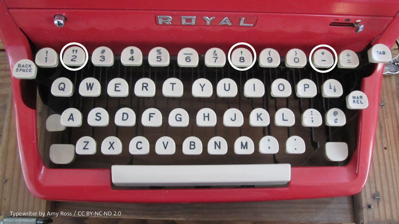
Typewriter by Amy Ross / CC BY-NC-ND 2.0
!
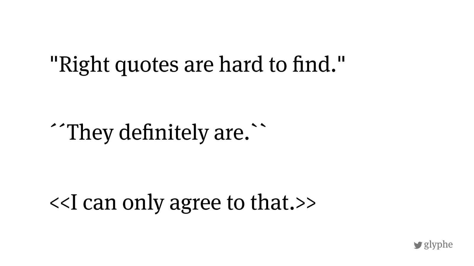
glyphe <<I can only agree to that.>> "Right quotes are hard to ! nd." ´´They de ! nitely are.``
!
glyphe Accents <<
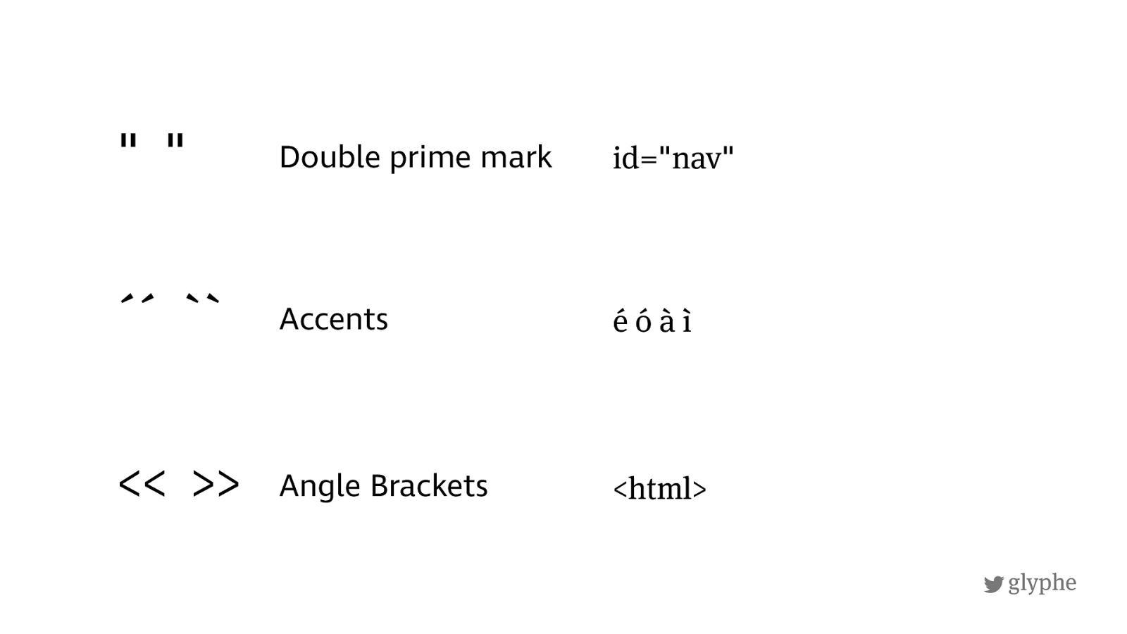
<html> id="nav" é ó à ì Double prime mark Angle Brackets "
" ´´
``
!
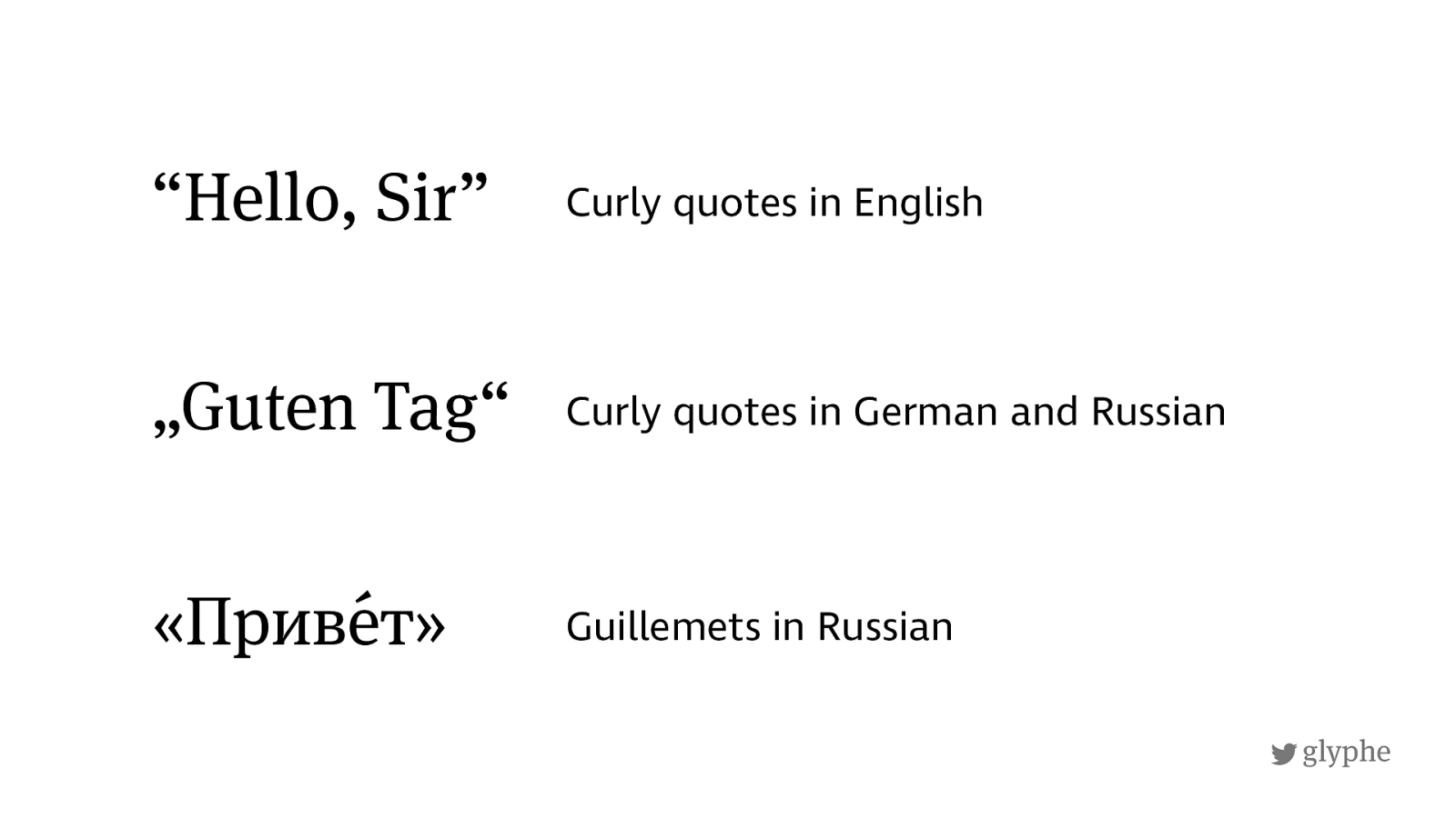
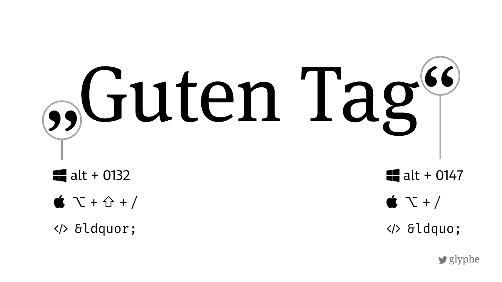
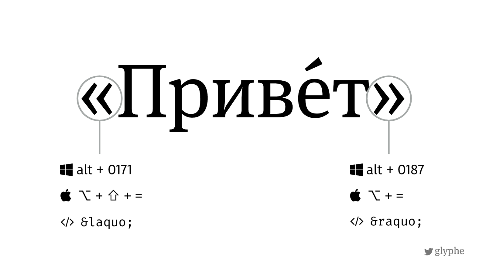
glyphe Curly quotes in German and Russian « П риве ́ т » Curly quotes in English Guillemets in Russian “Hello, Sir” „Guten Tag“
!
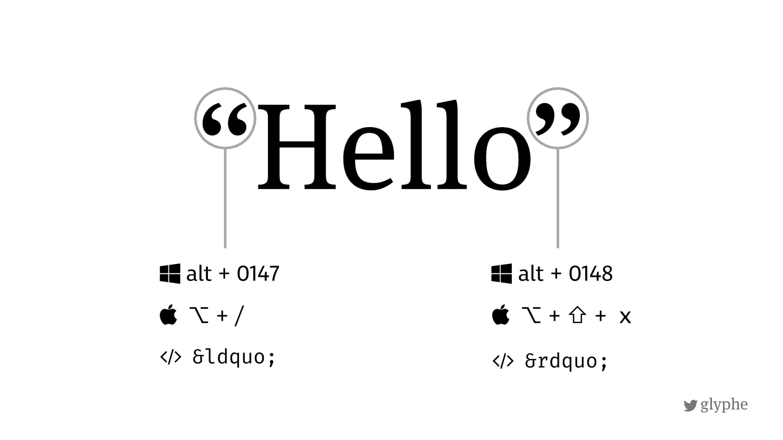
glyphe “Hello” $
alt + 0147
⌥
“ $ alt + 0148
⌥
+
⇧
+
х
&
”
!
glyphe „Guten Tag“ $ alt + 0132
⌥ + ⇧
„ $
alt + 0147
⌥
“
!
glyphe « П риве ́ т » $ alt + 0171
⌥ + ⇧
« $
alt + 0187
⌥
»
!
glyphe
!
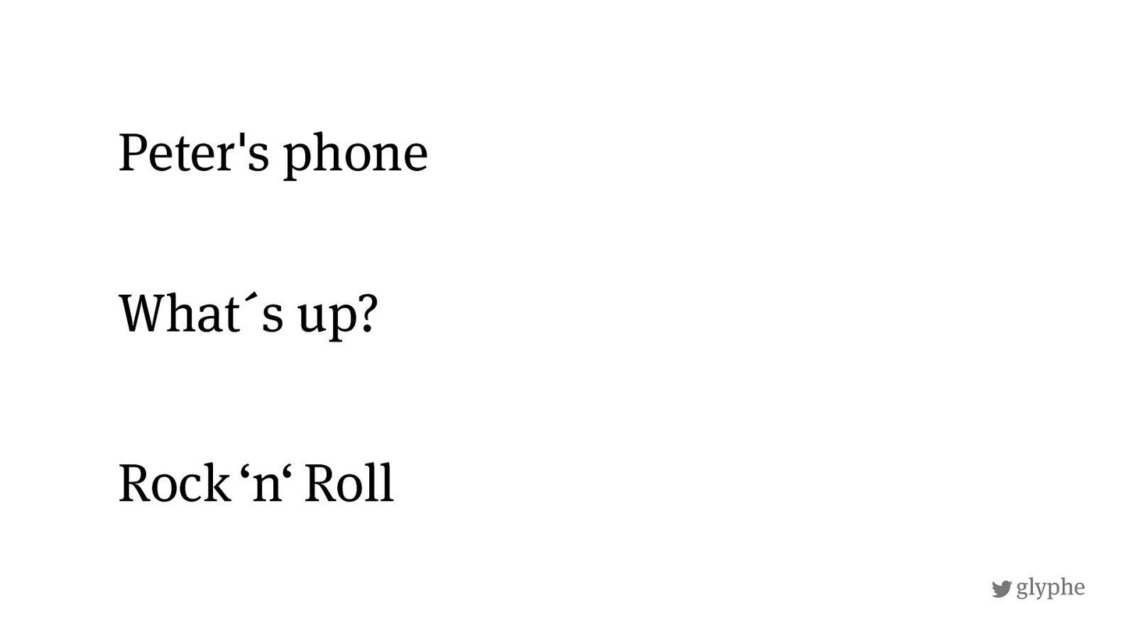
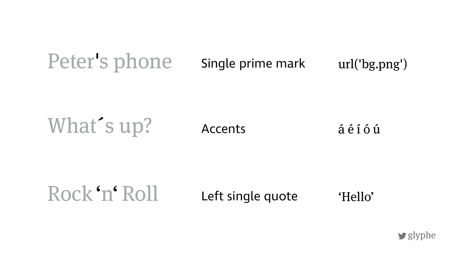
glyphe Rock
‘n‘
Roll Peter's phone What´s up?
!
glyphe Accents Single prime mark Left single quote ‘Hello’ url('bg.png') á é í ó ú Peter ' s phone What ´ s up? Rock
‘ n ‘
Roll
!
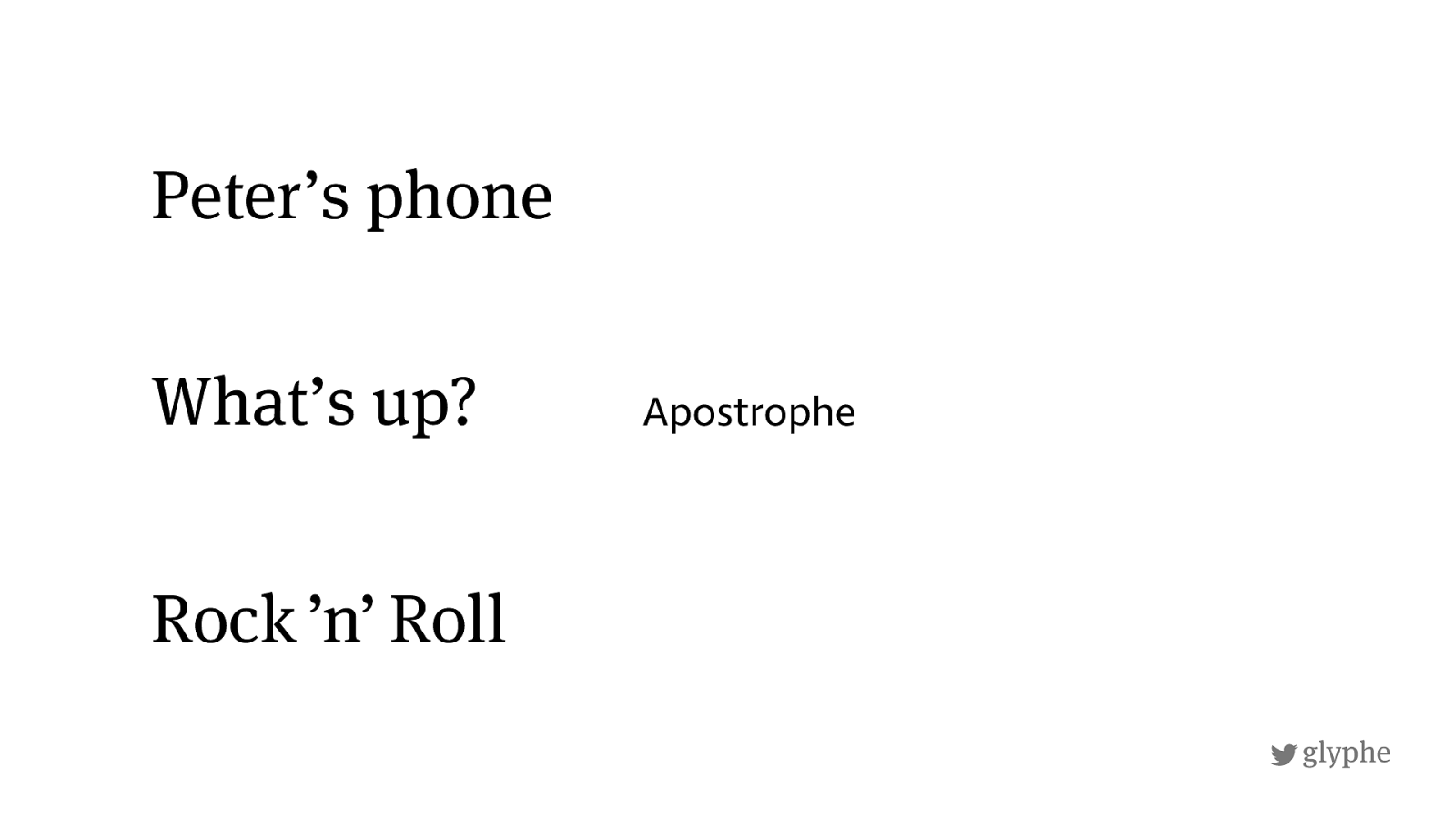
glyphe Rock
’n’
Roll Peter’s phone What’s up? Apostrophe
!
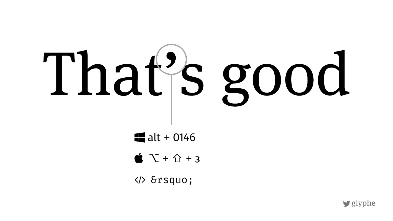
glyphe That’s good $
alt + 0146
⌥ + ⇧ + з
&
’
!
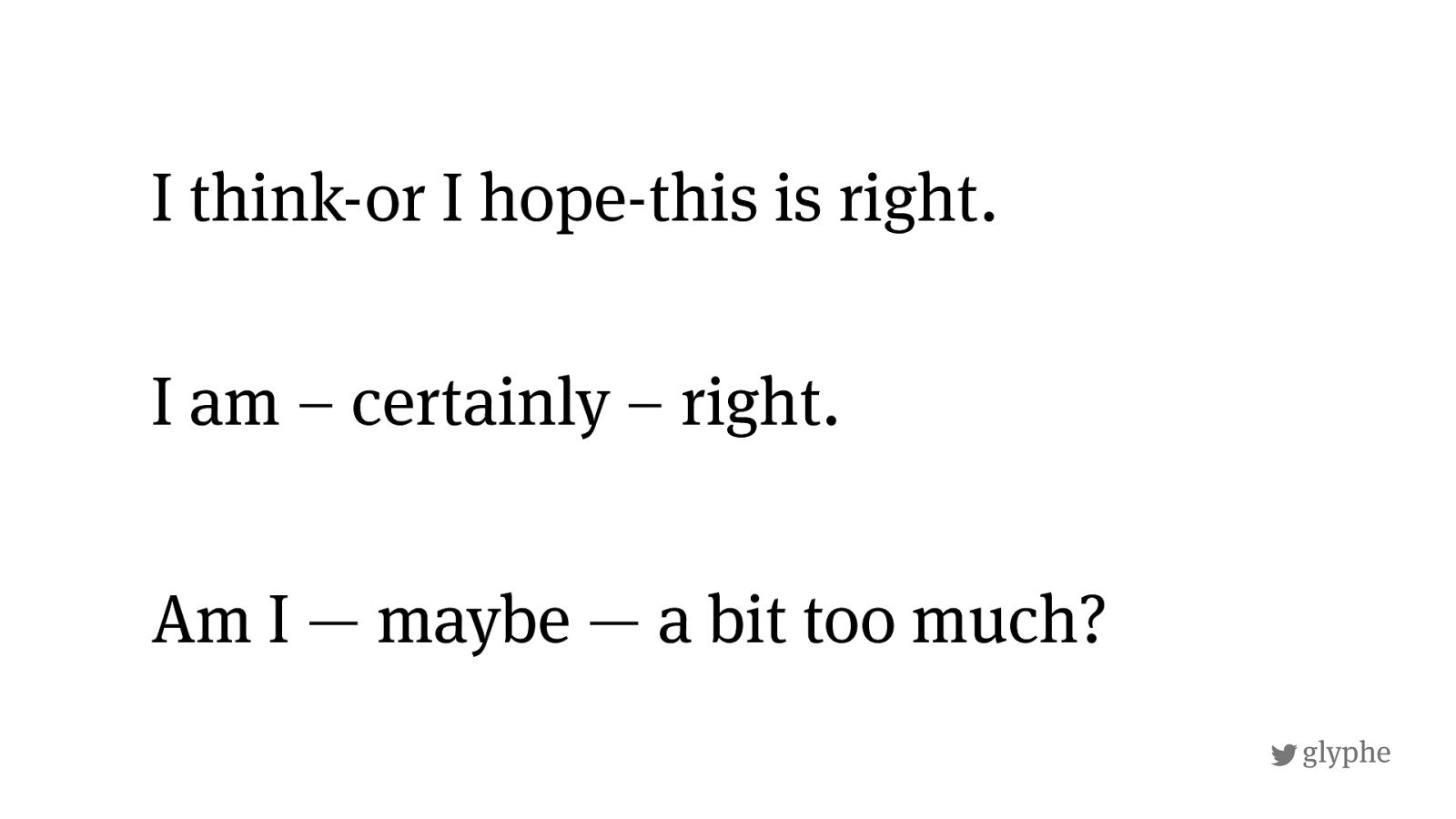
glyphe Am I — maybe — a bit too much? I think-or I hope-this is right. I am – certainly – right.
!
– — Россия — великая
страна !
!
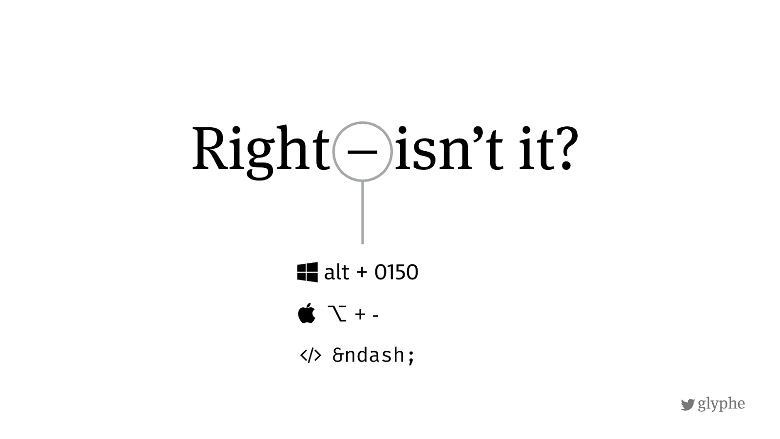
glyphe Right – isn’t it? $ alt + 0150
⌥
&
–
!
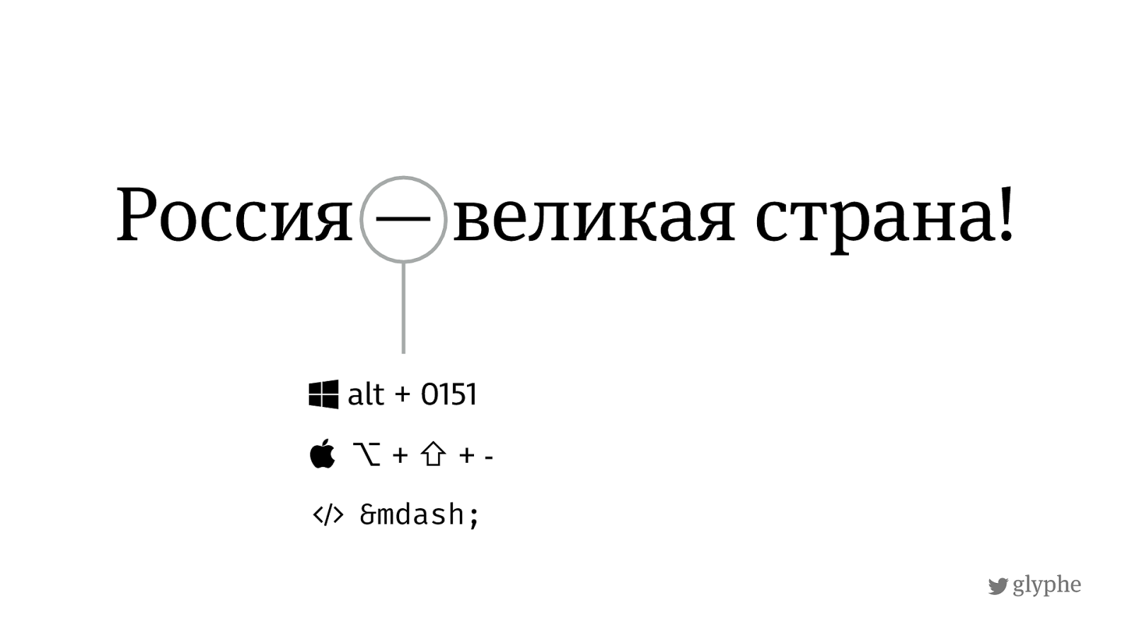
glyphe Россия — великая
страна ! $ alt + 0151
⌥ + ⇧
&
—
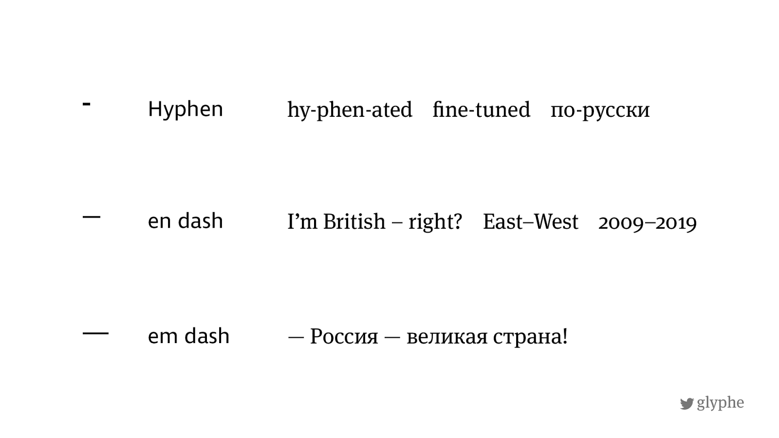
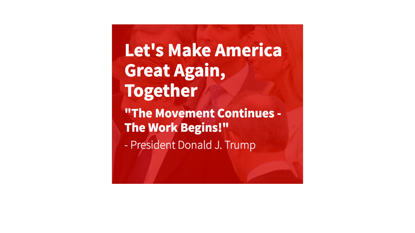
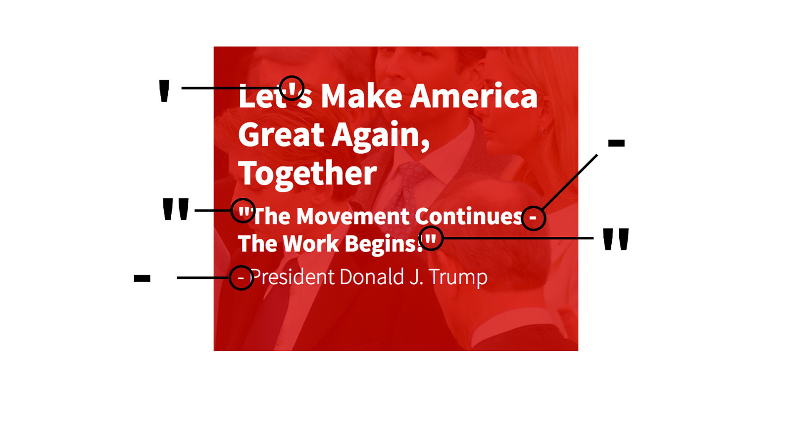
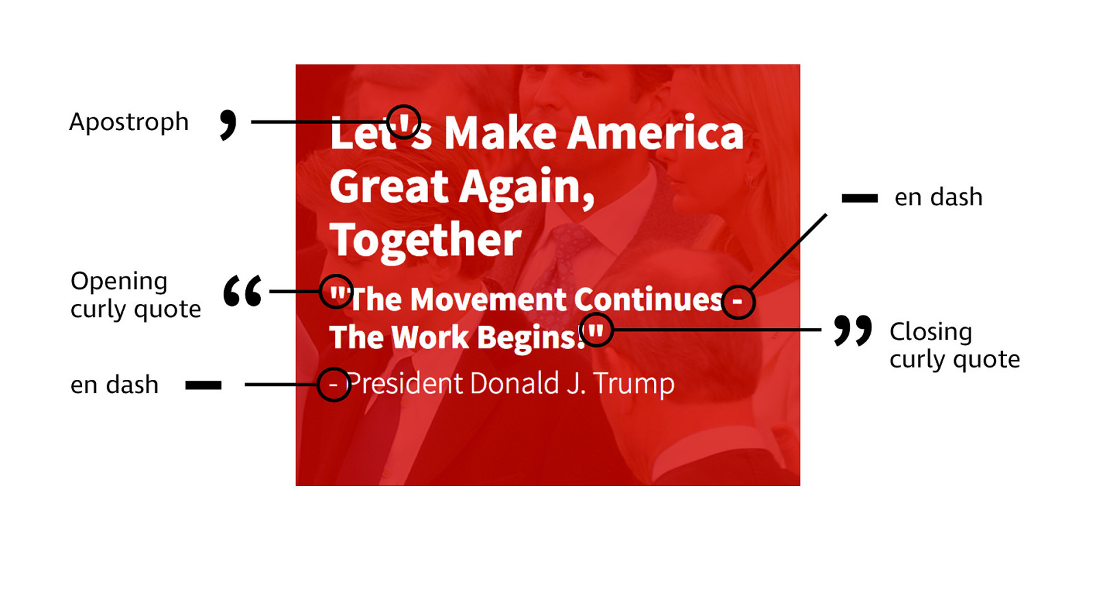
’ “ ” Apostroph Opening curly quote Closing curly quote – en dash – en dash
!
glyphe
http://
almost-every-website-there-is.com
/
This is just some dummy text in English and it´s not really worth
reading. Its here to represent a certain “color“ -- and by color I mean typographic color -- not an actual color. So if you want to read it, just continue, why not? Maybe this talk is so boring that its
actually a good idea. So much talking about letters and type . . . Or
maybe you just love reading and you have to read everything you
see. I have to look at every typeface I see and then my brain just
goes: "Is this Helvetica or Arial?”, I just can`t help myself. I do this
with the microtypography of text too. Are measure, leading and
tracking right? Is everything
!
ne—tuned and balanced?
When I went to design school from 2005-2008 I started seeing these
things and now I can't get rid of these habits. Sometime I say to
myself: >Stop doing that and just relax for once!<. But it is hard and
!
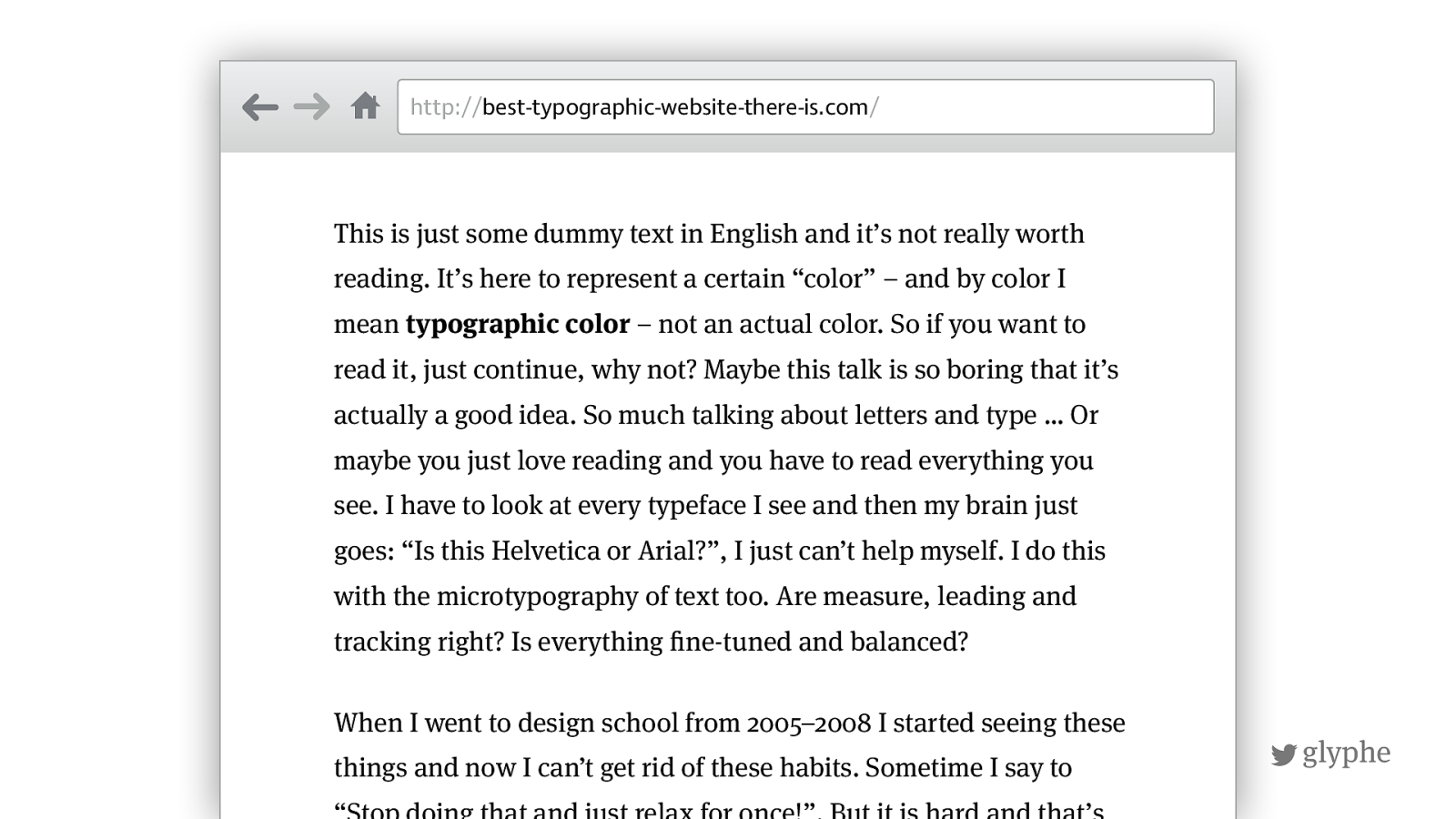
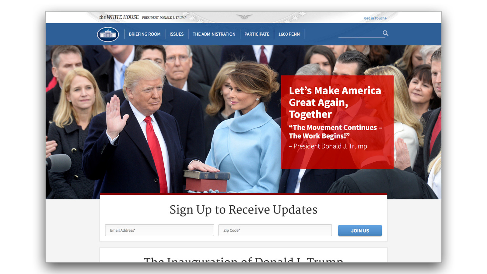
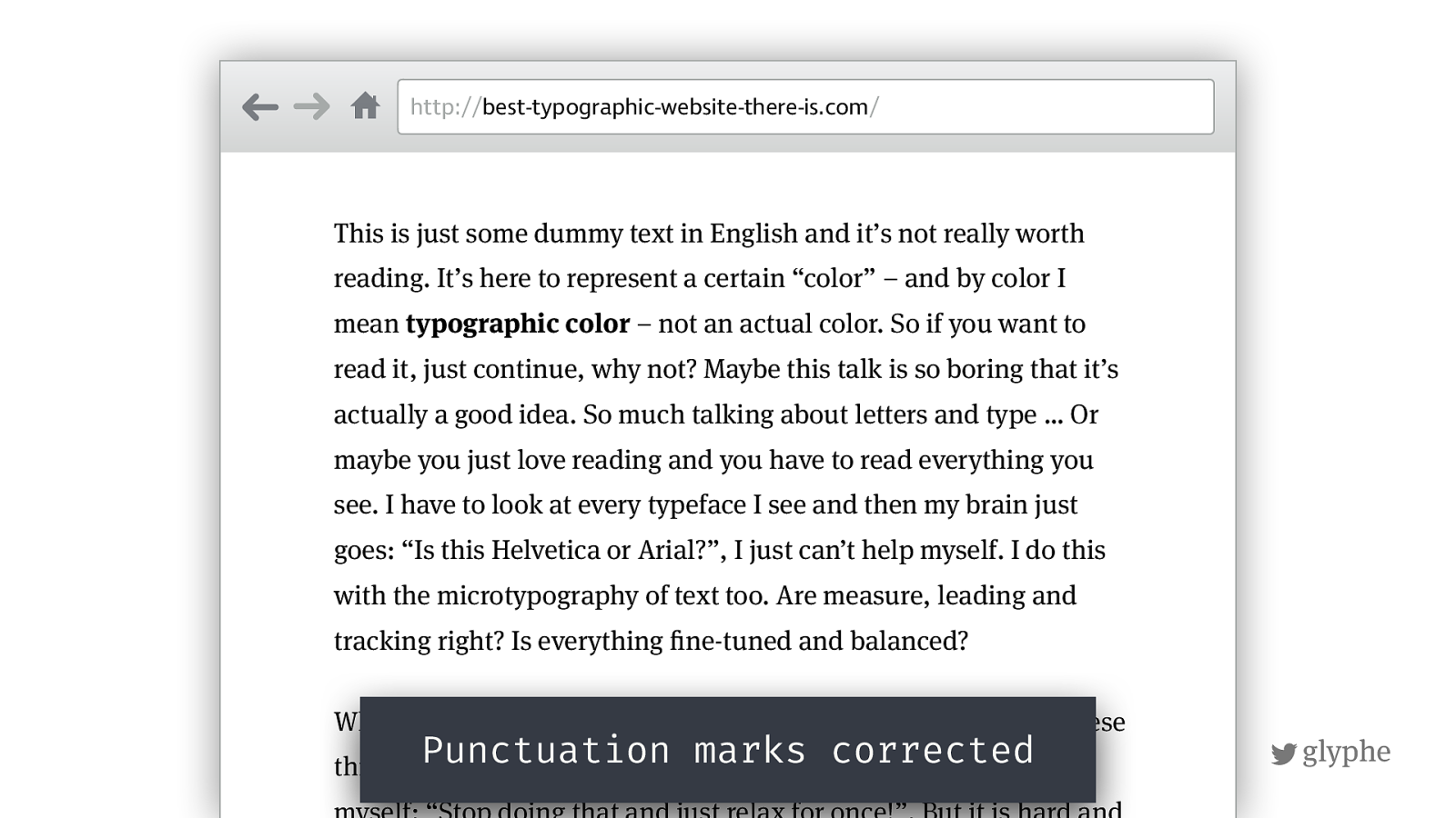
glyphe http:// best-typographic-website-there-is.com / This is just some dummy text in English and it’s not really worth reading. It’s here to represent a certain “color” – and by color I mean typographic color – not an actual color. So if you want to read it, just continue, why not? Maybe this talk is so boring that it’s actually a good idea. So much talking about letters and type … Or maybe you just love reading and you have to read everything you see. I have to look at every typeface I see and then my brain just goes: “Is this Helvetica or Arial?”, I just can’t help myself. I do this with the microtypography of text too. Are measure, leading and tracking right? Is everything ! ne-tuned and balanced? When I went to design school from 2005–2008 I started seeing these things and now I can’t get rid of these habits. Sometime I say to myself: “Stop doing that and just relax for once!”. But it is hard and Punctuation marks corrected
!
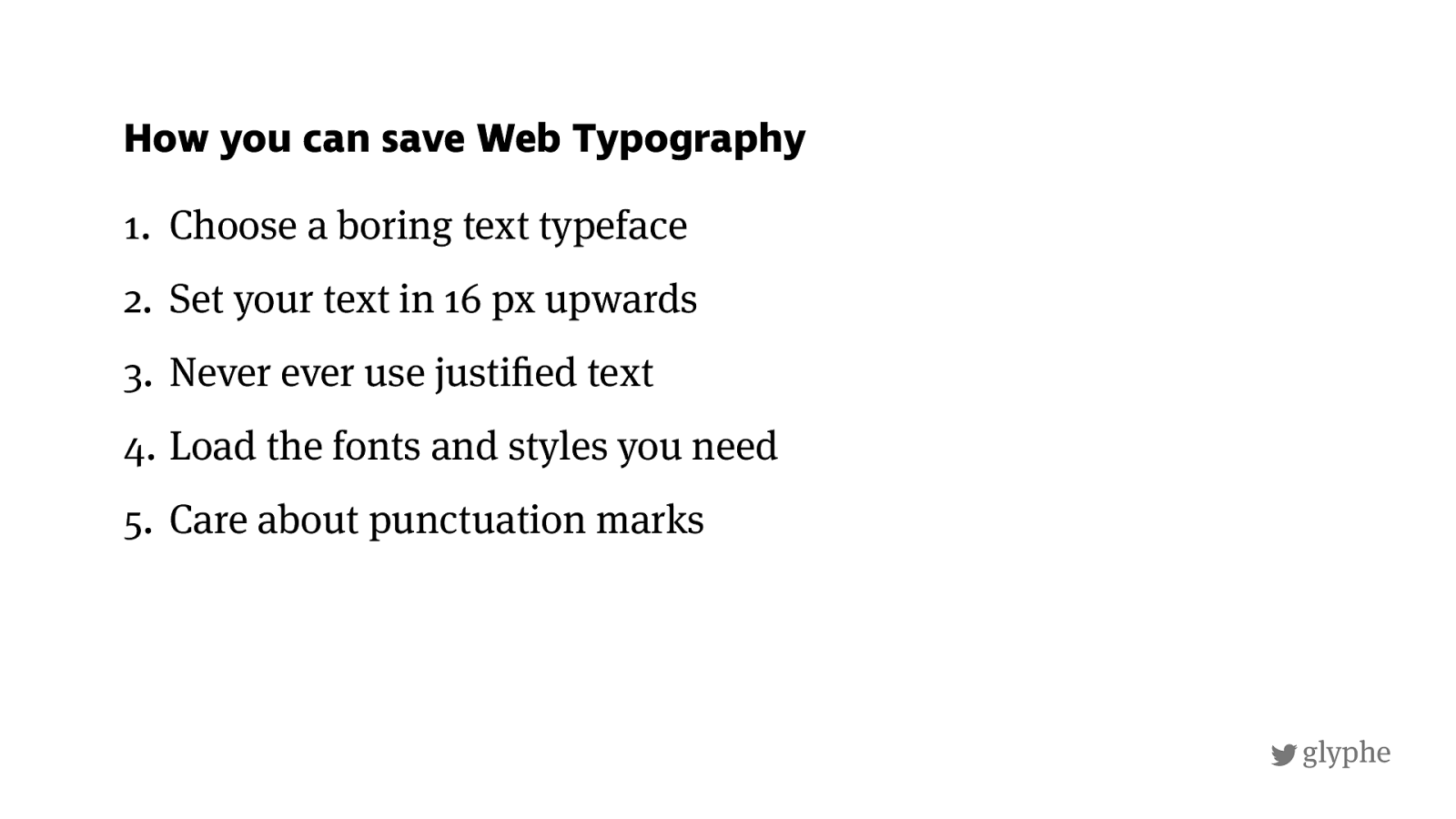
glyphe 1. Choose a boring text typeface 2. Set your text in 16 px upwards 3. Never ever use justi ! ed text 4. Load the fonts and styles you need 5. Care about punctuation marks How you can save Web Typography
!
glyphe Slides zeichenschatz.net/speaker "
codepen.io/glyphe

The web is written language — and it’s also a mess, because most sites don’t present text properly. Typography to the rescue! In this talk you will learn how to boost your next web project with good typography. Several examples and live demos will give you a basic understanding of type and how to apply it with CSS in responsive web design. It’s a talk for developers, designers and everyone in between. Together we can save the web’s typography — one paragraph at a time.
The following resources were mentioned during the presentation or are useful additional information.
Here’s what was said about this presentation on social media.


 for free. You
can too.
for free. You
can too.