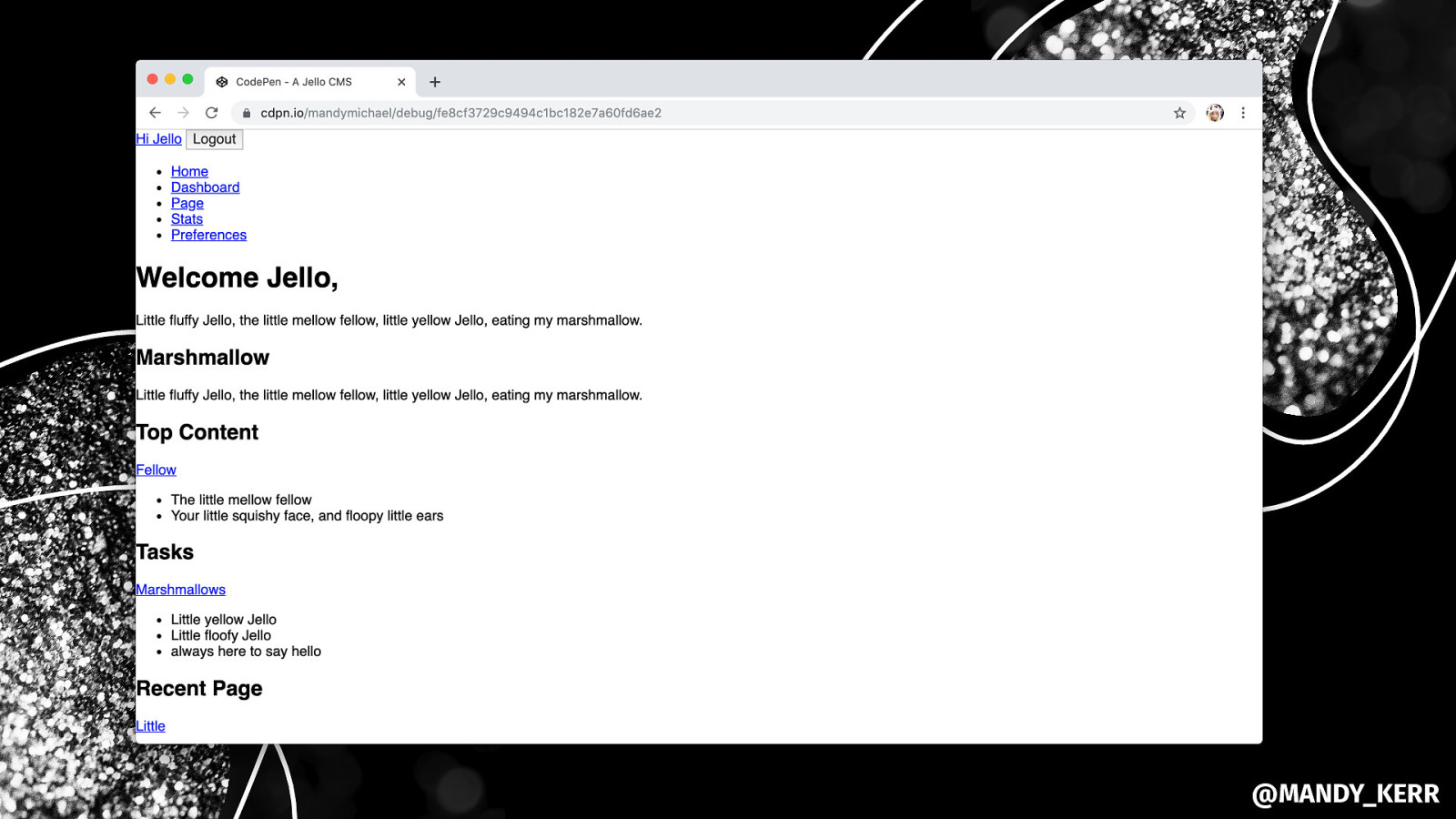
Frictionless FRONT-ENDS FOR BACKEND DEVELOPERS.

A presentation at NDC London in January 2020 in London, UK by Mandy Michael
Frictionless FRONT-ENDS FOR BACKEND DEVELOPERS.

MANDY MICHAEL @MANDY_KERR
HTML CSS JS.

Choosing THE RIGHT TYPE.
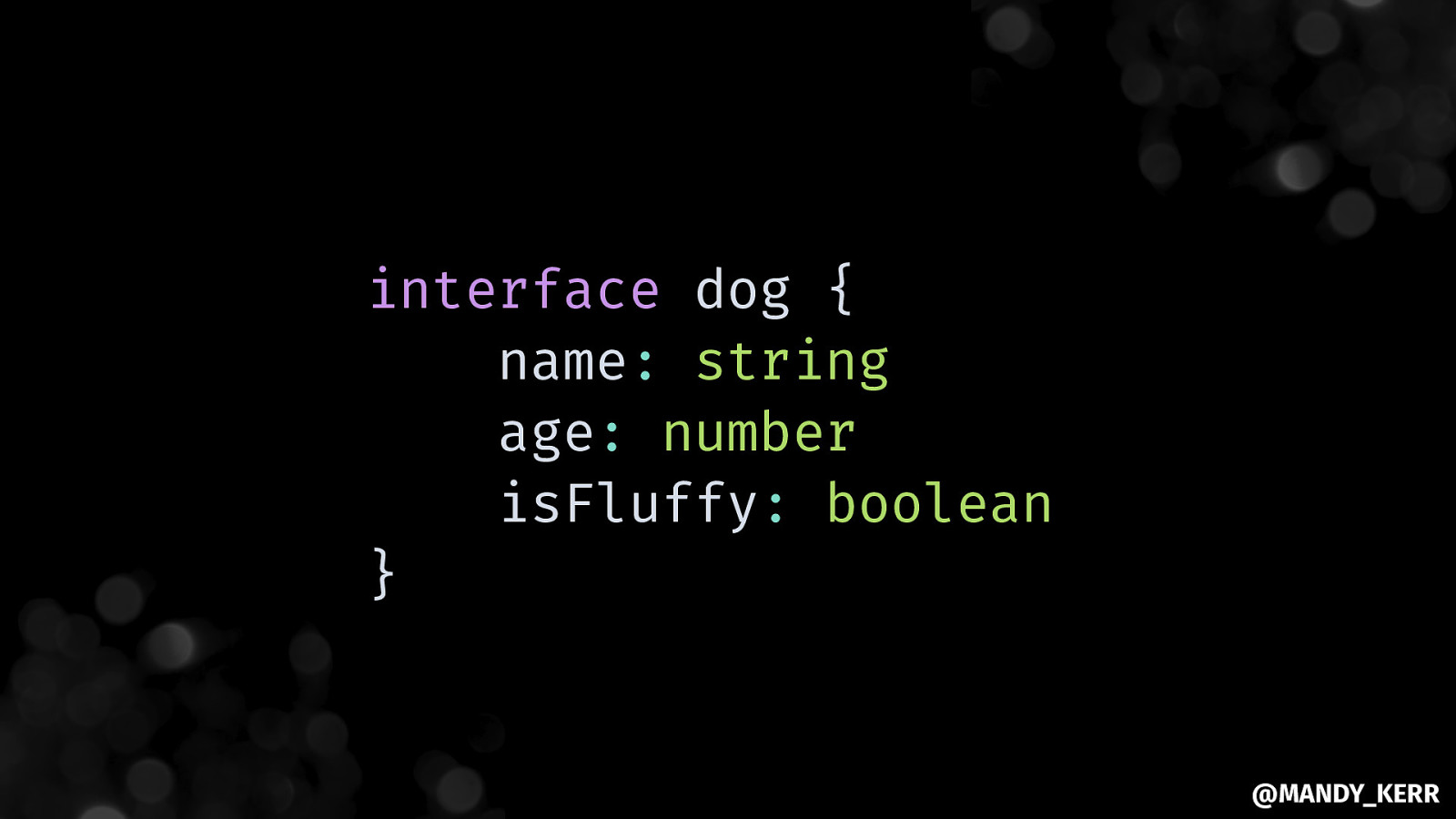
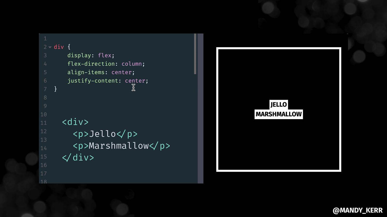
interface dog { name: string age: number isFluffy: boolean }

Be explicit ABOUT THE SHAPE OF THE CONTENT. @MANDY_KERR
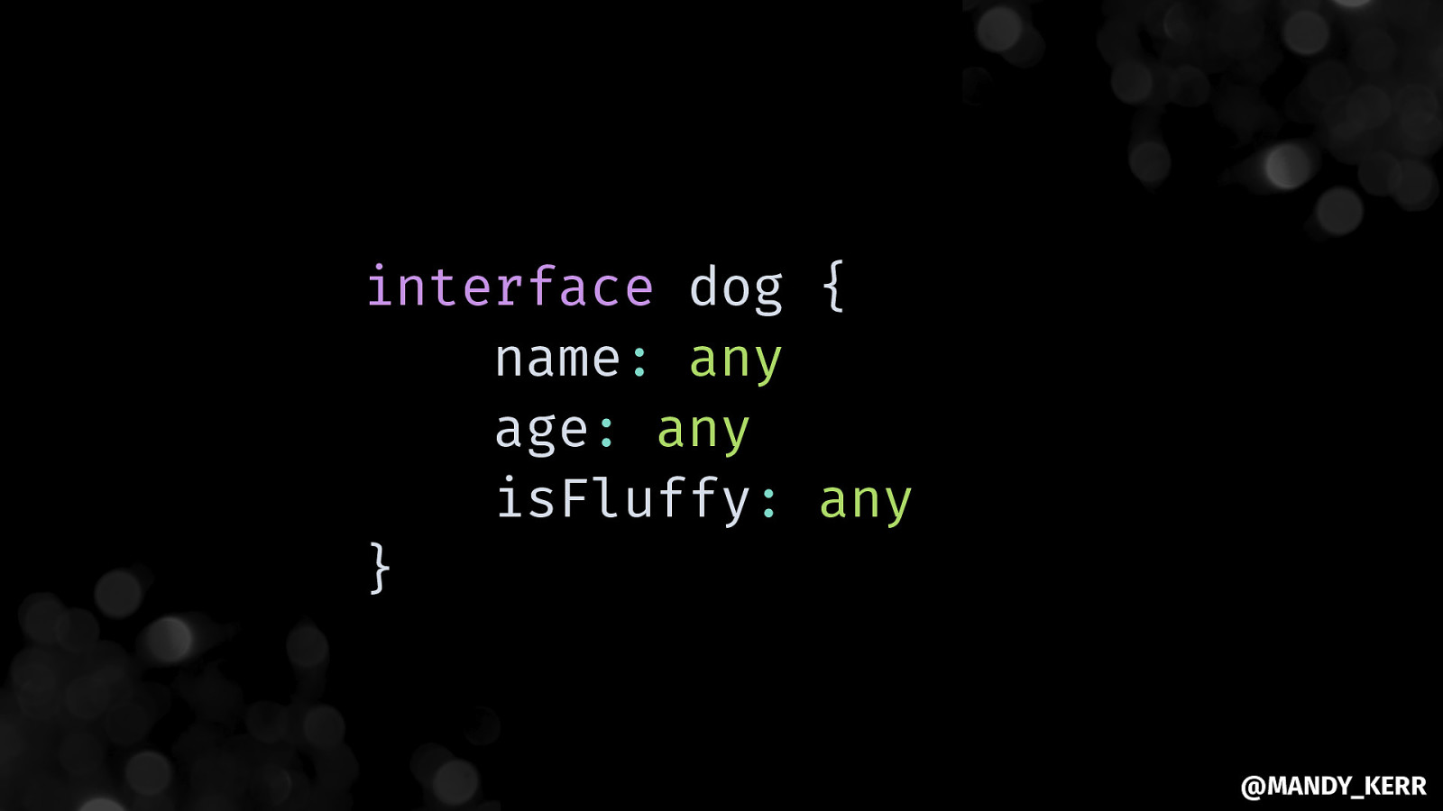
interface dog { name: any age: any isFluffy: any } @MANDY_KERR
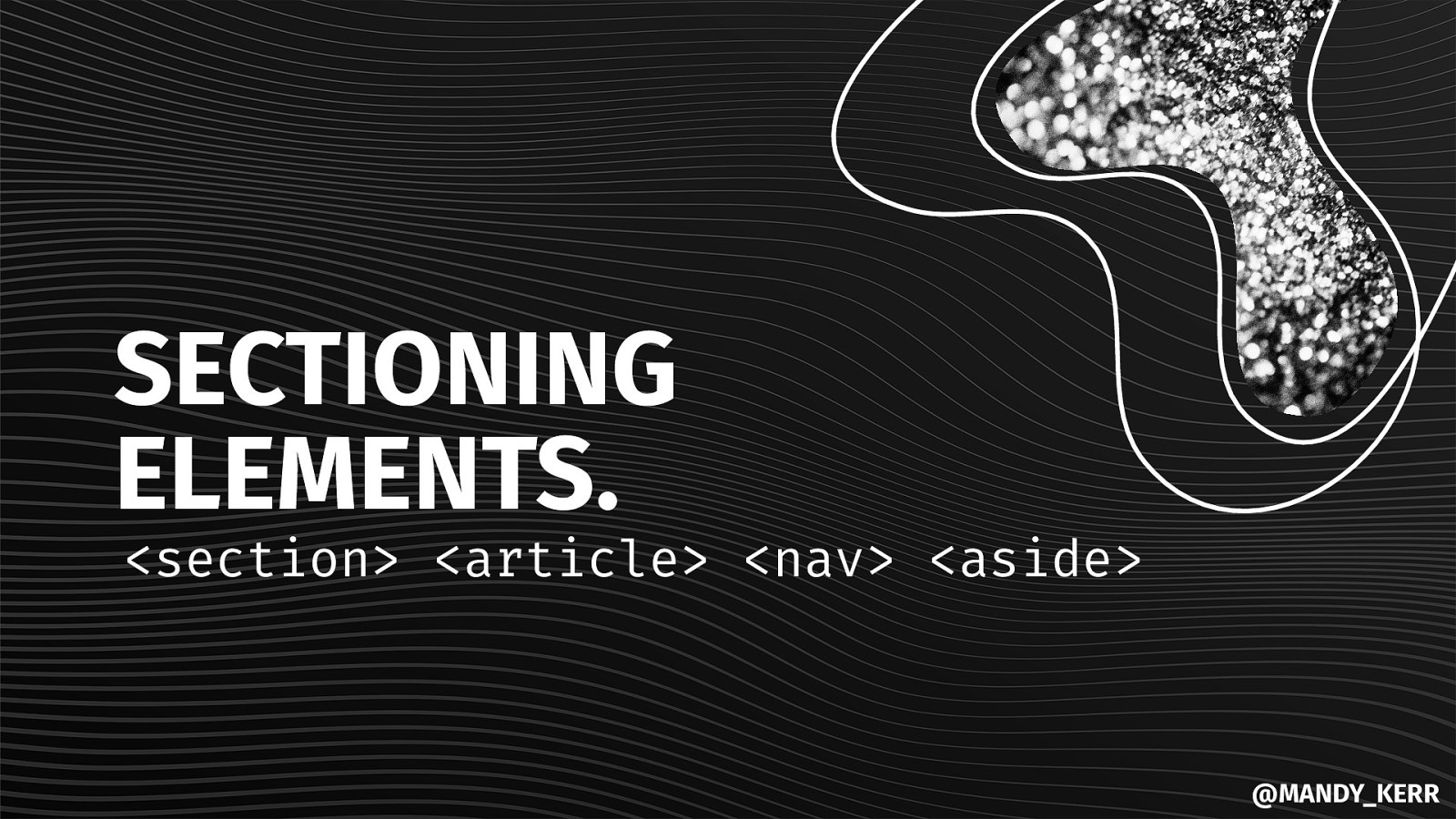
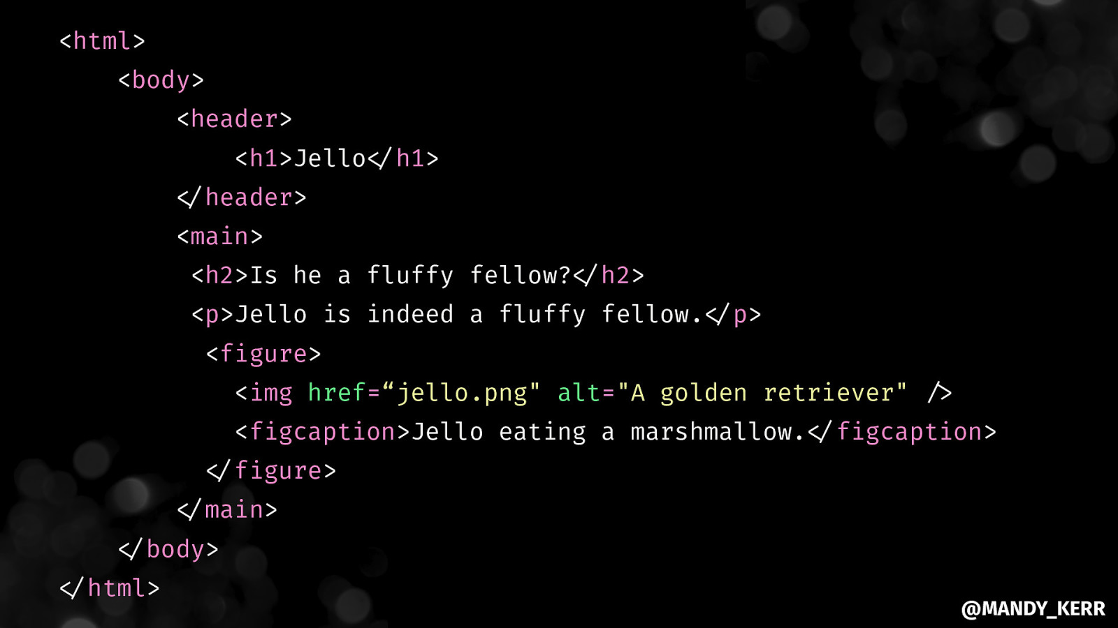
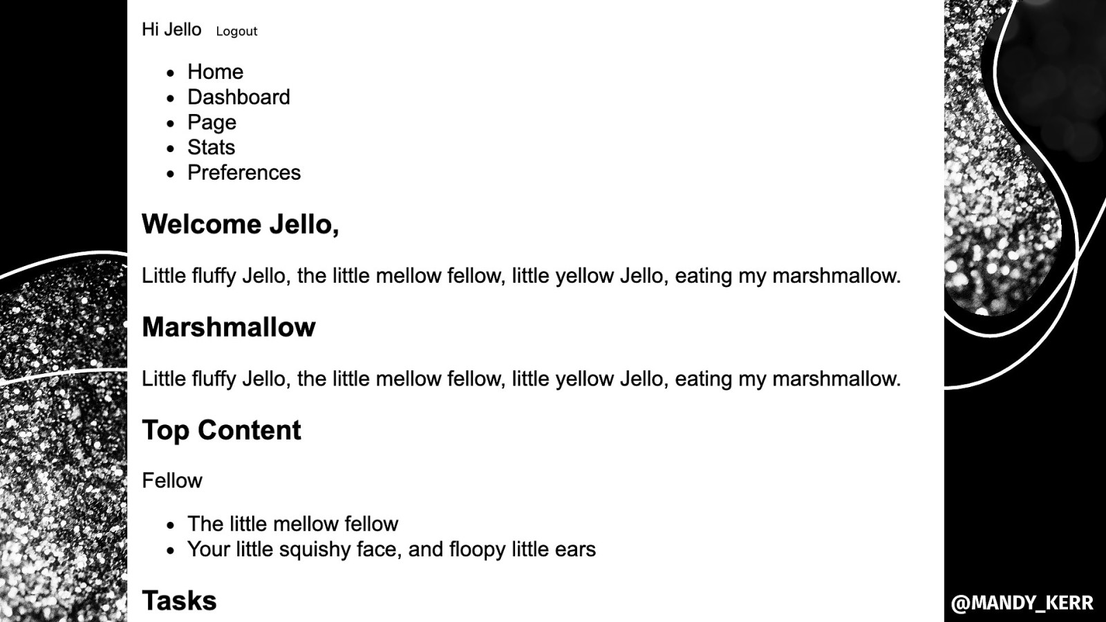
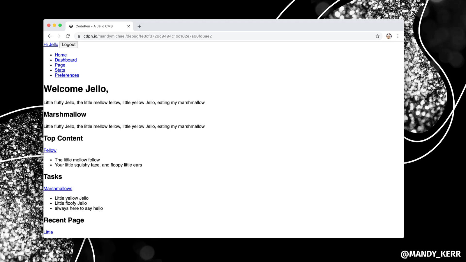
SECTIONING ELEMENTS.
<section> <article> <nav> <aside> @MANDY_KERR
CLEAR STRUCTURE AND HEIRARCHY.
<header> <footer> <h1> <h2> <h3> @MANDY_KERR
MAKE THE MOST OF HTML’S BUILT IN FUNCTIONALITY. @MANDY_KERR
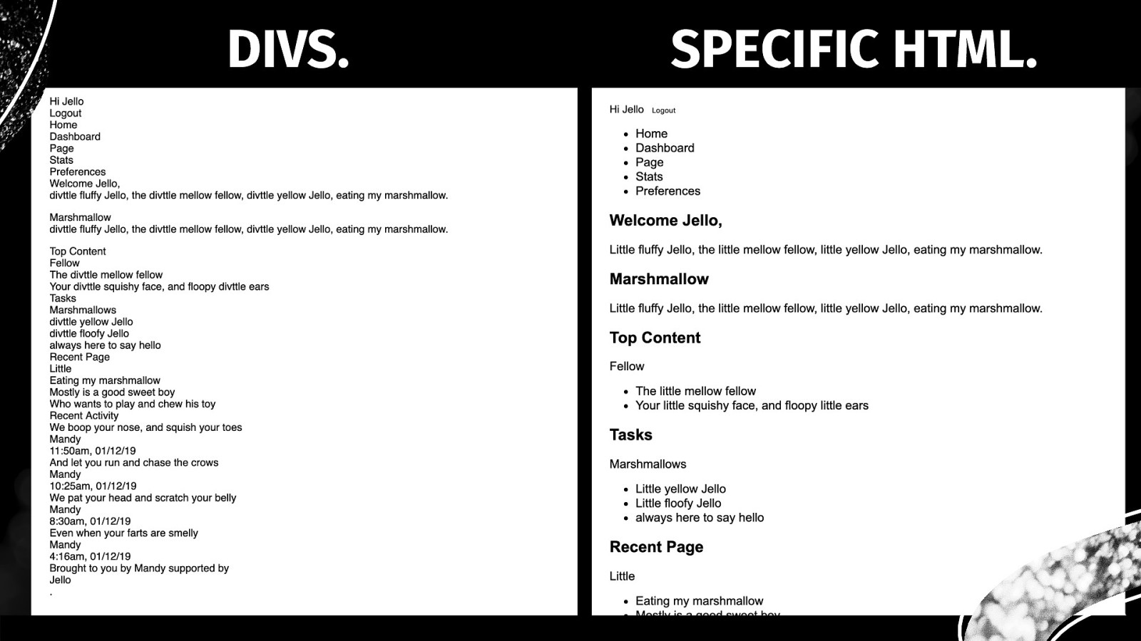
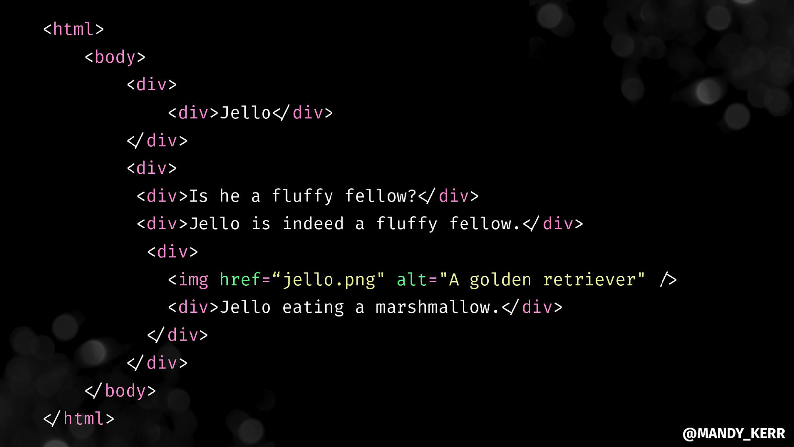
DIVS. SPECIFIC HTML. @MANDY_KERR
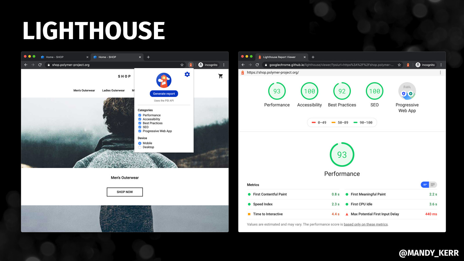
LIGHTHOUSE @MANDY_KERR
@MANDY_KERR
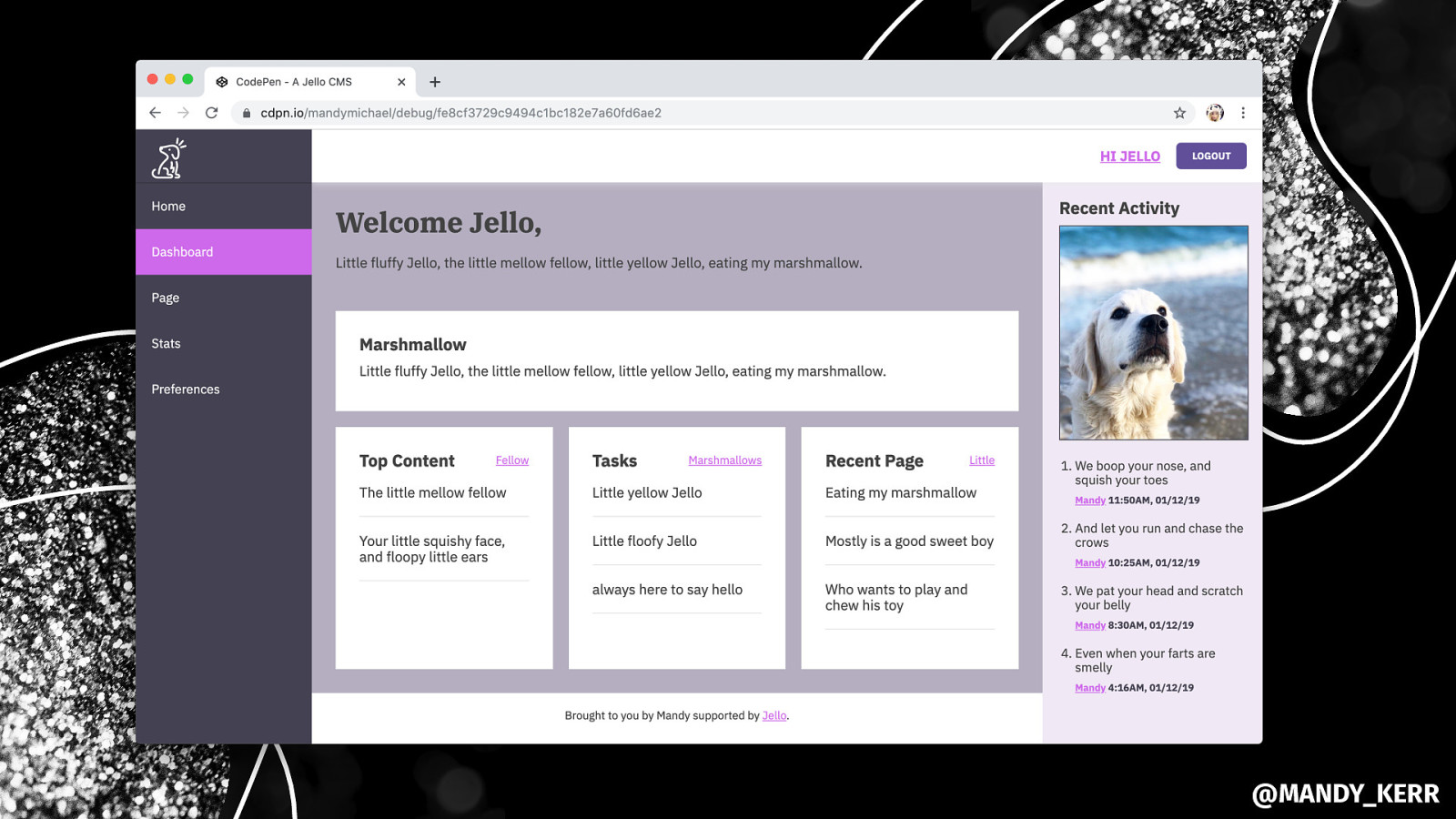
Understanding CSS, SCSS, CSS in JS @MANDY_KERR
Simple tricks for LAYOUTS WITH CSS GRID @MANDY_KERR
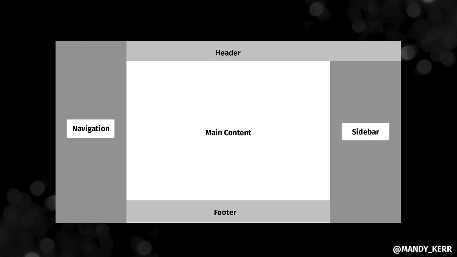
Header Navigation Main Content Sidebar Footer @MANDY_KERR
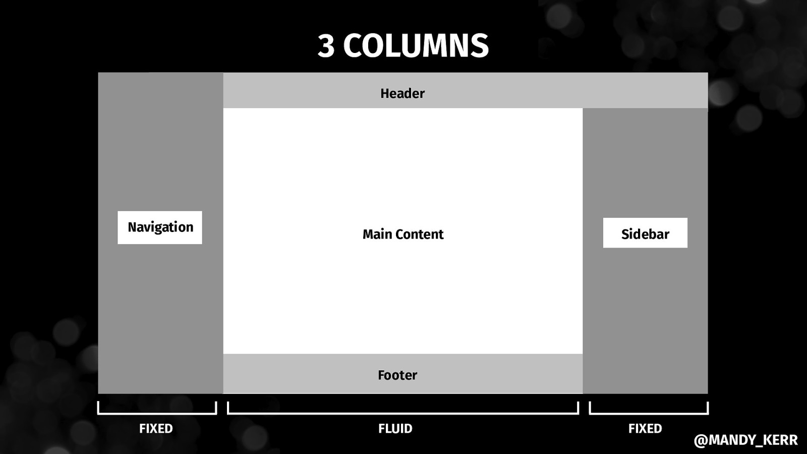
3 COLUMNS Header Navigation Main Content Sidebar Footer FIXED FLUID FIXED @MANDY_KERR
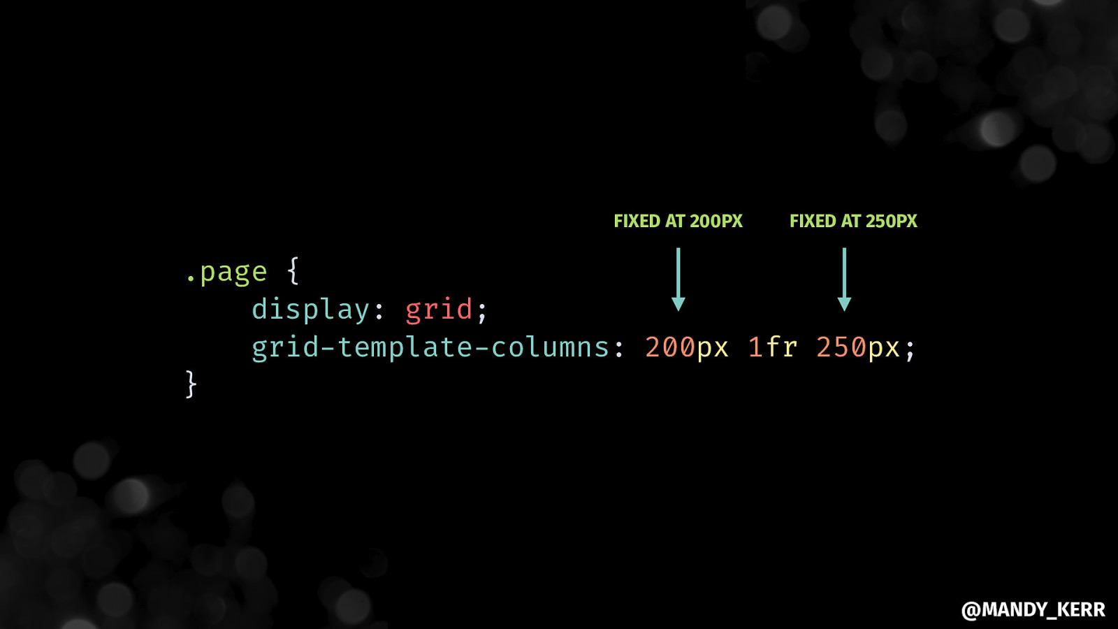
FIXED AT 200PX FIXED AT 250PX .page { display: grid; grid-template-columns: 200px 1fr 250px; } @MANDY_KERR
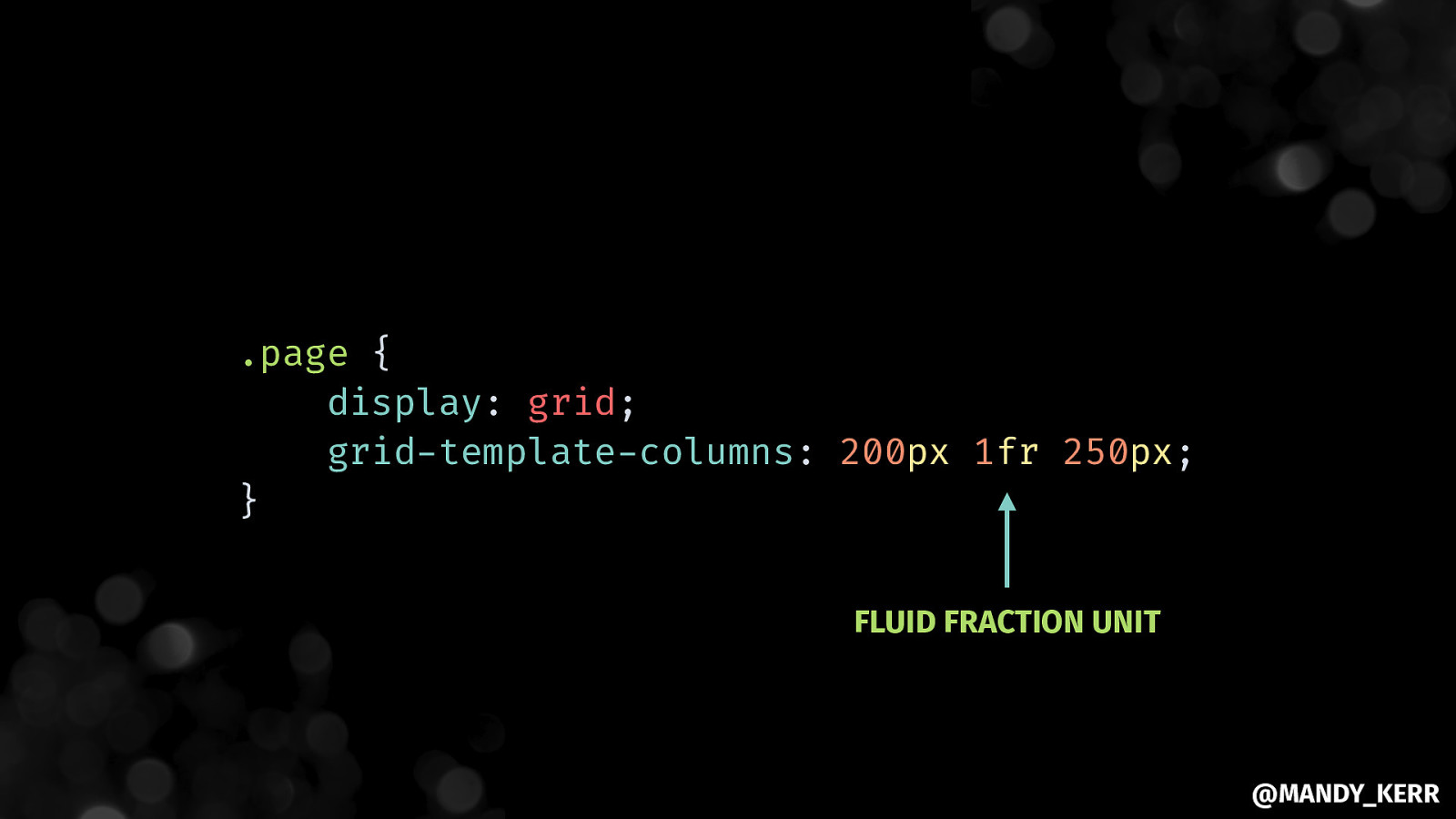
.page { display: grid; grid-template-columns: 200px 1fr 250px; } FLUID FRACTION UNIT @MANDY_KERR
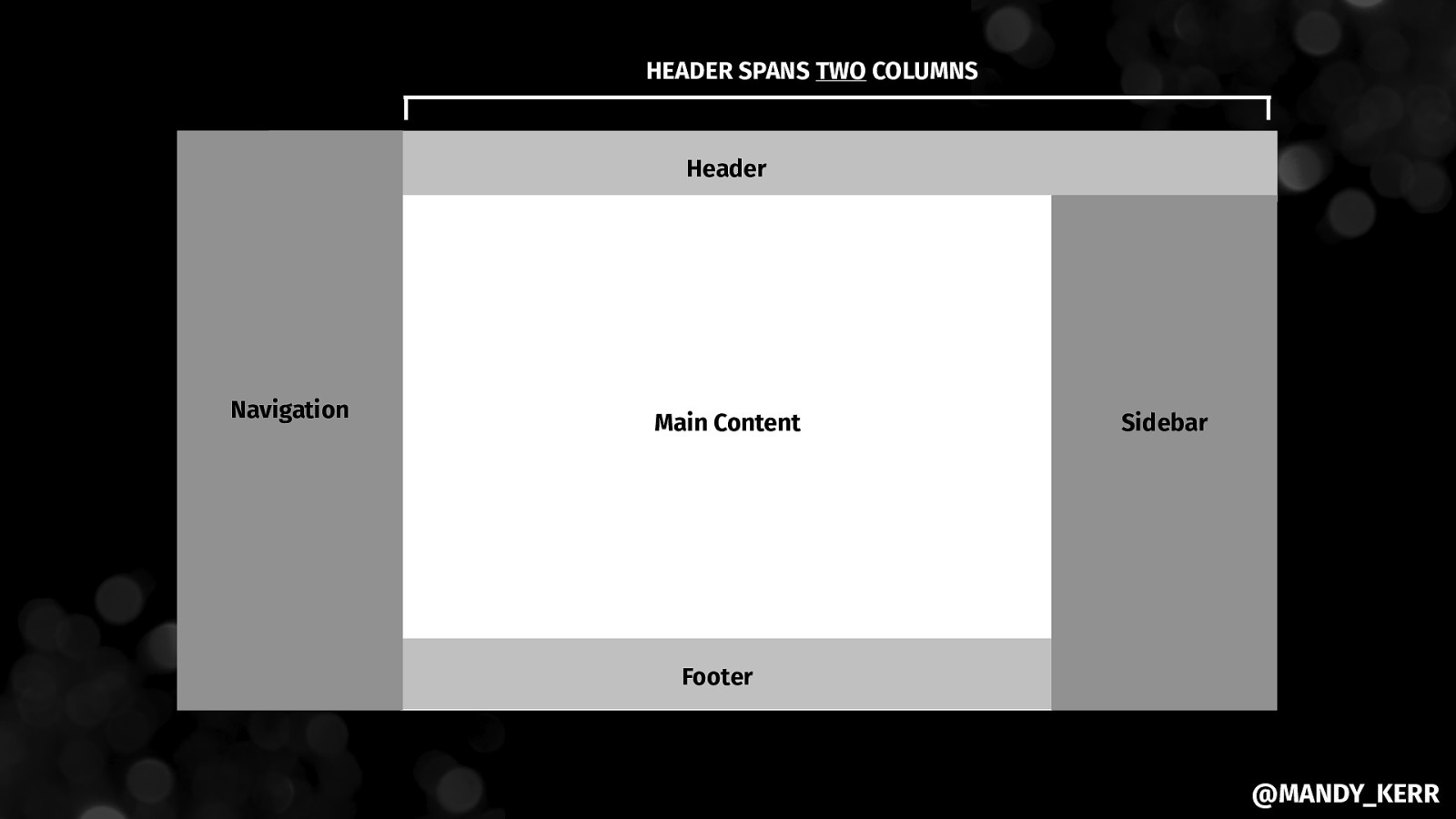
HEADER SPANS TWO COLUMNS Header Navigation Main Content Sidebar Footer @MANDY_KERR
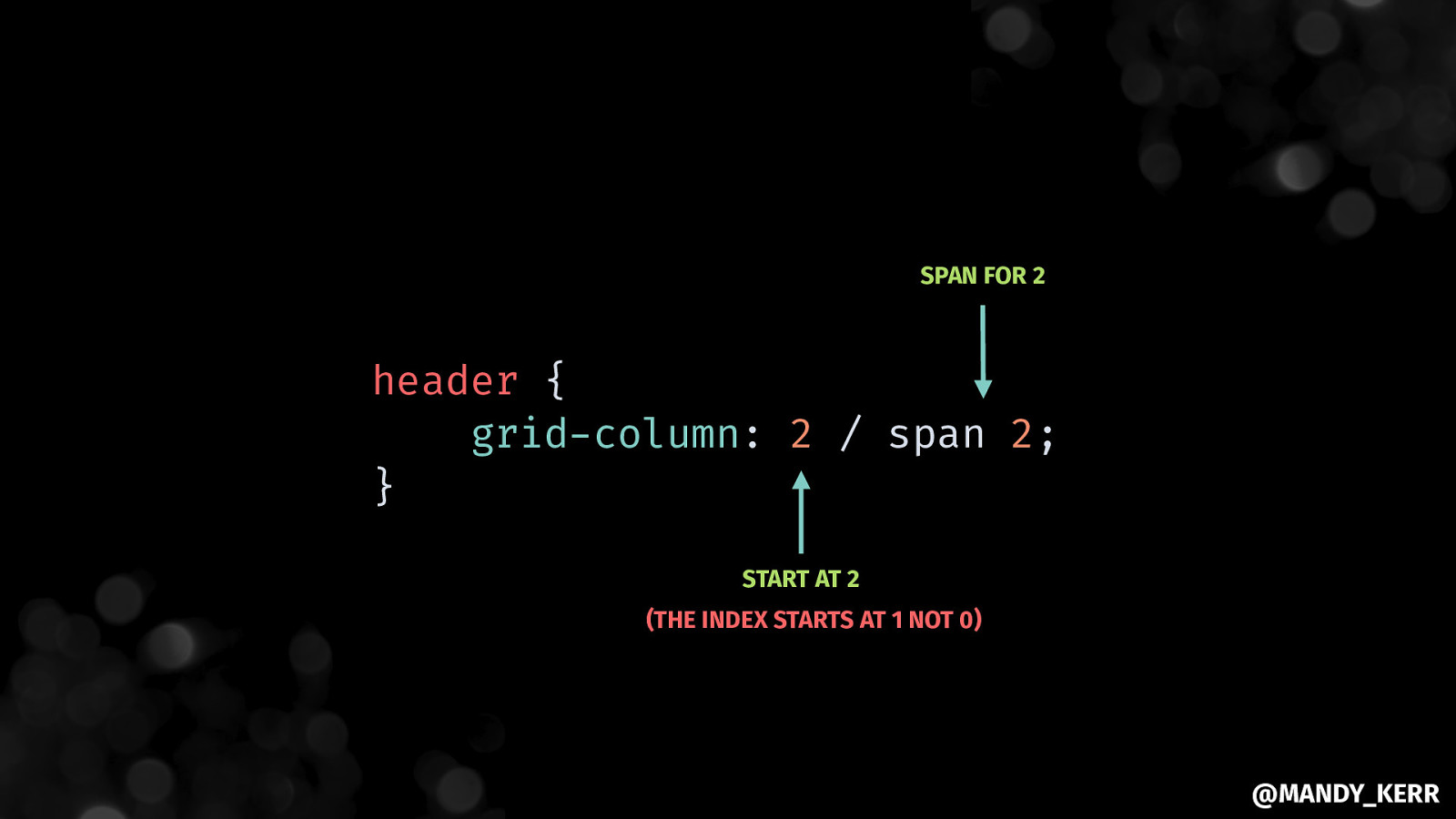
SPAN FOR 2 header { grid-column: 2 / span 2; } START AT 2 (THE INDEX STARTS AT 1 NOT 0) @MANDY_KERR
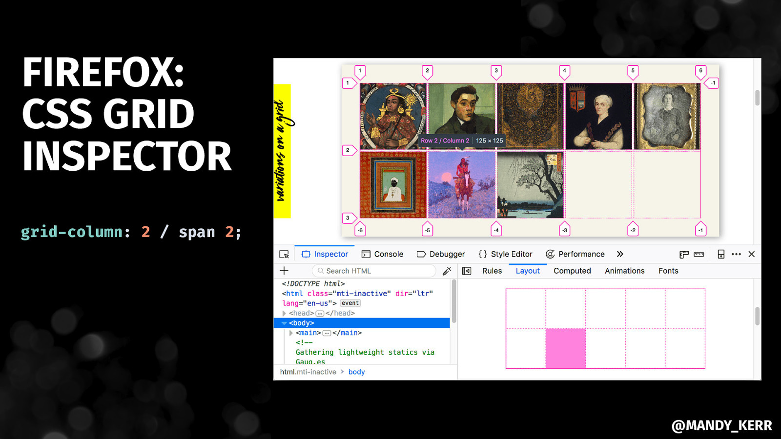
FIREFOX: CSS GRID INSPECTOR grid-column: 2 / span 2; @MANDY_KERR
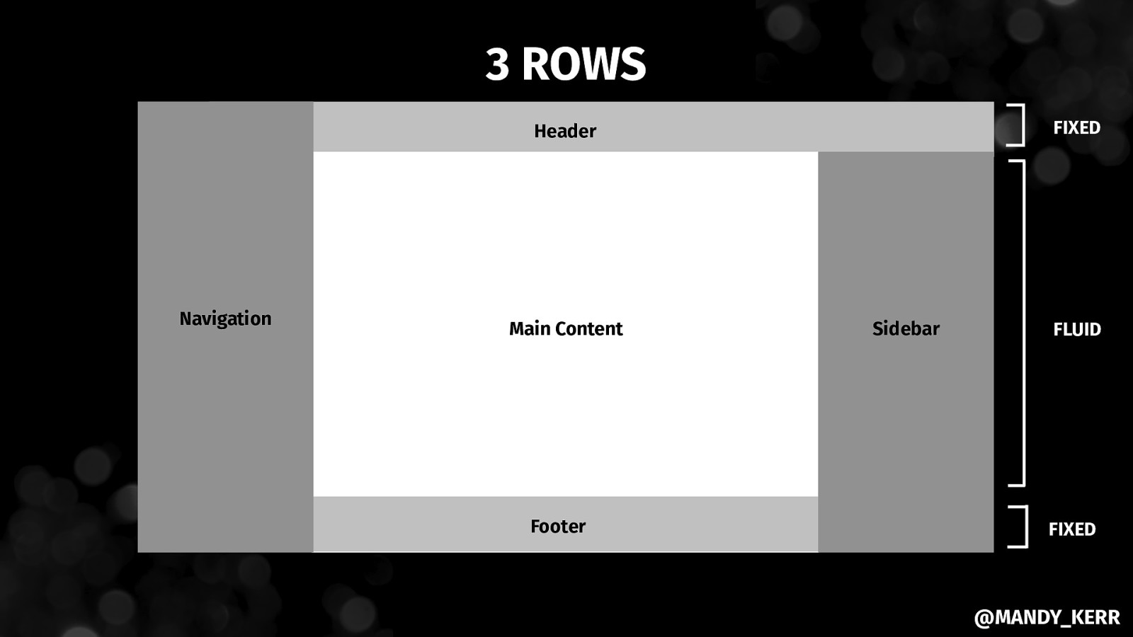
3 ROWS FIXED Header Navigation Main Content Footer Sidebar FLUID FIXED @MANDY_KERR
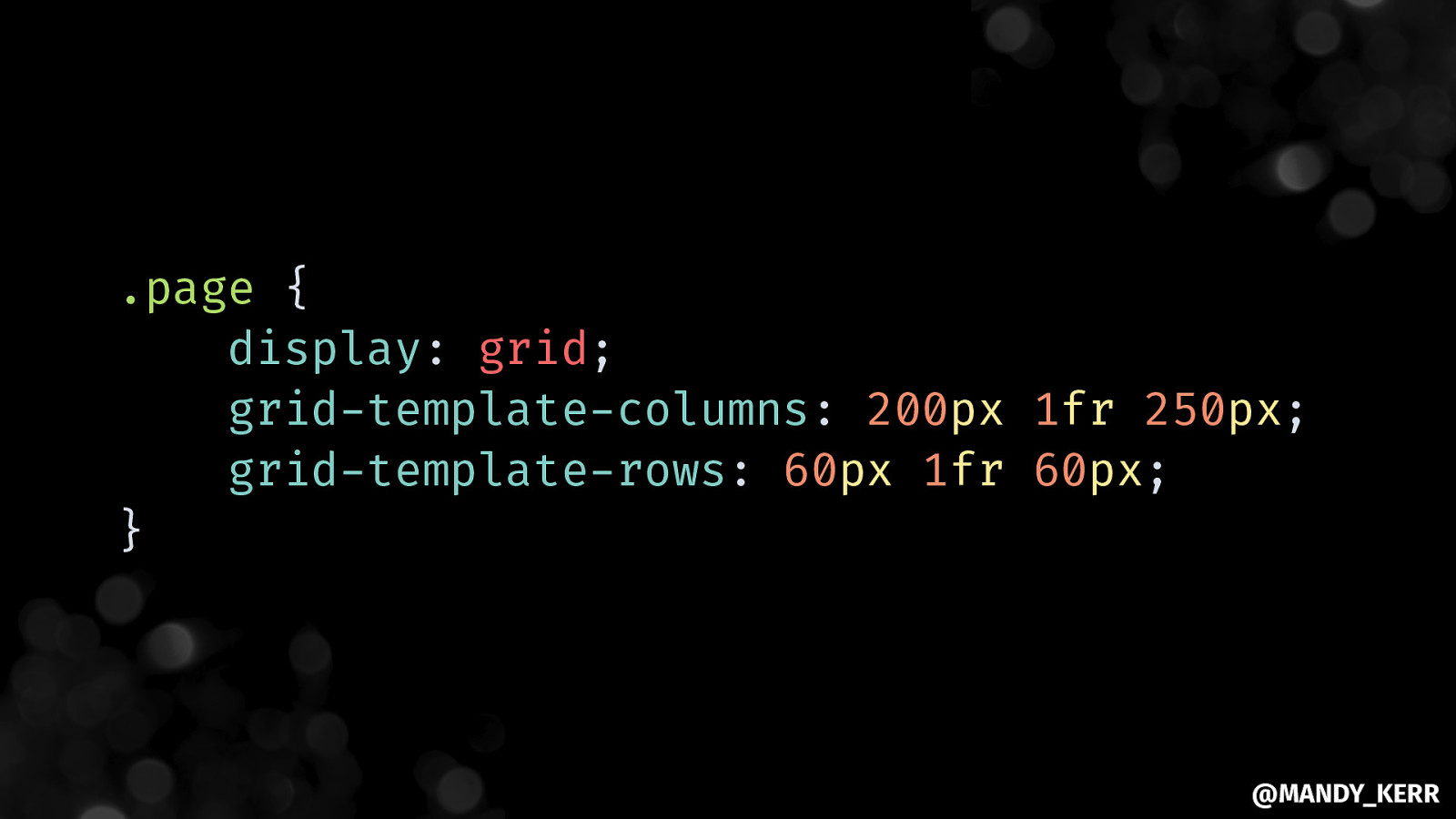
.page { display: grid; grid-template-columns: 200px 1fr 250px; grid-template-rows: 60px 1fr 60px; } @MANDY_KERR
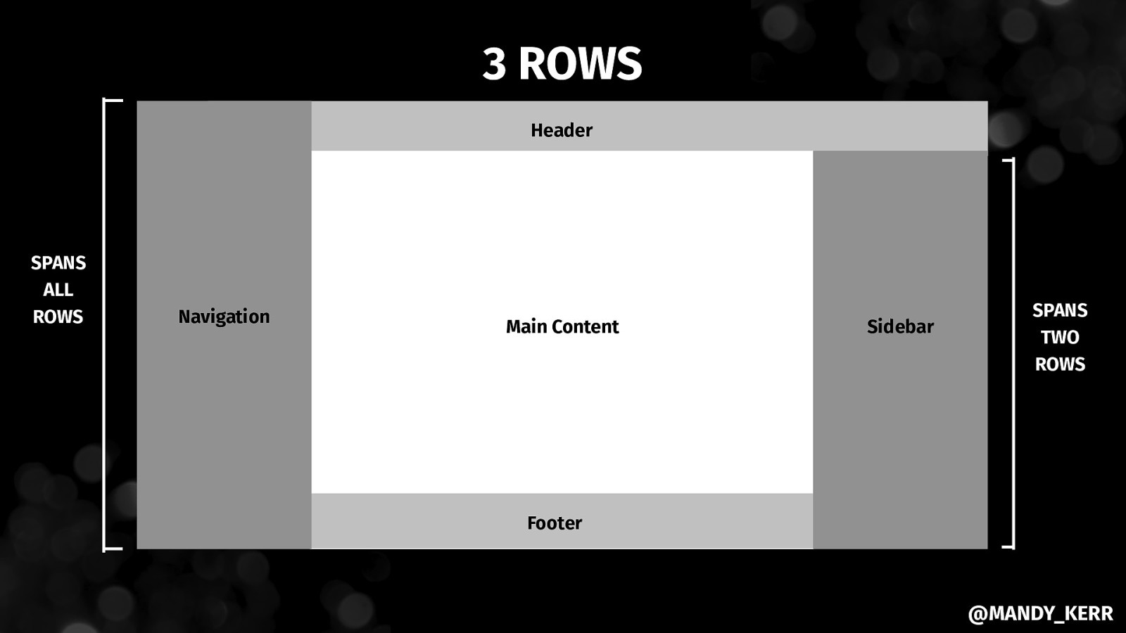
3 ROWS Header SPANS ALL ROWS Navigation Main Content Sidebar SPANS TWO ROWS Footer @MANDY_KERR
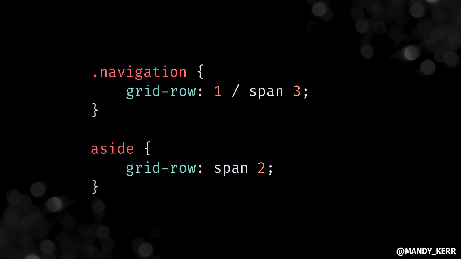
.navigation { grid-row: 1 / span 3; } aside { grid-row: span 2; } @MANDY_KERR
@MANDY_KERR
@MANDY_KERR
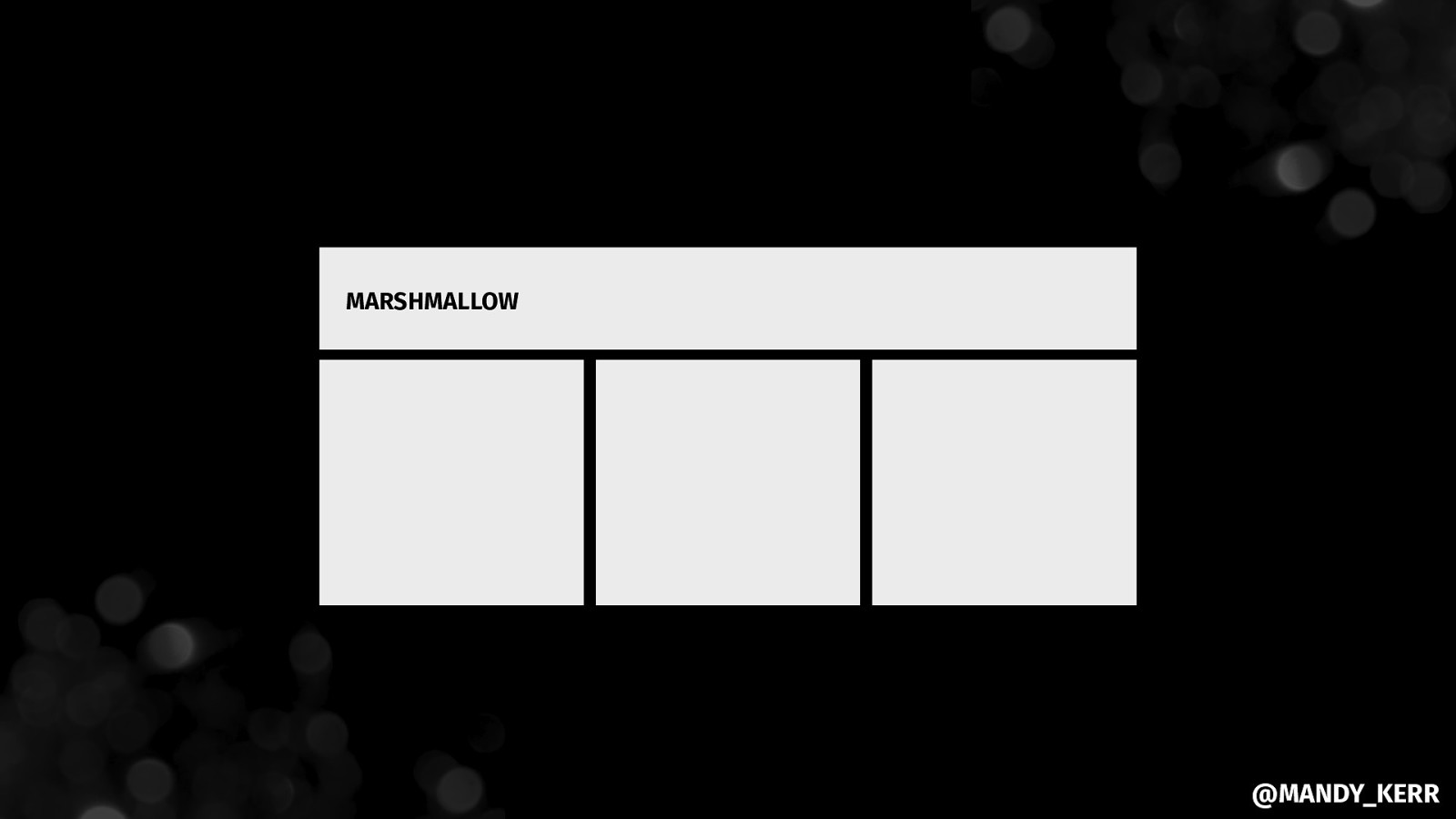
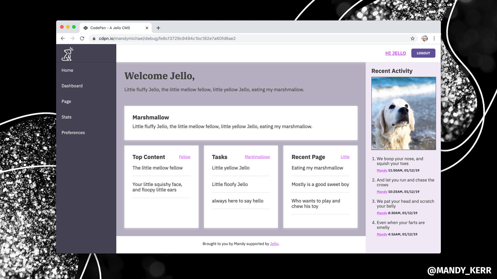
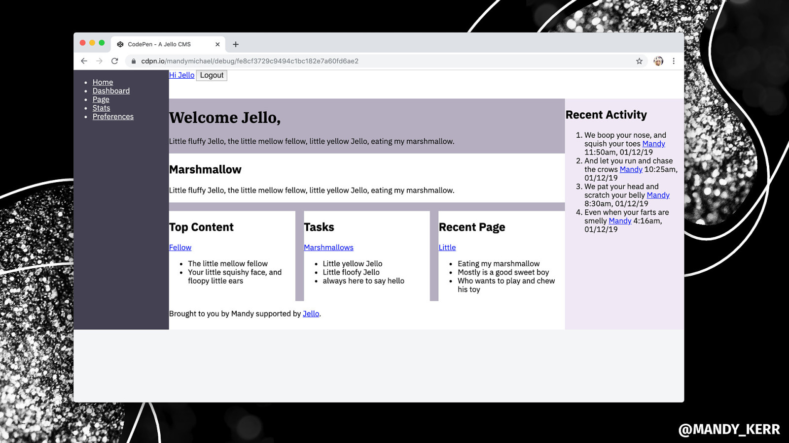
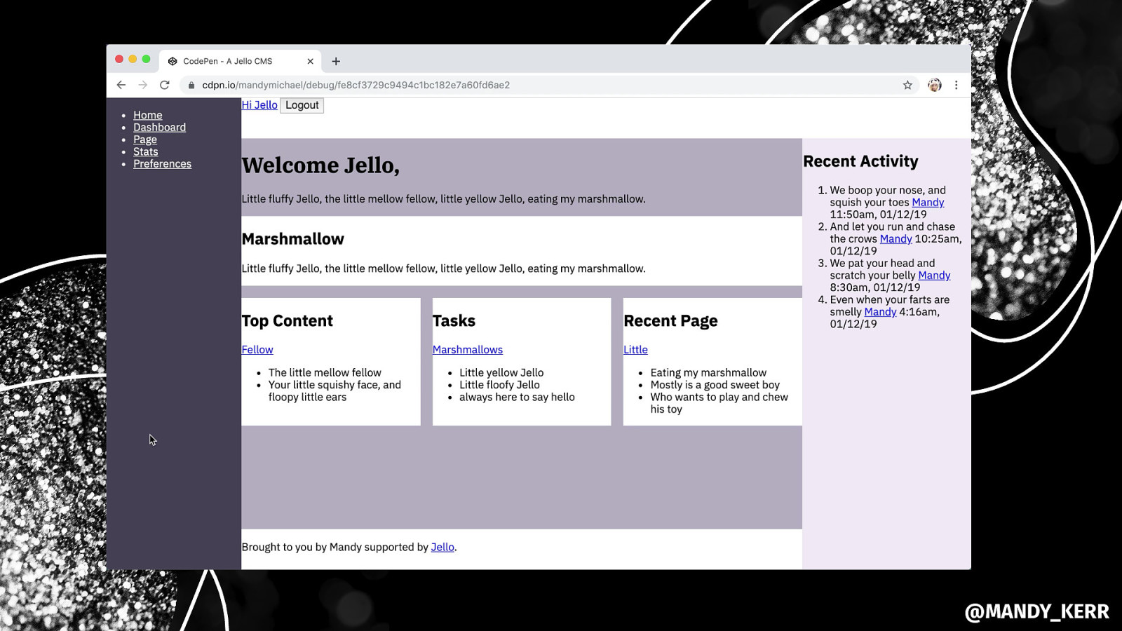
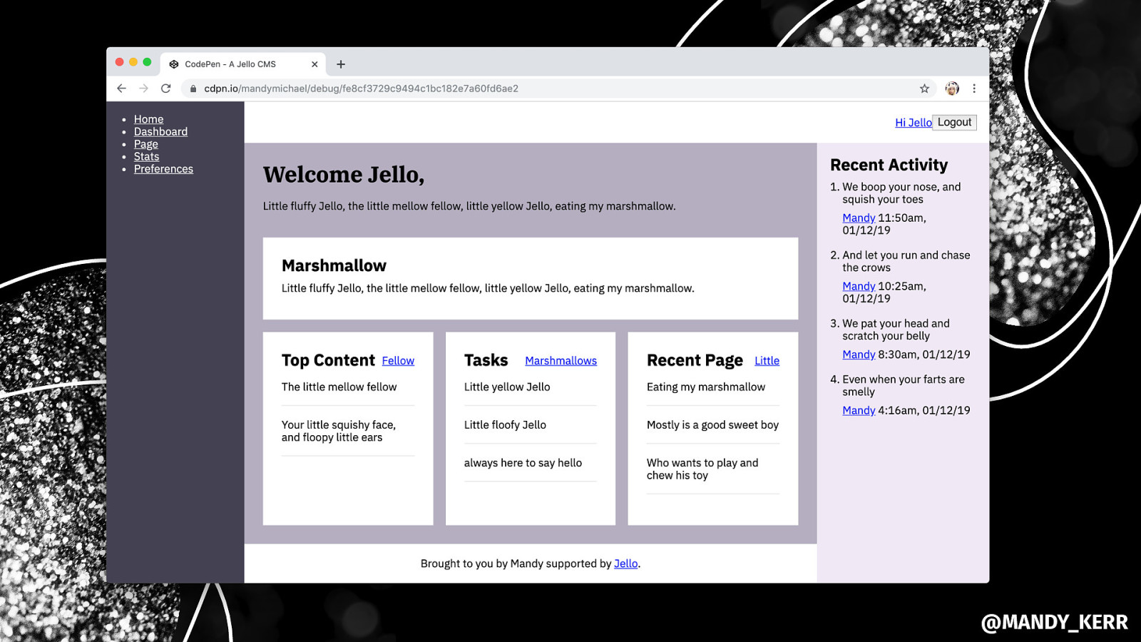
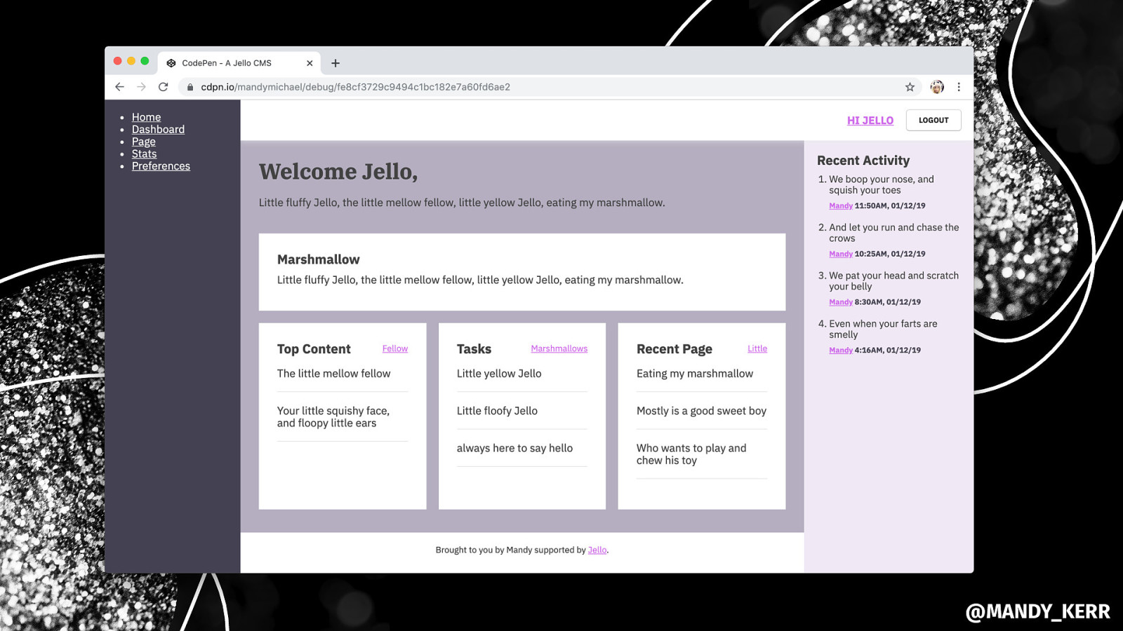
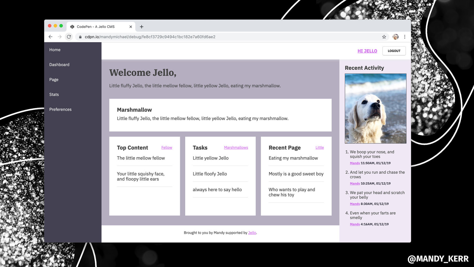
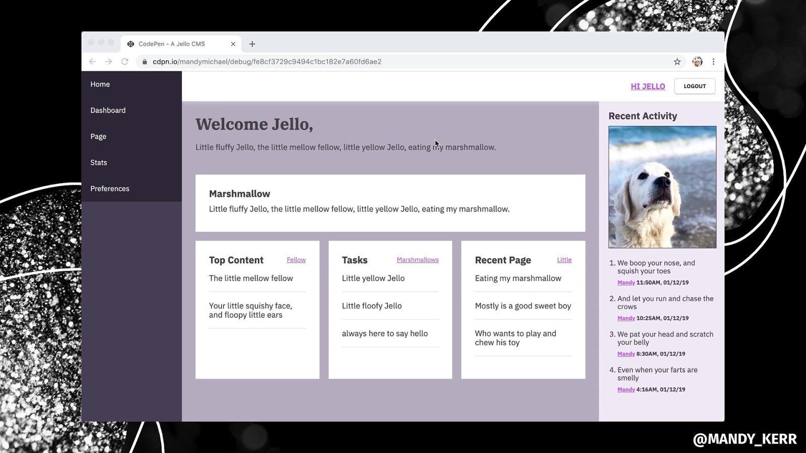
MARSHMALLOW @MANDY_KERR
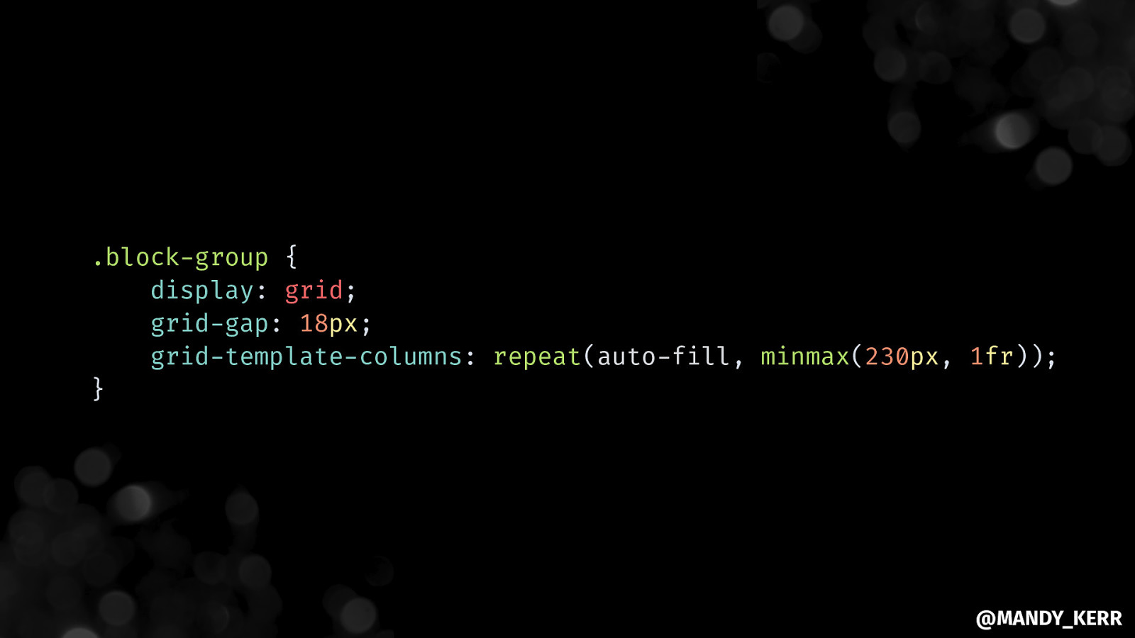
.block-group { display: grid; grid-gap: 18px; grid-template-columns: repeat(auto-fill, minmax(230px, 1fr)); } @MANDY_KERR
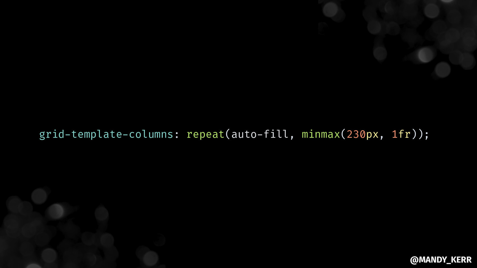
grid-template-columns: repeat(auto-fill, minmax(230px, 1fr)); @MANDY_KERR
@MANDY_KERR
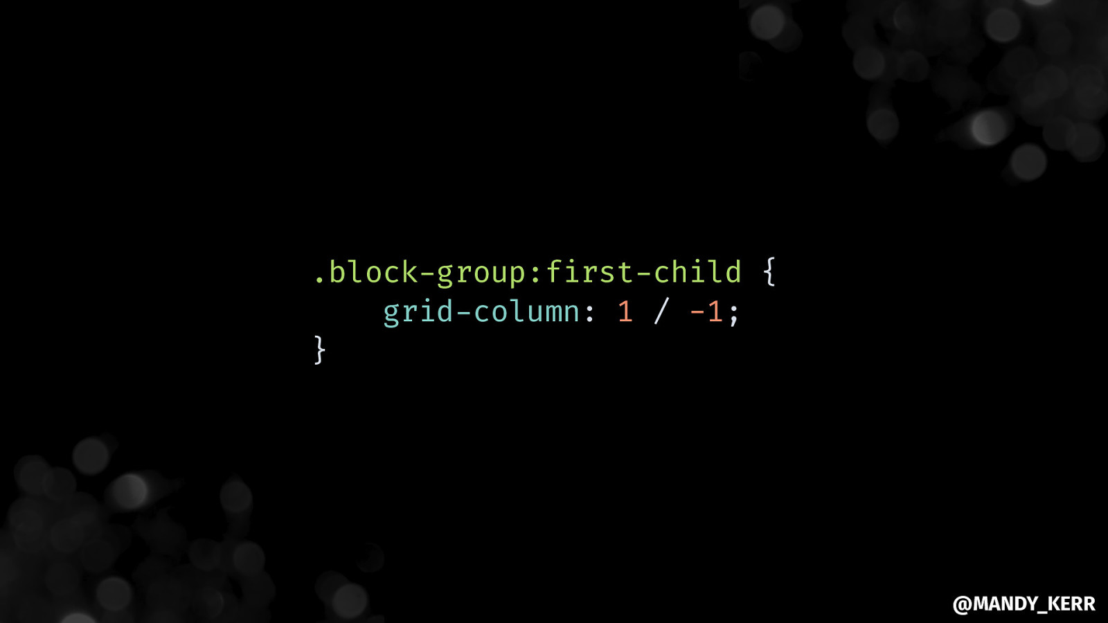
.block-group:first-child { grid-column: 1 / -1; } @MANDY_KERR
@MANDY_KERR
@MANDY_KERR
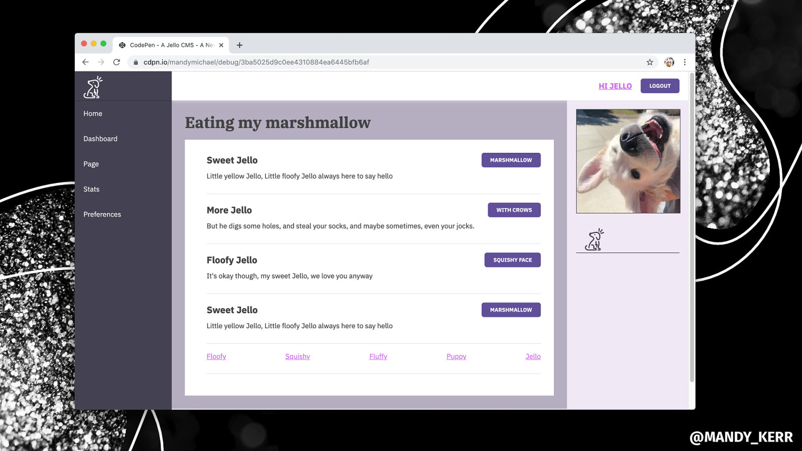
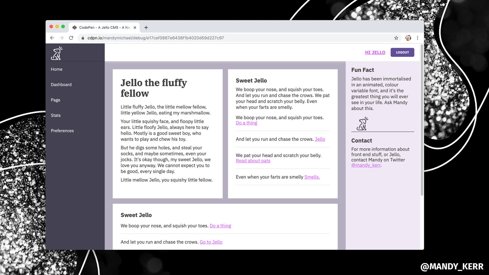
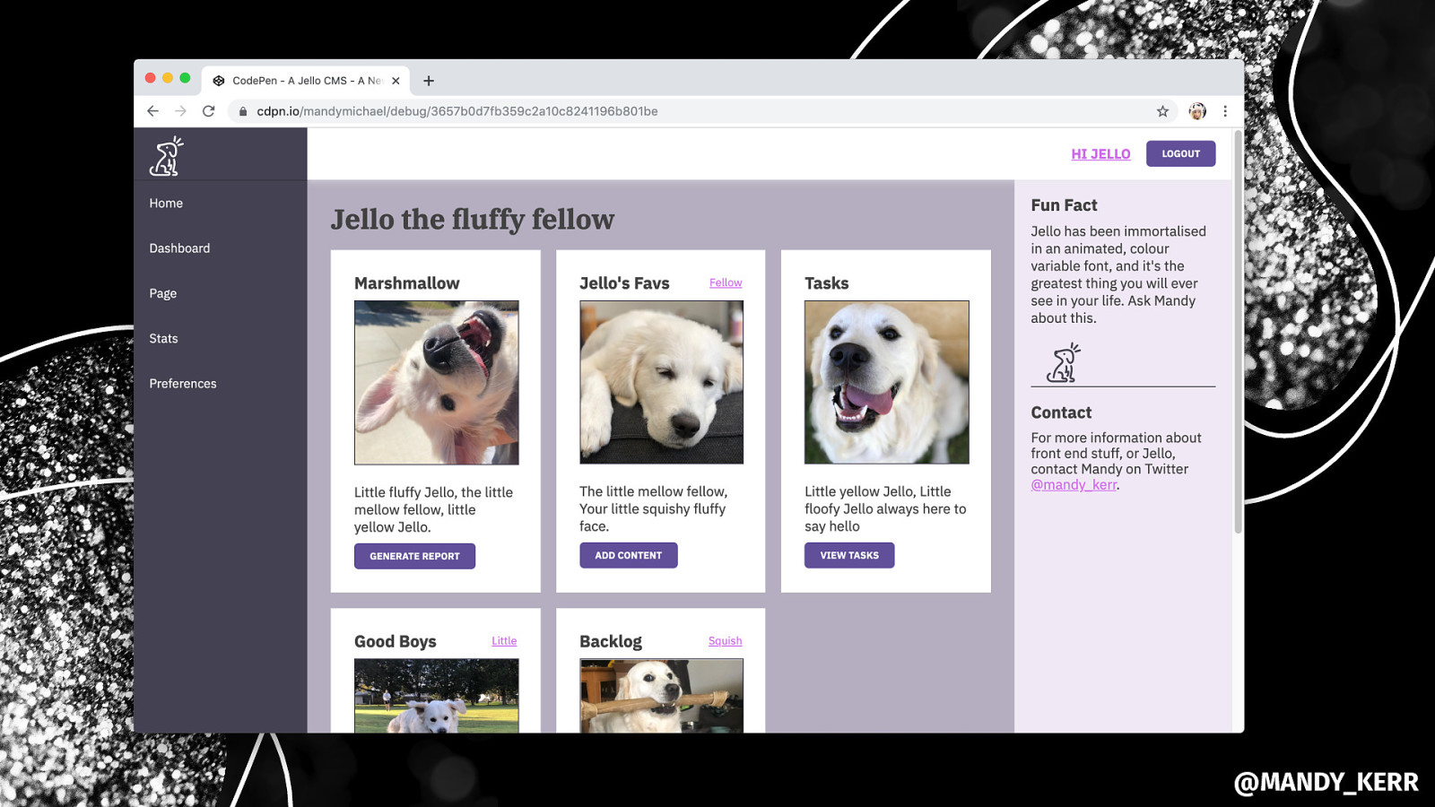
YOU CAN USE CSS GRID FOR ALL SORTS OF LAYOUTS LIKE FORMS OR CARDS. @MANDY_KERR
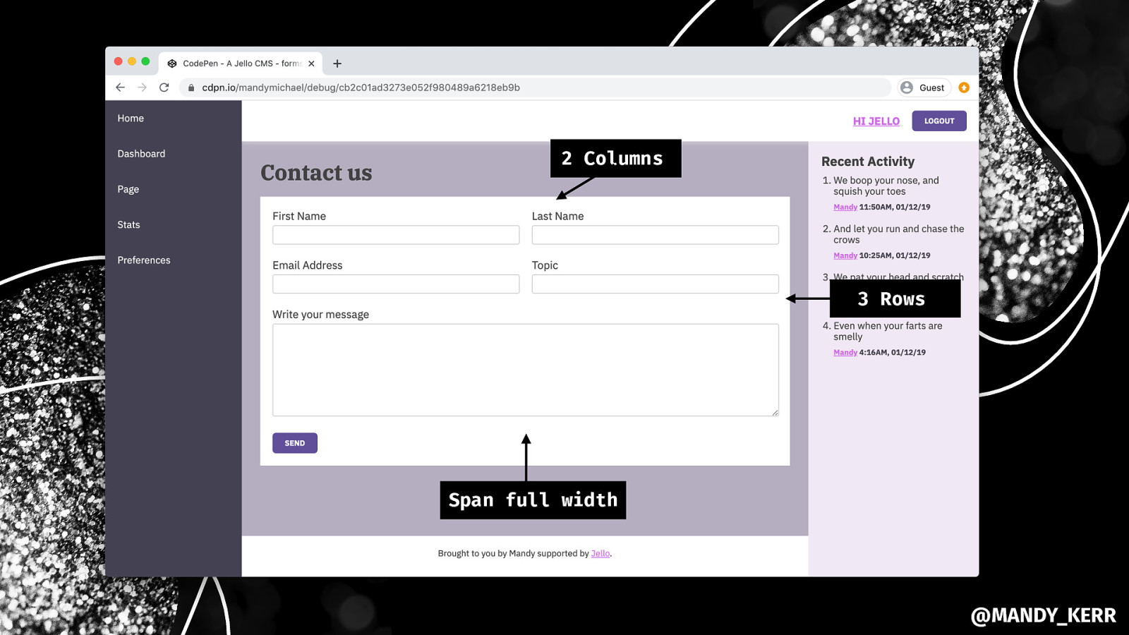
2 Columns 3 Rows Span full width @MANDY_KERR

EVERY-LAYOUT.DEV GRIDBYEXAMPLE.COM @rachelandrew @MANDY_KERR

@MANDY_KERR
Making the page FULL HEIGHT @MANDY_KERR
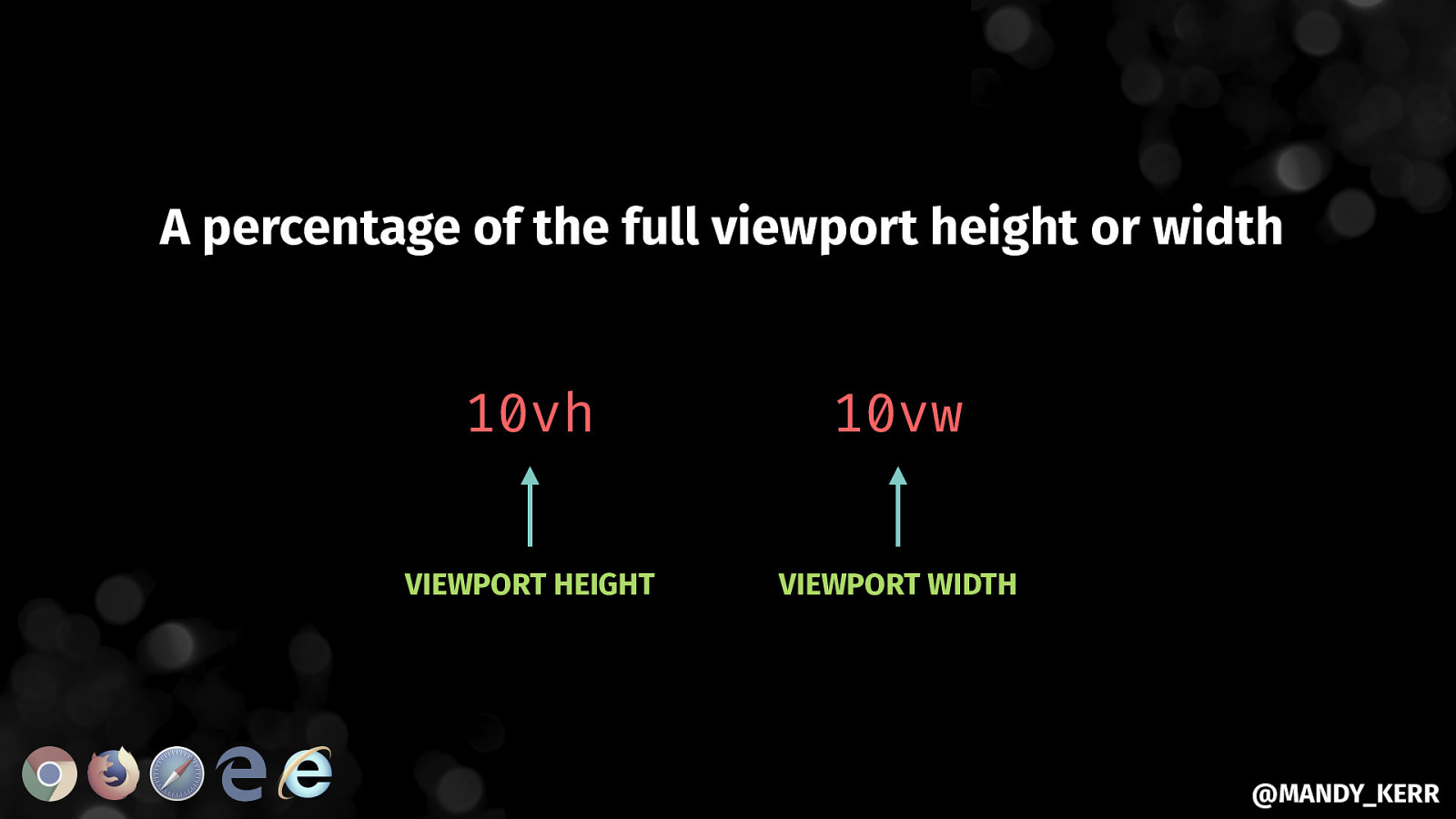
A percentage of the full viewport height or width 10vh 10vw VIEWPORT HEIGHT VIEWPORT WIDTH @MANDY_KERR
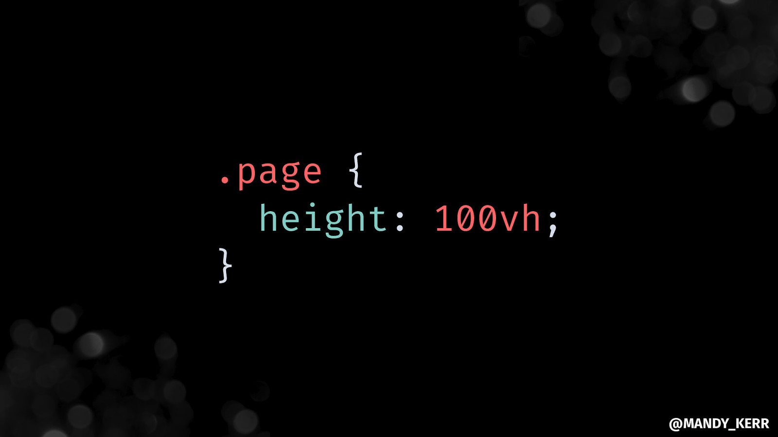
.page { height: 100vh; } @MANDY_KERR
@MANDY_KERR
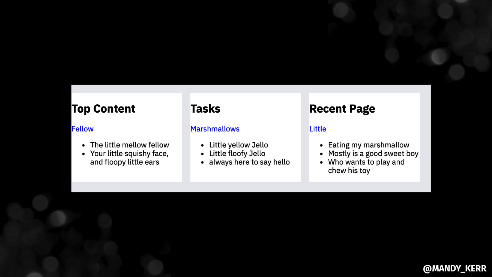
Some ways to ALIGN WITH FLEXBOX @MANDY_KERR
@MANDY_KERR
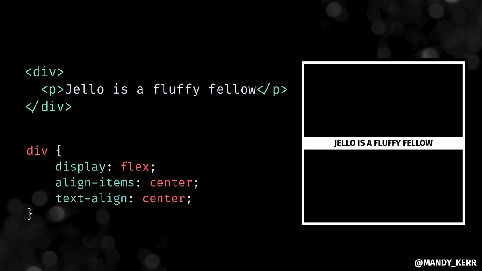
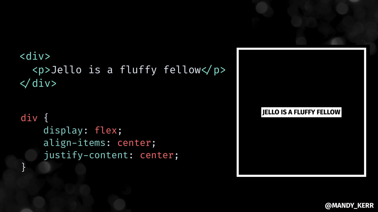
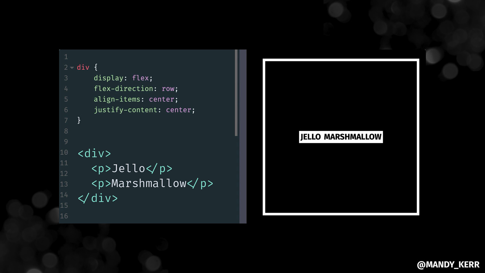
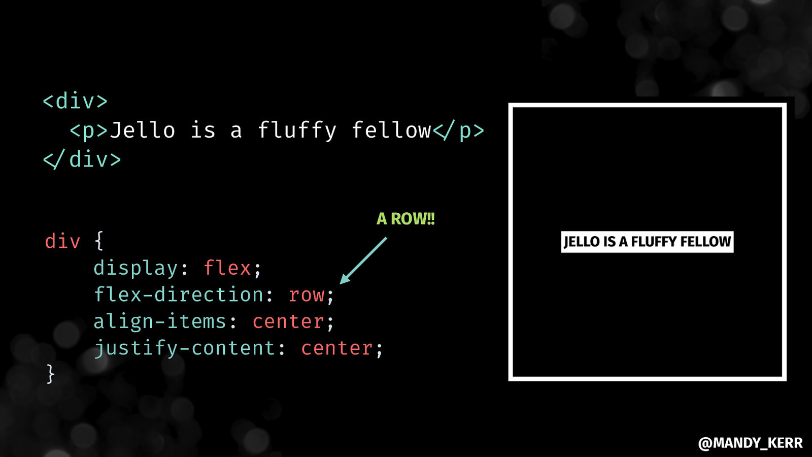
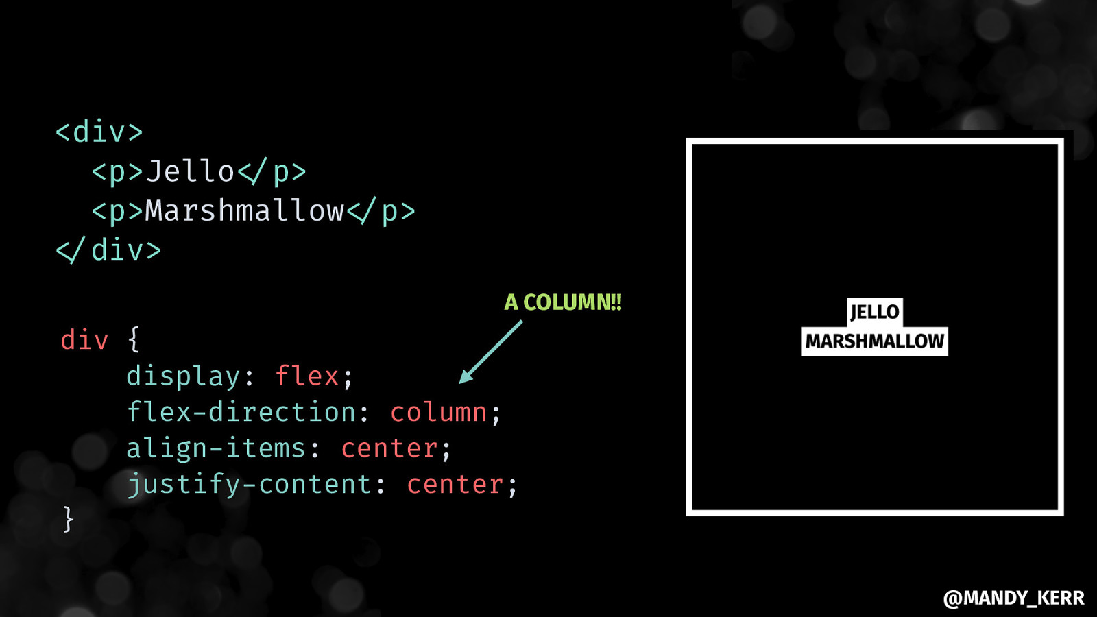
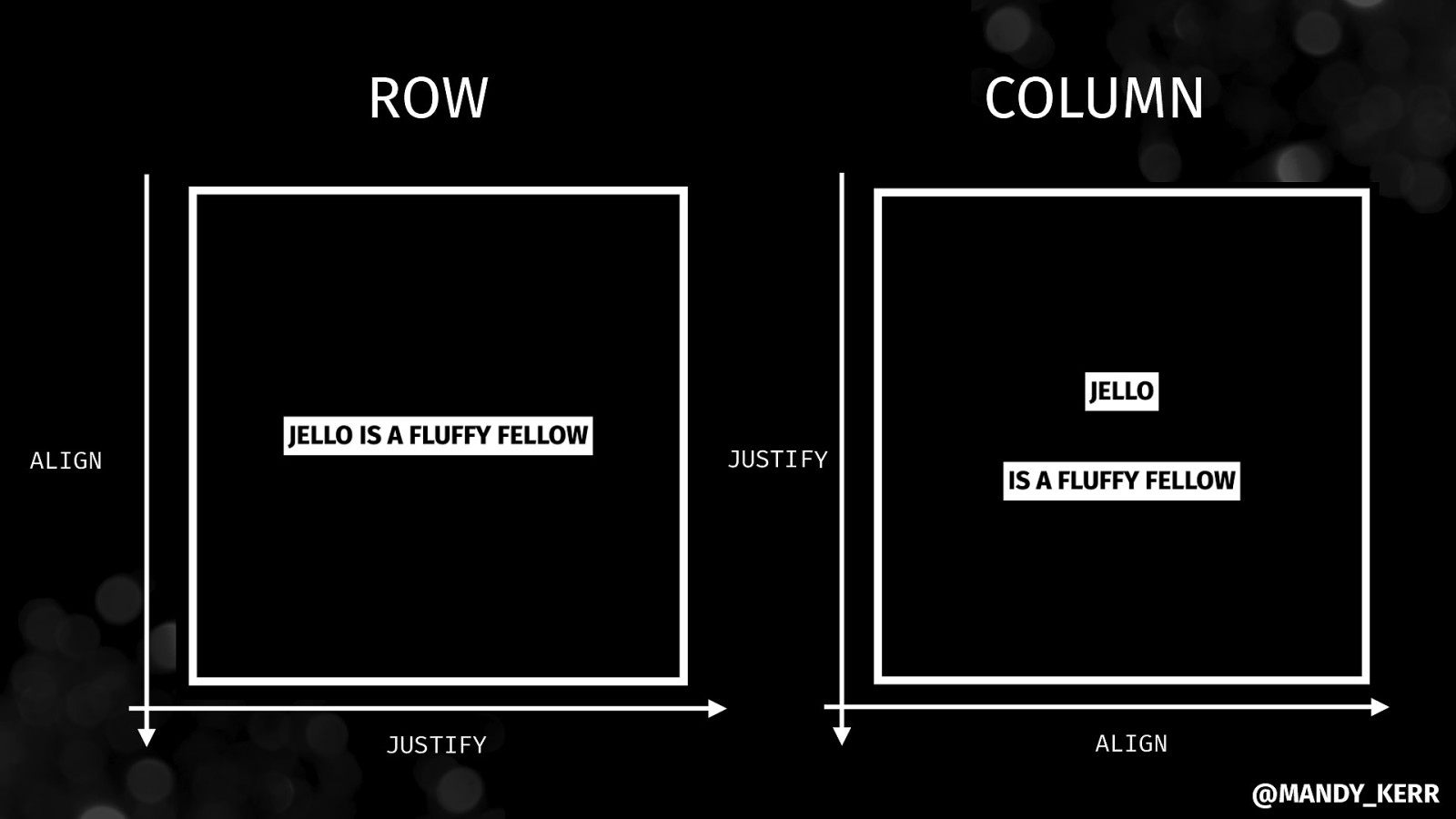
ROW COLUMN JUSTIFY ALIGN JUSTIFY ALIGN @MANDY_KERR
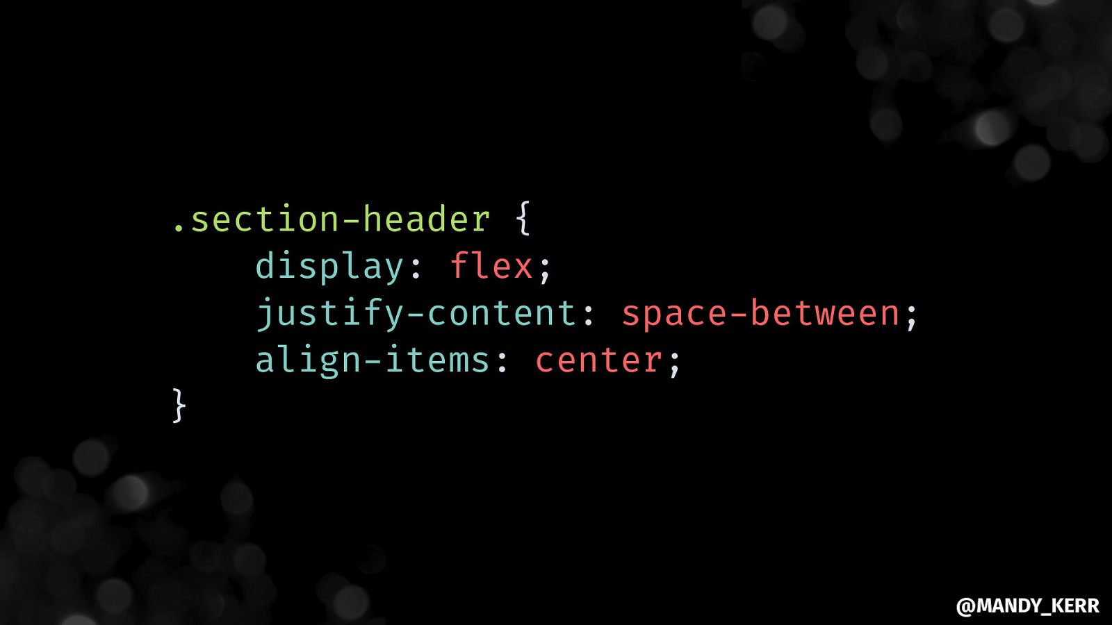
.section-header { display: flex; justify-content: space-between; align-items: center; } @MANDY_KERR
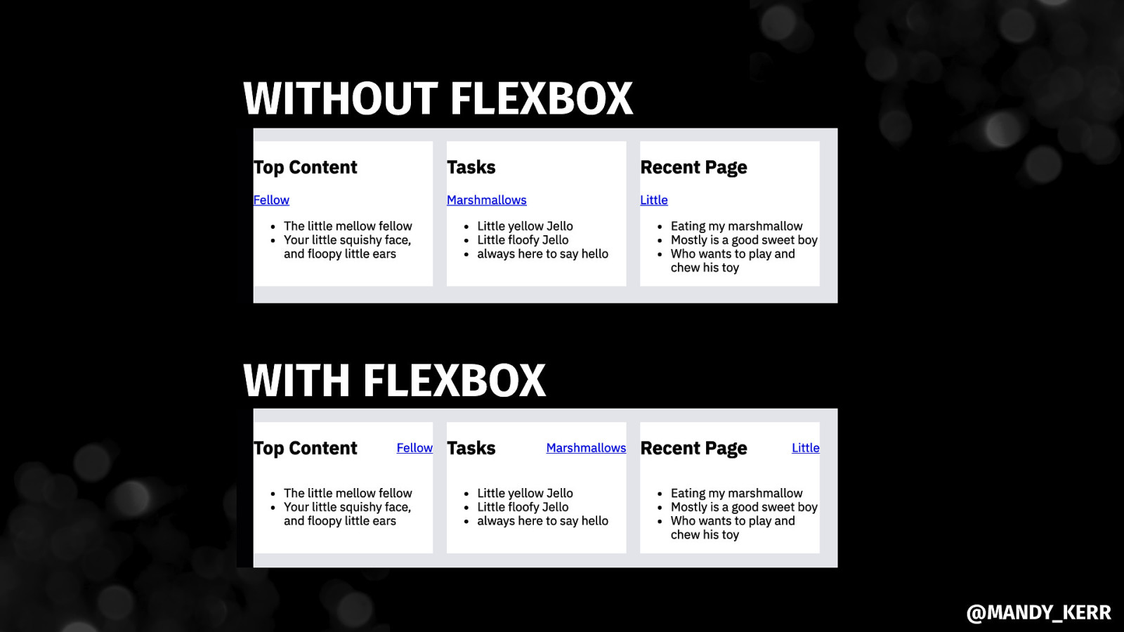
WITHOUT FLEXBOX WITH FLEXBOX @MANDY_KERR

@MANDY_KERR
Working with VARIABLES IN CSS @MANDY_KERR
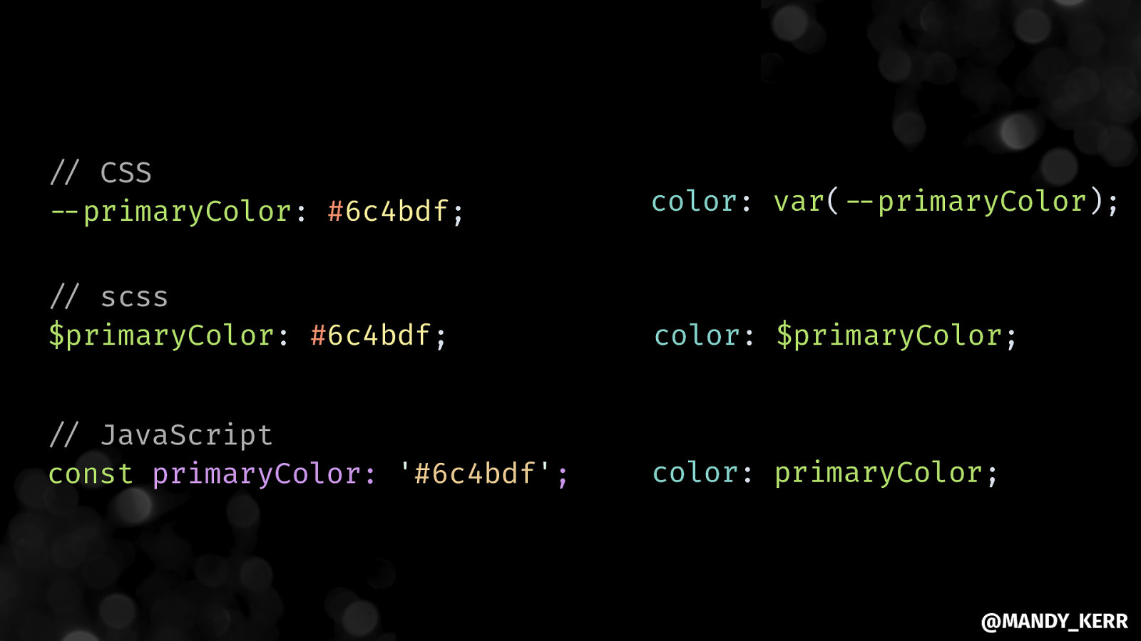
”// CSS “—primaryColor: #6c4bdf; color: var(“—primaryColor); “// scss $primaryColor: #6c4bdf; color: $primaryColor; “// JavaScript const primaryColor: ‘#6c4bdf’; color: primaryColor; @MANDY_KERR
Margins & Padding Colours Fonts @MANDY_KERR
Setting up CONSISTENT SPACING @MANDY_KERR
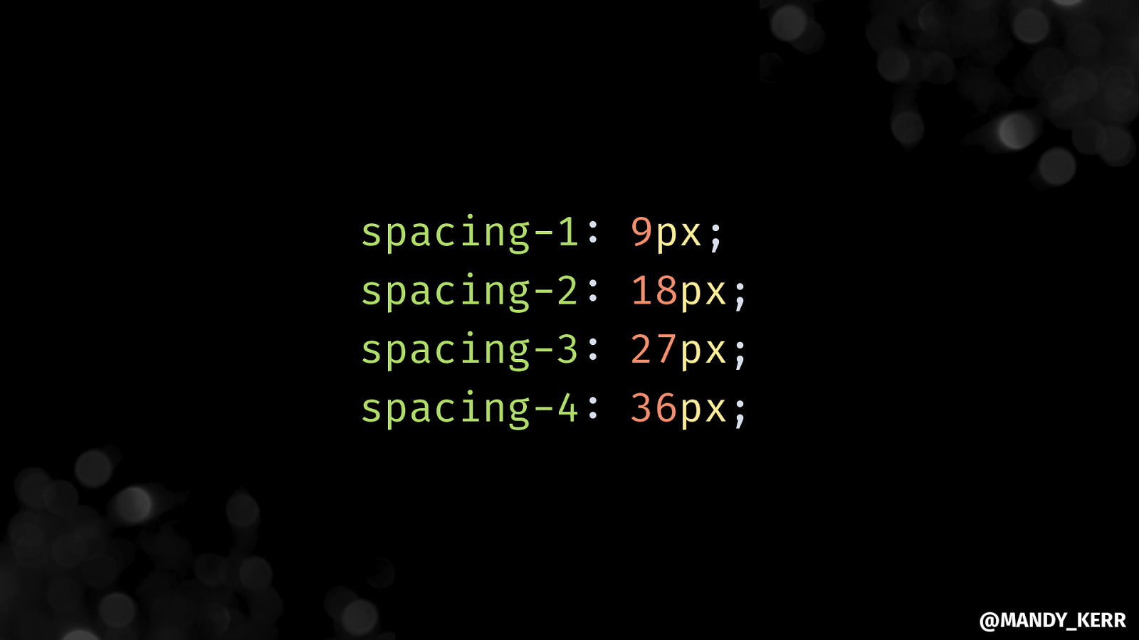
spacing-1: spacing-2: spacing-3: spacing-4: 9px; 18px; 27px; 36px; @MANDY_KERR

@MANDY_KERR
@MANDY_KERR
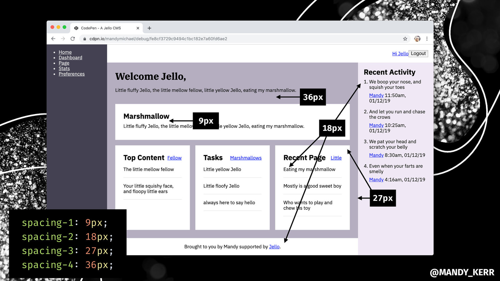
36px 9px 18px 27px spacing-1: spacing-2: spacing-3: spacing-4: 9px; 18px; 27px; 36px; @MANDY_KERR
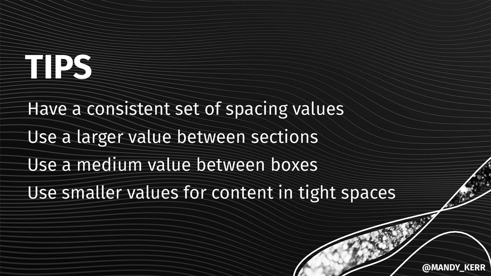
TIPS Have a consistent set of spacing values Use a larger value between sections Use a medium value between boxes Use smaller values for content in tight spaces @MANDY_KERR

Adding in COLOURS & FONT SIZE @MANDY_KERR
@MANDY_KERR
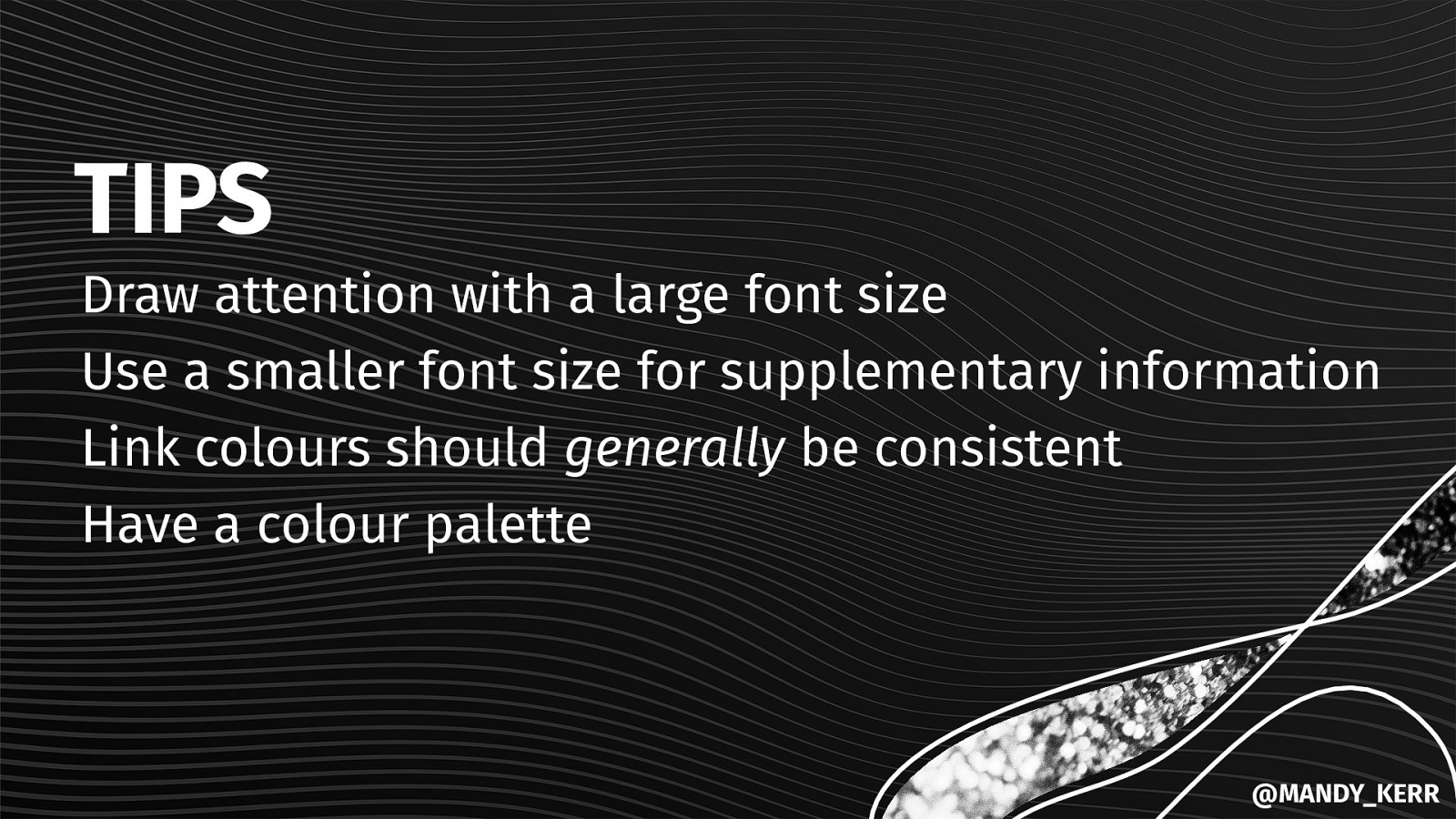
TIPS Draw attention with a large font size Use a smaller font size for supplementary information Link colours should generally be consistent Have a colour palette @MANDY_KERR
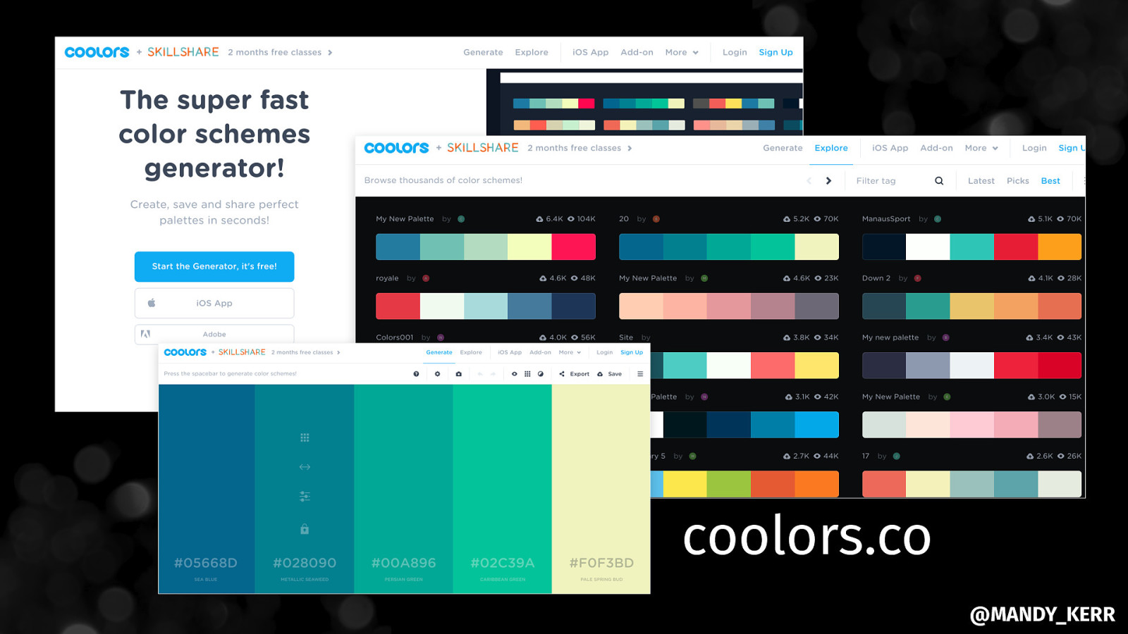
coolors.co @MANDY_KERR

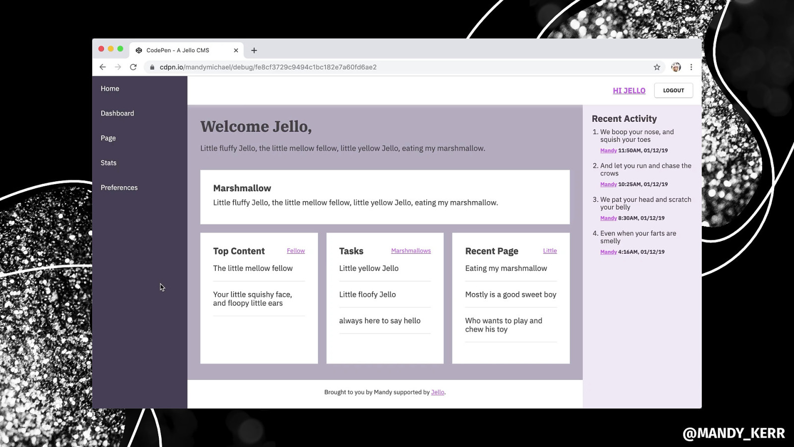
Styling THE MAIN NAVIGATION @MANDY_KERR
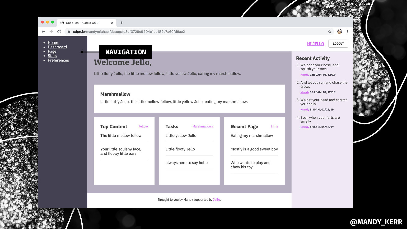
NAVIGATION @MANDY_KERR
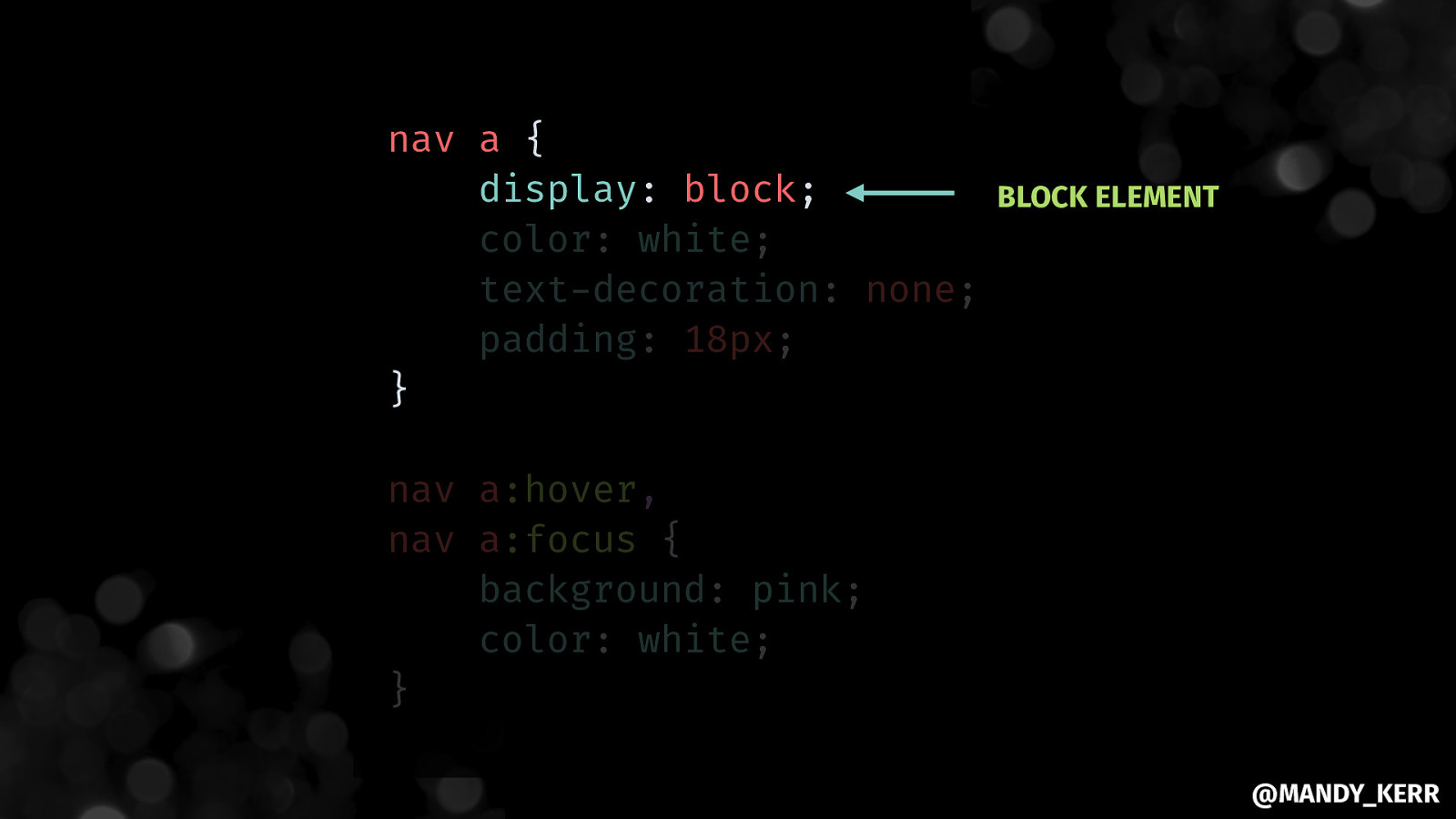
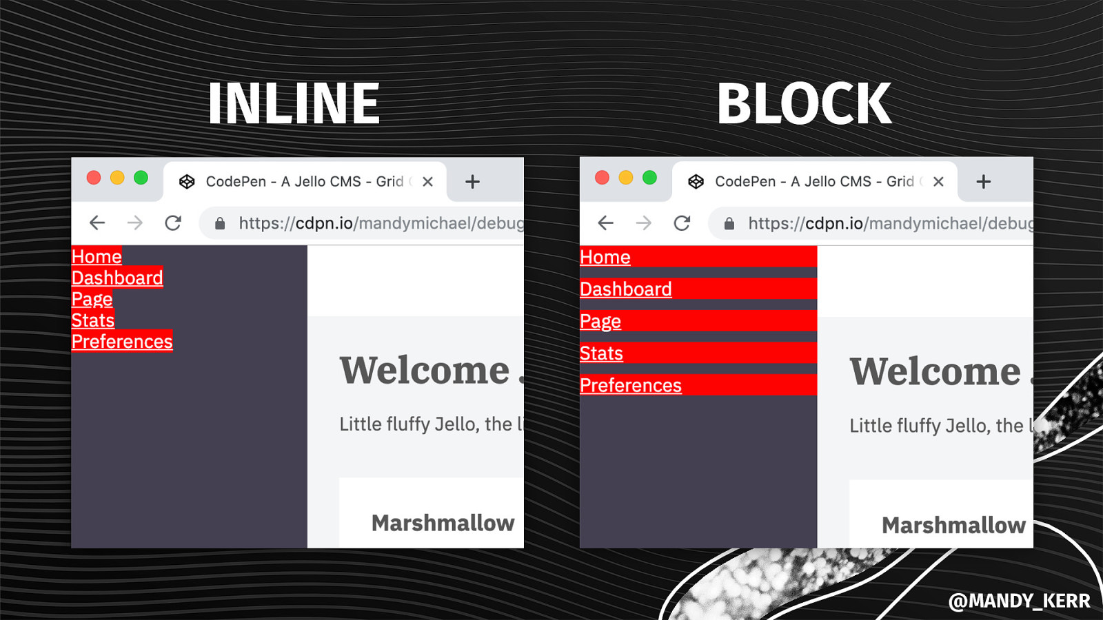
nav a { display: block; color: white; text-decoration: none; padding: 18px; } BLOCK ELEMENT nav a:hover, nav a:focus { background: pink; color: white; } @MANDY_KERR
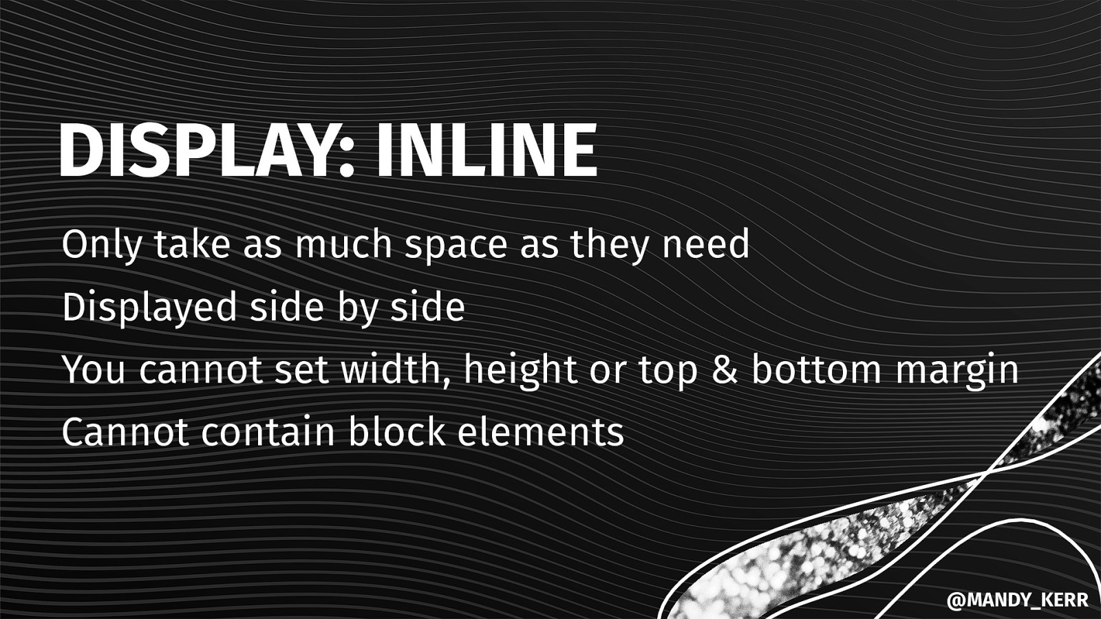
DISPLAY: INLINE Only take as much space as they need Displayed side by side You cannot set width, height or top & bottom margin Cannot contain block elements @MANDY_KERR
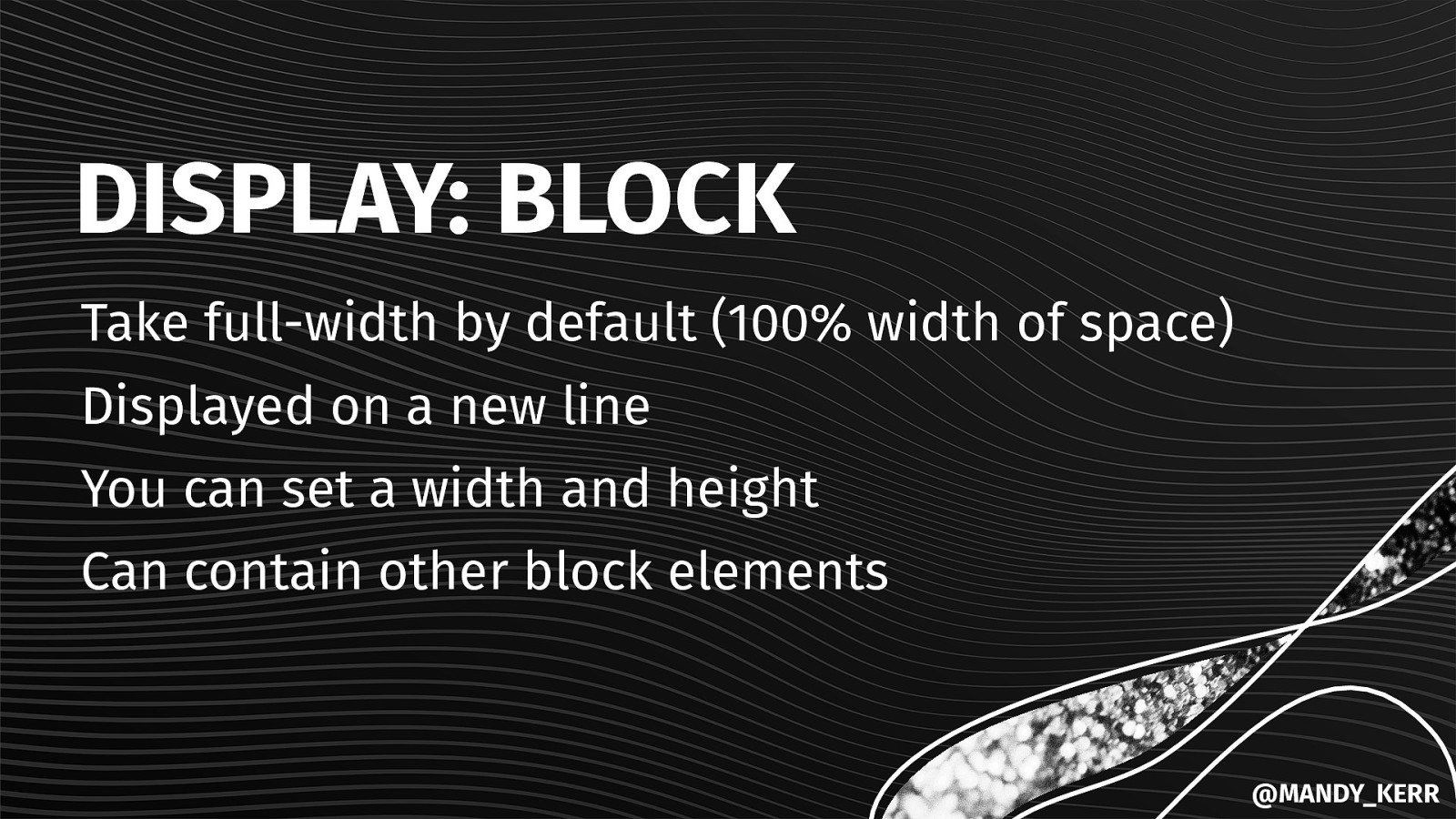
DISPLAY: BLOCK Take full-width by default (100% width of space) Displayed on a new line You can set a width and height Can contain other block elements @MANDY_KERR
INLINE BLOCK @MANDY_KERR
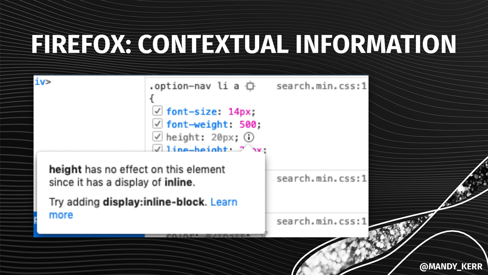
FIREFOX: CONTEXTUAL INFORMATION @MANDY_KERR
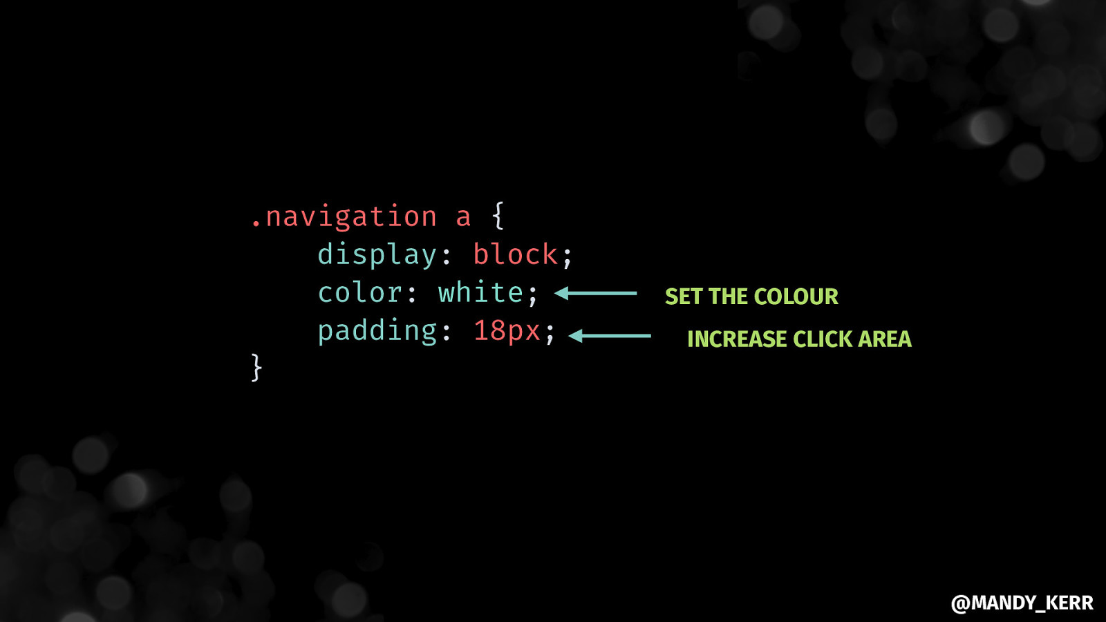
.navigation a { display: block; color: white; padding: 18px; } SET THE COLOUR INCREASE CLICK AREA @MANDY_KERR
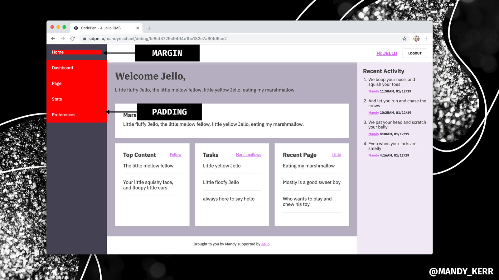
MARGIN PADDING @MANDY_KERR
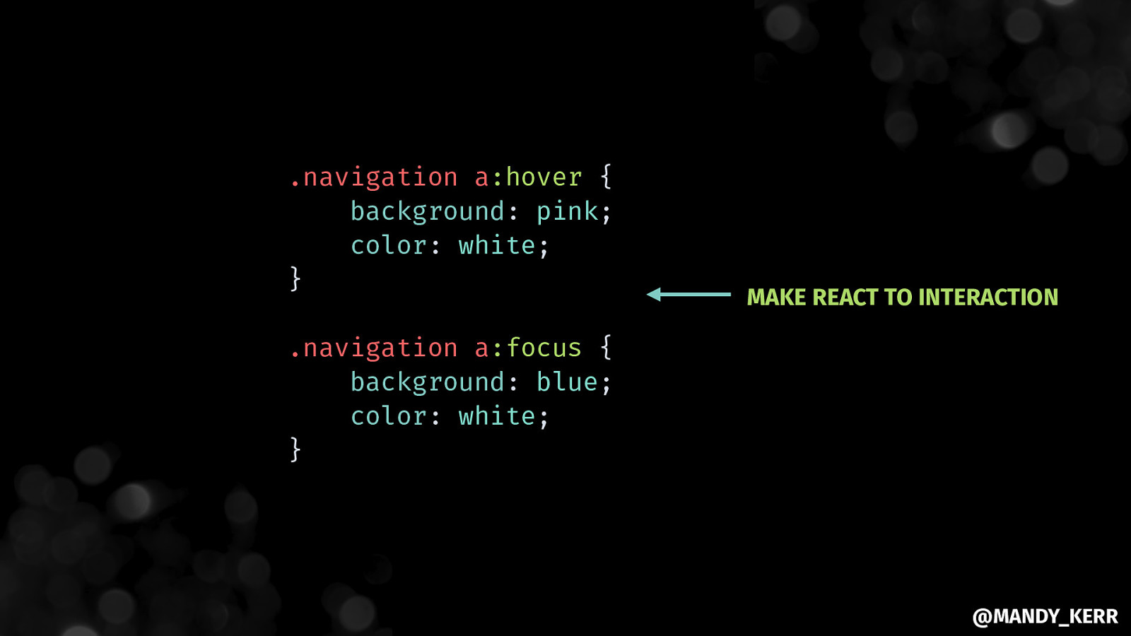
.navigation a:hover { background: pink; color: white; } MAKE REACT TO INTERACTION .navigation a:focus { background: blue; color: white; } @MANDY_KERR
@MANDY_KERR
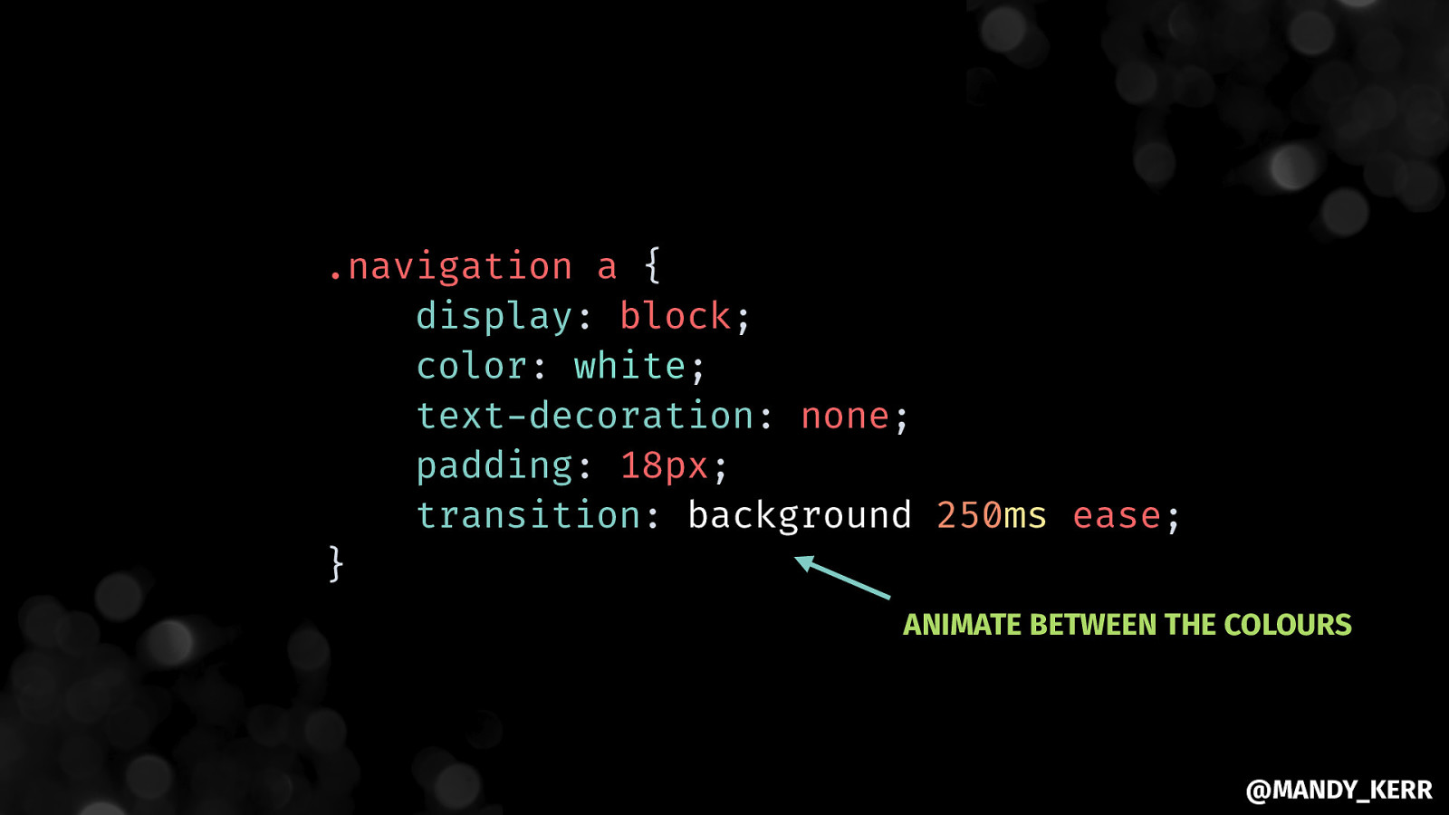
.navigation a { display: block; color: white; text-decoration: none; padding: 18px; transition: background 250ms ease; } ANIMATE BETWEEN THE COLOURS @MANDY_KERR
@MANDY_KERR

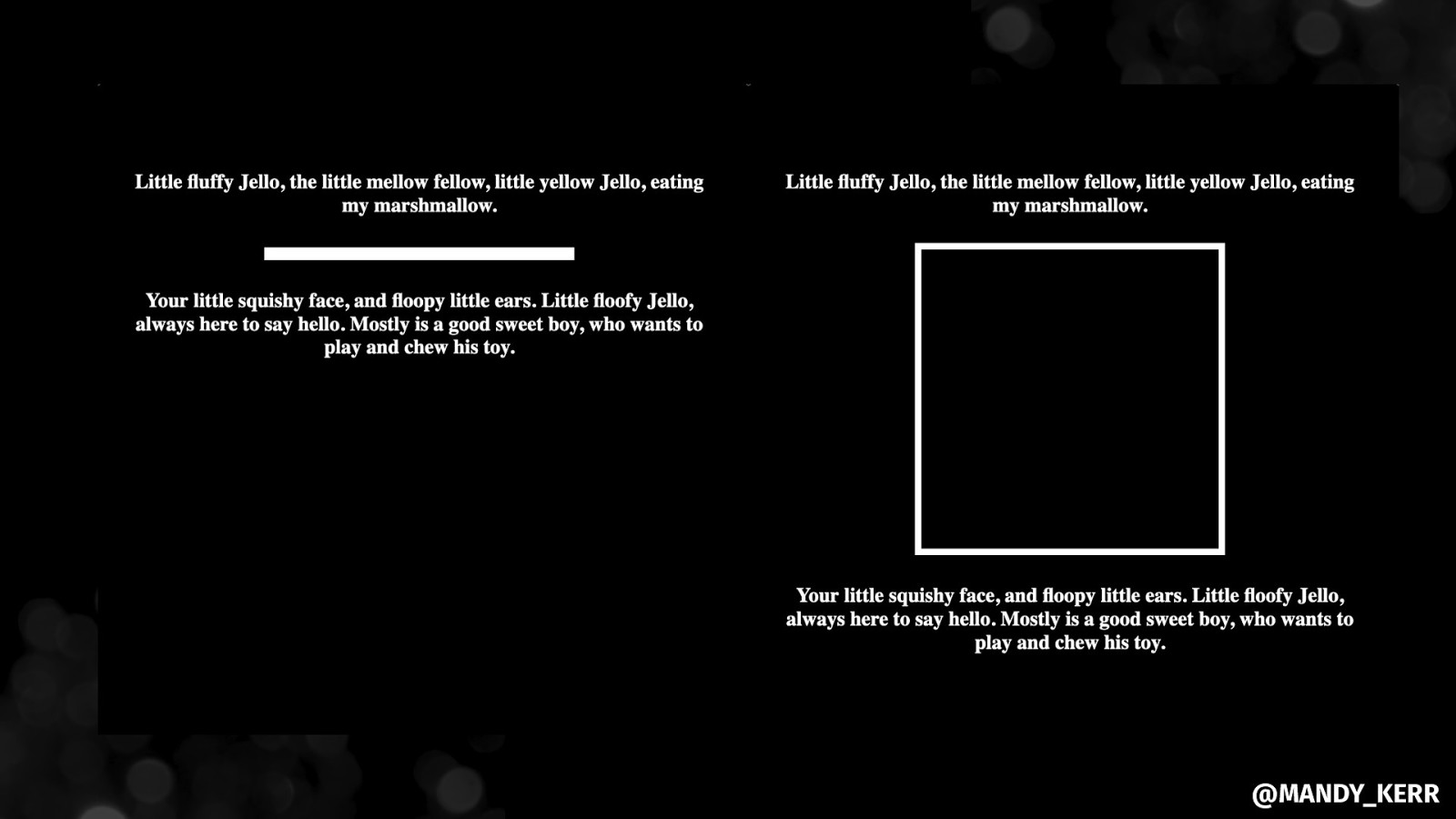
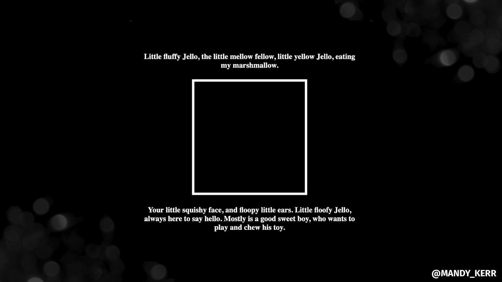
Making PERFORMANT IMAGES @MANDY_KERR
@MANDY_KERR
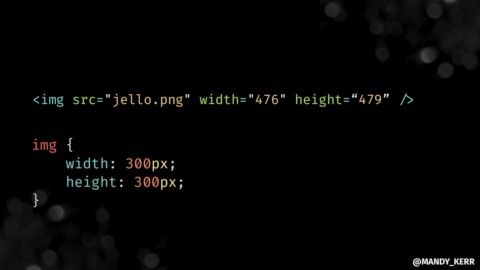
<img src=”jello.png” width=”476” height=“479” “/> img { width: 300px; height: 300px; } @MANDY_KERR
@MANDY_KERR
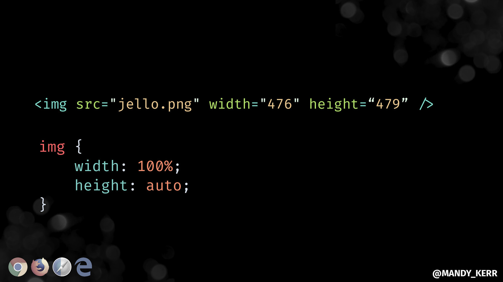
<img src=”jello.png” width=”476” height=“479” “/> img { width: 100%; height: auto; } @MANDY_KERR
@MANDY_KERR
@MANDY_KERR
Aside.. STICKING THINGS @MANDY_KERR
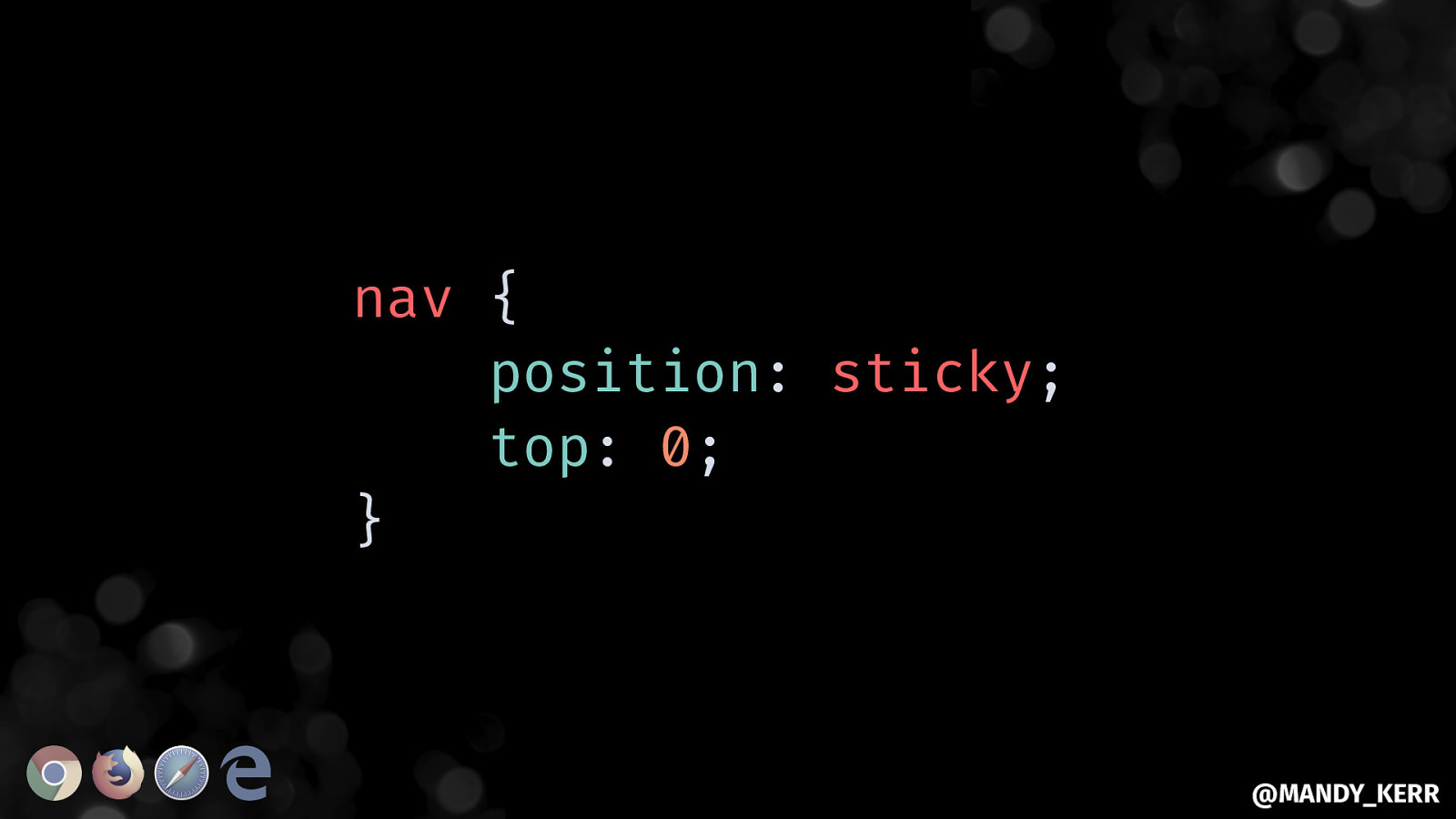
nav { position: sticky; top: 0; } @MANDY_KERR
@MANDY_KERR
@MANDY_KERR
@MANDY_KERR
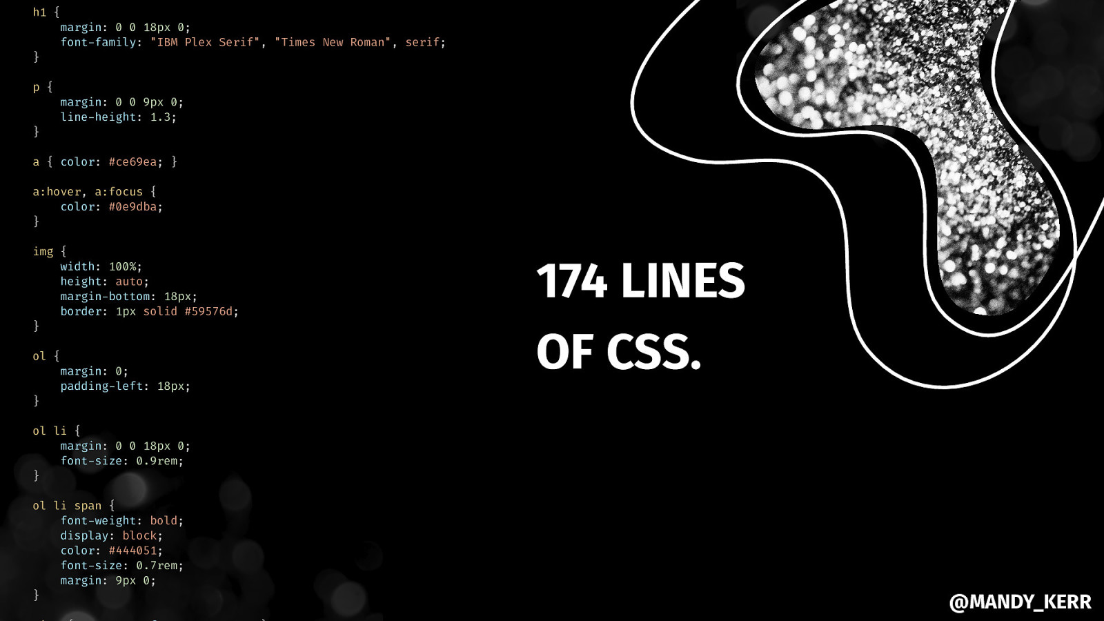
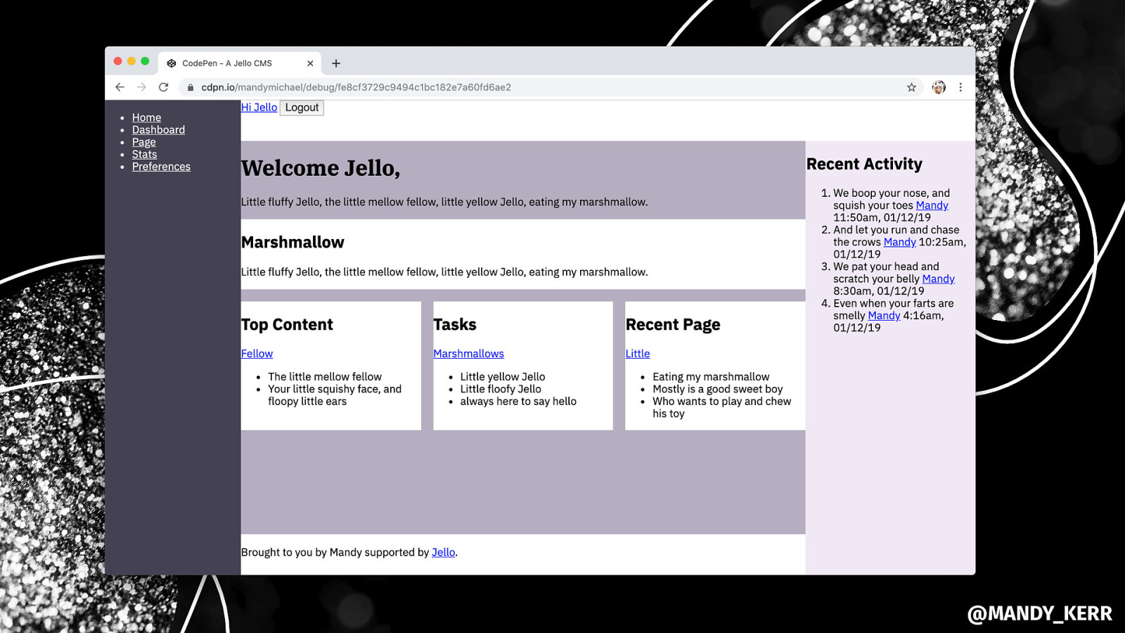
h1 { } margin: 0 0 18px 0; font-family: “IBM Plex Serif”, “Times New Roman”, serif; p { } margin: 0 0 9px 0; line-height: 1.3; a { color: #ce69ea; } a:hover, a:focus { color: #0e9dba; } img { width: 100%; height: auto; margin-bottom: 18px; border: 1px solid #59576d; } ol { } margin: 0; padding-left: 18px; 174 LINES OF CSS. ol li { margin: 0 0 18px 0; font-size: 0.9rem; } ol li span { font-weight: bold; display: block; color: #444051; font-size: 0.7rem; margin: 9px 0; } @MANDY_KERR
@MANDY_KERR
@MANDY_KERR
@MANDY_KERR
START WITH A STRONG FOUNDATION& BUILD UPON IT. @MANDY_KERR
THANK YOU MDN developer.mozilla.org/docs/Web Every Layout every-layout.dev Grid by Example gridbyexample.com CSS Tricks Flexbox Guide css-tricks.com/snippets/css/a-guide-to-flexbox CSS Tricks Grid Guide css-tricks.com/snippets/css/complete-guide-grid adognamedjello @MANDY_KERR