Decoding the Impact
Accessibility Overlays through a Scientific Lens
A presentation at #a11yTO Conf 2024 in October 2024 in Toronto, ON, Canada by Daniela Kubesch
Accessibility Overlays through a Scientific Lens
Today I am here to speak about a topic that’s equally uncomfortable as bringing up politics at the dinner table of a family gathering.
✨Accessibility Overlays ✨

Or as others like to call it, the digital equivalent of putting a band-aid on a broken bone.
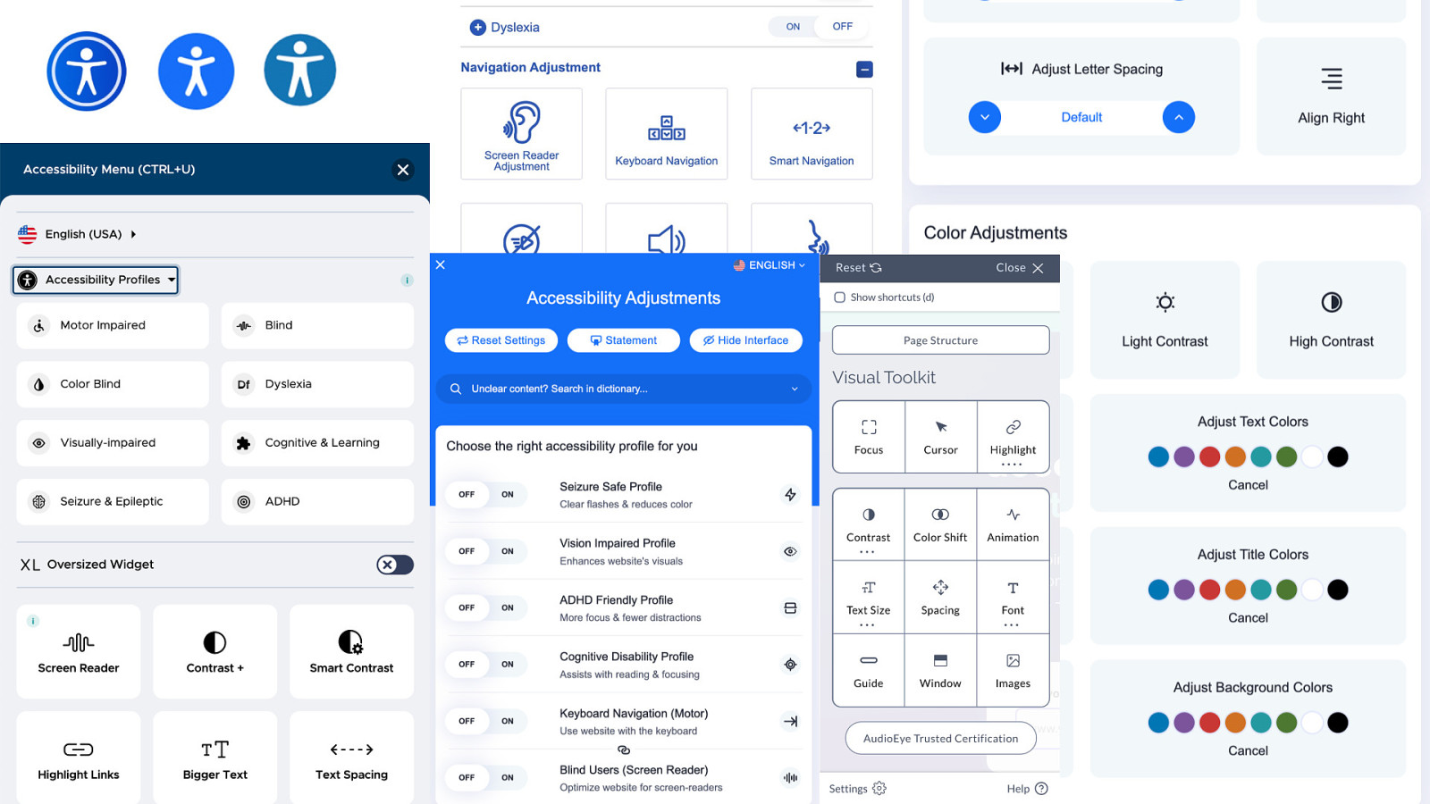
An accessibility overlay is a special software that has the goal of making a website more accessible for people with impairments. They usually have a starting price of about 50$/month and can be added to a website by the website owner with just one line of JavaScript.
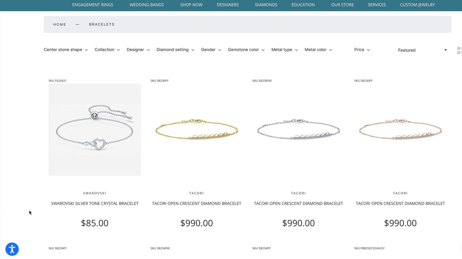
Once it is installed, typically a floating action button appears somewhere on the website. With this button, users can access several functions, typically presented as a toolbar or widget. It allows users to customise their browsing experience by offering various adjustments, such as changes to font size, colour contrast, and text-to-speech functionalities via a button click. Some accessibility overlays also use AI to identify and automatically correct accessibility errors in website code.
So, in theory, this sounds very good. Also, the market for these tools is growing, overlay companies receive a lot of funding and overlays are implemented on more websites every day.
It seems like Accessibility Overlays are simply amazing!
But are they really?
Or are they a disability dongle, meaning “an outcome in which designs or technologies ‘for’ people with impairments garner mainstream attention and praise despite valid concerns people with impairments have about them”?

So I thought:
Okay, I have to write a scientific thesis for my master degrees. Why not dedicate 2 years of my life to researching accessibility overlays! That sounds fun! And that’s exactly what I did.
So let’s decode the impact and look at accessibility overlays through a scientific lens!
My name is Daniela Kubesch and my pronouns are she/her. I am an Accessibility Engineer who is passionate about user experience and inclusive design. In my day-to-day live I do things like coding, testing, UX design and teaching. I studied Web Engineering in Austria and Digital Service Innovation in Sweden. During my studies I created a11yphant.com, the easy way to learn web accessibility for web developers.
Let’s start with a few details about my study to give you some more context.
I selected and purchased different accessibility overlays and added them to a clone of an inaccessible public website.
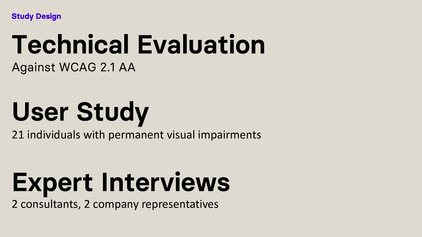
I then performed a Technical Evaluation against the WCAG 2.1 AA standard, consisting of automated and manual accessibility testing. Sadly, I haven’t had CAAT.report for testing back then, which would have made things a lot easier.
Then I did a User Study assessing the usability and User Experience of 21 individuals with permanent visual impairments while interacting with websites that have Accessibility Overlays.
Lastly I did Expert Interviews to get some additional context.
In their current state, accessibility overlays do not deliver on their promises and are a disability dongle.

But!
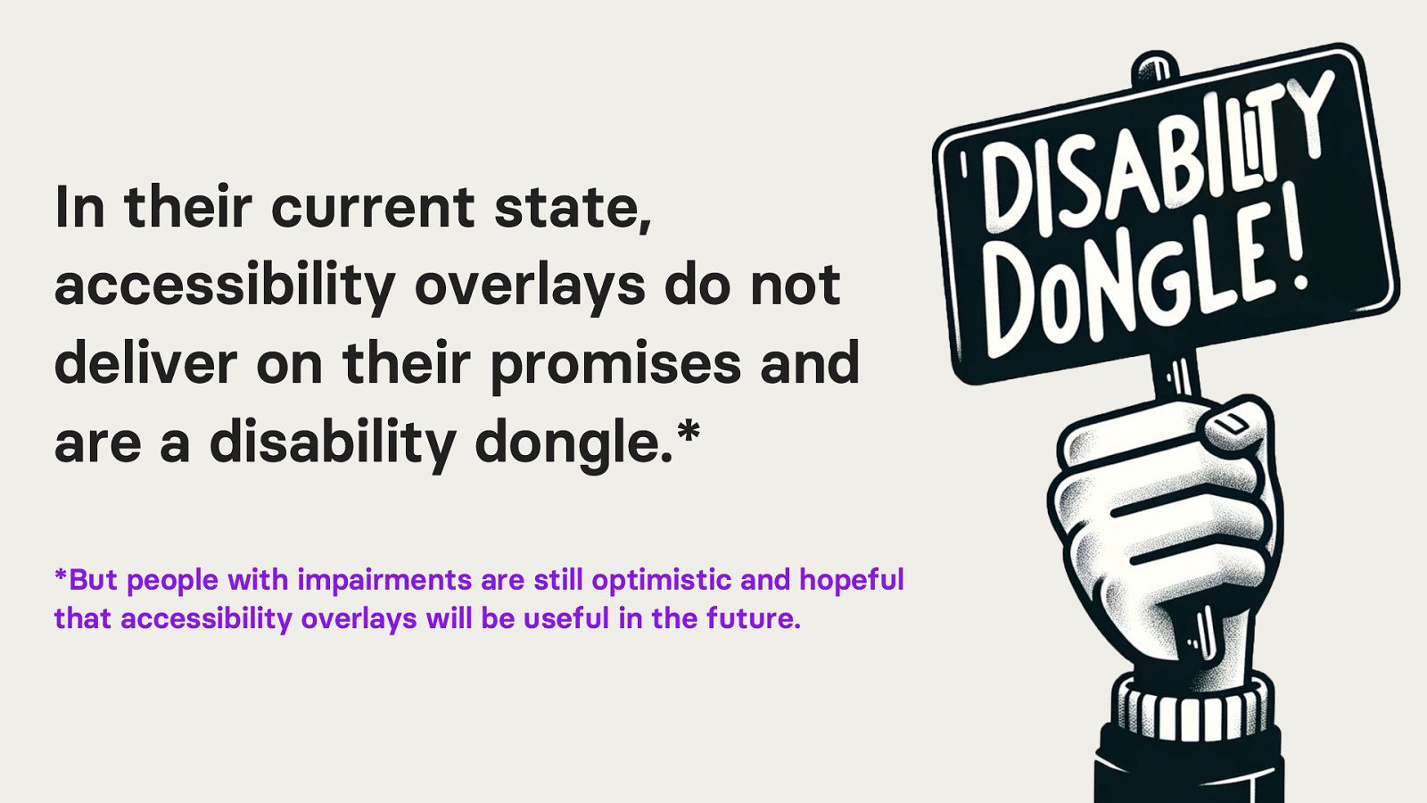
People with impairments are still optimistic and hopeful that accessibility overlays will be useful in the future.
So, I think we should discuss this topic. Talk about what worked and what didn’t. Accessibility Overlays are a reality, they are on websites, and I believe it is worth looking at where they currently fail, and how they could potentially be improved. Especially because people with impairments are so optimistic that overlays could be a solution, we should not scare away from the topic and continue having discussions about them.

If you take one thing away from this talk today, besides accessibility overlays being a disability dongle, I want it to be three guiding principles resulting from my research. I think that these principles are important to move forward with the whole discussion around accessibility overlays.
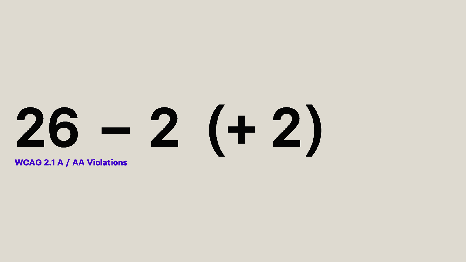
The technical evaluation showed that the selected inaccessible public website website has 26 WCAG 2.1 Level A or AA violations.
Then, I added the different selected Accessibility Overlays and repeated the test. I have to say, that during testing, the button for activating the accessibility overlay was not used. The technical evaluation only analysed automatically applied changes by each overlay, that required no action from a user. I was curious about these automate changes as the overlay companies are not very transparent about what exactly is changing.
So, adding the overlays, fixed WCAG violations. Specifically speaking, it made 2 success criteria pass.
However, one of the tested overlays, introduced new errors due to the extensive use of ARIA, making 2 other success criteria fail, leaving us with either 24 or 26 remaining violations.
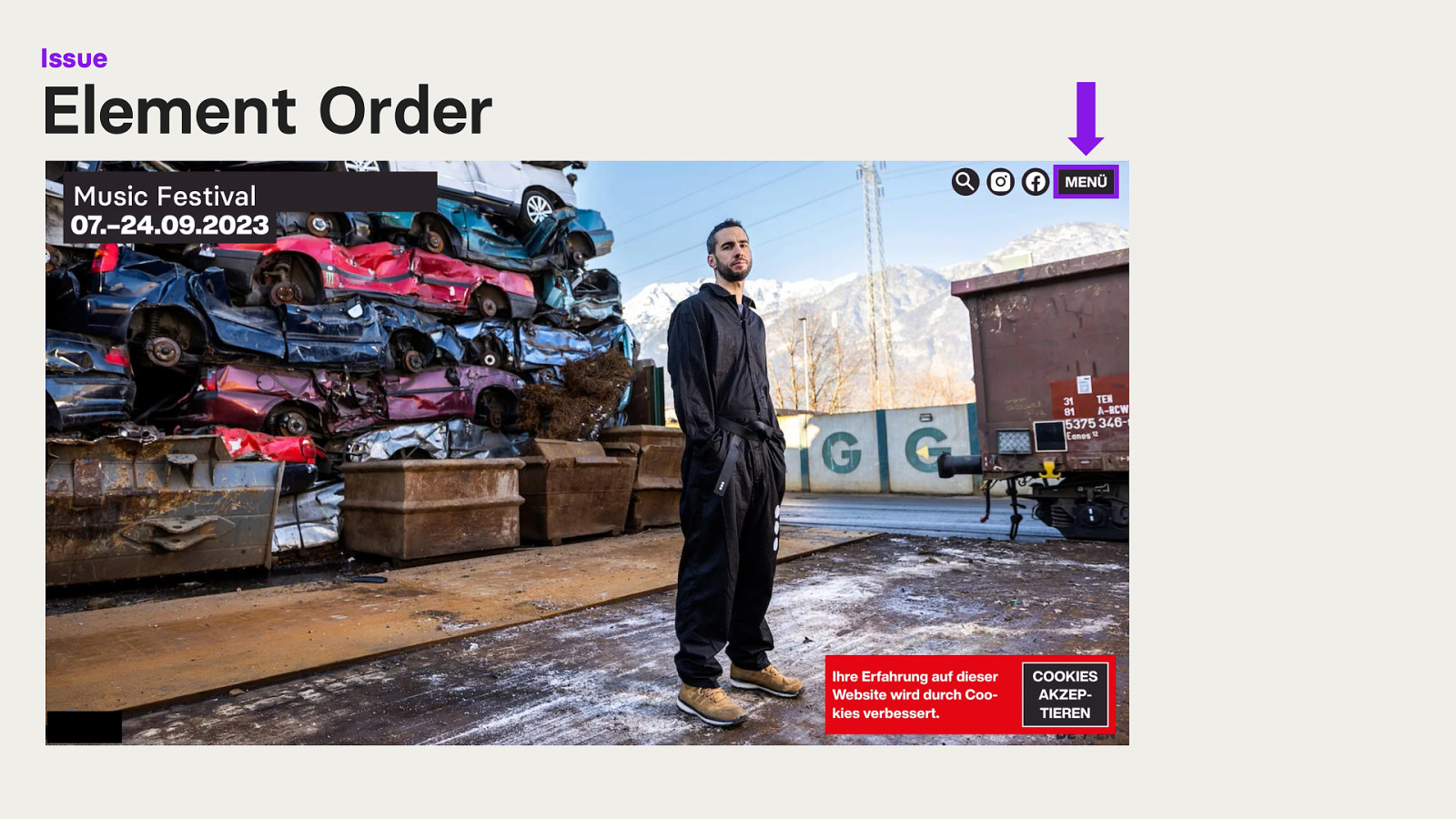
Here we have the public inaccessible website I used for my research. It is a website of a music festival. I have blacked out the name as it is not relevant. Also, please ignore that the website is in German, I will translate everything necessary. Because my study was set in the DACH region, the study was performed in German.
So the part of the website displayed here in the screenshot is the homepage. We have a full-screen image slider as the background. In the top left corner is the name of the festival and the date it takes place. In the top right corner are some interactive elements, like a search, social media links and a menu button. In the bottom right corner is a cookie banner.
Let’s look at the first issue: Element Order If a user navigates to the menu button and clicks on it to access the navigation it slides in from the right side of the screen.
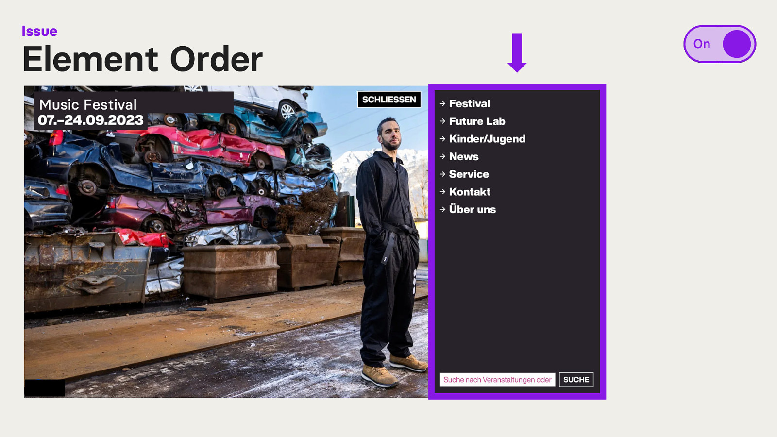
However, users navigating with access technology such as a screen reader, cannot view the menu contents directly. Instead, they must navigate to the bottom of the page as the navigation appears after all website content. The DOM order does not match the visual order.
What happens if we turn the overlay on?
Not much. One of the overlays shifts and traps the focus within the menu when navigating with a keyboard. However, navigating with a screen reader sometimes results in unexpected focus shifts as the menu is treated as pop-up that will be automatically closed after a few seconds.
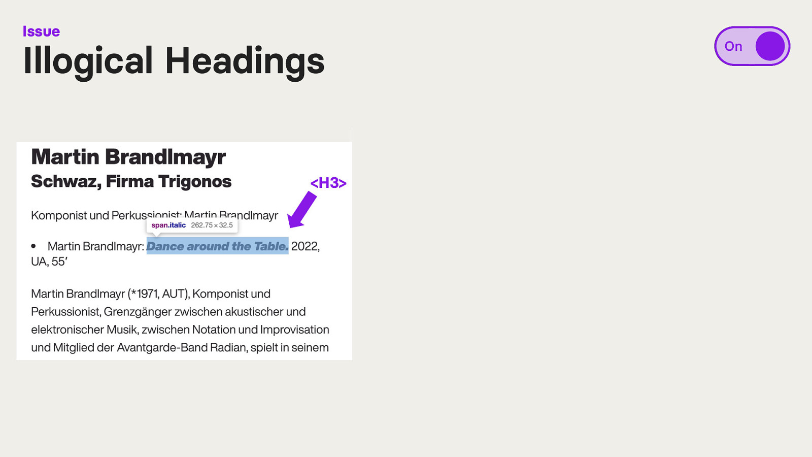
Here we have a paragraph of text, in German. A sentence within this paragraph is styled as bold text with CSS.
When we look at the code, we see that the overlay has turned this bold sentence into a heading, with heading level 3 (<h3>).
This heading now interrupts the sentence flow within the paragraph.
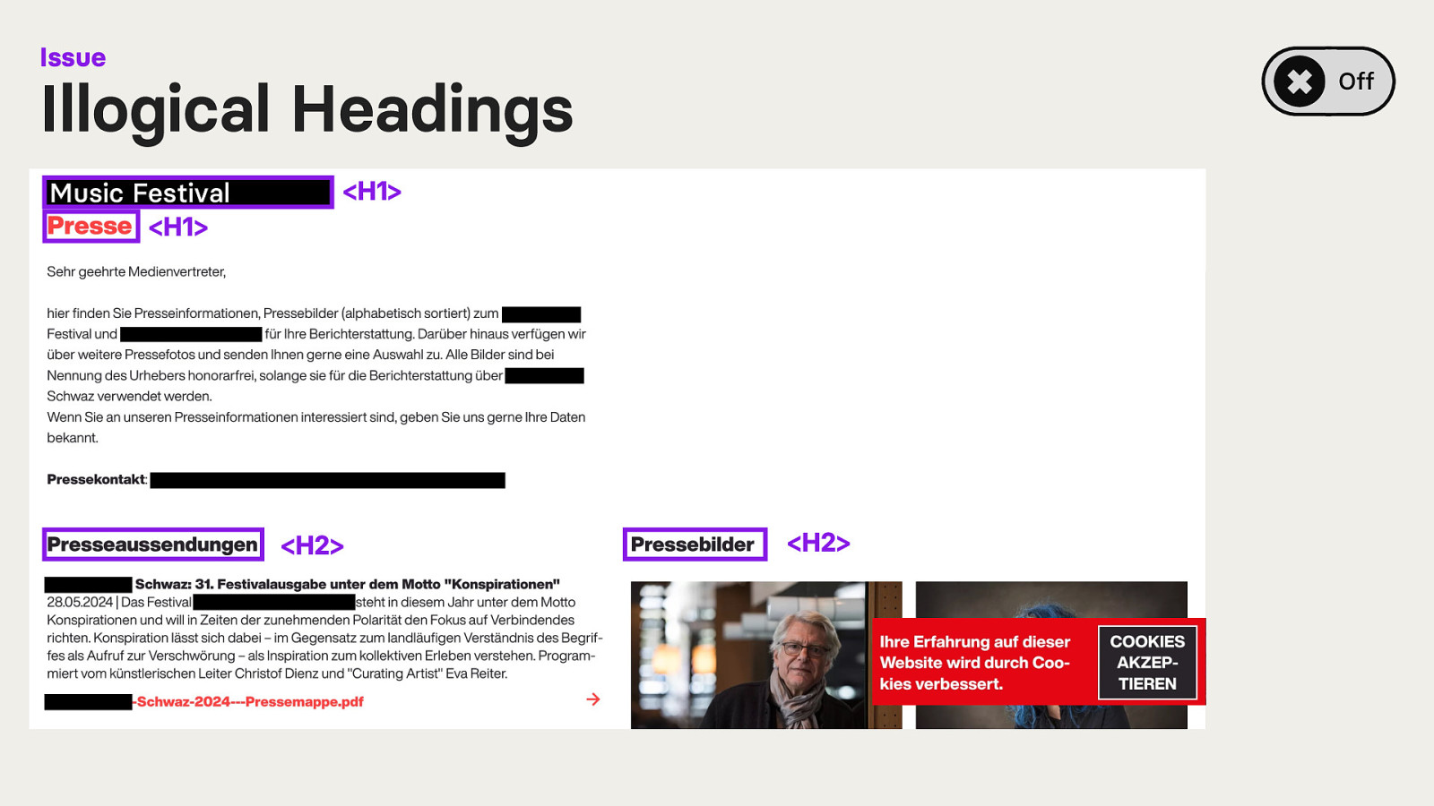
Here is another example. Let’s look ad heading structure. The accessibility overlay is currently switched off.
The screenshot shows the press page of the website. It starts with the name of the music festival (<H1>) and the heading for “Pres” (<H1>).
Following is a paragraph of text and to more headings. One for press releases (<H2>) and one for press images (<H2>).
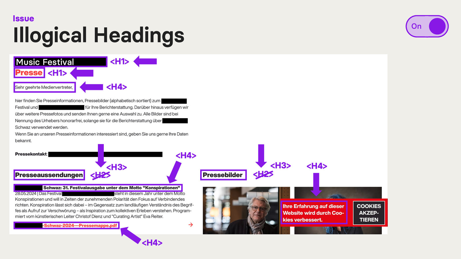
If we turn the accessibility overlay on and take another look at the heading structure we see some changes.
The first to headings are still headings of level 1 (<H1>). However, the first sentence of the following paragraph was turned into a heading level 4 (<H4>).
The two previously headings of level 2 are now headings of level 3 (<H3>). Additionally, a sentence in bold text in one of the paragraphs was turned into a heading level 4 (<H4>), as well as the links to download the PDFs (now <H4>) and the text within the cookie banner (now a <H4>).
What is happening here?
The accessibility overlay creates headings from HTML elements that should not have been used as such. In addition, it skips heading levels.
The overlay’s decision lacks logical sense and is potentially confusing for users.
“Just because it looks like many elements have now been made accessible doesn’t mean it’s optimal. If I have one thousand headings, it doesn’t really help me to get an overview.” – Participant T5
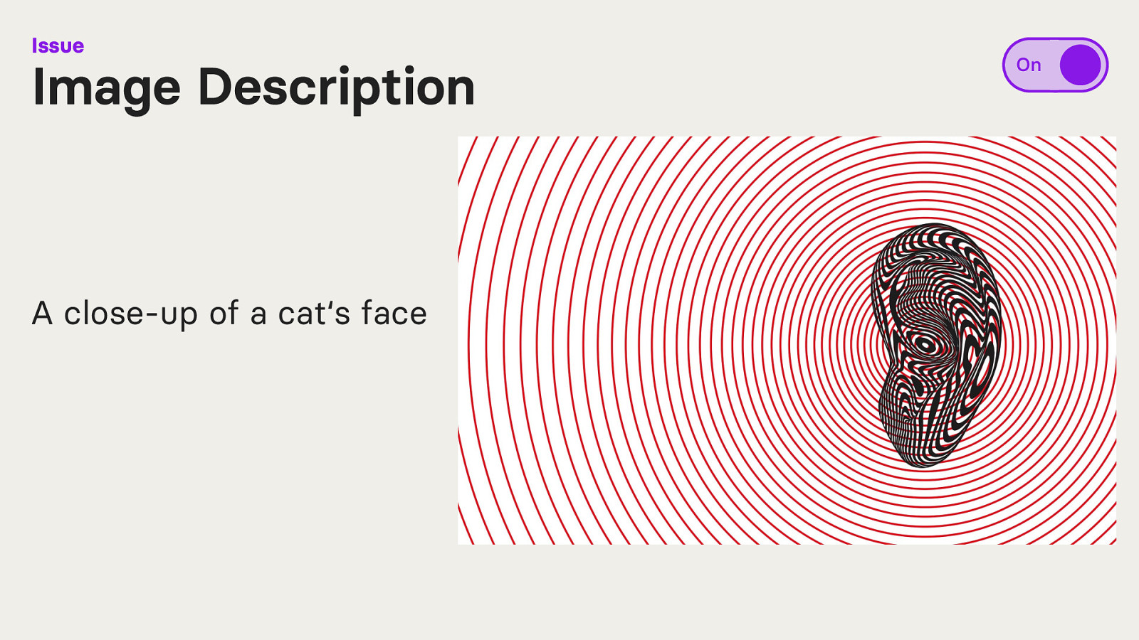
Let’s look at some automatically generated alternative texts.
the accessibility overlay created the alternative text of “A close-up of a cat‘s face”.
However, the picture is actually showing a close-up of a black-and-white illustration of a human ear, surrounded by red circles indicating sound waves.
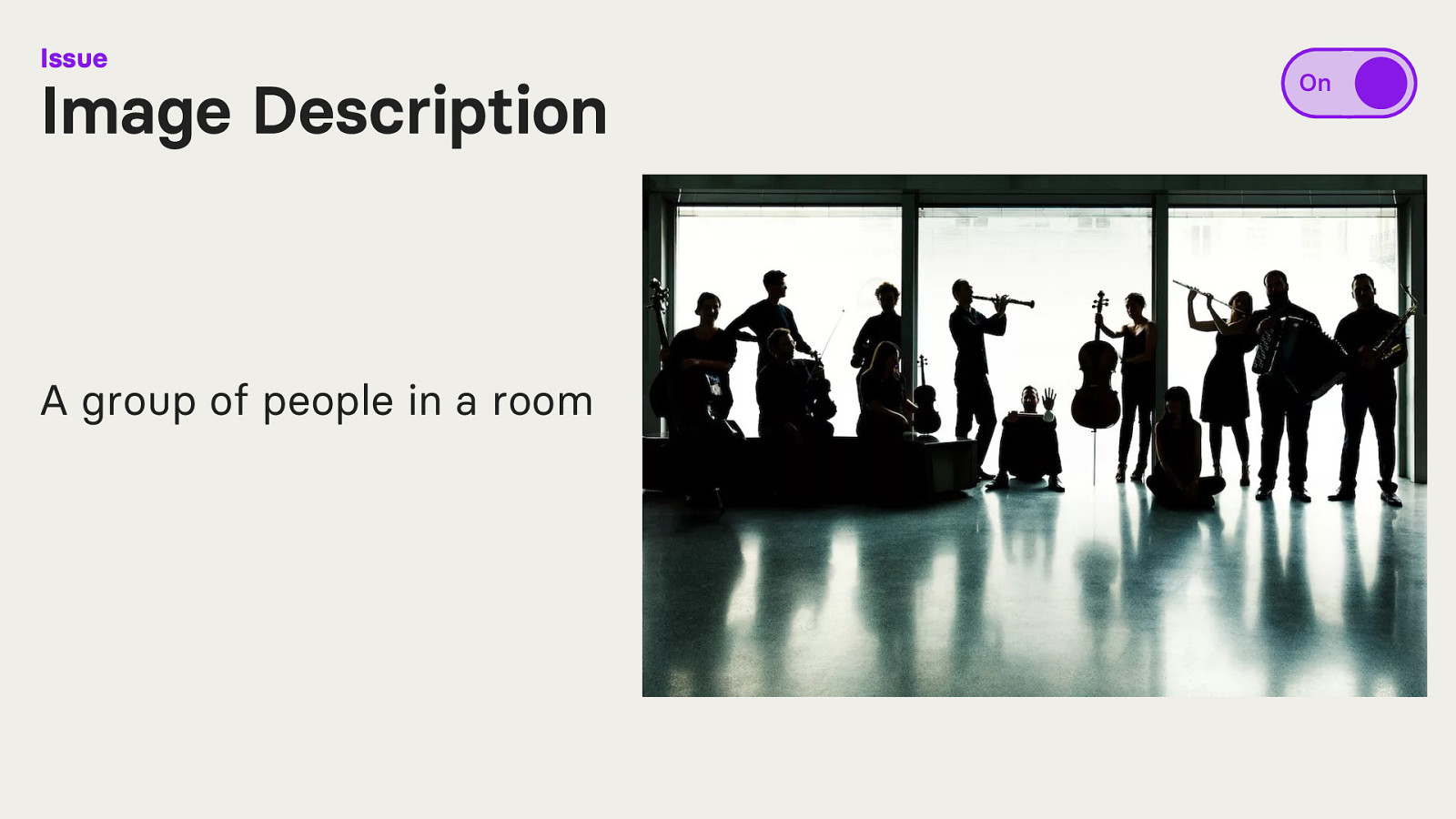
Another example. The overlay generated the alternative text of “A group of people in a room”.
While the picture actually shows people in a room, the overlay did not mention that every person in the picture is holding an instrument.
What about improvements?! Are there things accessibility overlays can fix?
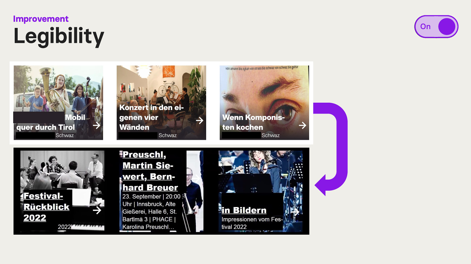
The selected website has a component consisting of an image overlaid with text. The text was not legible to some participants due to contrast issues.
After activating the accessibility overlay, a black background colour was added behind the text. With this increased contrast, text was legible.
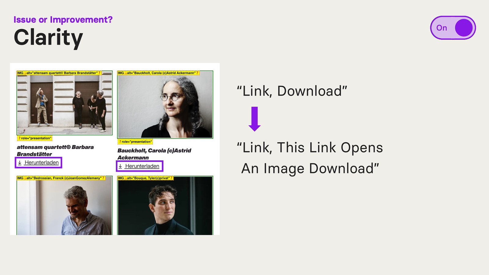
On the press page, users can download press images. The link to download the image is announced to screen reader users as “Link, Download”.
After activating the accessibility overlay, “Link, This Link Opens An Image Download” is announced.
Some users perceived this as an improvement, as it was apparent to them what the link is doing. Others, however, found it annoying that the screen reader now reads a longer text. This example further highlights how different the needs and experiences of users can be.
In accessibility, it is difficult to serve the need of all users. We often have to decide which groups we prioritise.
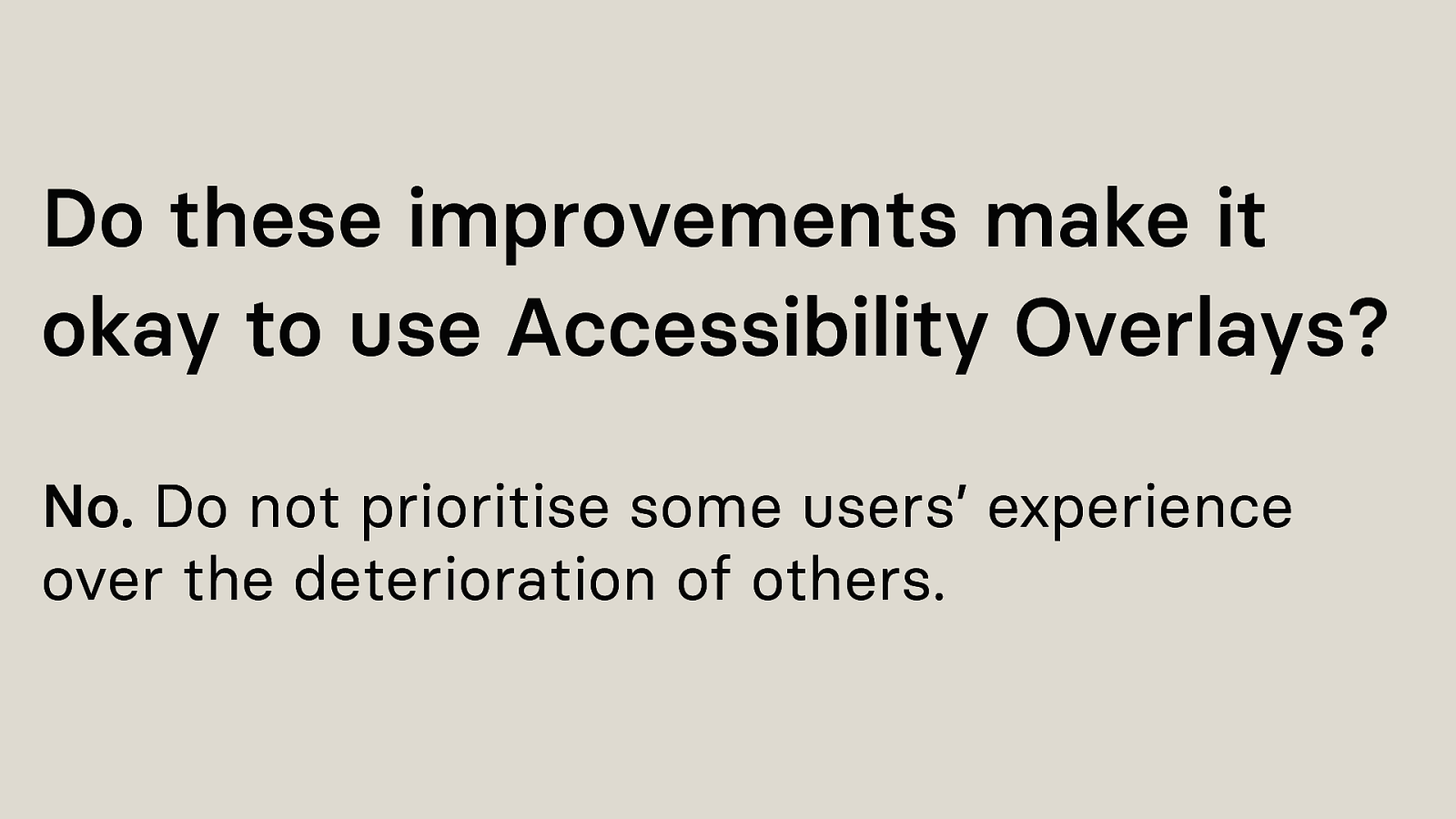
But should we, in this case, prioritise these users’, who had a better experience with an accessibility overlay?
I’d say no, because accessibility overlays introduced issues to other users, that wouldn’t have been there without an overlay. Do not prioritise some users’ experience over the deterioration of others.
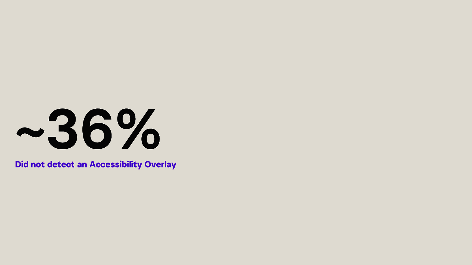
36% of the study participants did not detect any of the accessibility overlays.
This is suboptimal. Accessibility overlays can’t be used if you do not recognise them as such. Creating the question of why are they on a website then?
I could identify multiple reasons why participants had troubles here.
One, for example, being that an overlay announced to screen reader users: “Use this website in a screen reader mode”, when they opened the website. The problem here was the language. Although the accessibility overlay and website were in German, the text announced was in English.
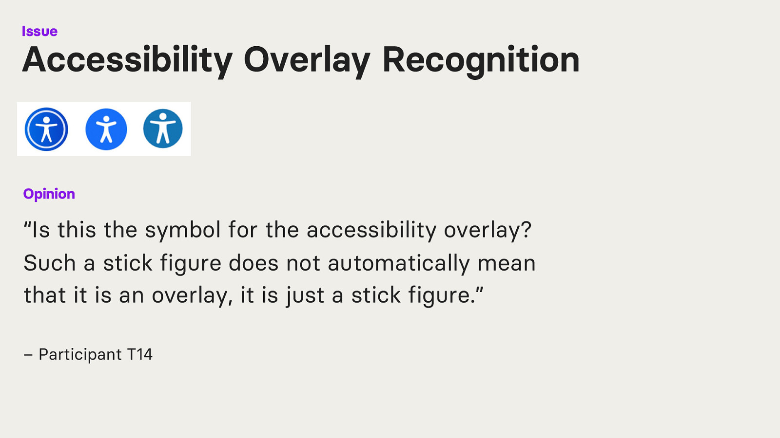
A participant with reduced vision, who did not use a screen reader and was not blind, recognised a button with a stick figure in the lower left corner of the screen. Nonetheless, they did not comprehend its function.
“Is this the symbol for the accessibility overlay? Such a stick figure does not automatically mean that it is an overlay, it is just a stick figure.” – Participant T14
Other participants also said that they just don’t know how to identify an accessibility overlay because they don’t have the experience to recognise it.
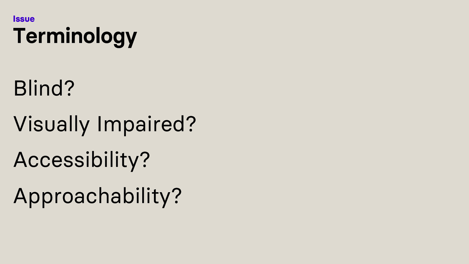
There is confusion regarding the terminology used.
What is the difference between blind and visually impaired? And what is the difference between accessibility and approachability?
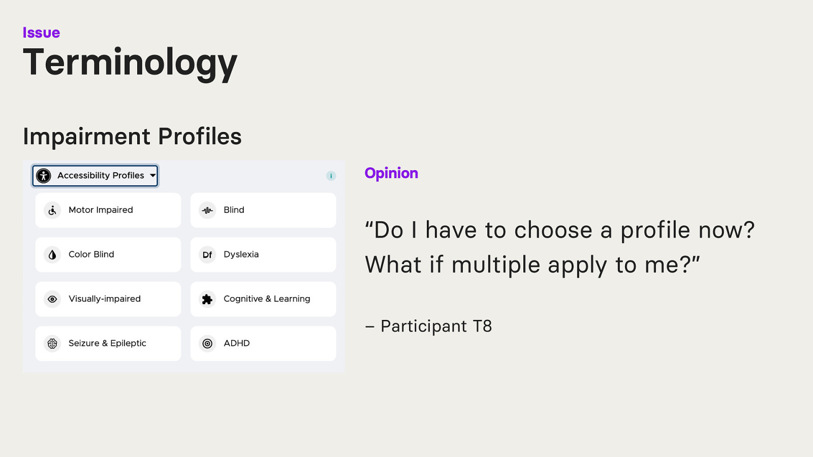
Some of the tested accessibility overlays had impairment profiles. These profiles are a kind of shortcut-button that activate several functionalities within the overlay at once.
One Participant was confused as to why impairment profiles exist.
“Do I have to choose a profile now? What if multiple apply to me?” – Participant T8
Furthermore, some participants were unsure if they should click, for example, “blind” or “visually impaired”. They were unsure about the terminology used.
However, accessibility overlay companies are not the only ones who use inconsistent terminology. If you look at research, terminology used to describe visual impairments varies across regions, cultures, and research disciplines. Also, it is challenging to establish a neutral terminology that is universally accepted.
Unsurprising this is also the case for study participants, as each individual may have a unique interpretation of visual impairment.
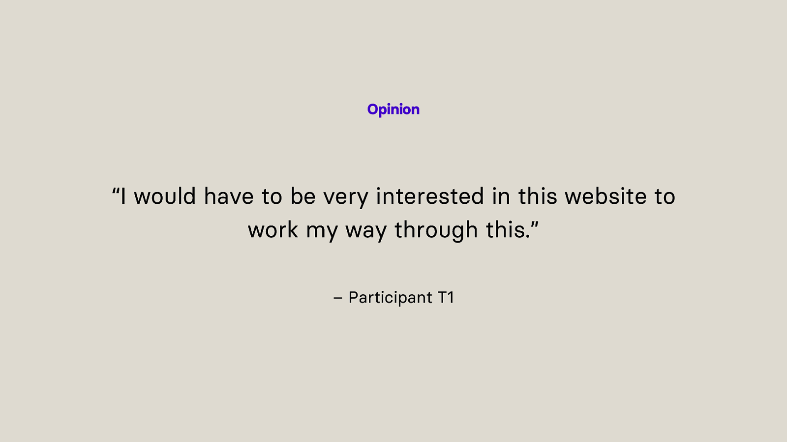
All the different impairment profiles, all the buttons for individual adjustments on the website and the different structure of each accessibility overlay were overwhelming for most people.
“I would have to be very interested in this website to work my way through this.” – Participant T1
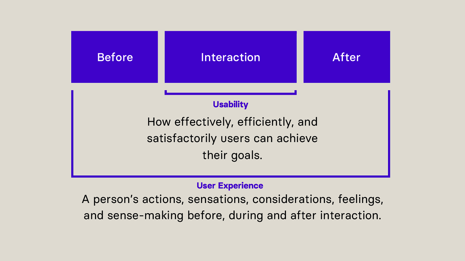
But let’s take a look at how usable accessibility overlays actually were and what experience people had.
Usability describes how effectively, efficiently, and satisfactorily users can achieve their goals.
User Experience describes a person’s actions, sensations, considerations, feelings, and sense-making before, during and after interaction.
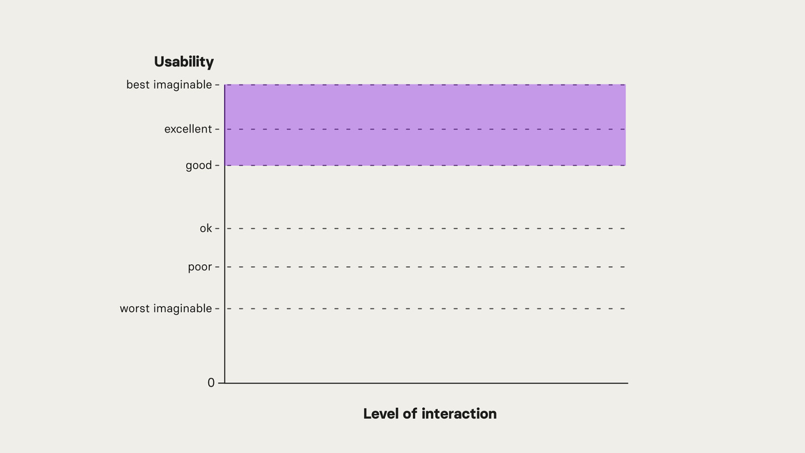
Usability can be measured with specific questionnaires and the results can be visualised on a scale. The scale goes from the best imaginable, to below worst imaginable.
We want to be in the area between the best imaginable and good. When a website scores there, its usability is acceptable.
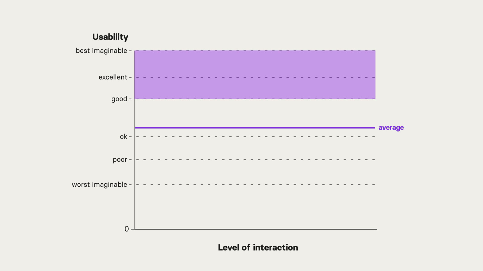
The average over all tested websites during the study has a below good and above okay usability.
Let’s have a closer look at how the average comes together.
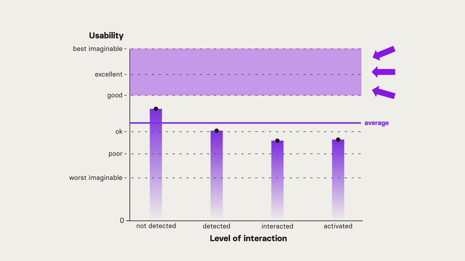
The average is calculated from 4 different levels of interaction on the same website: Not detected, detected, interacted, activated.
Users who never detected any of the accessibility overlays during the study had the best and above average usability. With every other level of interaction, the usability continues to decrease.
It is also important to note, that the overall on average usability was not in the desired acceptable area.
When it comes to user experience the deterioration is similar.
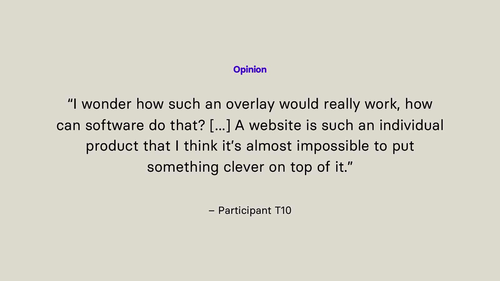
“I wonder how such an overlay would really work, how can software do that? […] A website is such an individual product that I think it’s almost impossible to put something clever on top of it.” – Participant T10
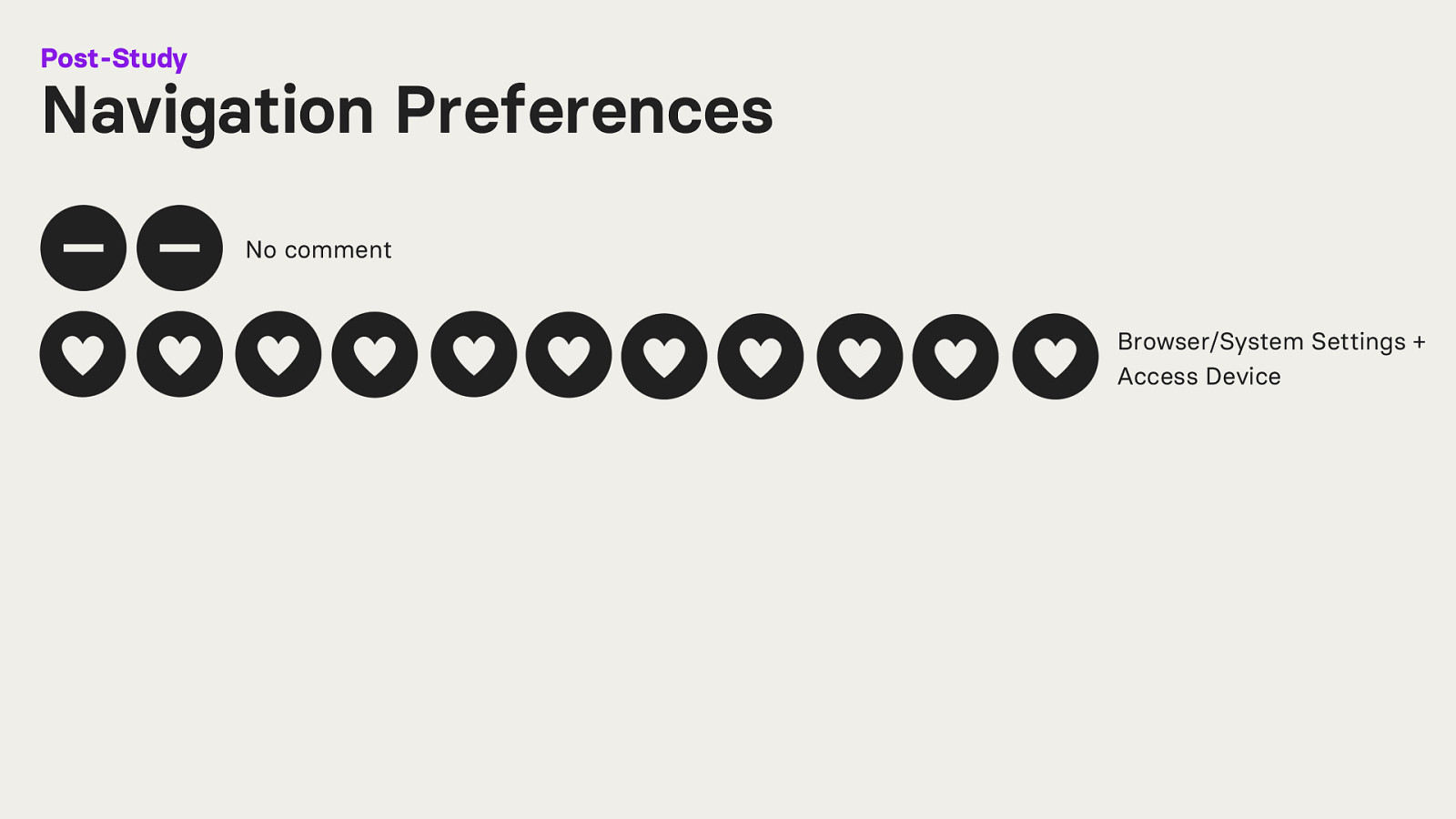
After the study, participants were asked on their navigation preferences for the future.
Two participants said “No comment”.
Eleven participants stated that they want to continue using their Browser/System Settings and their Access Device.
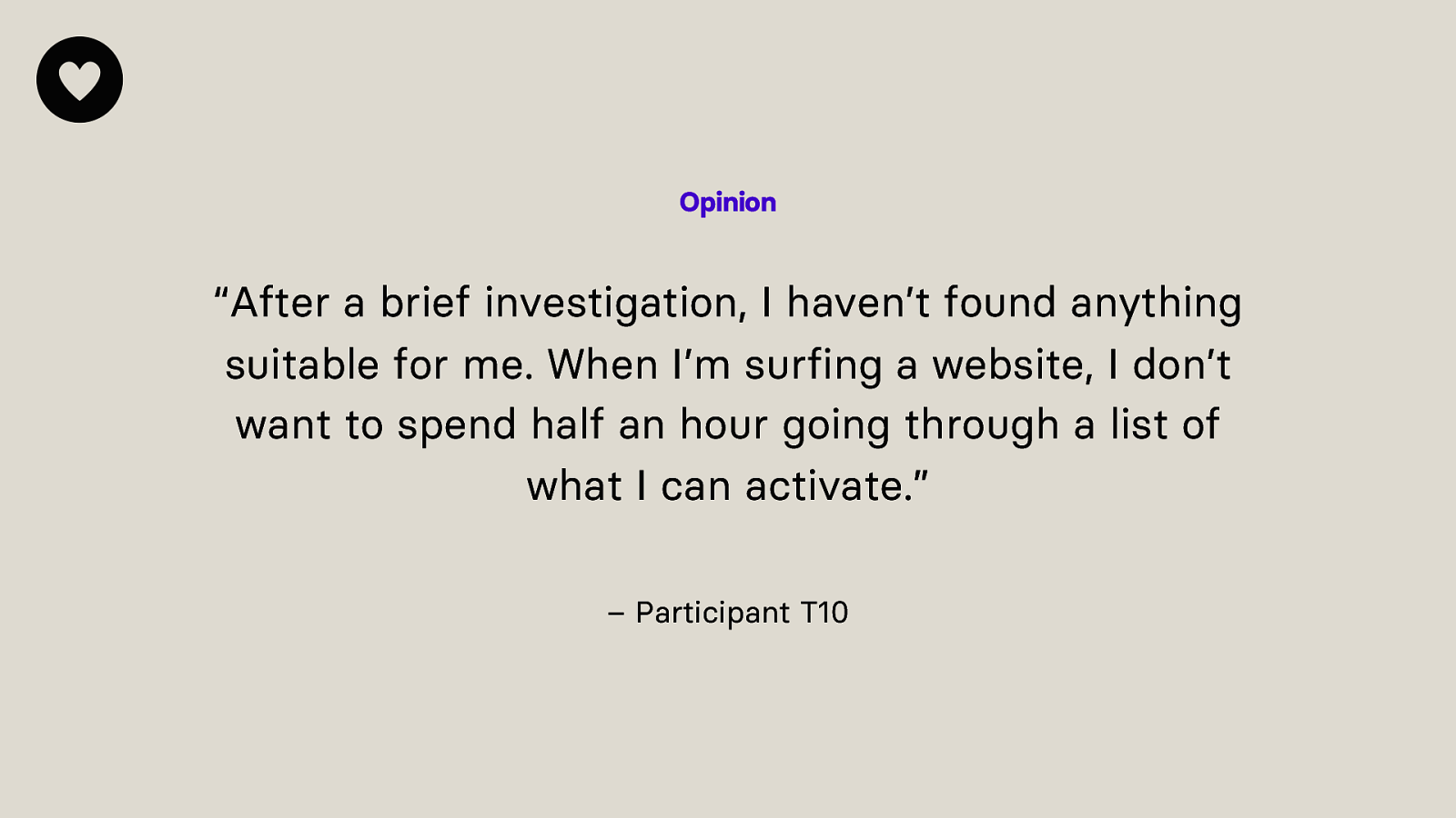
“After a brief investigation, I haven’t found anything suitable for me. When I’m surfing a website, I don’t want to spend half an hour going through a list of what I can activate.” – Participant T10
“Personally, I prefer to use system and browser options because then it is simply a global setting and does not have to be readjusted from website to website.” – Participant T11
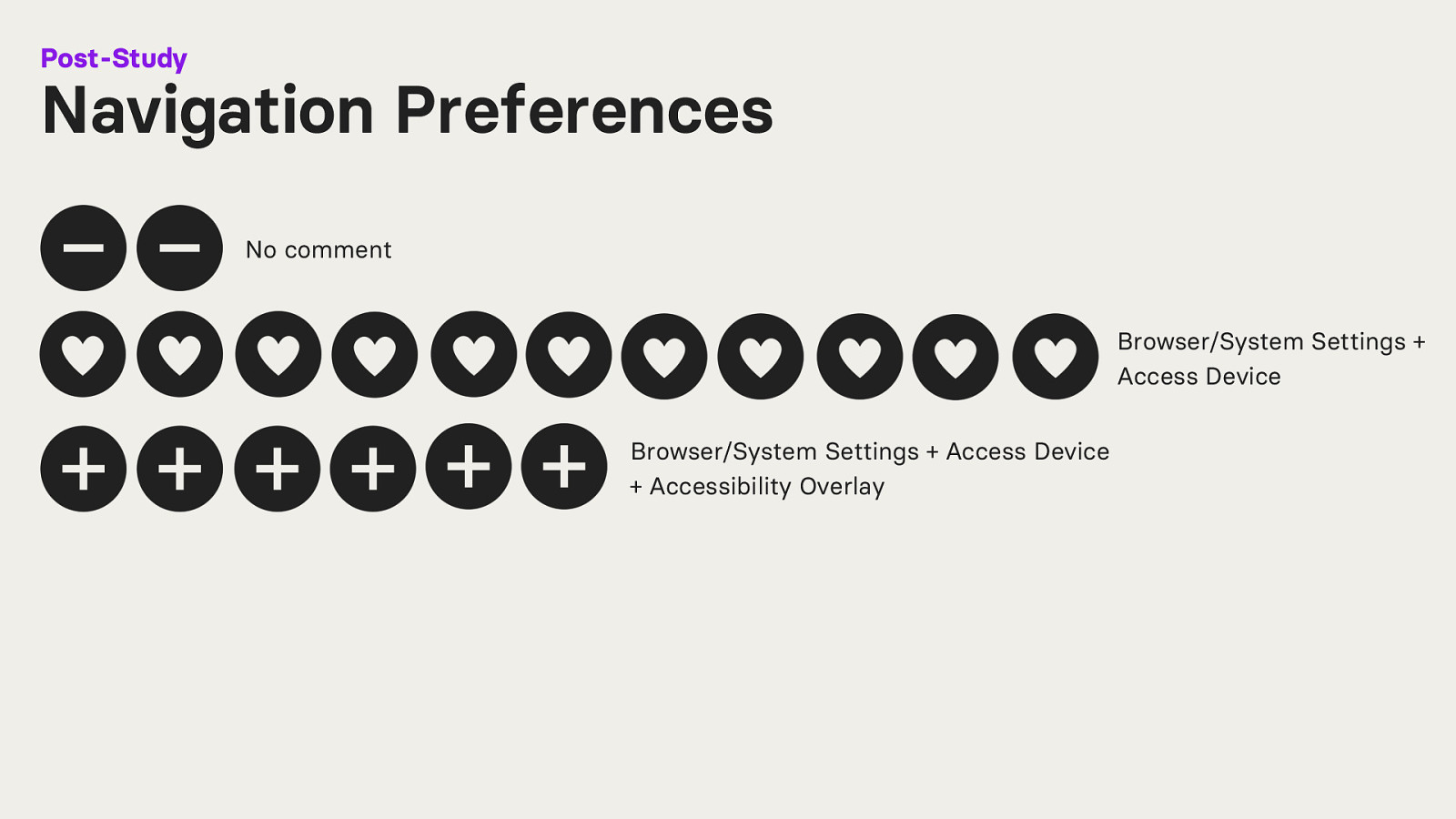
Six participants stated that they want to navigate using their Browser/System Settings, Access Device and an Accessibility Overlay.
“I have set my accessibility settings so that it works for me. But when navigating websites, I sometimes change these settings or use accessibility overlays because then I don’t have to change my system settings again when I go to another website.” – Participant T21
“For example, if I’m in a hotel on someone else’s computer, I can imagine using the accessibility overlay […] but I think I’ll fail because not everything is so intuitive. However, it’s probably better than nothing. But I don’t see any point in using it on my computer now.” – Participant T4
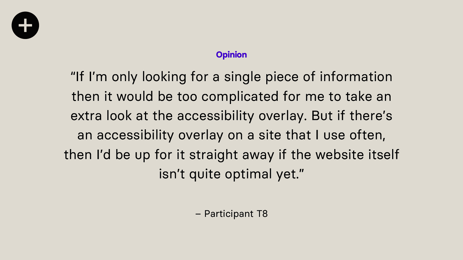
“If I’m only looking for a single piece of information then it would be too complicated for me to take an extra look at the accessibility overlay. But if there’s an accessibility overlay on a site that I use often, then I’d be up for it straight away if the website itself isn’t quite optimal yet.” – Participant T8
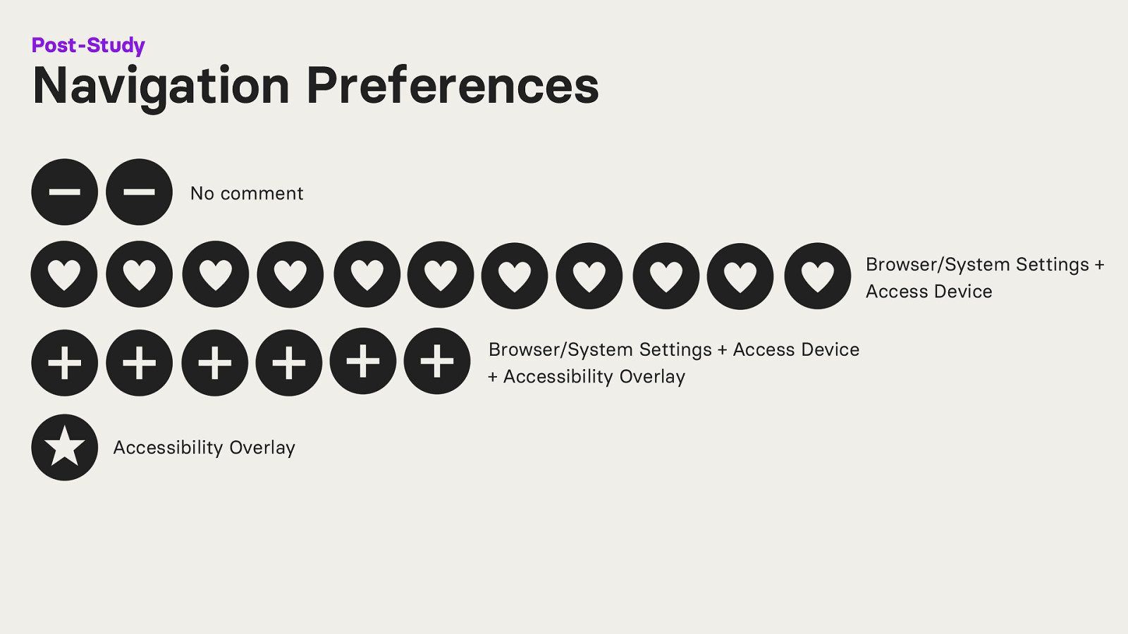
One participant stated, that from now on, they only want to navigate using an accessibility overlay.
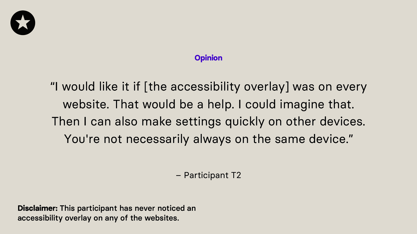
“I would like it if [the accessibility overlay] was on every website. That would be a help. I could imagine that. Then I can also make settings quickly on other devices. You’re not necessarily always on the same device.” – Participant T2
Disclaimer: This participant has never noticed an accessibility overlay on any of the websites.
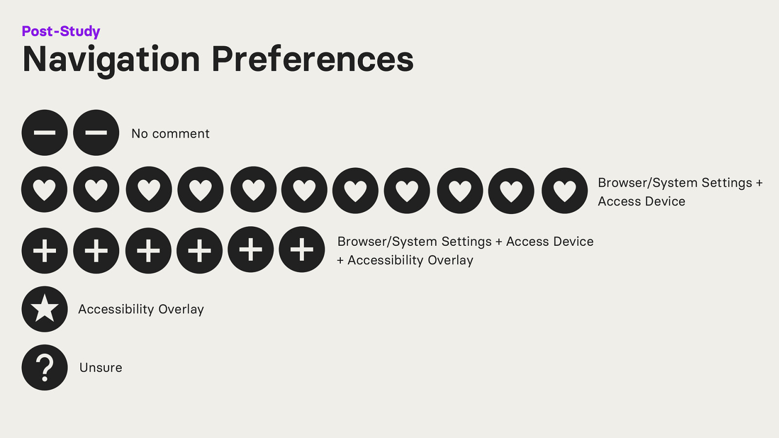
One participant was unsure about how they want to navigate in the future.
“It always depends on how much energy I have and what I have planned for the rest of the day. Sometimes it’s just too hard for me to click through and search, especially if every accessibility overlay is different. Then I’m also disappointed when I stumble across one that doesn’t work so well.” – Participant T14
Okay, what does all this information tell us?
We clearly have identified issues that can be attributed to insufficient incorporation of the people accessibility overlays are for. There is also room for improvement when it comes to usability and user experience and what this technology could do.
And here I am not saying that such technology, and even the incorporation of AI and machine learning cannot be used for accessibility. Automated solutions that use AI or not, can undoubtedly be used for accessibility in the future, but under the premise that the effort comes from within the community.
Individuals with impairments must be incorporated into the design, development, and decision process.
“Maybe I’m just not very experienced, but then [Accessibility Overlays] have to be so good that I can use them intuitively and don’t have to take an extra course to be able to use them.” – Participant T18

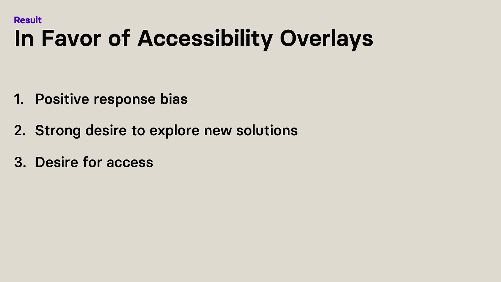
I could identify three things that can explain why participants were favouring accessibility overlays.
Positive response bias. Participants who volunteer for accessibility research studies, as they did for this research, may have a very positive attitude. Furthermore, in non-anonymous accessibility research studies participants provide more positive average ratings, especially when answering questions about a proposed innovation.
A strong desire to explore new solutions
A desire for access in a world where the majority of websites contain accessibility errors, disabling individuals with impairments and resulting in digital divide and inequality
Therefore, the observed contradicting behaviour may be due to a desire for access rather than the actual effectiveness of the accessibility overlay itself.

You are probably asking yourself “what can we do”? What needs to change to give people access.
Research suggests that part of the reason for the persistence of inaccessible websites, resulting in the desire for access and the favouring of the idea of accessibility overlays, lies in crucial gaps in the engagement between different discourses.
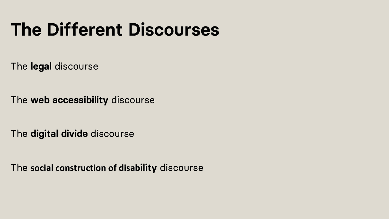
The Legal discourse refers to the legal regulations established worldwide to prevent discrimination against individuals with impairments.
The web accessibility discourse is centred around movements such as the World Wide Web Consortium (W3C), which establish accessibility standards.
The digital divide concept refers to the division between those who have access to information and communication technologies and those who do not.
The discourse on the social construction of disability is based on the Social Model Definition of Disability. The Social Model views disability as a socially constructed disadvantage that does not take people with impairments into account, excluding them from participating in mainstream social activities.
Technology can create disability by being designed in a way that excludes specific individuals from using it.
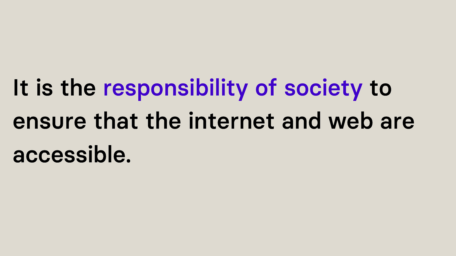
In essence, it is the responsibility of society as a whole to ensure that the internet and web are accessible, rather than placing the burden on individuals with impairments to obtain specialised technical aids or to navigate through poorly designed and frequently inaccessible websites.
Therefore, it could be argued that a poorly designed website may be considered as creating a disability.
So, these discourses exist, but do not really overlap.
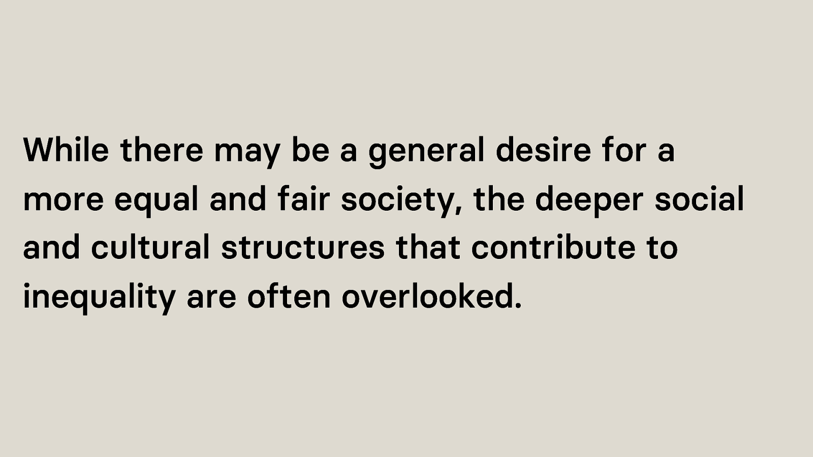
But the debate about accessibility overlays should not only focus on functionality or exist only in a vacuum. Engagement between different fields is necessary to reduce the persistence of inaccessible websites in the long run. Without a united voice from the complete spectrum of relevant discourses pressing for the active rights of people with impairments against constructed barriers to web accessibility, a relatively passive liberal approach prevails.
The issue with a liberal discourse is that while there may be a general desire for a more equal and fair society, the deeper social and cultural structures that contribute to inequality are often overlooked.
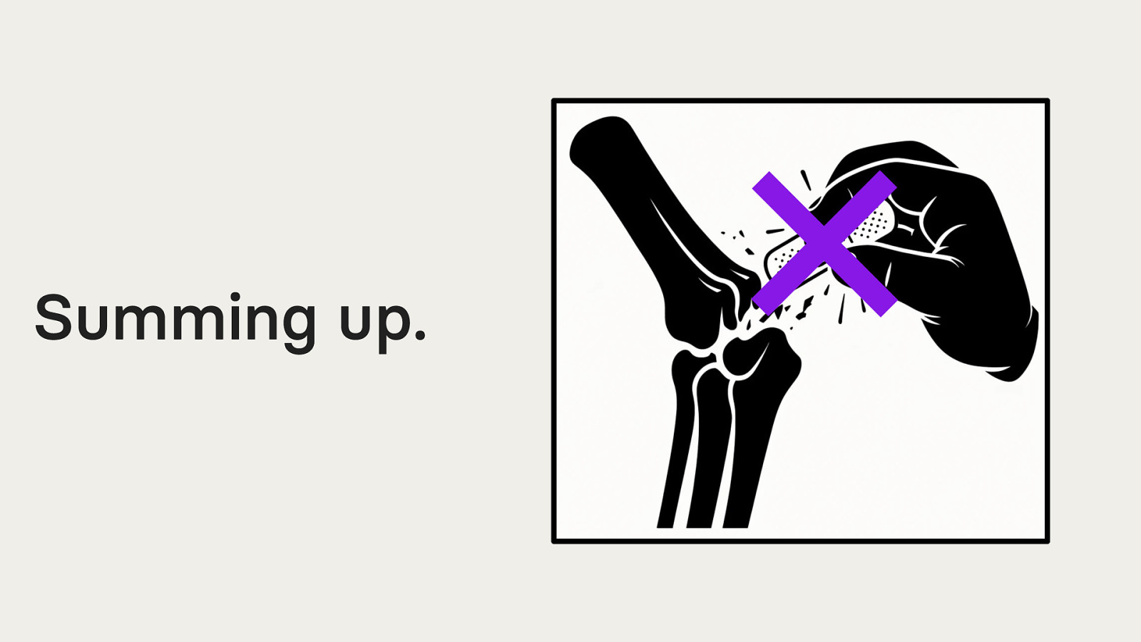
Do not use accessibility overlays in their current form.
A band-aid is not enough. Go to the hospital and get a proper plaster for your broken bone.
Do not prioritise some users’ experience over the deterioration of others. Accessibility Overlay companies must invest in research, remediate the identified issues while considering ethics and not prioritising the enhancement of some users’ experience over the deterioration of others.
Nothing about us, without us! Individuals with impairments must be incorporated into the development and design process to understand user needs, identify errors that go beyond the WCAG success criteria and create usable products.
The debate about Accessibility Overlays should not only exist in a vacuum. Engagement between different fields is necessary to reduce the persistence of inaccessible websites in the long run.
Find me on: Mastodon @dnikub@front-end.social Twitter/X @dnikub LinkedIn @danikubesch Web www.dnikub.dev E-Mail daniela.kubesch@mindscreen.de / hey@dnikub.dev
Thanks to AK Salzburg Salzburg University of Applied Sciences Halmstad University
Check out www.a11yphant.com - The easy way to learn web accessibility mindscreen.de - Scaling digital accessibility