Fundamental Component Design Patterns 2019 @bencodezen

A presentation at Connect.Tech in October 2019 in Atlanta, GA, USA by Ben Hong

Fundamental Component Design Patterns 2019 @bencodezen

BEN HONG Senior Frontend Engineer @ GitLab Vue.js Community Partner @bencodezen

Before we get started…
Before we get started… All resources will be available online https://www.twitter.com/bencodezen For the social media folks @bencodezen - #ConnectTech

Component Basics
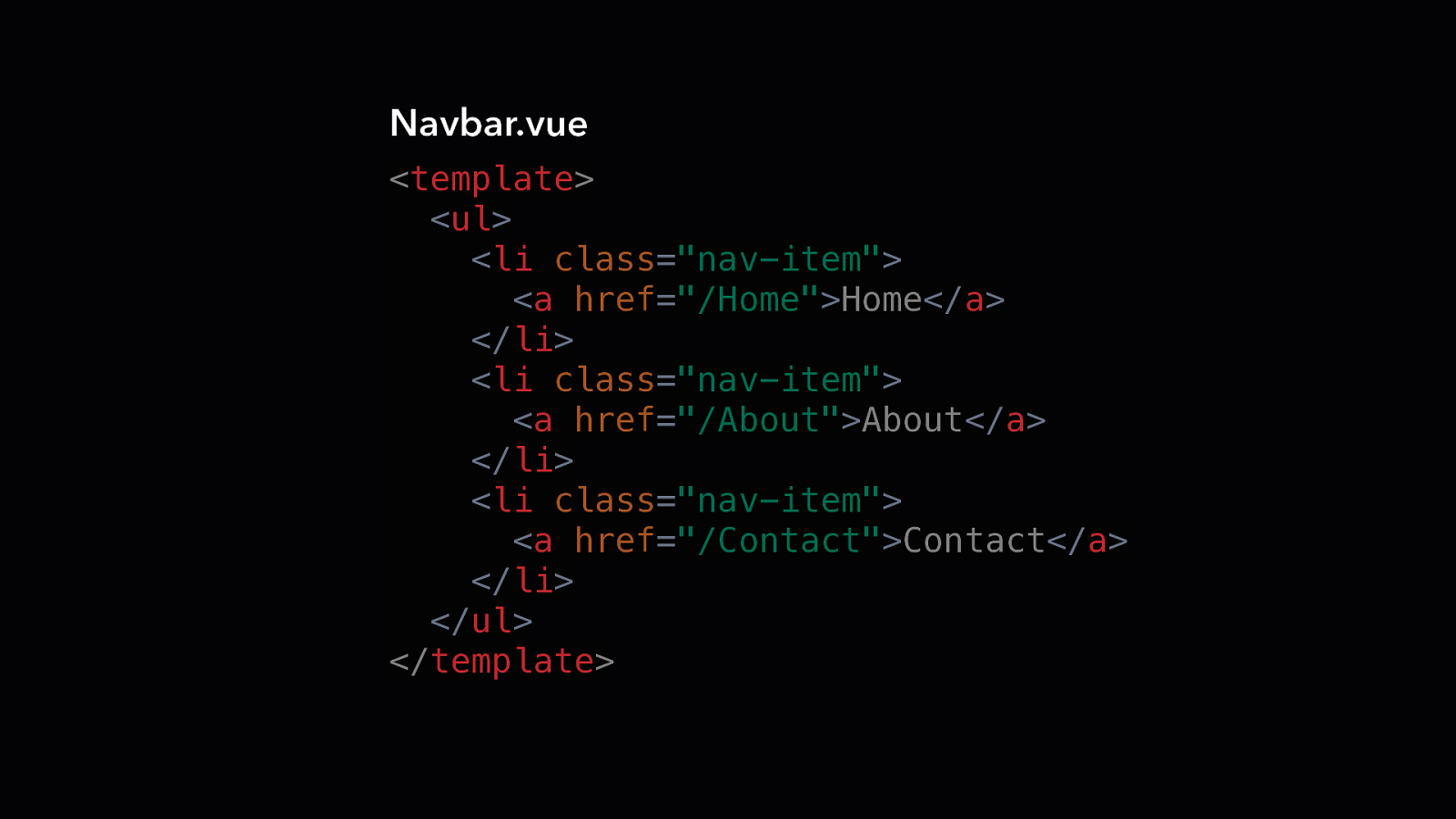
Navbar.vue <template> <ul> <li class=”nav-item”> <a href=”/Home”>Home</a> </li> <li class=”nav-item”> <a href=”/About”>About</a> </li> <li class=”nav-item”> <a href=”/Contact”>Contact</a> </li> </ul> </template>
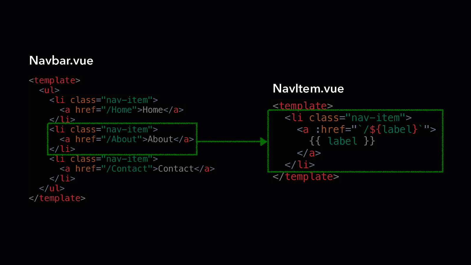
Navbar.vue <template> <ul> <li class=”nav-item”> <a href=”/Home”>Home</a> </li> <li class=”nav-item”> <a href=”/About”>About</a> </li> <li class=”nav-item”> <a href=”/Contact”>Contact</a> </li> </ul> </template> NavItem.vue <template> <li class=”nav-item”> <a :href=”`/${label}`”> {{ label }} </a> </li> </template>
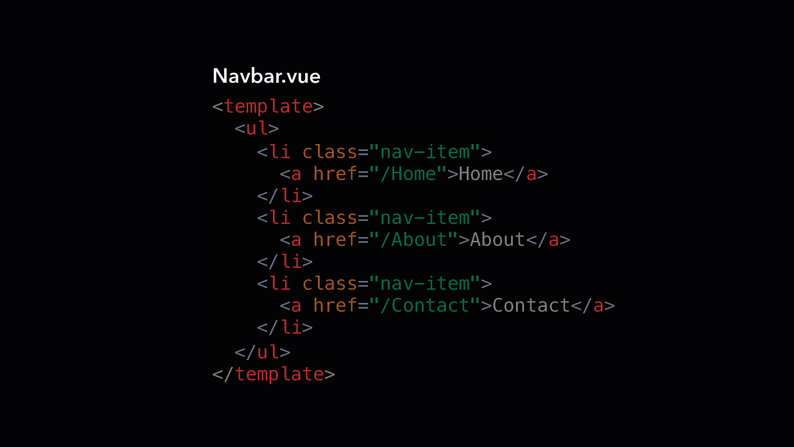
Navbar.vue <template> <ul> <li class=”nav-item”> <a href=”/Home”>Home</a> </li> <li class=”nav-item”> <a href=”/About”>About</a> </li> <li class=”nav-item”> <a href=”/Contact”>Contact</a> </li> </ul> </template>
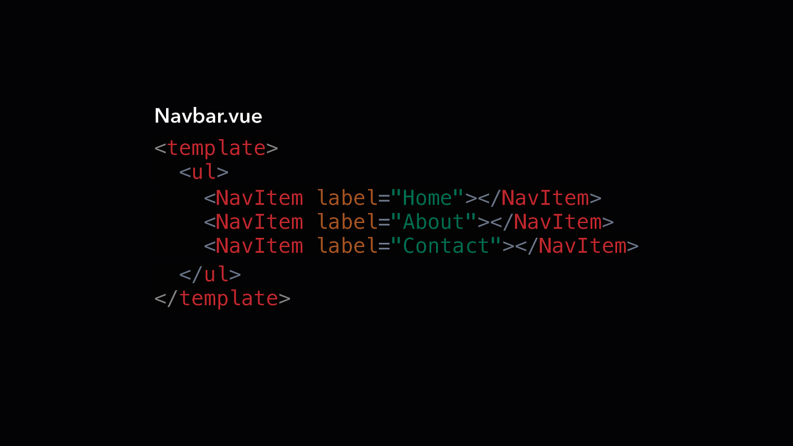
Navbar.vue <template> <ul> <NavItem label=”Home”></NavItem> <NavItem label=”About”></NavItem> <NavItem label=”Contact”></NavItem> </ul> </template>
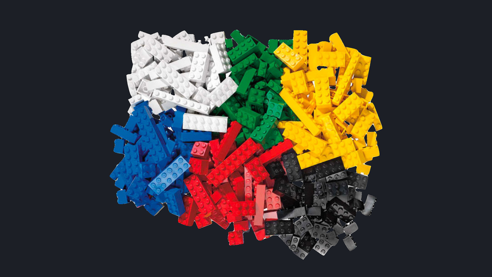
Why Components?
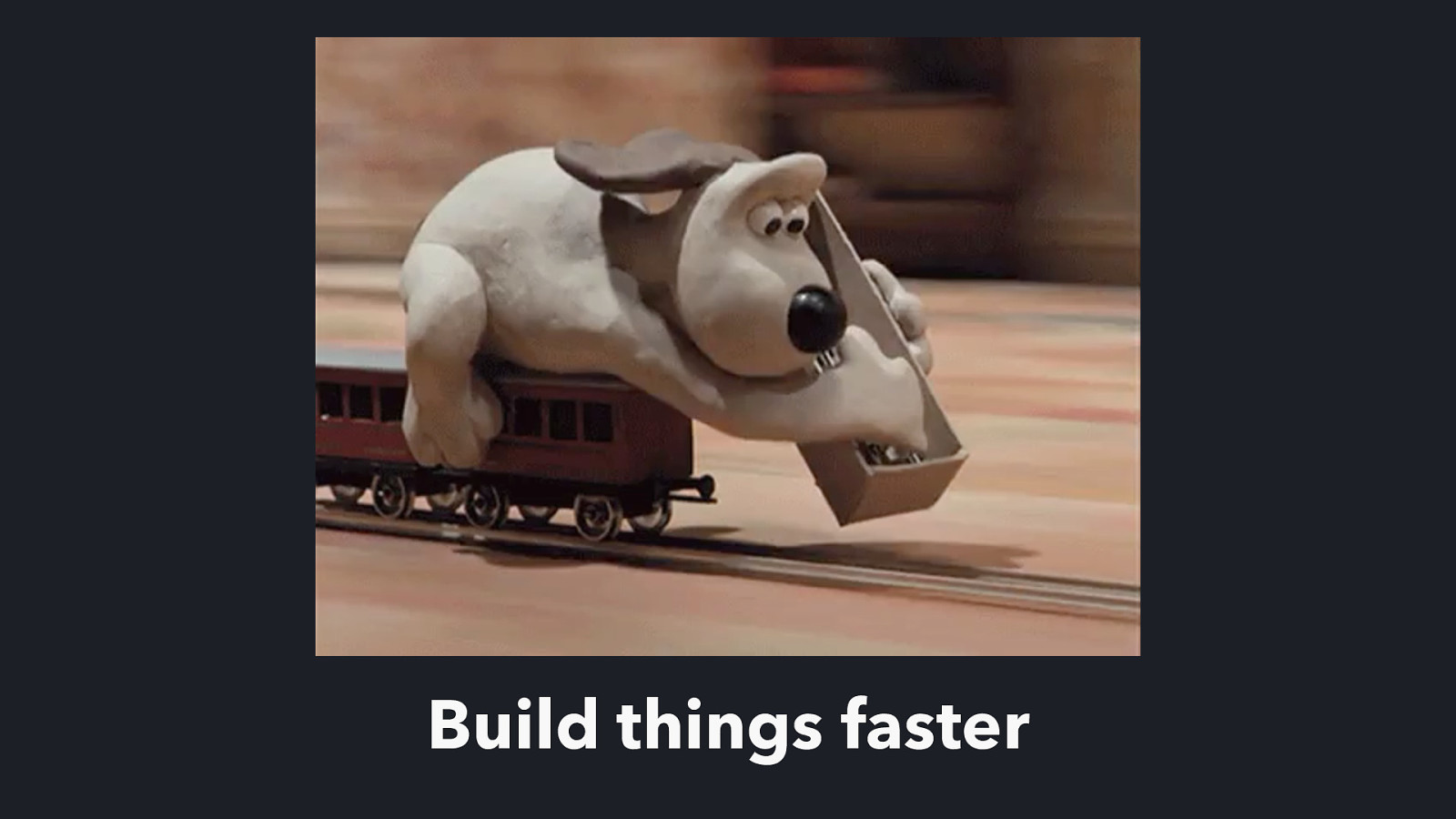
Build things faster
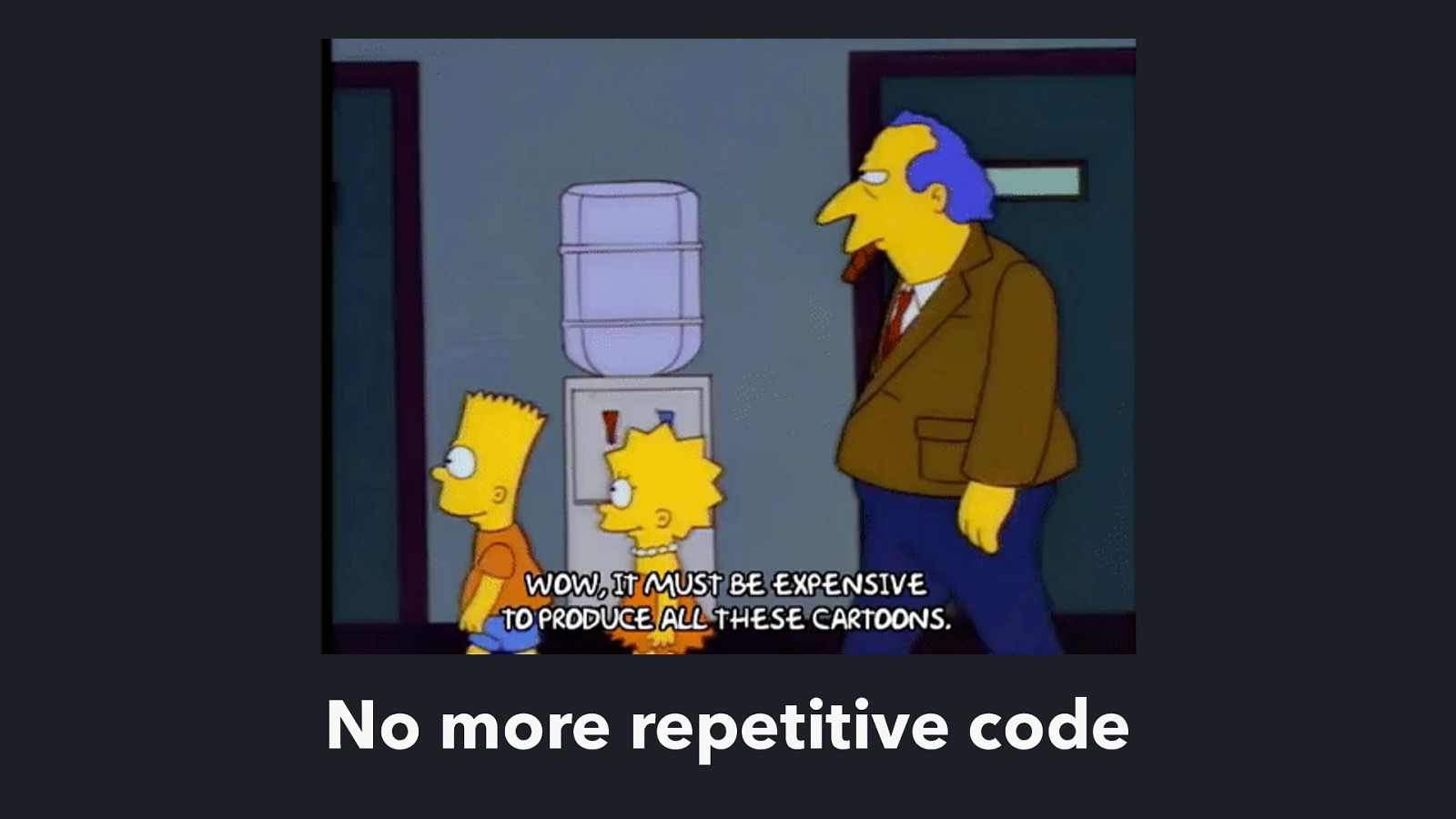
No more repetitive code

Less bugs means you can relax
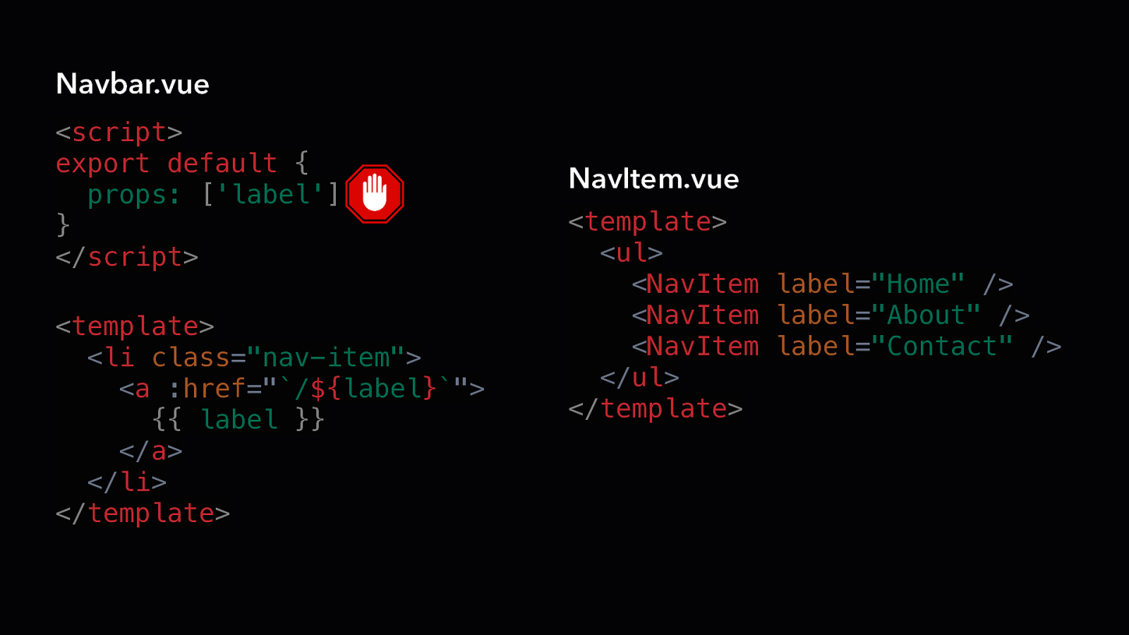
TECHNIQUE Props
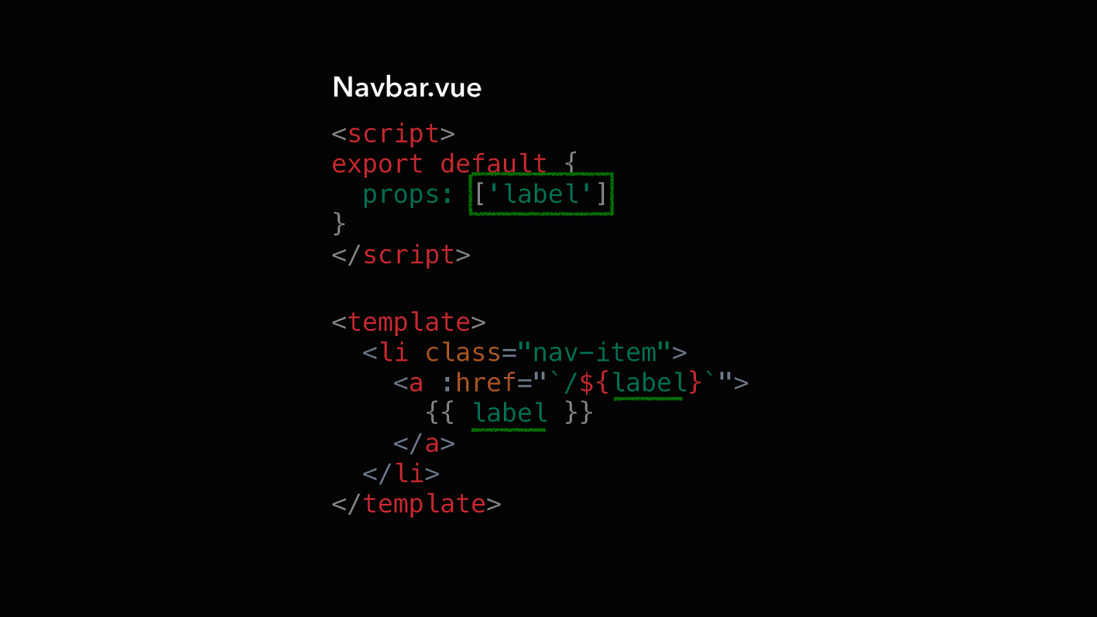
Navbar.vue <script> export default { props: [‘label’] } </script> <template> <li class=”nav-item”> <a :href=”`/${label}`”> {{ label }} </a> </li> </template>
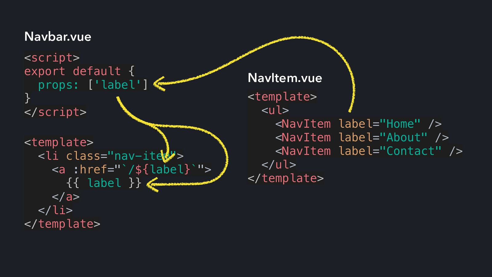
Navbar.vue <script> export default { props: [‘label’] } </script> <template> <li class=”nav-item”> <a :href=”`/${label}`”> {{ label }} </a> </li> </template> NavItem.vue <template> <ul> <NavItem label=”Home” /> <NavItem label=”About” /> <NavItem label=”Contact” /> </ul> </template>
Navbar.vue <script> export default { props: [‘label’] } </script> <template> <li class=”nav-item”> <a :href=”`/${label}`”> {{ label }} </a> </li> </template> NavItem.vue <template> <ul> <NavItem label=”Home” /> <NavItem label=”About” /> <NavItem label=”Contact” /> </ul> </template>
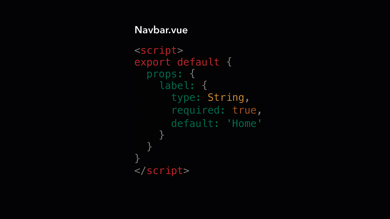
Navbar.vue <script> export default { props: { label: { type: String, required: true, default: ‘Home’ } } } </script>
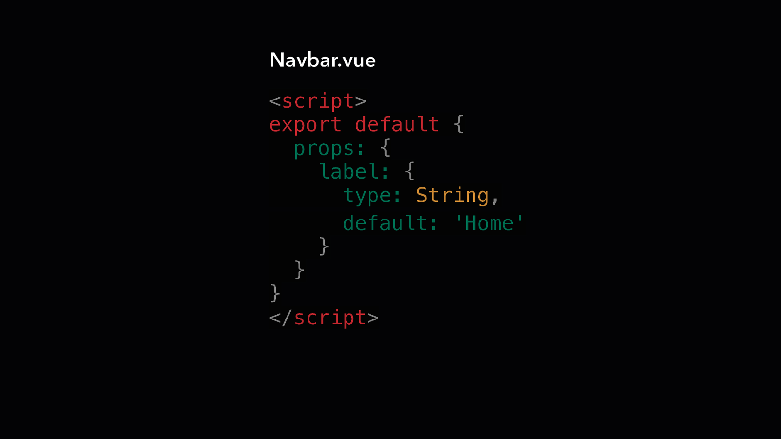
Navbar.vue <script> export default { props: { label: { type: String, default: ‘Home’ } } } </script>
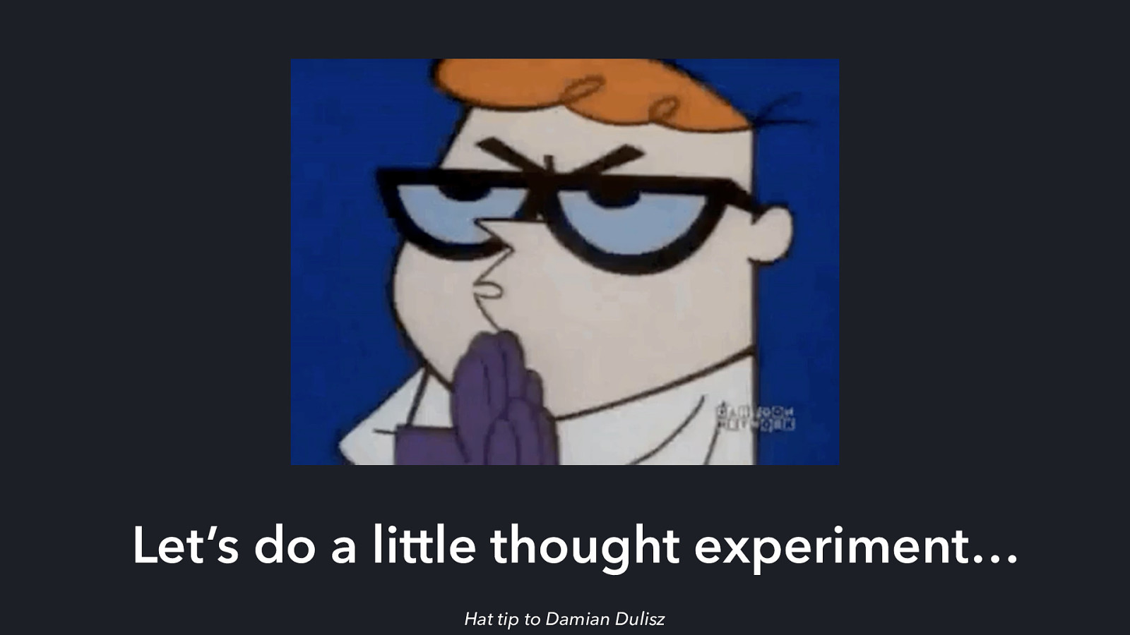
Let’s do a little thought experiment… Hat tip to Damian Dulisz
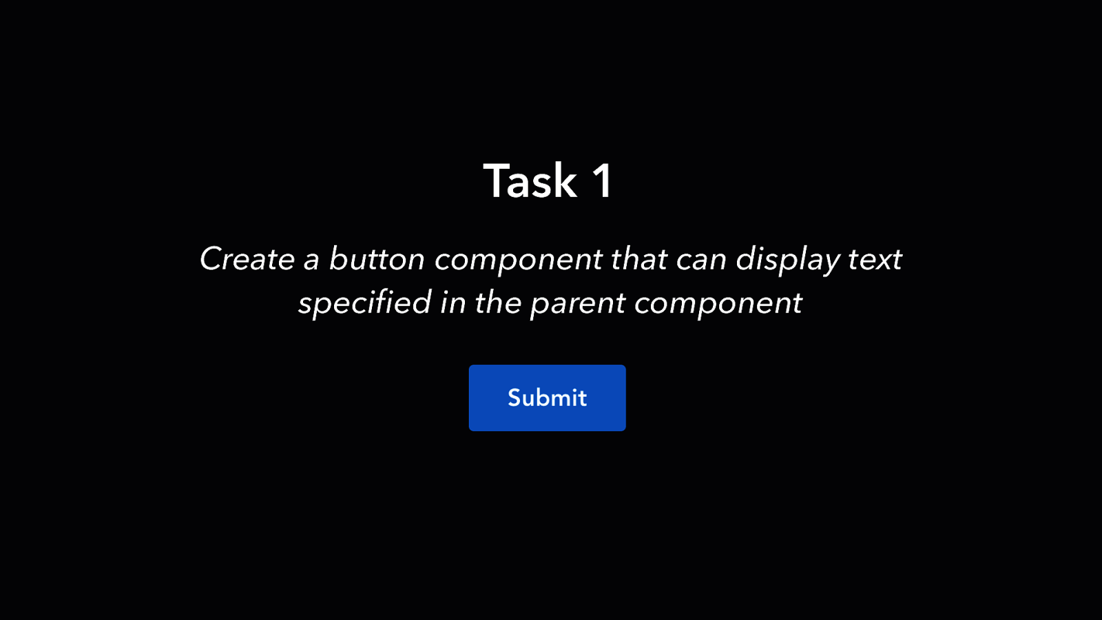
Task 1 Create a button component that can display text specified in the parent component
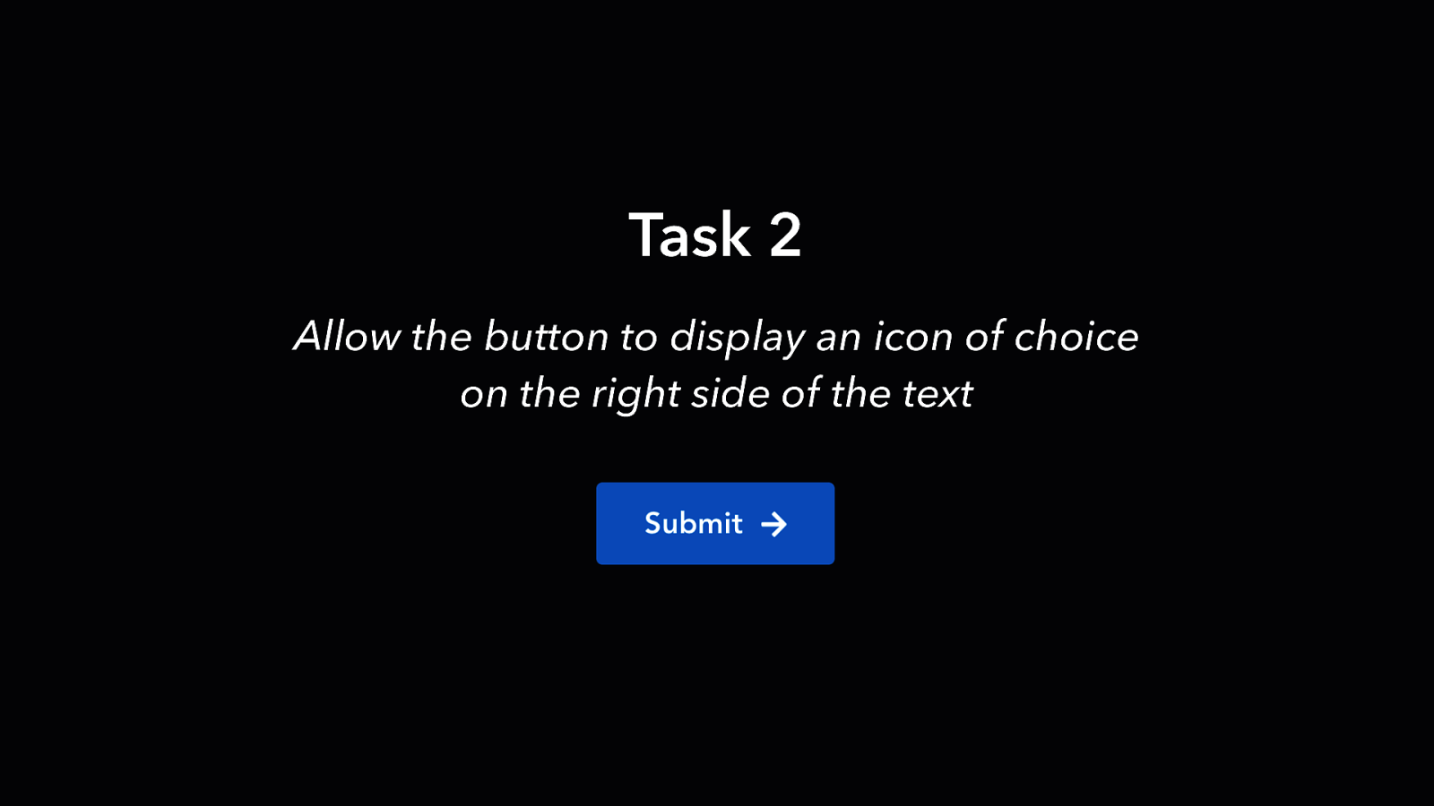
Task 2 Allow the button to display an icon of choice on the right side of the text
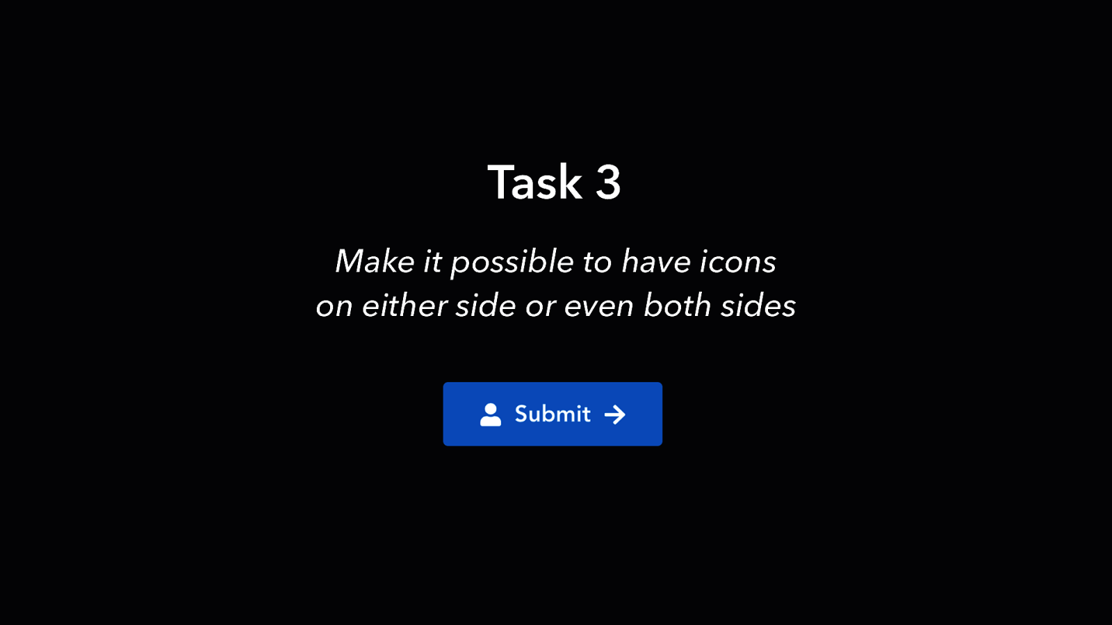
Task 3 Make it possible to have icons on either side or even both sides
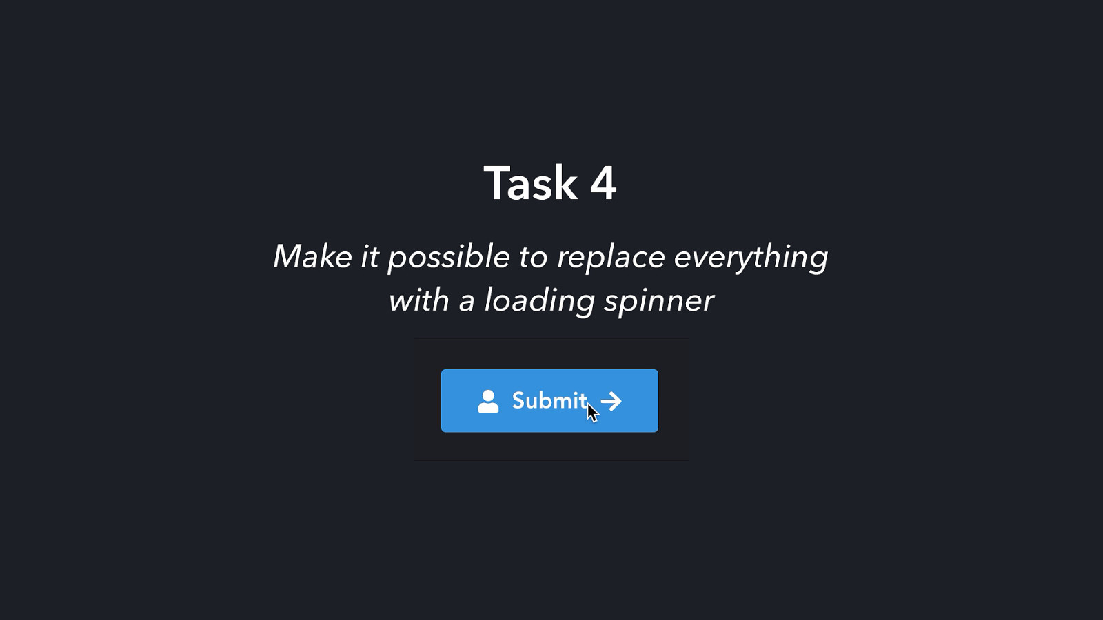
Task 4 Make it possible to replace everything with a loading spinner
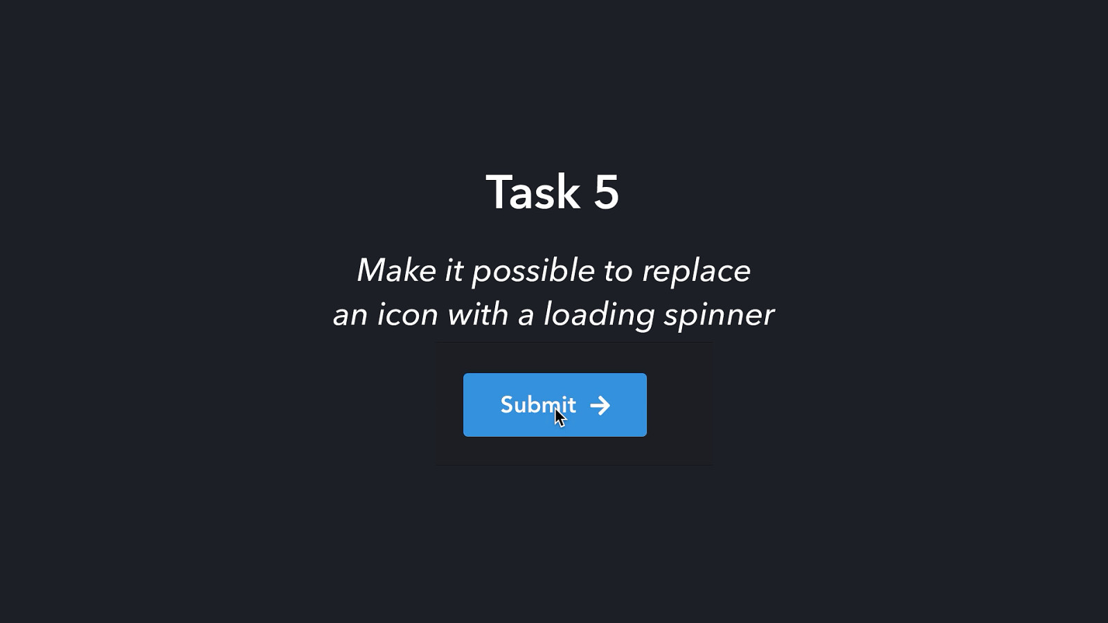
Task 5 Make it possible to replace an icon with a loading spinner
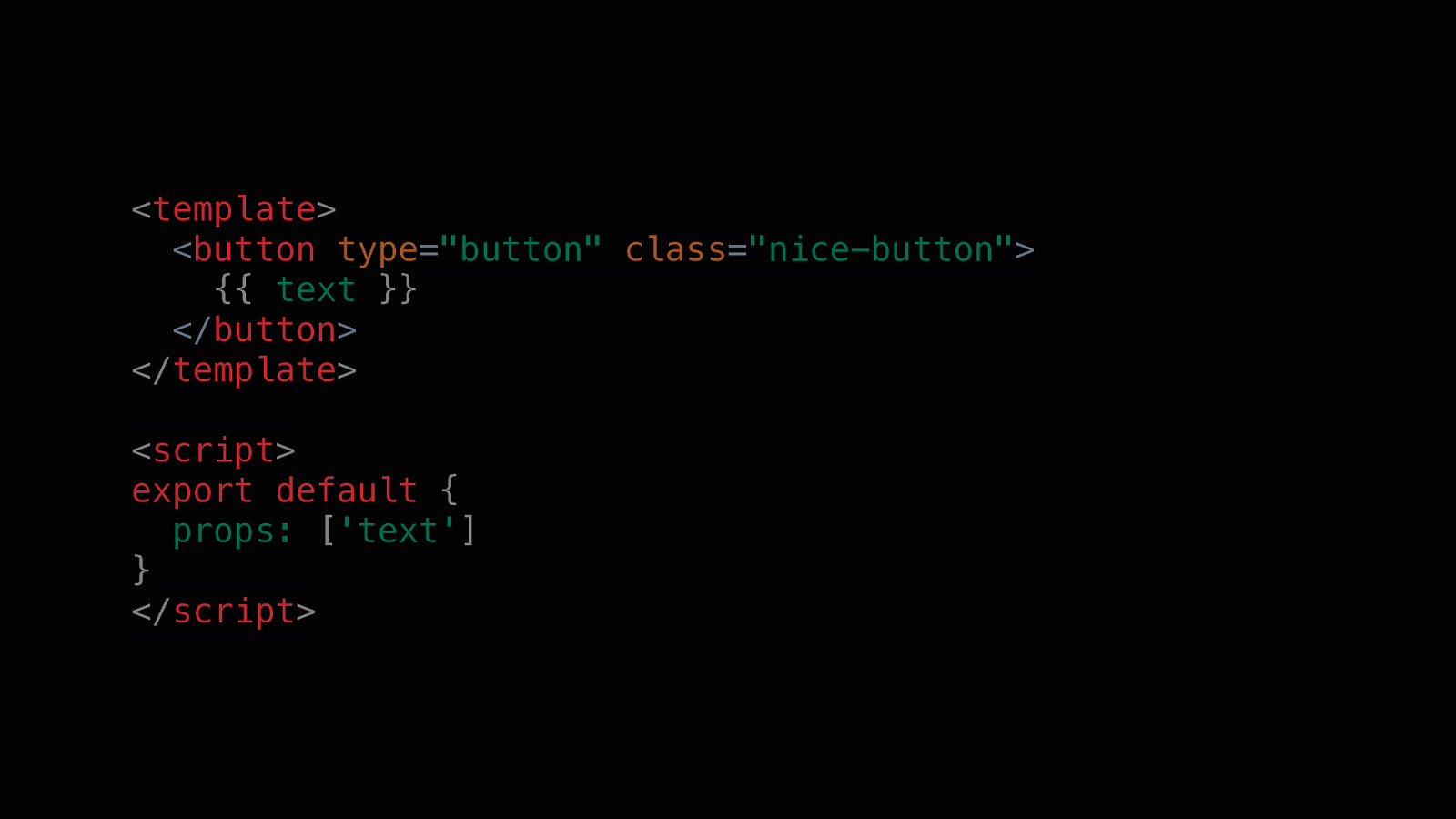
<template> <button type=”button” class=”nice-button”> {{ text }} </button> </template> <script> export default { props: [‘text’] } </script>
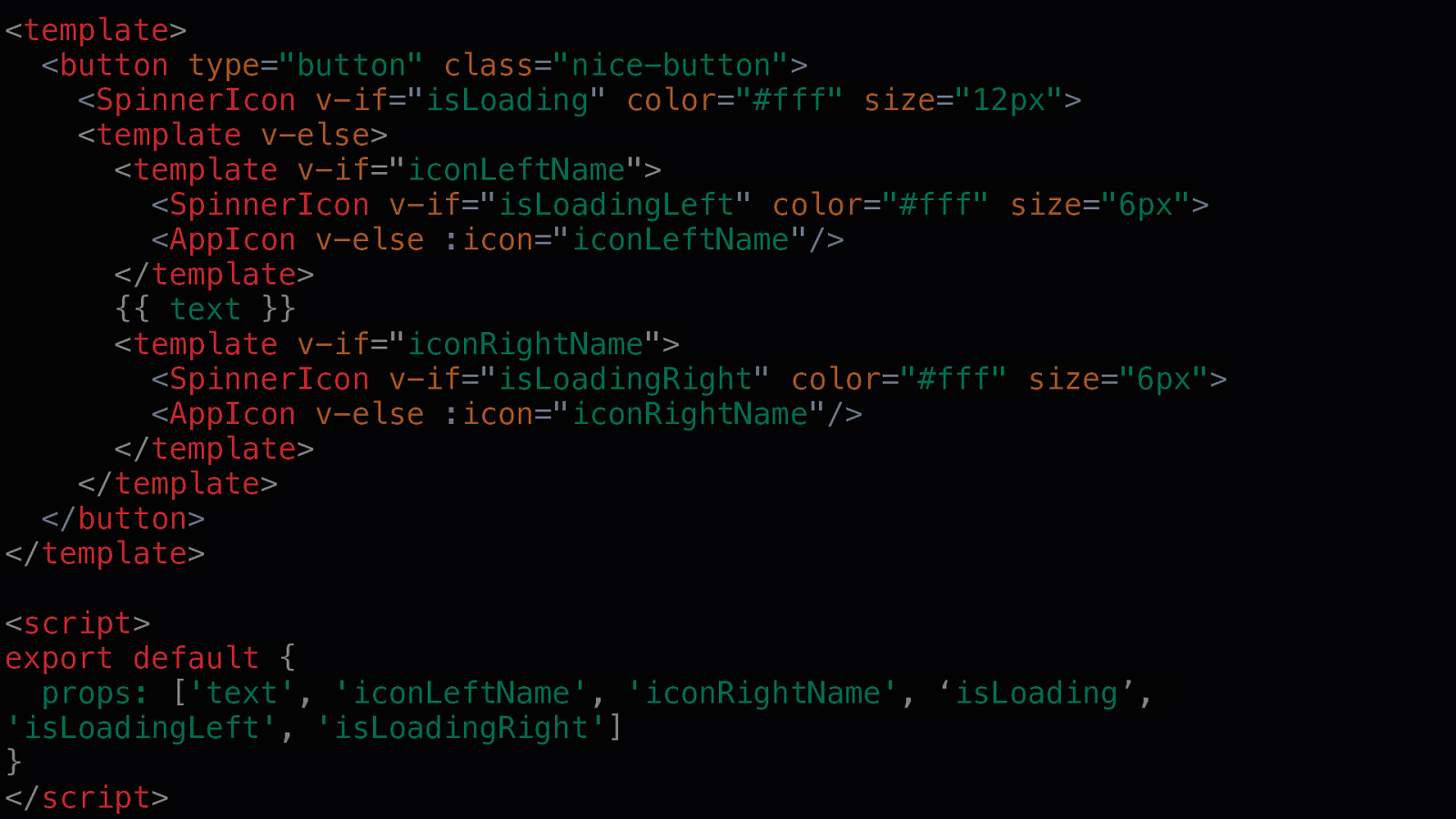
<template> <button type=”button” class=”nice-button”> <SpinnerIcon v-if=”isLoading” color=”#fff” size=”12px”> <template v-else> <template v-if=”iconLeftName”> <SpinnerIcon v-if=”isLoadingLeft” color=”#fff” size=”6px”> <AppIcon v-else :icon=”iconLeftName”/> </template> {{ text }} <template v-if=”iconRightName”> <SpinnerIcon v-if=”isLoadingRight” color=”#fff” size=”6px”> <AppIcon v-else :icon=”iconRightName”/> </template> </template> </button> </template> <script> export default { props: [‘text’, ‘iconLeftName’, ‘iconRightName’, ‘isLoading’, ‘isLoadingLeft’, ‘isLoadingRight’] } </script>
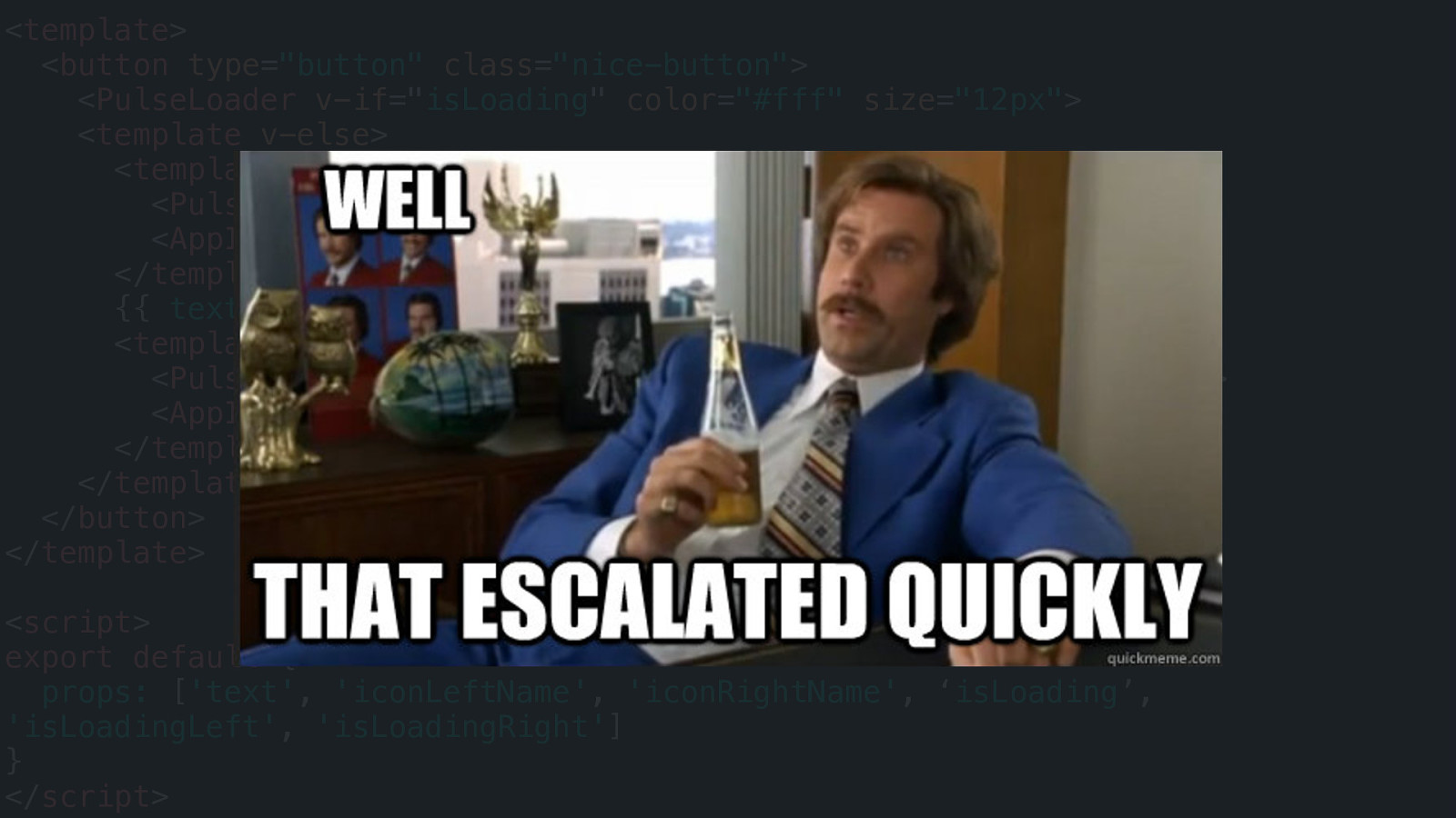
<template> <button type=”button” class=”nice-button”> <PulseLoader v-if=”isLoading” color=”#fff” size=”12px”> <template v-else> <template v-if=”iconLeftName”> <PulseLoader v-if=”isLoadingLeft” color=”#fff” size=”6px”> <AppIcon v-else :icon=”iconLeftName”/> </template> {{ text }} <template v-if=”iconRightName”> <PulseLoader v-if=”isLoadingRight” color=”#fff” size=”6px”> <AppIcon v-else :icon=”iconRightName”/> </template> </template> </button> </template> <script> export default { props: [‘text’, ‘iconLeftName’, ‘iconRightName’, ‘isLoading’, ‘isLoadingLeft’, ‘isLoadingRight’] } </script>
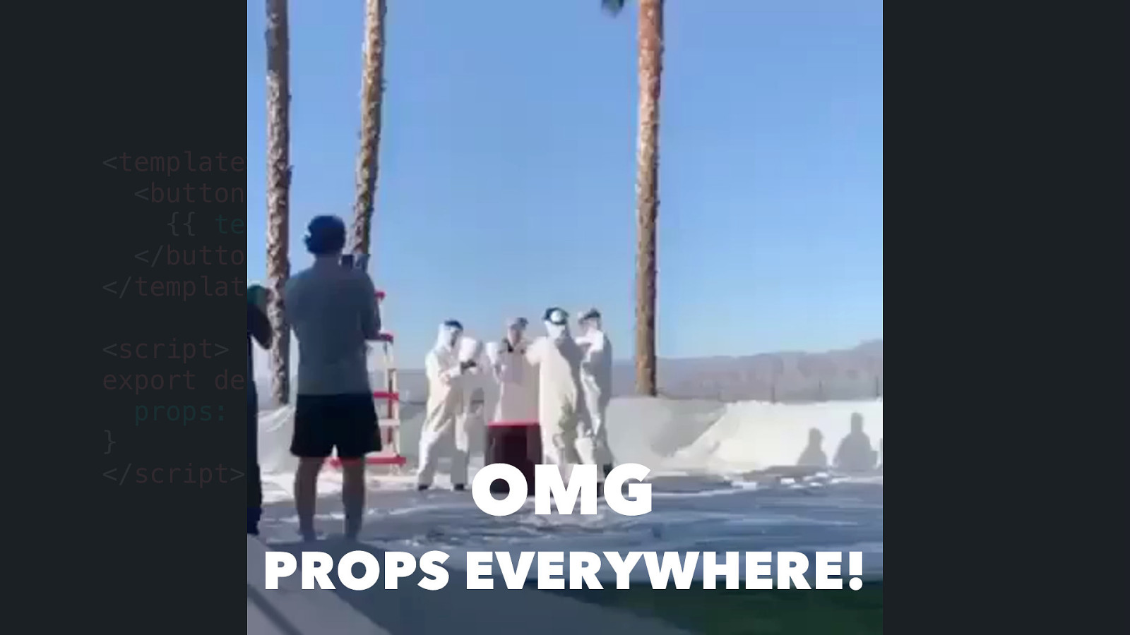
<template> <button type=”button” class=”nice-button”> {{ text }} </button> </template> <script> export default { props: [‘text’] } </script> OMG PROPS EVERYWHERE!
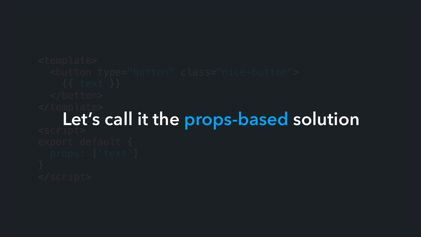
<template> <button type=”button” class=”nice-button”> {{ text }} </button> </template> Let’s call it the props-based solution <script> export default { props: [‘text’] } </script>
props-based solution Is it wrong?
props-based solution Is it wrong? No. It does the job.
props-based solution Is it good, then?
props-based solution Is it good, then? Not exactly.
props-based solution Problems
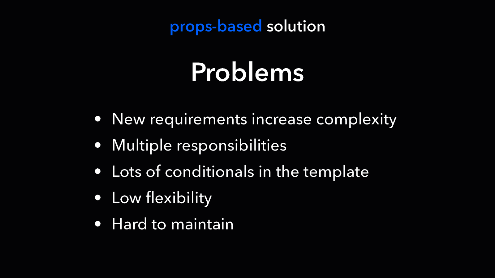
props-based solution Problems • New requirements increase complexity • Multiple responsibilities • Lots of conditionals in the template • Low flexibility • Hard to maintain
Is there a better another alternative?
Is there a better another alternative?

TECHNIQUE Slots
Recommended solution
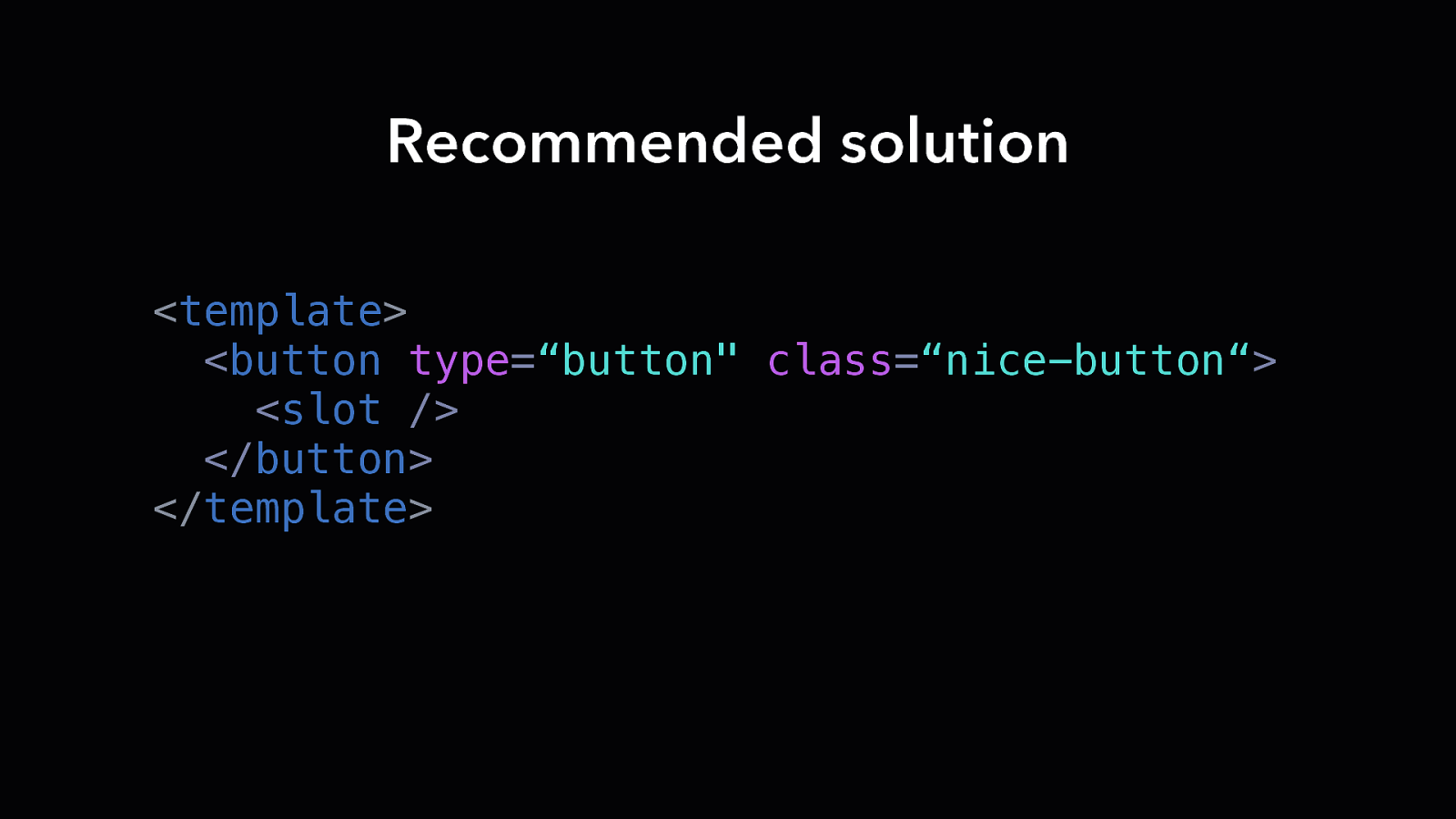
Recommended solution <template> <button type=“button” class=“nice-button“> <slot /> </button> </template>
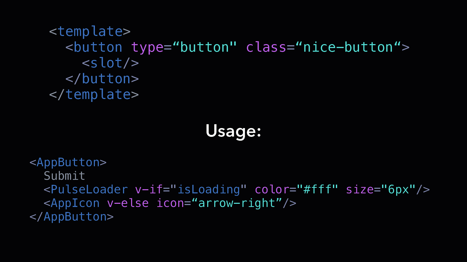
<template> <button type=“button” class=“nice-button“> <slot/> </button> </template> Usage: <AppButton> Submit <PulseLoader v-if=”isLoading” color=”#fff” size=”6px”/> <AppIcon v-else icon=“arrow-right”/> </AppButton>
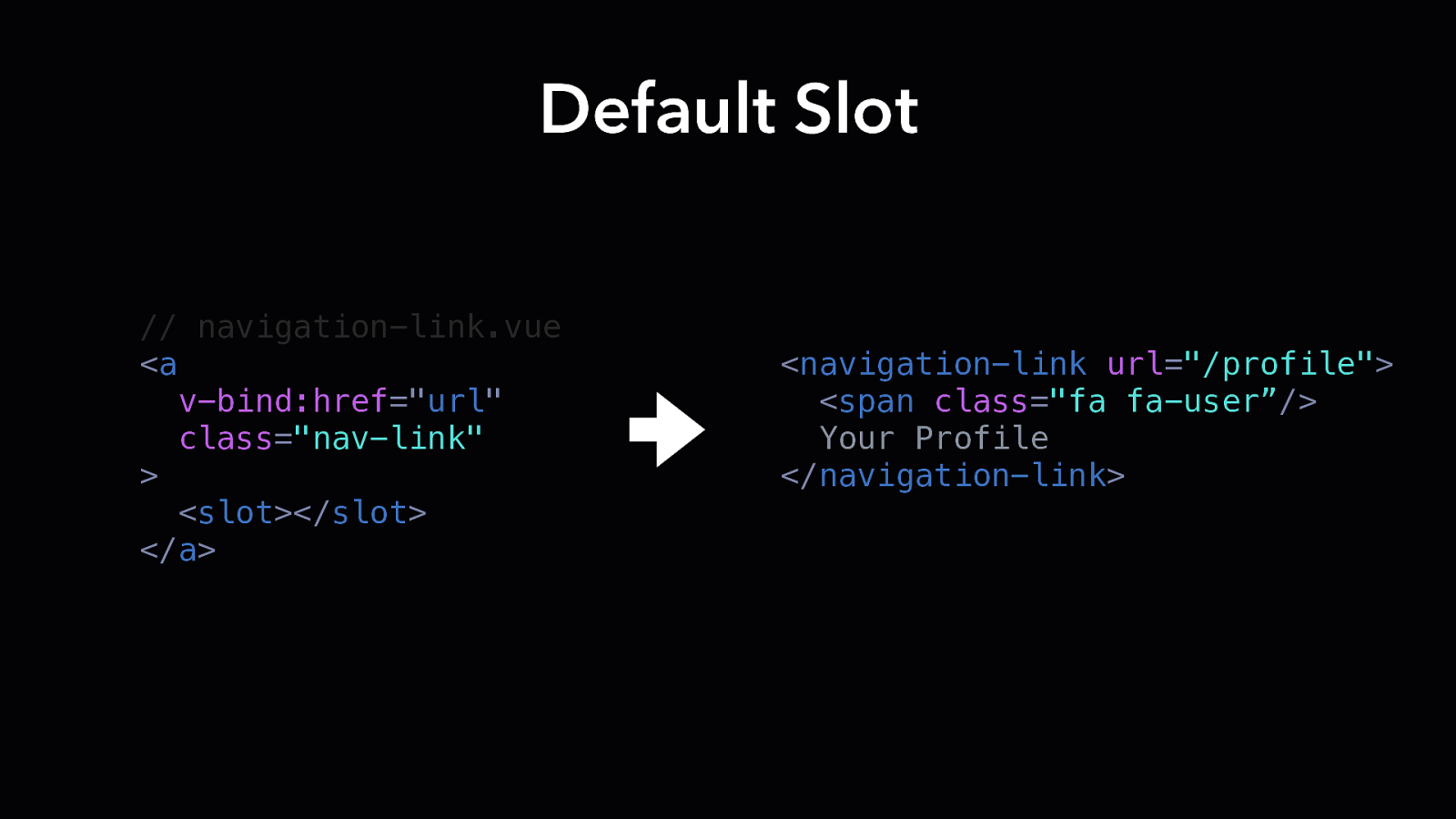
Default Slot // navigation-link.vue <a v-bind:href=”url” class=”nav-link” > <slot></slot> </a> <navigation-link url=”/profile”> <span class=”fa fa-user”/> Your Profile </navigation-link>
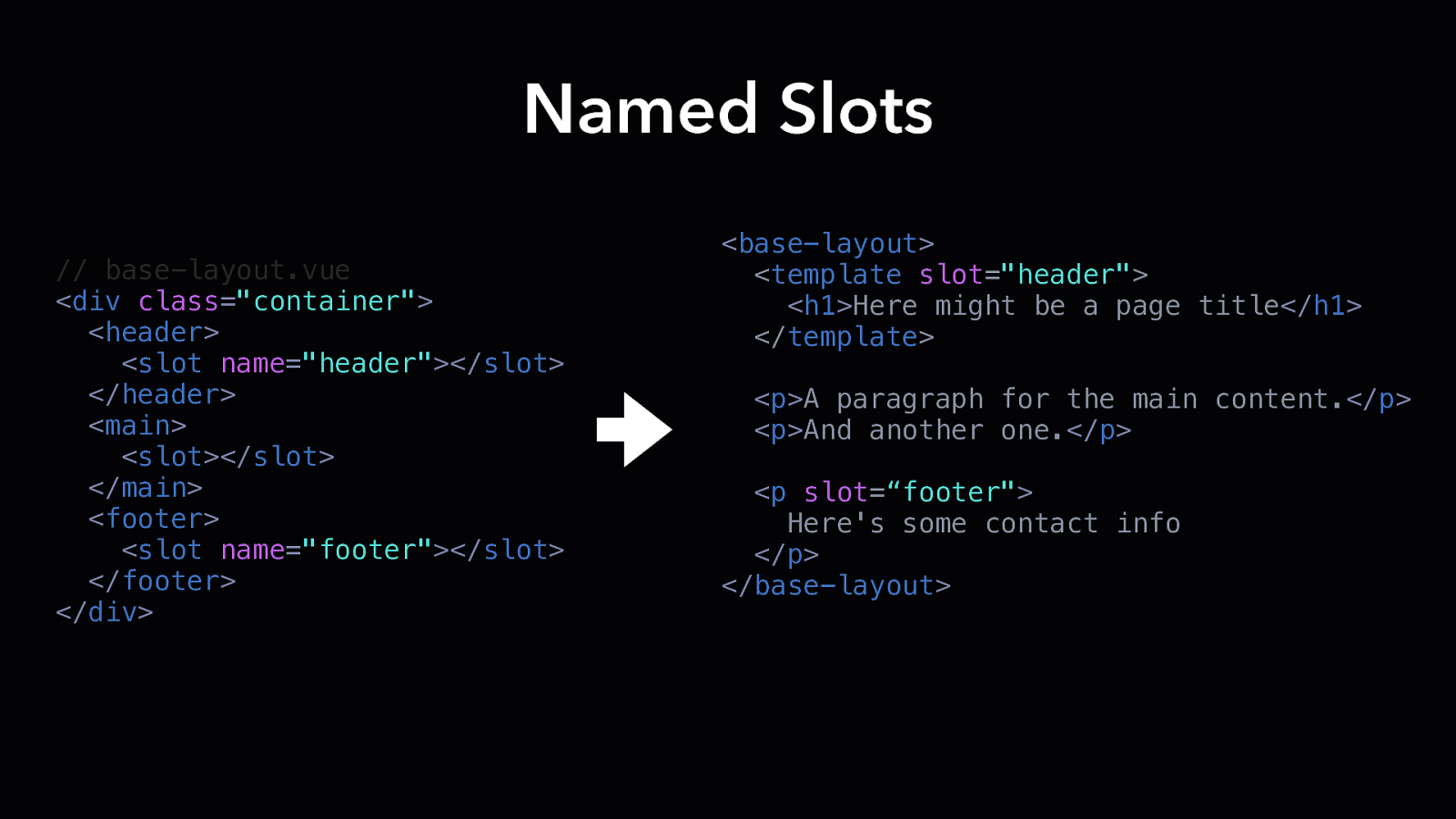
Named Slots // base-layout.vue <div class=”container”> <header> <slot name=”header”></slot> </header> <main> <slot></slot> </main> <footer> <slot name=”footer”></slot> </footer> </div> <base-layout> <template slot=”header”> <h1>Here might be a page title</h1> </template> <p>A paragraph for the main content.</p> <p>And another one.</p> <p slot=“footer”> Here’s some contact info </p> </base-layout>
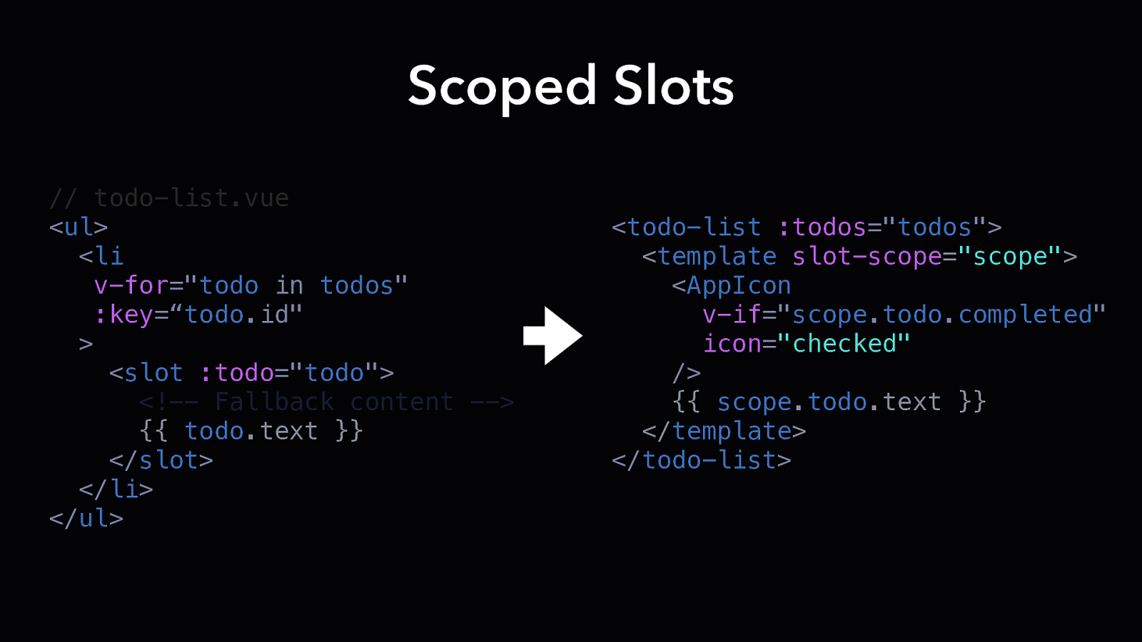
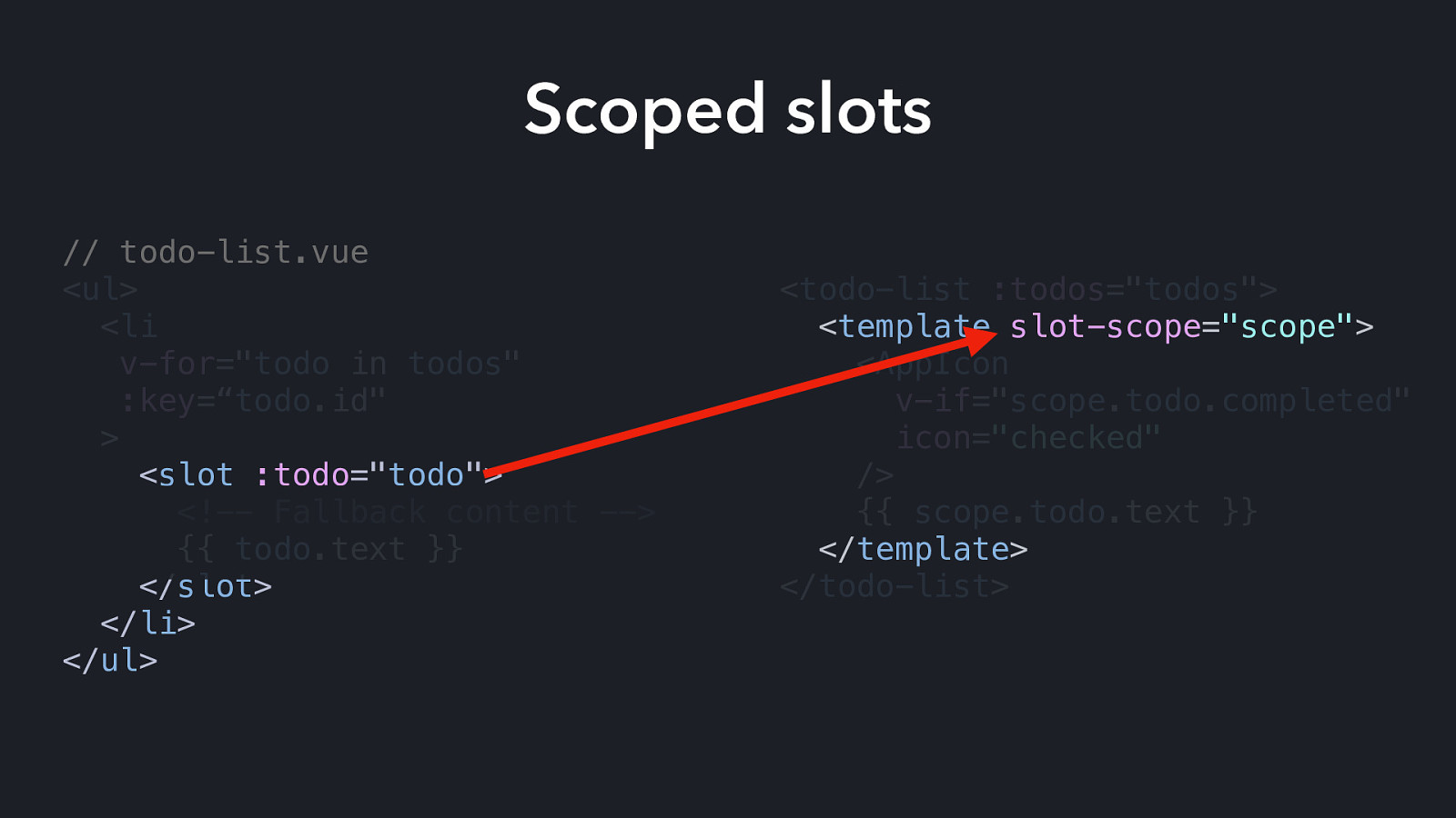
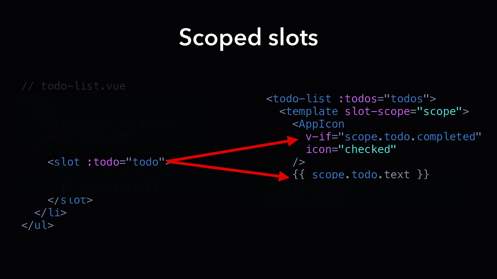
Scoped Slots // todo-list.vue <ul> <li v-for=”todo in todos” :key=“todo.id” > <slot :todo=”todo”> <!— Fallback content —> {{ todo.text }} </slot> </li> </ul> <todo-list :todos=”todos”> <template slot-scope=”scope”> <AppIcon v-if=”scope.todo.completed” icon=”checked” /> {{ scope.todo.text }} </template> </todo-list>
Scoped slots // todo-list.vue <ul> <li v-for=”todo in todos” :key=“todo.id” > <slot :todo=”todo”> <!— Fallback content —> {{ todo.text }} </slot> </li> </ul> <todo-list :todos=”todos”> <template slot-scope=”scope”> <AppIcon v-if=”scope.todo.completed” icon=”checked” /> {{ scope.todo.text }} </template> </todo-list>
Scoped slots // todo-list.vue <ul> <li v-for=”todo in todos” :key=“todo.id” > <slot :todo=”todo”> <!— Fallback content —> {{ todo.text }} </slot> </li> </ul> <todo-list :todos=”todos”> <template slot-scope=”scope”> <AppIcon v-if=”scope.todo.completed” icon=”checked” /> {{ scope.todo.text }} </template> </todo-list>
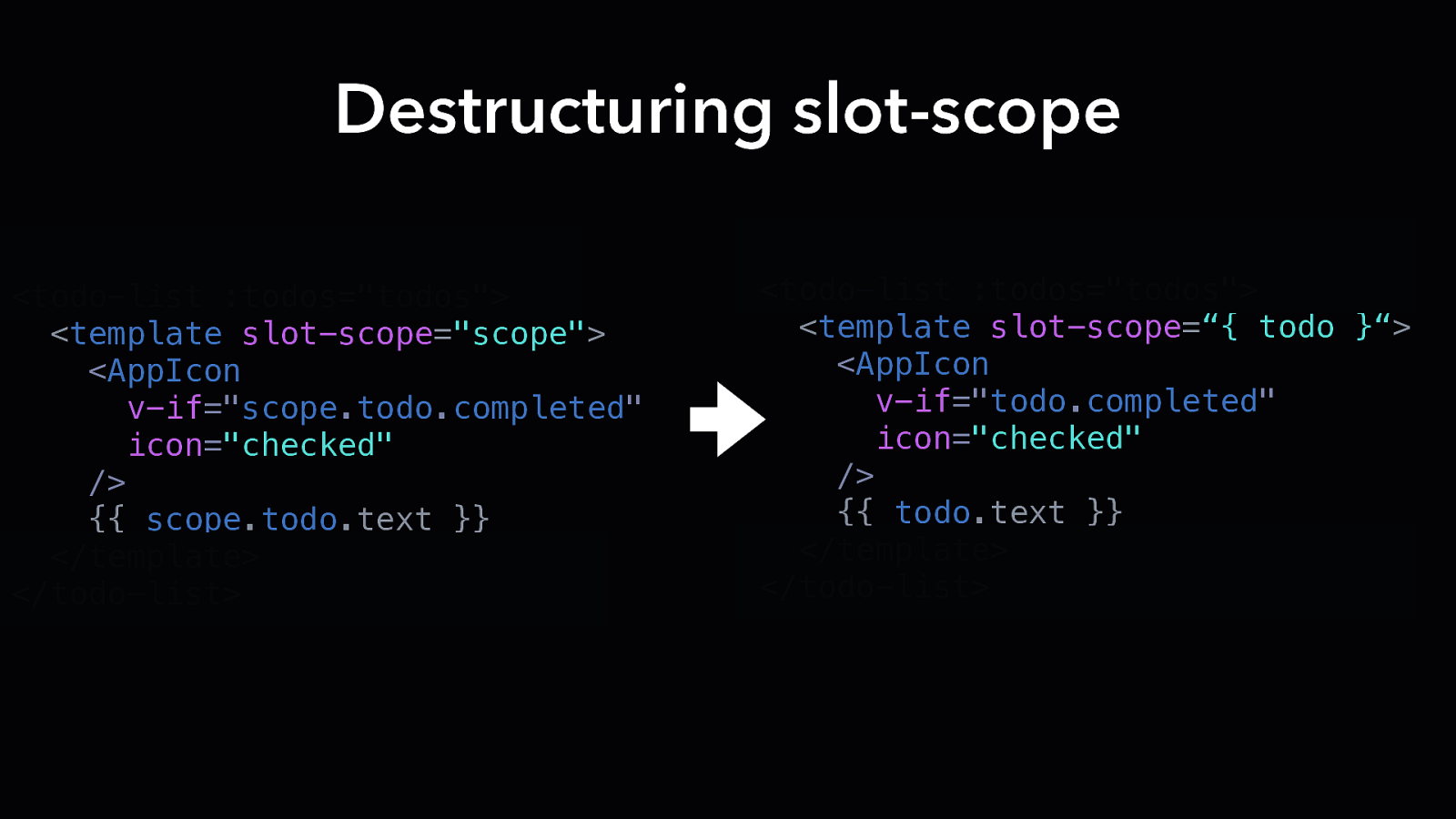
Destructuring slot-scope <todo-list :todos=”todos”> <template slot-scope=”scope”> <AppIcon v-if=”scope.todo.completed” icon=”checked” /> {{ scope.todo.text }} </template> </todo-list> <todo-list :todos=”todos”> <template slot-scope=“{ todo }“> <AppIcon v-if=”todo.completed” icon=”checked” /> {{ todo.text }} </template> </todo-list>
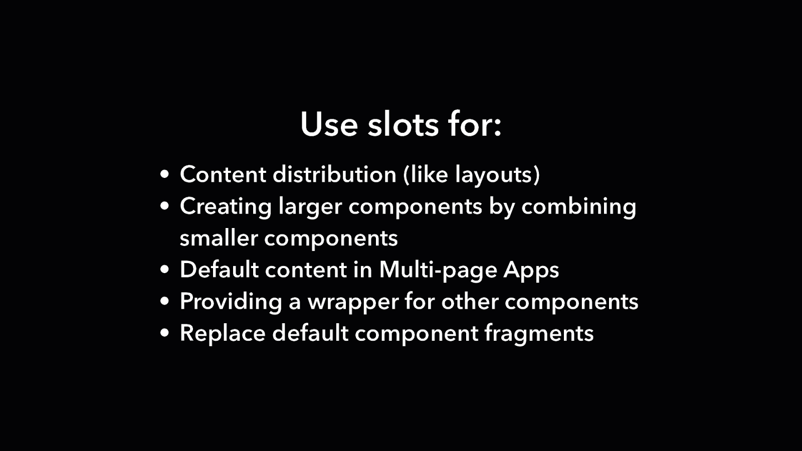
Use slots for: • Content distribution (like layouts) • Creating larger components by combining smaller components • Default content in Multi-page Apps • Providing a wrapper for other components • Replace default component fragments
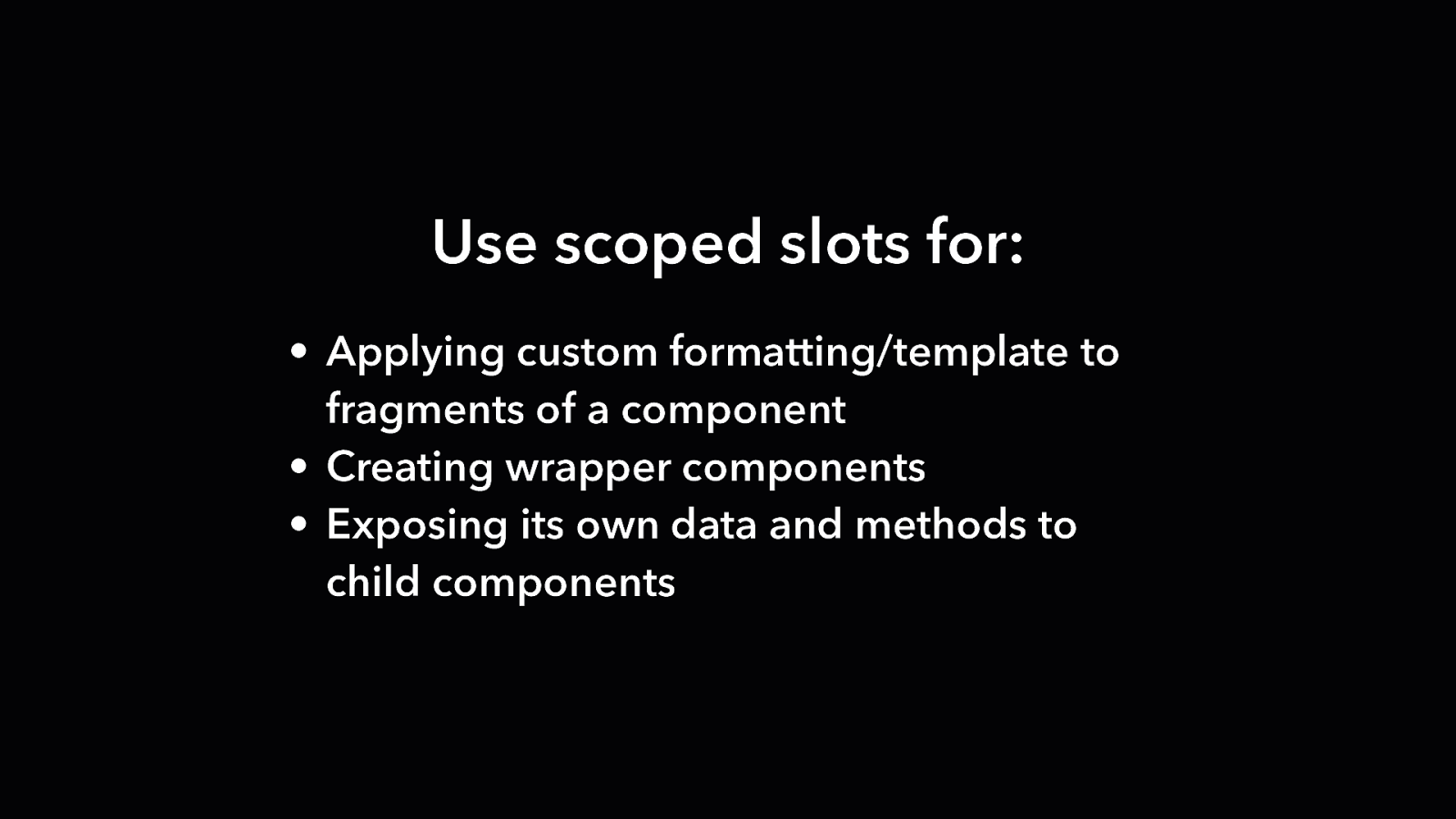
Use scoped slots for: • Applying custom formatting/template to fragments of a component • Creating wrapper components • Exposing its own data and methods to child components

Slots changes in Vue v2.6
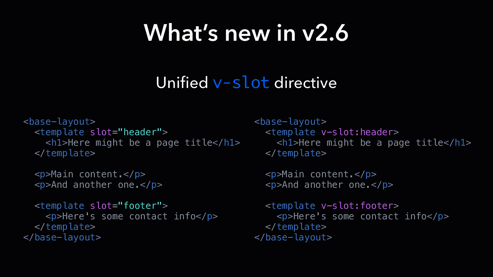
What’s new in v2.6 Unified v-slot directive <base-layout> <template slot=”header”> <h1>Here might be a page title</h1> </template> <p>Main content.</p> <p>And another one.</p> <template slot=”footer”> <p>Here’s some contact info</p> </template> </base-layout> <base-layout> <template v-slot:header> <h1>Here might be a page title</h1> </template> <p>Main content.</p> <p>And another one.</p> <template v-slot:footer> <p>Here’s some contact info</p> </template> </base-layout>
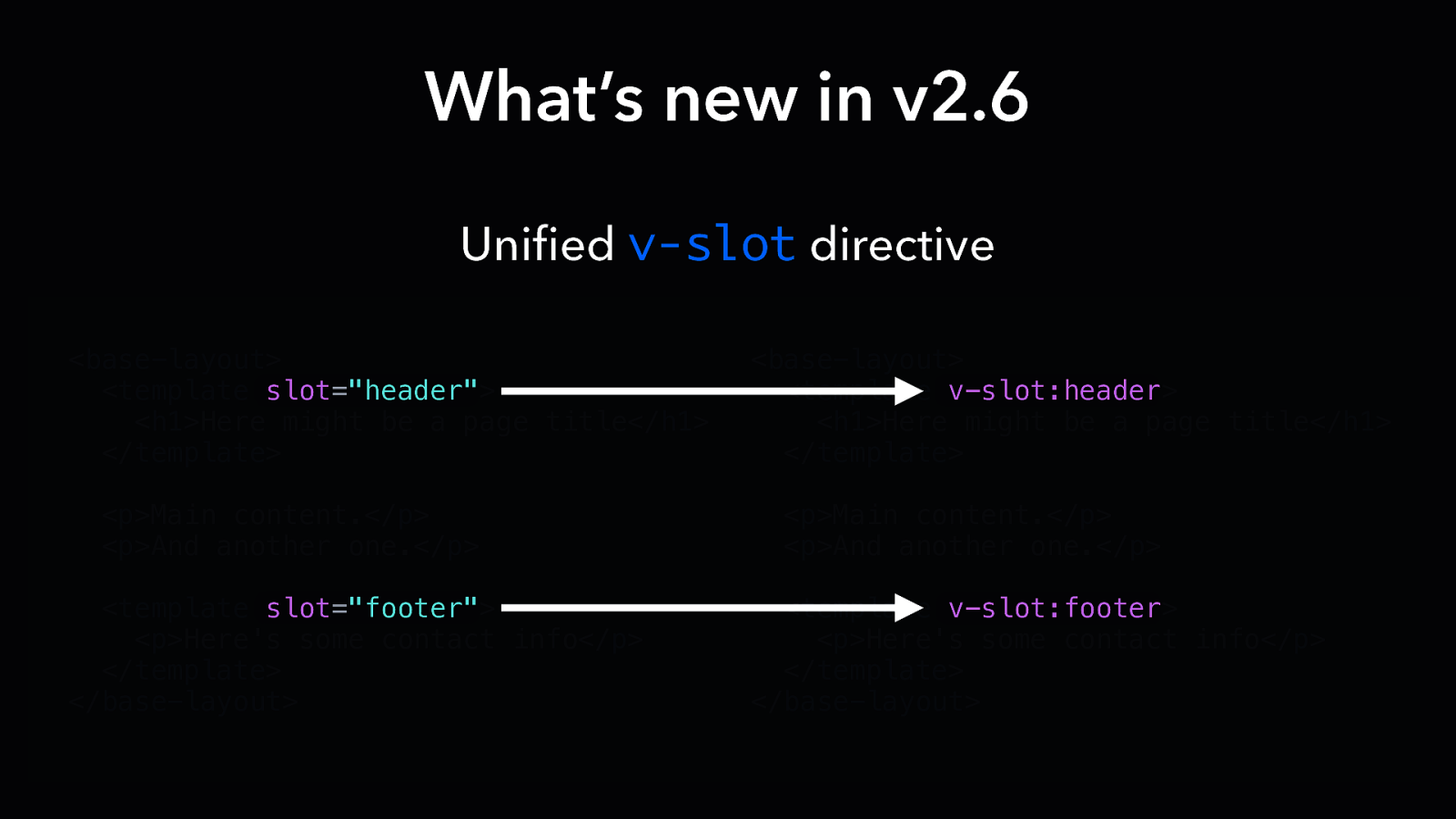
What’s new in v2.6 Unified v-slot directive <base-layout> <template slot=”header”> <h1>Here might be a page title</h1> </template> <p>Main content.</p> <p>And another one.</p> <template slot=”footer”> <p>Here’s some contact info</p> </template> </base-layout> <base-layout> <template v-slot:header> <h1>Here might be a page title</h1> </template> <p>Main content.</p> <p>And another one.</p> <template v-slot:footer> <p>Here’s some contact info</p> </template> </base-layout>
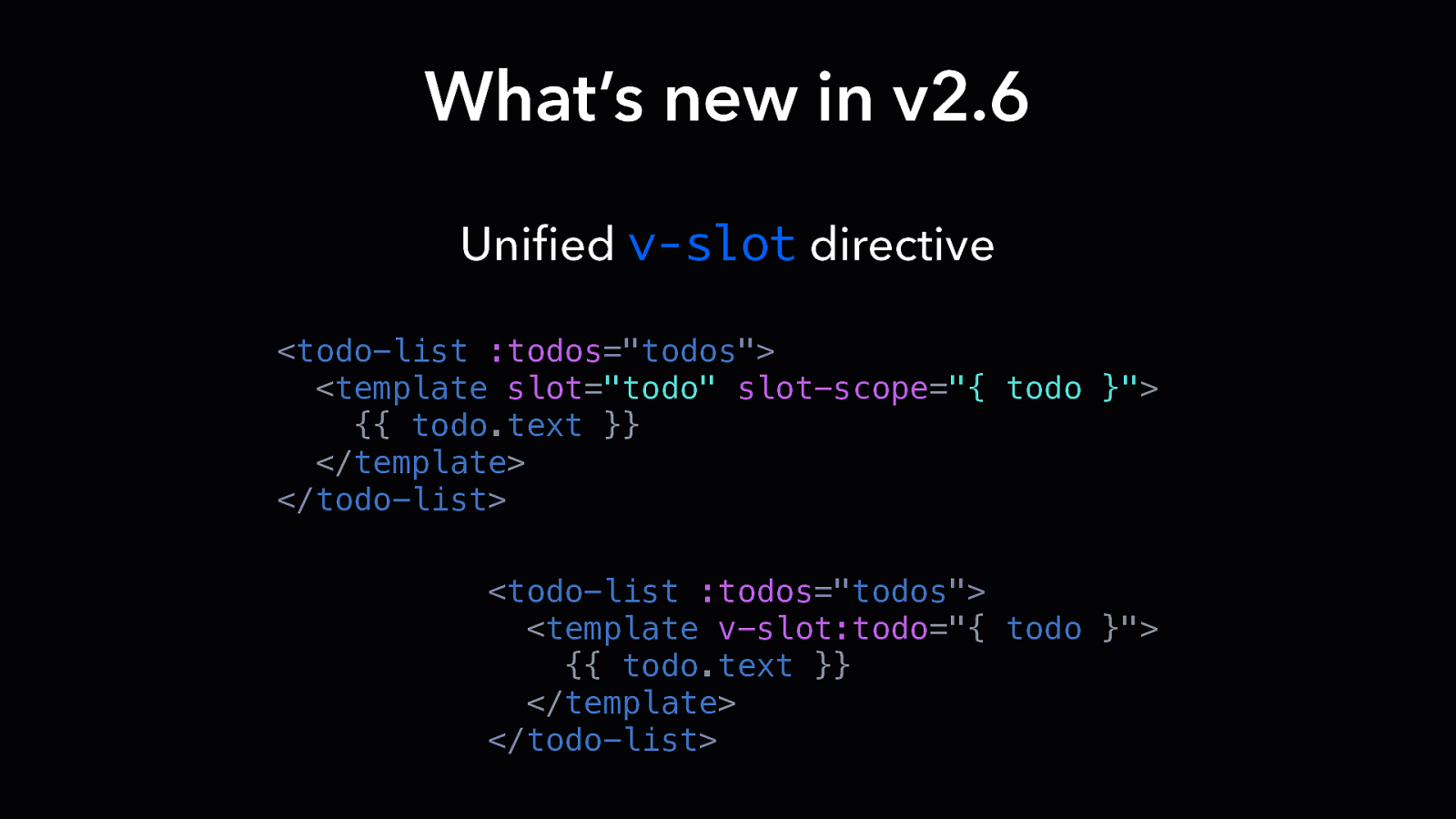
What’s new in v2.6 Unified v-slot directive <todo-list :todos=”todos”> <template slot=”todo” slot-scope=”{ todo }”> {{ todo.text }} </template> </todo-list> <todo-list :todos=”todos”> <template v-slot:todo=”{ todo }”> {{ todo.text }} </template> </todo-list>
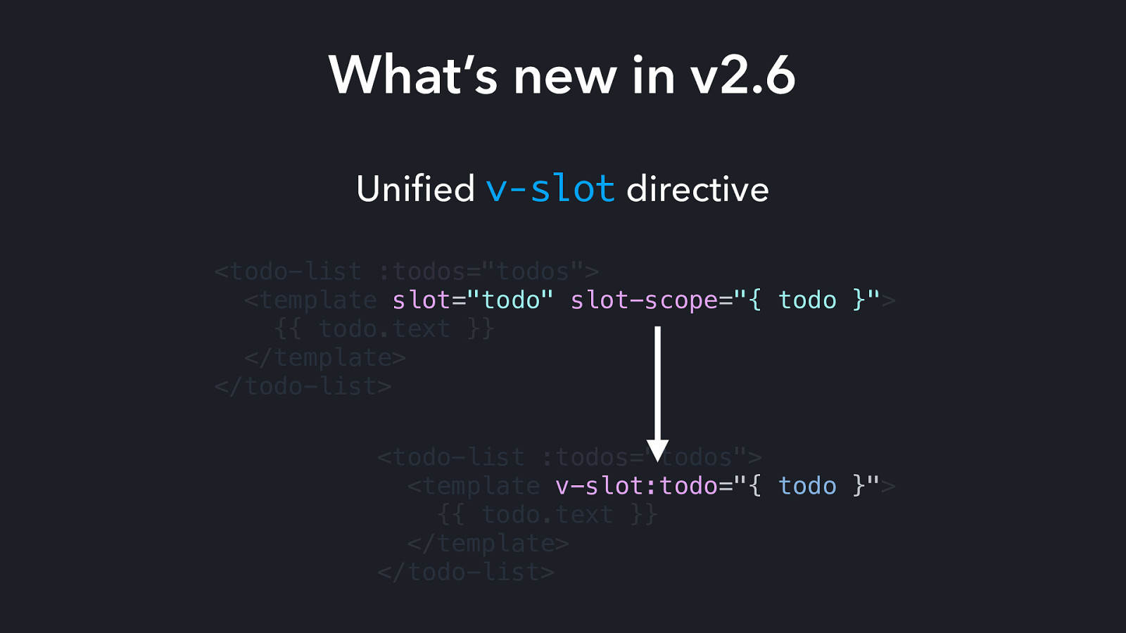
What’s new in v2.6 Unified v-slot directive <todo-list :todos=”todos”> <template slot=”todo” slot-scope=”{ todo }”> {{ todo.text }} </template> </todo-list> <todo-list :todos=”todos”> <template v-slot:todo=”{ todo }”> {{ todo.text }} </template> </todo-list>
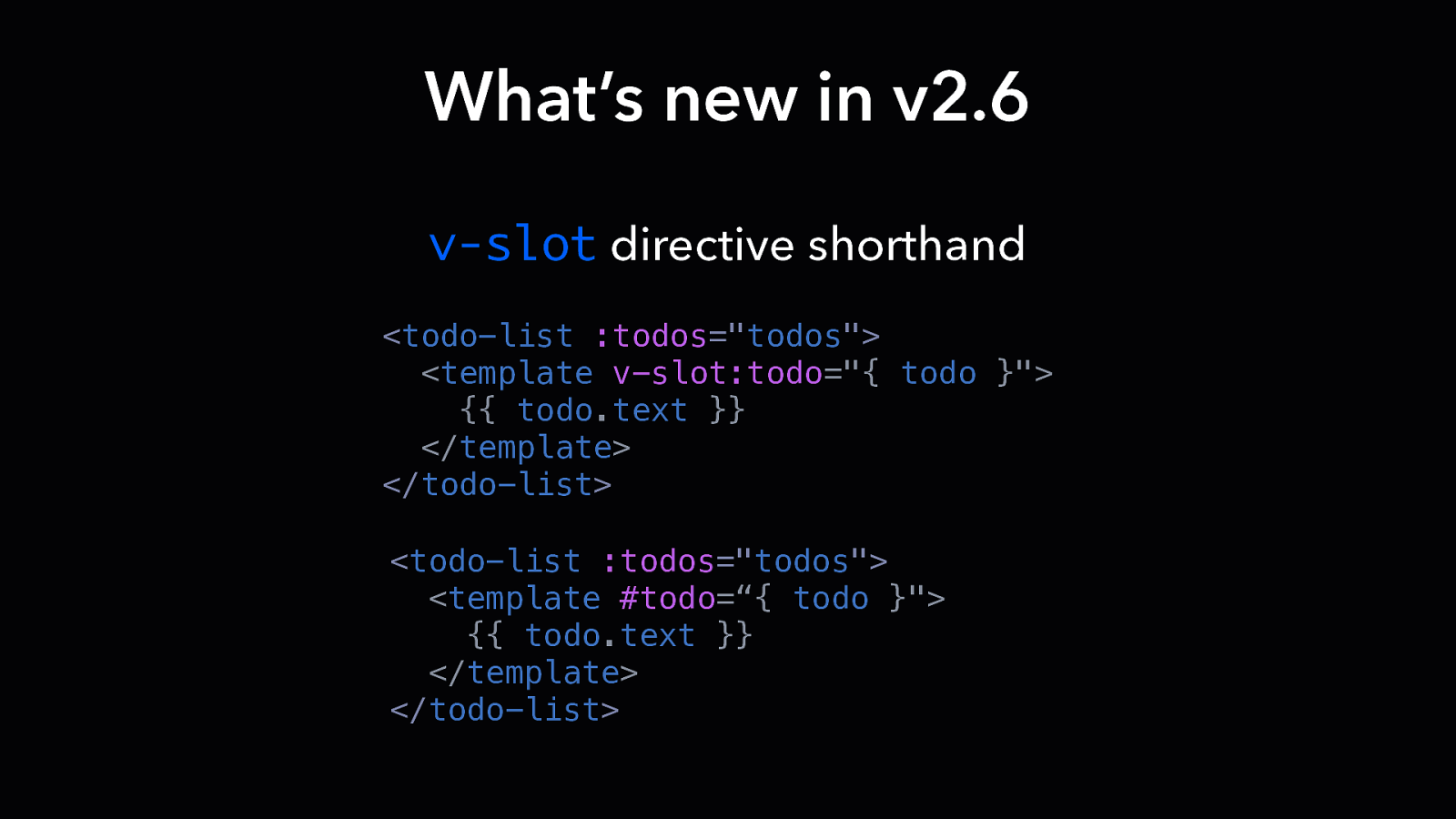
What’s new in v2.6 v-slot directive shorthand <todo-list :todos=”todos”> <template v-slot:todo=”{ todo }”> {{ todo.text }} </template> </todo-list> <todo-list :todos=”todos”> <template #todo=“{ todo }”> {{ todo.text }} </template> </todo-list>
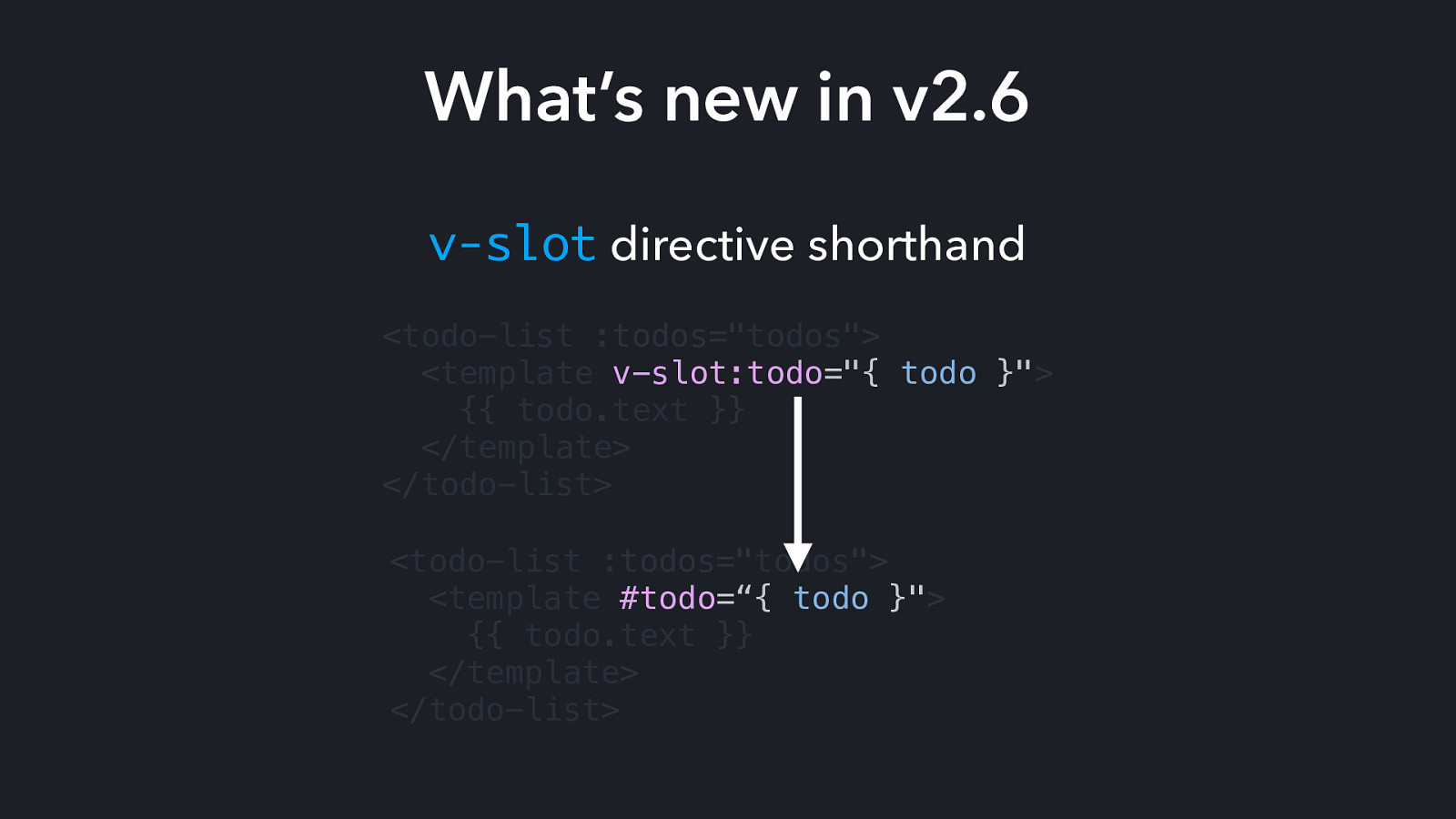
What’s new in v2.6 v-slot directive shorthand <todo-list :todos=”todos”> <template v-slot:todo=”{ todo }”> {{ todo.text }} </template> </todo-list> <todo-list :todos=”todos”> <template #todo=“{ todo }”> {{ todo.text }} </template> </todo-list>
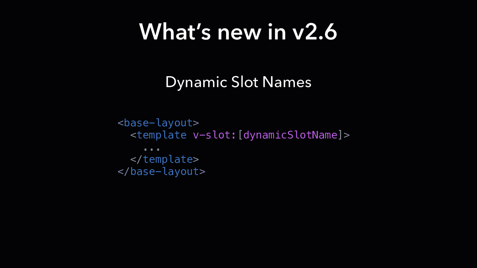
What’s new in v2.6 Dynamic Slot Names <base-layout> <template v-slot:[dynamicSlotName]> … </template> </base-layout>
Slots > Props
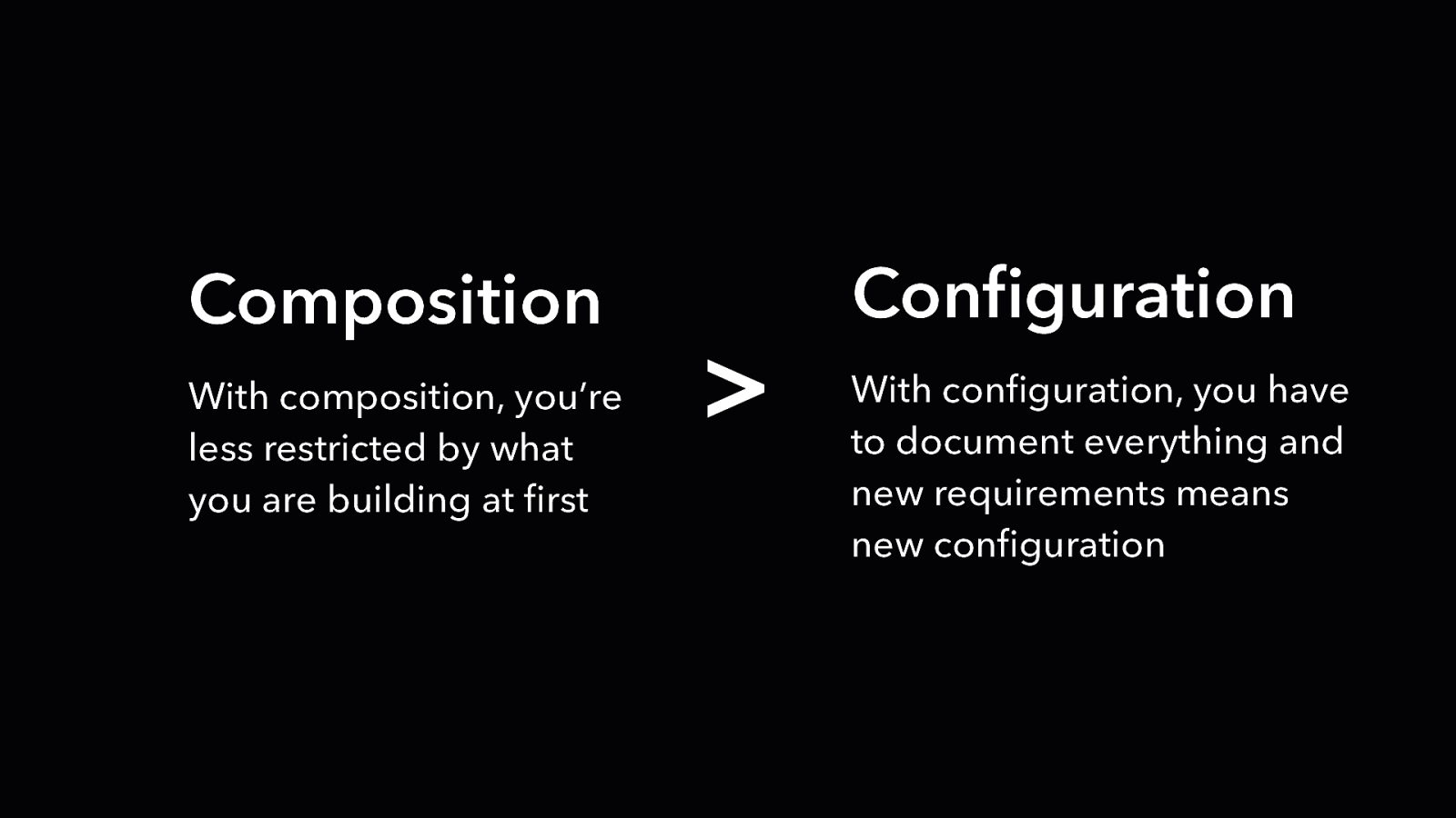
Composition With composition, you’re less restricted by what you are building at first
Configuration With configuration, you have to document everything and new requirements means new configuration

DESIGN PATTERN Transparent Components
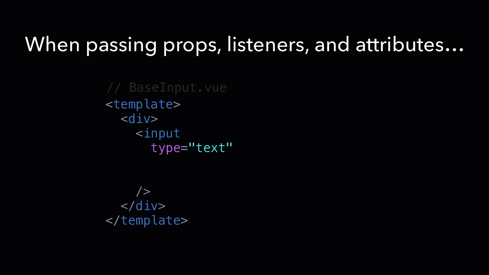
When passing props, listeners, and attributes… // BaseInput.vue <template> <div> <input type=”text” v-bind=“{ …$attrs, …$props }” v-on=“$listeners” /> </div> </template>
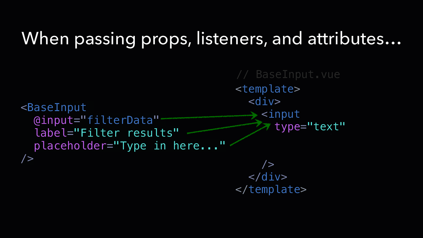
When passing props, listeners, and attributes… // BaseInput.vue <template> <div> <BaseInput <input @input=”filterData” type=”text” label=”Filter results” v-bind=“{ …$attrs, …$pr placeholder=”Type in here…” v-on=“$listeners” /> /> </div> </template>
When passing props, listeners, and attributes… // BaseInput.vue <template> <div> <BaseInput <input @input=”filterData” type=”text” label=”Filter results” v-bind=“{ …$attrs, …$pr placeholder=”Type in here…” v-on=“$listeners” /> /> </div> </template>
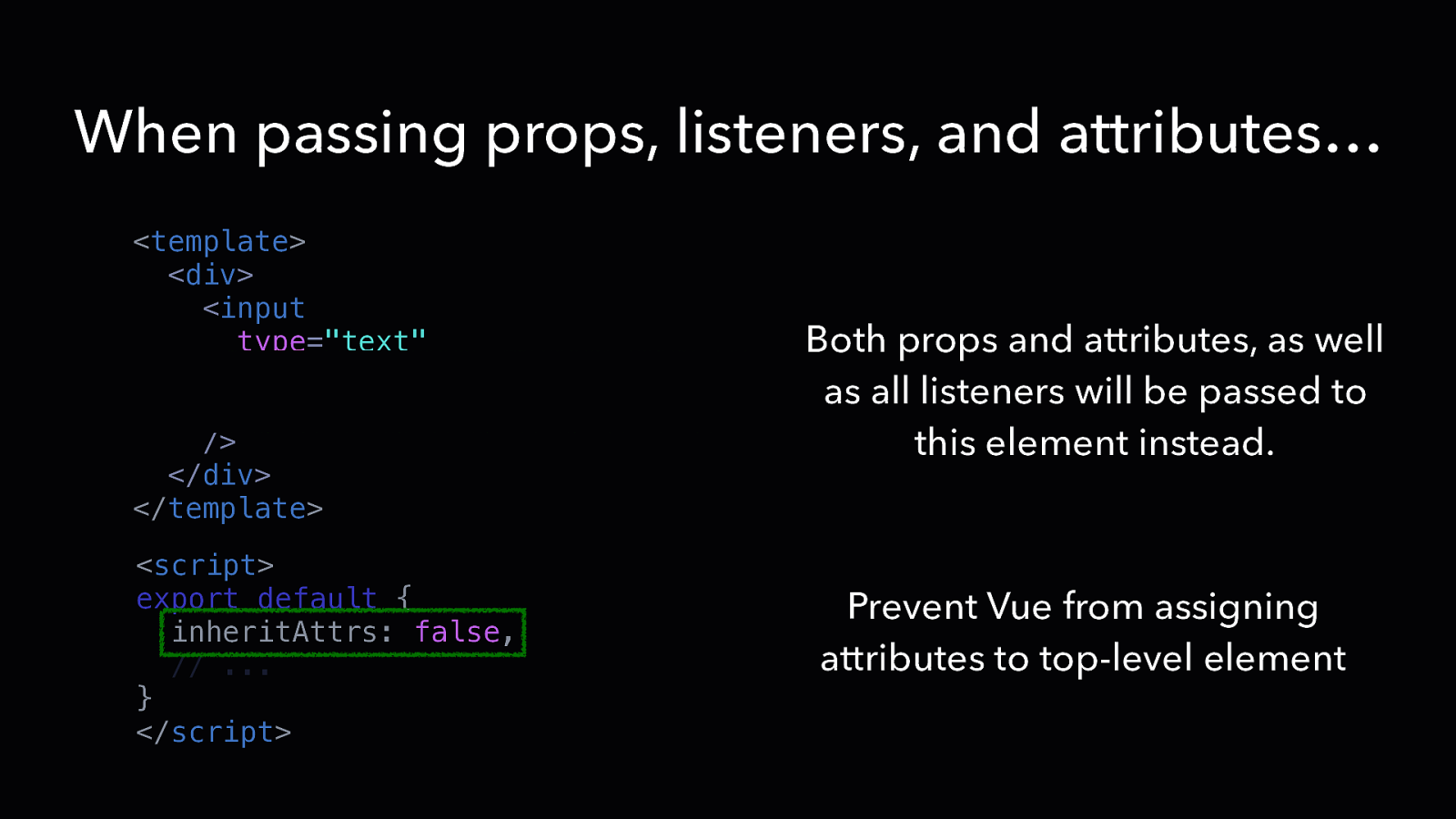
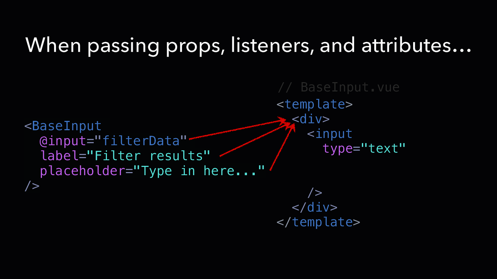
When passing props, listeners, and attributes… <template> <div> <input type=”text” v-bind=“{ …$attrs, …$props }” v-on=“$listeners” /> </div> </template> <script> export default { inheritAttrs: false, // … } </script> Both props and attributes, as well as all listeners will be passed to this element instead. Prevent Vue from assigning attributes to top-level element
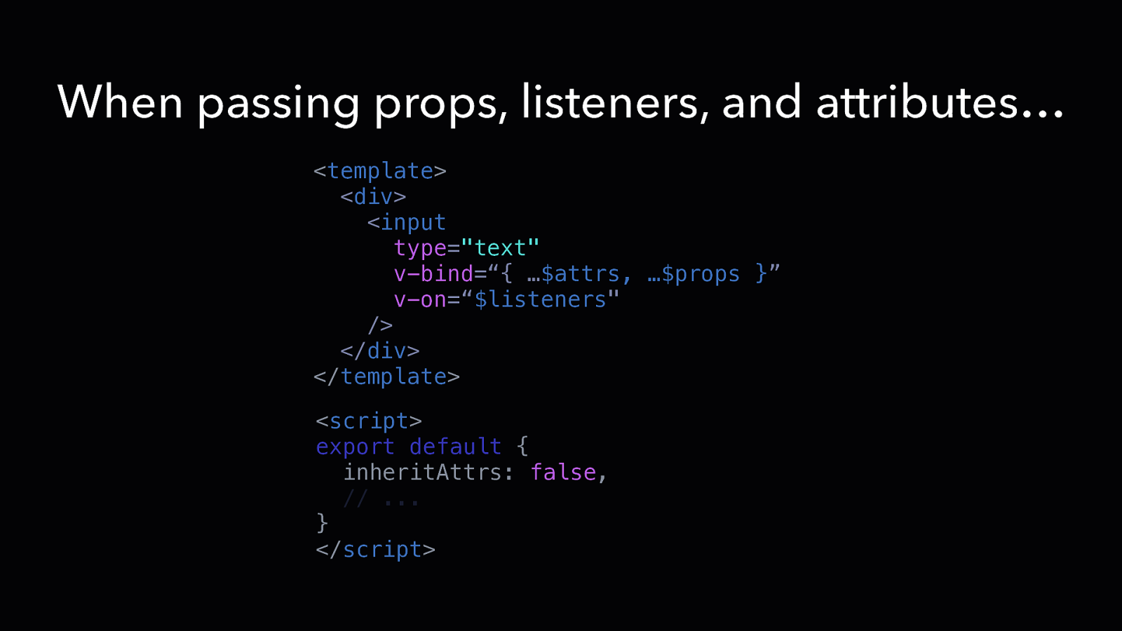
When passing props, listeners, and attributes… <template> <div> <input type=”text” v-bind=“{ …$attrs, …$props }” v-on=“$listeners” /> </div> </template> <script> export default { inheritAttrs: false, // … } </script>

DESIGN PATTERN Wrap Vendor Components
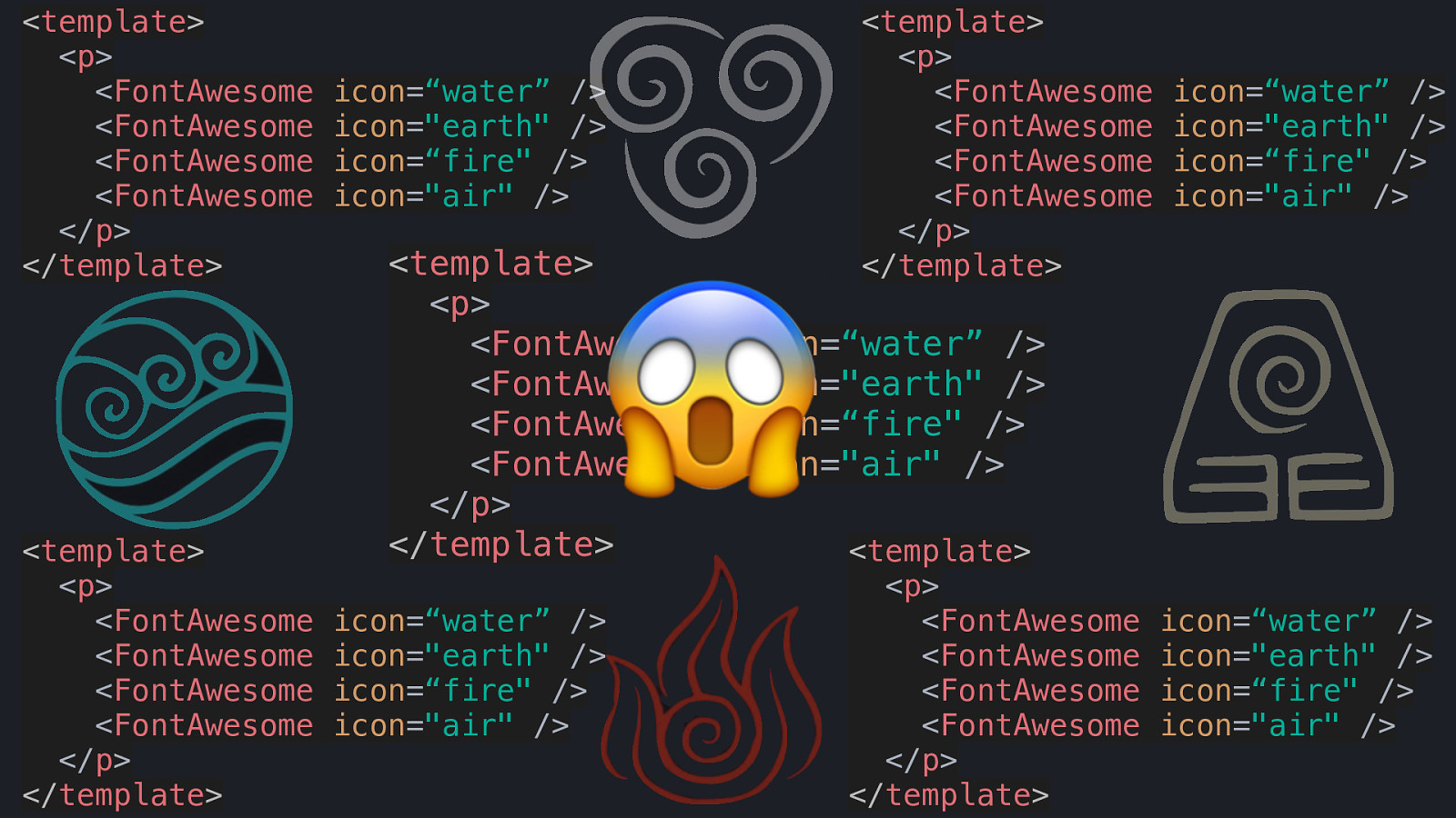
<template> <p> <FontAwesome <FontAwesome <FontAwesome <FontAwesome </p> </template> <template> <p> <FontAwesome <FontAwesome <FontAwesome <FontAwesome </p> </template> icon=“water” /> icon=”earth” /> icon=“fire” /> icon=”air” /> <template> <p> <FontAwesome <FontAwesome <FontAwesome <FontAwesome </p> </template> 😱 icon=“water” /> icon=”earth” /> icon=“fire” /> icon=”air” /> <template> <p> <FontAwesome <FontAwesome <FontAwesome <FontAwesome </p> </template> icon=“water” /> icon=”earth” /> icon=“fire” /> icon=”air” /> icon=“water” /> icon=”earth” /> icon=“fire” /> icon=”air” /> <template> <p> <FontAwesome <FontAwesome <FontAwesome <FontAwesome </p> </template> icon=“water” /> icon=”earth” /> icon=“fire” /> icon=”air” />
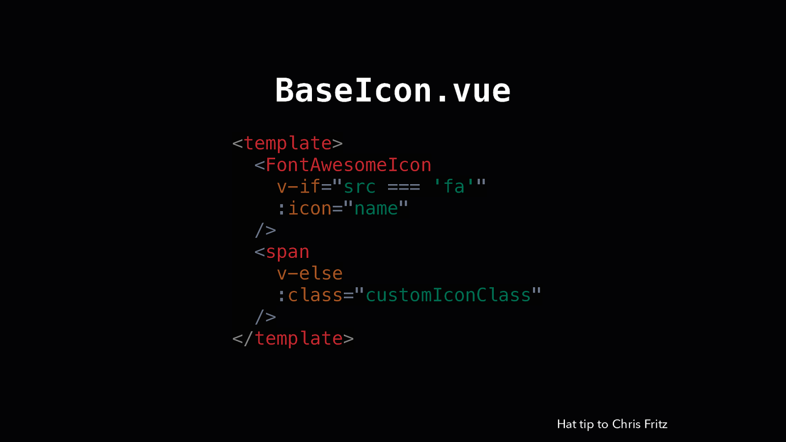
BaseIcon.vue <template> <FontAwesomeIcon v-if=”src === ‘fa’” :icon=”name” /> <span v-else :class=”customIconClass” /> </template> Hat tip to Chris Fritz
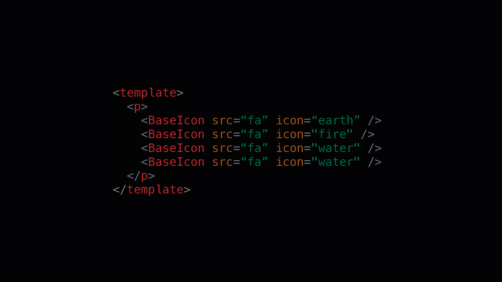
<template> <p> <BaseIcon <BaseIcon <BaseIcon <BaseIcon </p> </template> src=“fa” src=“fa” src=“fa” src=“fa” icon=“earth” /> icon=”fire” /> icon=”water” /> icon=”water” />

DESIGN PATTERN Provider Components
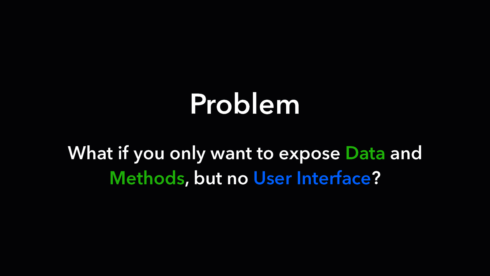
Problem What if you only want to expose Data and Methods, but no User Interface?
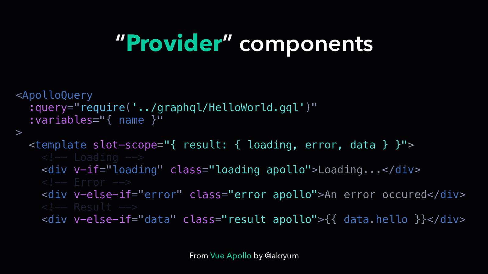
“Provider” components <ApolloQuery :query=”require(‘../graphql/HelloWorld.gql’)” :variables=”{ name }” > <template slot-scope=”{ result: { loading, error, data } }”> <!— Loading —> <div v-if=”loading” class=”loading apollo”>Loading…</div> <!— Error —> <div v-else-if=”error” class=”error apollo”>An error occured</div> <!— Result —> <div v-else-if=”data” class=”result apollo”>{{ data.hello }}</div> From Vue Apollo by @akryum
<ApolloQuery :query=”require(‘../graphql/HelloWorld.gql’)” :variables=”{ name }” > <template slot-scope=”{ result: { loading, error, data } }”> <!— Loading —> <div v-if=”loading” class=”loading apollo”>Loading…</div> <!— Error —> <div v-else-if=”error” class=”error apollo”>An error occured</div> <!— Result —> <div v-else-if=”data” class=”result apollo”>{{ data.hello }}</div> From Vue Apollo by @akryum
<ApolloQuery :query=”require(‘../graphql/HelloWorld.gql’)” :variables=”{ name }” > <template slot-scope=”{ result: { loading, error, data } }”> <!— Loading —> <div v-if=”loading” class=”loading apollo”>Loading…</div> <!— Error —> <div v-else-if=”error” class=”error apollo”>An error occured</div> <!— Result —> <div v-else-if=”data” class=”result apollo”>{{ data.hello }}</div> From Vue Apollo by @akryum
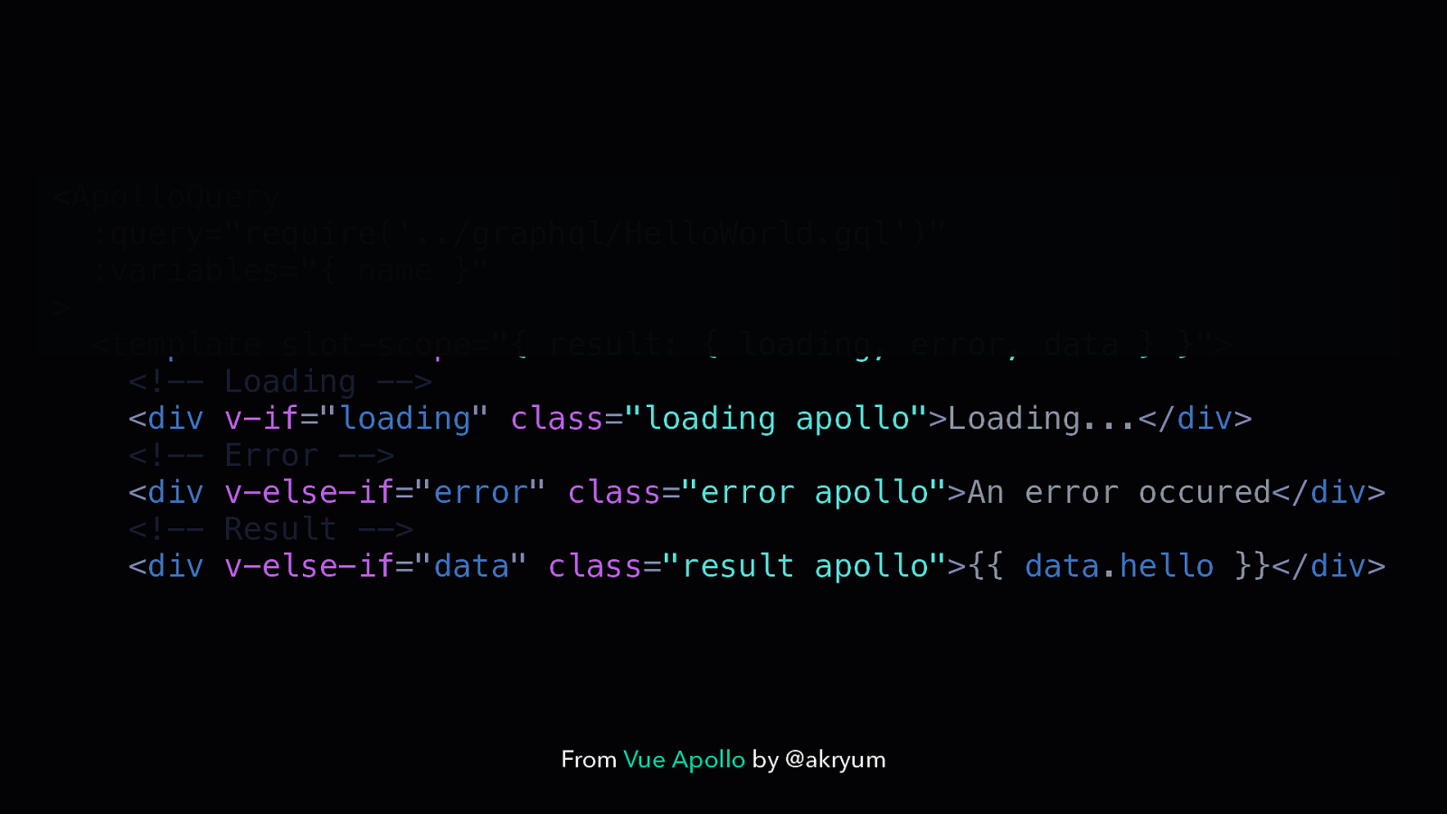
<ApolloQuery :query=”require(‘../graphql/HelloWorld.gql’)” :variables=”{ name }” > <template slot-scope=”{ result: { loading, error, data } }”> <!— Loading —> <div v-if=”loading” class=”loading apollo”>Loading…</div> <!— Error —> <div v-else-if=”error” class=”error apollo”>An error occured</div> <!— Result —> <div v-else-if=”data” class=”result apollo”>{{ data.hello }}</div> From Vue Apollo by @akryum
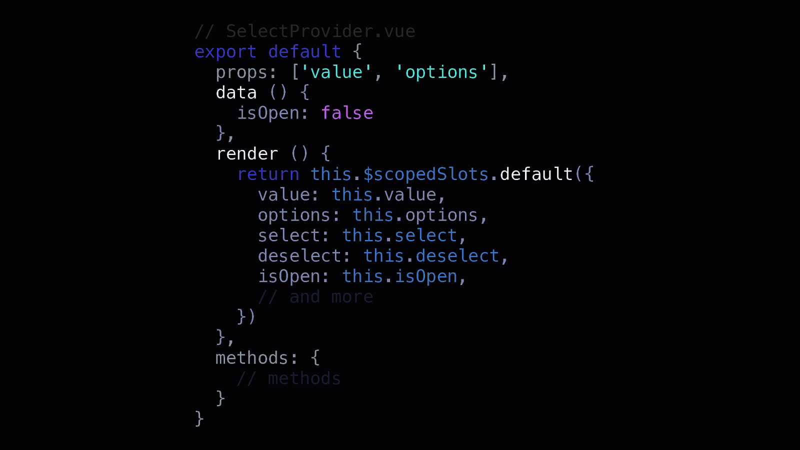
// SelectProvider.vue export default { props: [‘value’, ‘options’], data () { isOpen: false }, render () { return this.$scopedSlots.default({ value: this.value, options: this.options, select: this.select, deselect: this.deselect, isOpen: this.isOpen, // and more }) }, methods: { // methods } }
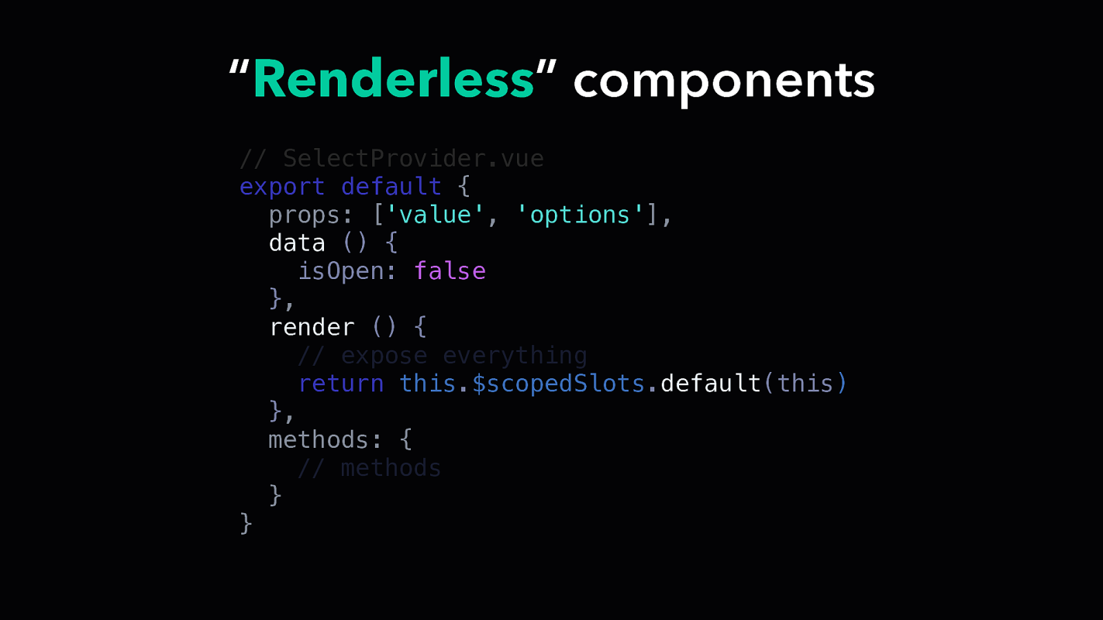
“Renderless” components // SelectProvider.vue export default { props: [‘value’, ‘options’], data () { isOpen: false }, render () { // expose everything return this.$scopedSlots.default(this) }, methods: { // methods } }
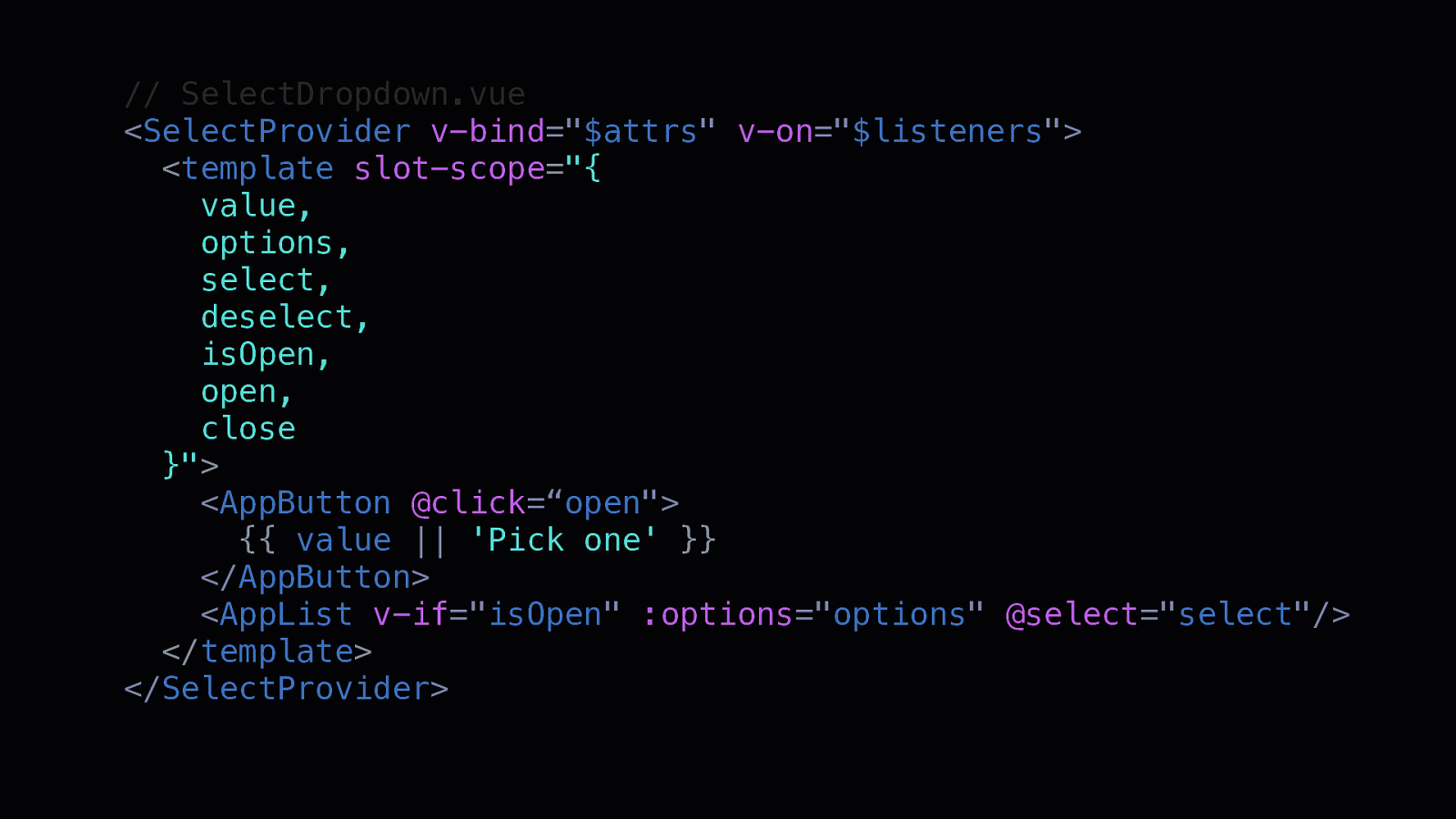
// SelectDropdown.vue <SelectProvider v-bind=”$attrs” v-on=”$listeners”> <template slot-scope=”{ value, options, select, deselect, isOpen, open, close }”> <AppButton @click=“open”> {{ value || ‘Pick one’ }} </AppButton> <AppList v-if=”isOpen” :options=”options” @select=”select”/> </template> </SelectProvider>
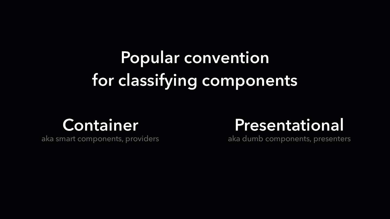
Popular convention for classifying components Container aka smart components, providers Presentational aka dumb components, presenters
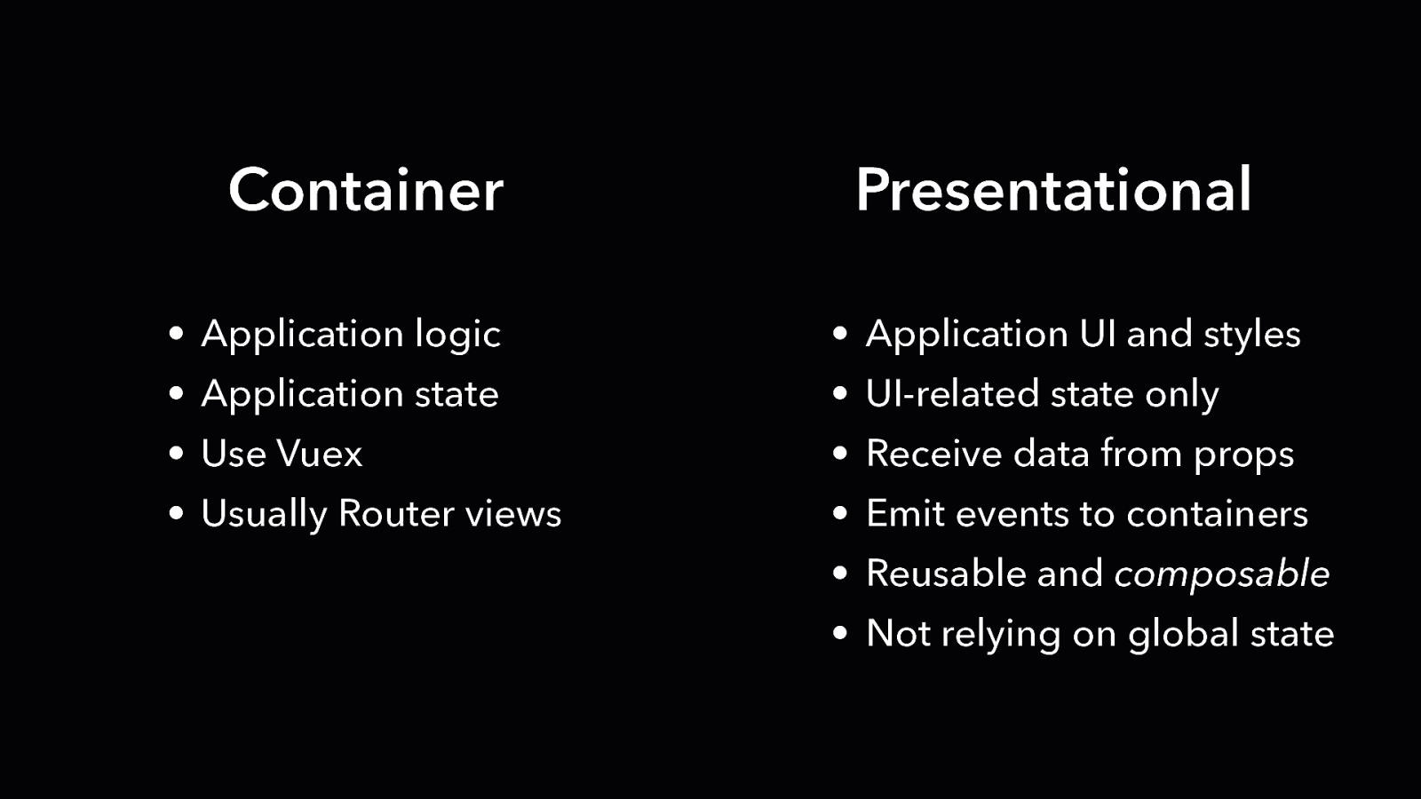
Container Presentational • Application logic • Application UI and styles • Application state • UI-related state only • Use Vuex • Receive data from props • Usually Router views • Emit events to containers • Reusable and composable • Not relying on global state
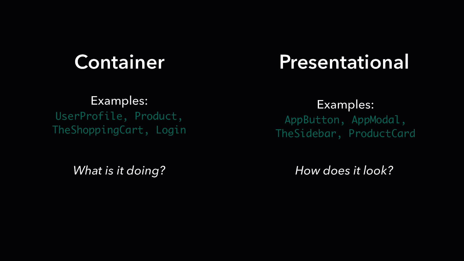
Container Presentational Examples: Examples: UserProfile, Product, TheShoppingCart, Login AppButton, AppModal, TheSidebar, ProductCard What is it doing? How does it look?
Should I always follow this convention?
Should I always follow this convention? NO
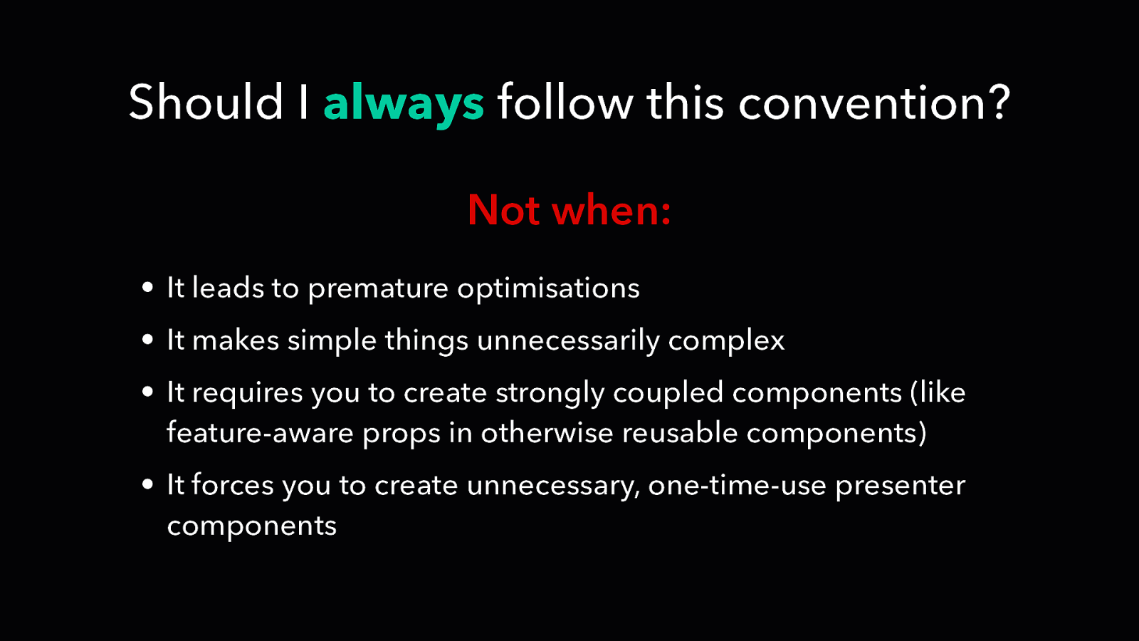
Should I always follow this convention? Not when: • It leads to premature optimisations • It makes simple things unnecessarily complex • It requires you to create strongly coupled components (like feature-aware props in otherwise reusable components) • It forces you to create unnecessary, one-time-use presenter components
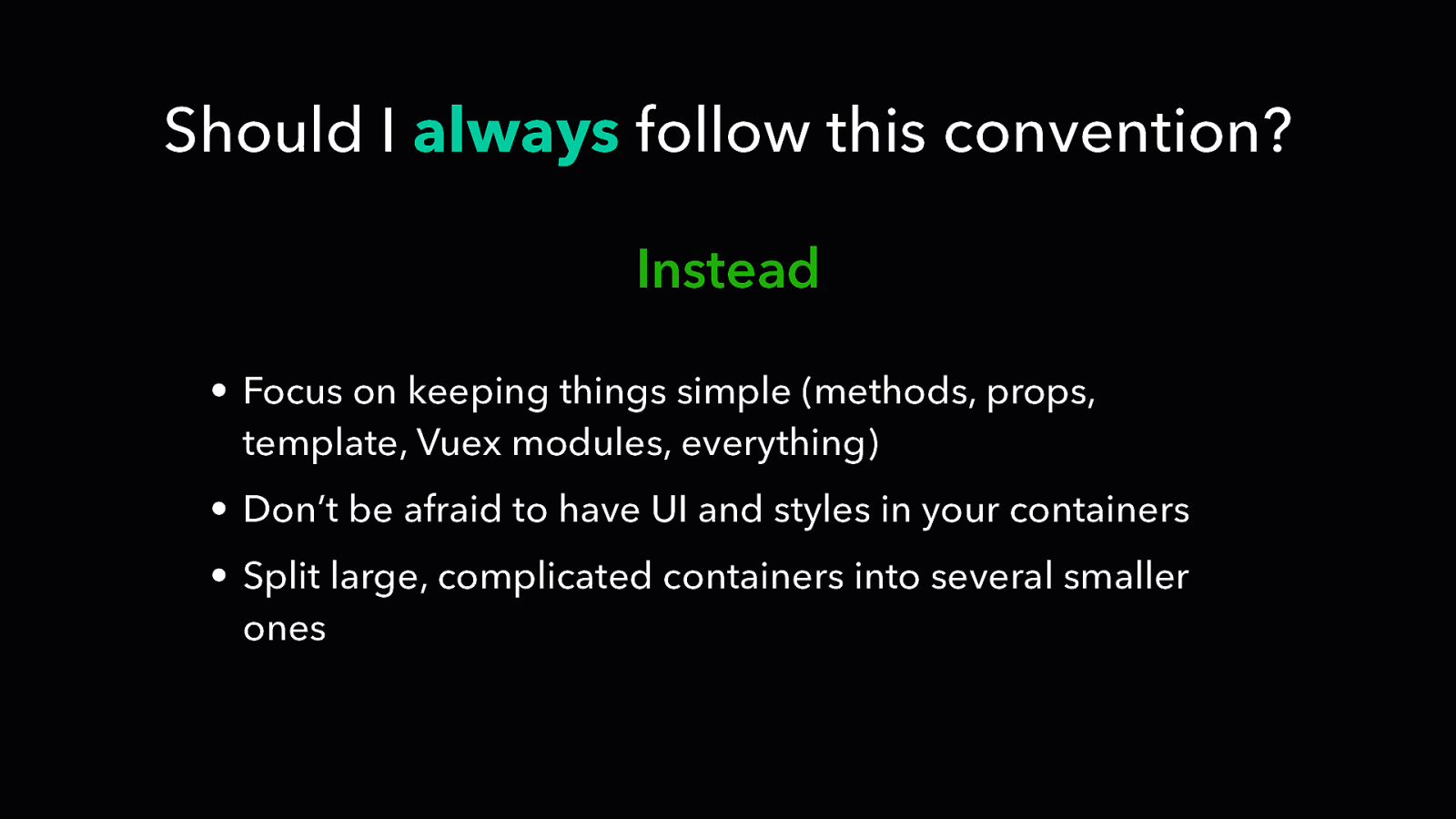
Should I always follow this convention? Instead • Focus on keeping things simple (methods, props, template, Vuex modules, everything) • Don’t be afraid to have UI and styles in your containers • Split large, complicated containers into several smaller ones
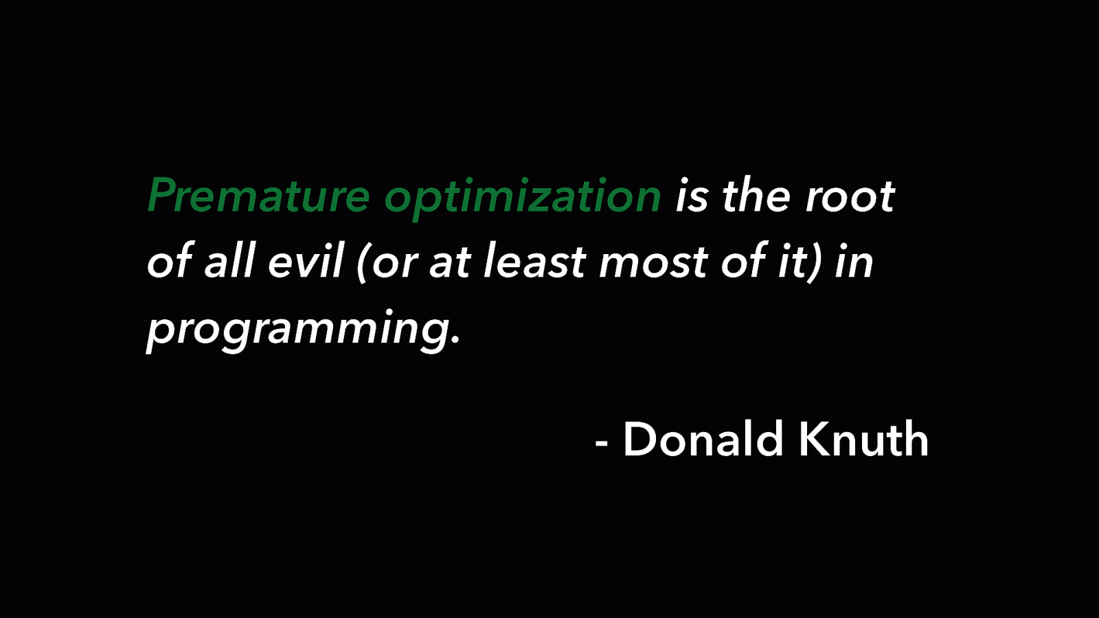
Premature optimization is the root of all evil (or at least most of it) in programming. - Donald Knuth

Data Driven Refactoring
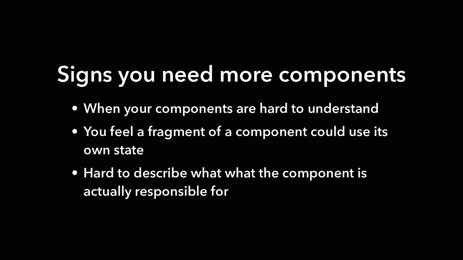
Signs you need more components • When your components are hard to understand • You feel a fragment of a component could use its own state • Hard to describe what what the component is actually responsible for
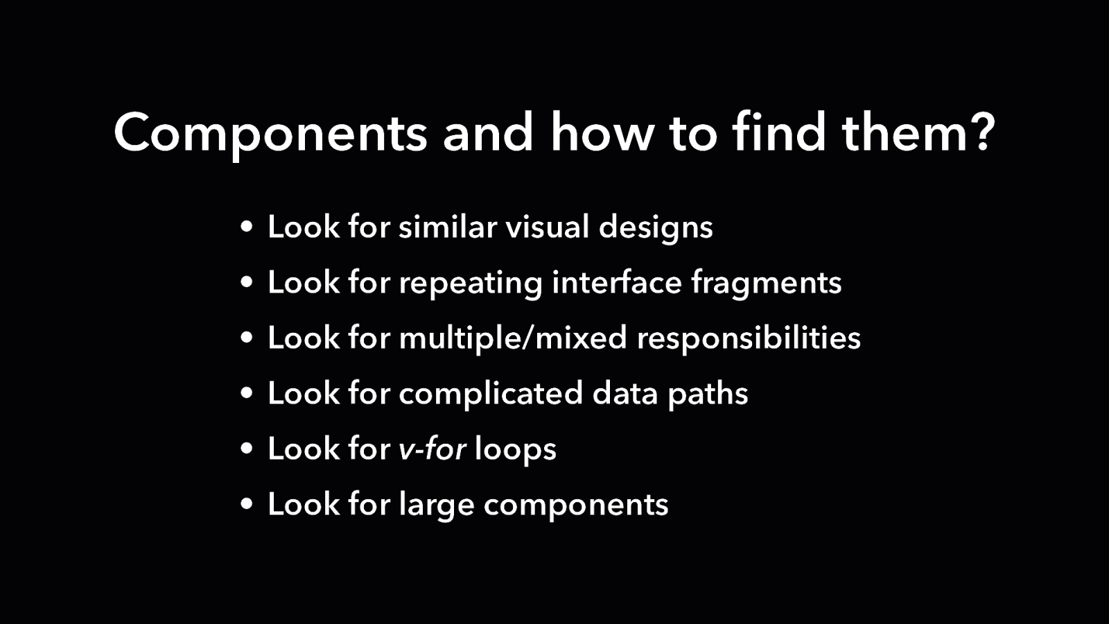
Components and how to find them? • Look for similar visual designs • Look for repeating interface fragments • Look for multiple/mixed responsibilities • Look for complicated data paths • Look for v-for loops • Look for large components

Composition API http://bit.ly/compositionapi

Thank you! www.bencodezen.io